What is Susan Care's design work at Apple that designed the first Mac icon "Happy Mac"?
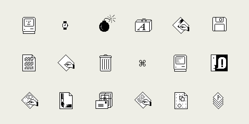
Designers known for designing the first Mac's "Happy Mac", "Trash", "Bomb"Susan CareIn recognition of his tremendous achievements in the computer world, Mr. Awara was awarded "AIGA Medals" from the American Graphic Arts Association (AIGA) in the field of graphic design and visual communication in April 2018 to superior people. It was. Mr. Care's efforts at Apple Computer, which had a great influence on subsequent computer design,MilanoteI look back on Mr. Care's sketches and works.
The Story Behind Susan Kare's Iconic Design Work for Apple | The Work Behind The Work
https://milanote.com/the-work/the-story-behind-susan-kares-iconic-design-work-for-apple
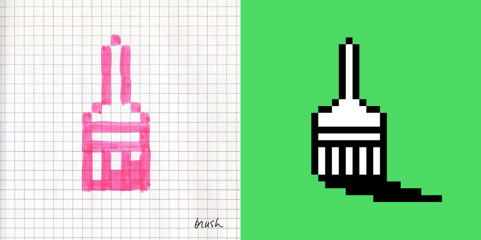
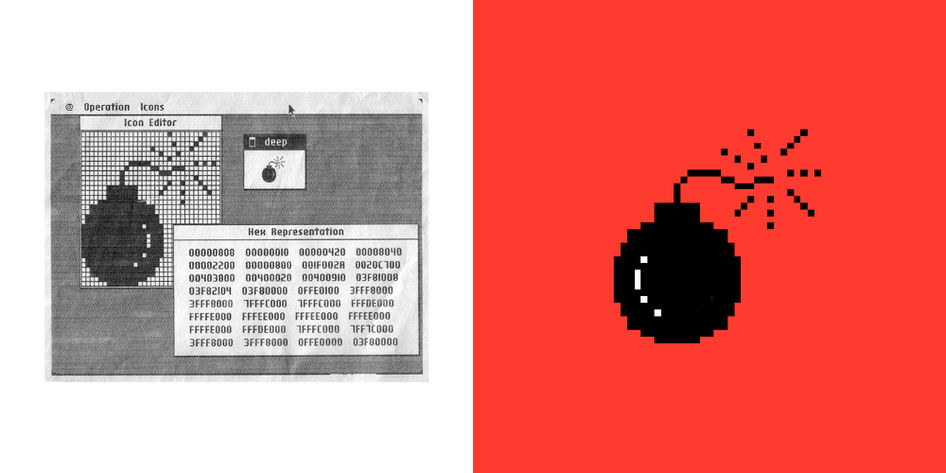
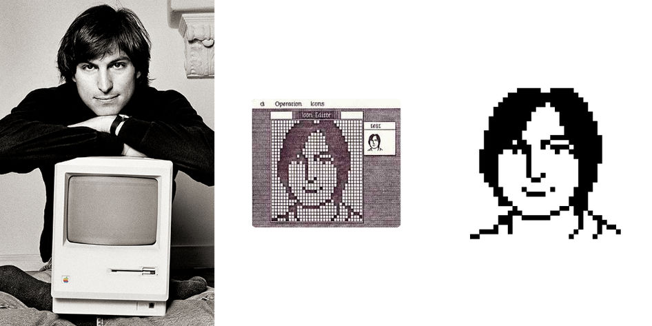
I am a friend from the age of 14Andy HertzfeldMr. Care who joined Apple in response to the request that "I am looking for a designer at Apple" from Mr. Mr. Care. Initially, he said that he used grid paper to express it with a bitmap.
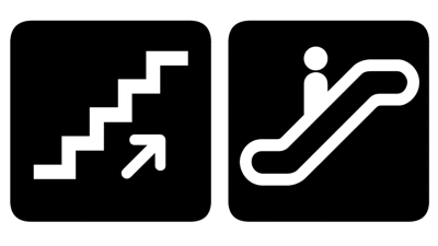
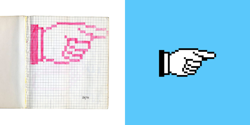
One of the most symbolic ones by Mr. Care's design is the design which means the following arrows. This arrow icon is used as a signboard for directions at modern art museums around the world.
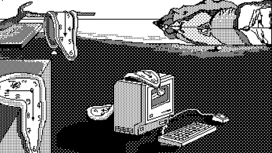
After that, Mr. Hertzfeld made an icon editor for Mr. Care. Thanks to this software, you can now enlarge the sketch and change it to the actual size while working, and that "bomb" icon will be created as well.
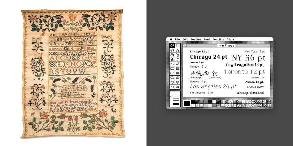
"If you like embroidery, I often said that I love bitmap design, they are really similar," says Care.
Mr. Care said he learned from Steve Jobs the value of accumulating attention to detail. Jobs' philosophy, which dislikes displaying too much information at once, emphasizing the value of "simplicity" in visual messaging, had a great influence on Mr. care's design.
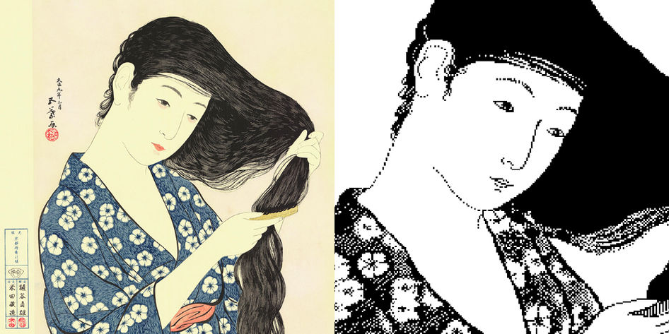
Paint software "MacPaint"As the promotional design ofHashiguchi Five leaves"The woman who can have hair" is said to have been created based on the woodcut prints owned by Jobs.
Care created by Mr. Care that likes to make friendly and human-like things is "Happy Mac"

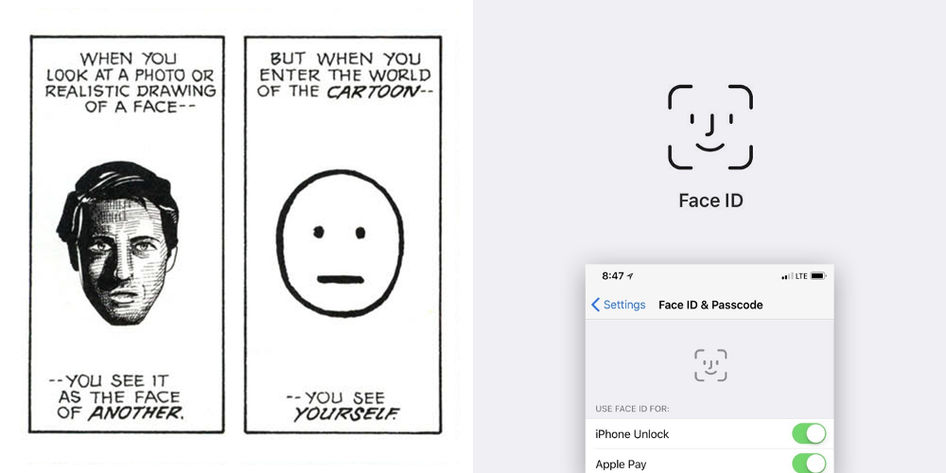
According to Mr. Care, if the icon becomes too realistic, people will not feel familiar. By removing features and making it simple, it becomes universal and it seems that everyone can easily project themselves.
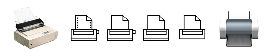
The universality of Keer 's design is well represented by the printer' s icon. The icon on the far left has a hole and dial to rotate the paper, but if you remove these two, you can see that it is a design that works well as a modern printer. If it is simple and universal design, it will keep a long life.
Apple's logo was printed on the initial Mac command key. However, Jobs ordered Mr. Care to make an icon meaning "feature", assuming that there are too many Apple logos in the interface. Mr. Care who did not know how to draw "function" said that he found "⌘" in the symbol dictionary he was looking at. Mr. Care, who felt "abstract but able to use" decided to use "⌘" as the command key logo.
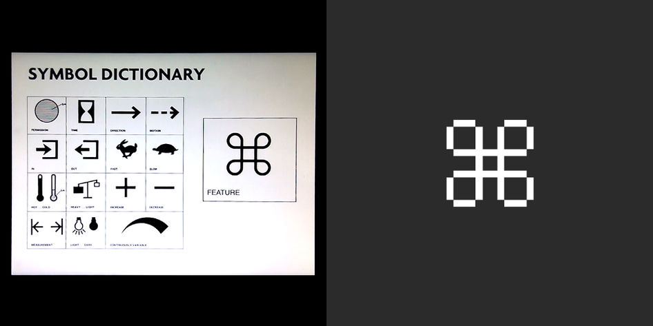
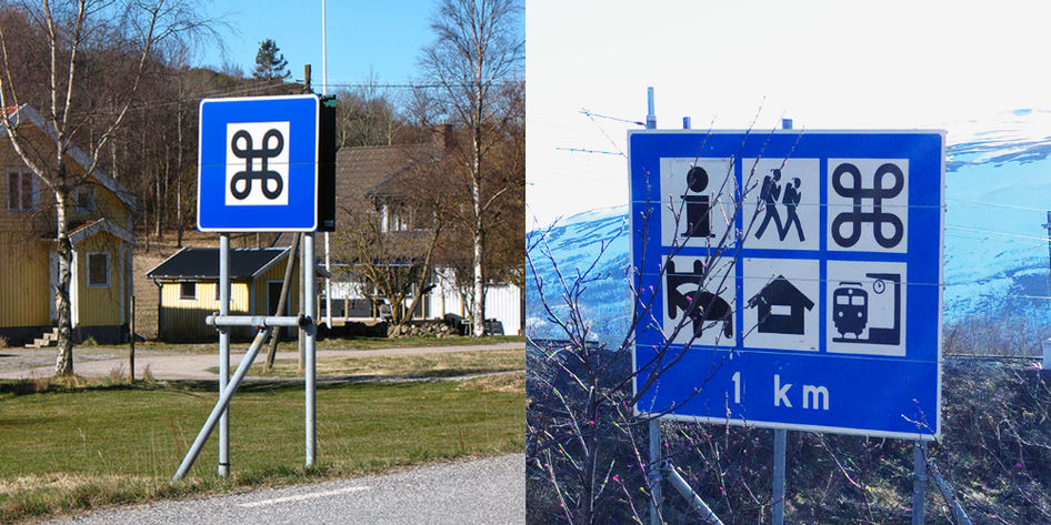
The command symbol is made in Northern Europe around 400 - 600, and it shows the sightseeing spots in Northern Europe countries even as of 2018It is used as a road sign. Mr. Care who traveled in Sweden in a few years said that he enjoyed being able to find the traffic sign of the command key logo everywhere.
Mr. Care, who felt that the design of "⌘" was abstract, was later told from a person living in Scandinavia that "⌘ is designing a view from the sky from the castle" It seems that she was surprised, "What a concrete thing!"

The logo designed by Mr. Care at Apple continues to make a big impact on computer design still from the simplicity and clarity.
In receiving the AIGA Medals award, Mr. Care is commenting on the design of the past in the following movie.
Susan Kare | 2018 AIGA Medalist - YouTube
Related Posts: