What is a graphic designer who opened up the future of icons with Apple?
The icon and the computer are inseparably related to each other, as there is no day to see the icons when using a computer, but as graphic designer's great contribution to the icon used todaySusan CareYou can mention. Mr. Care who worked as an Apple employee, but as to what she did and how she opened up the future of the icon,PriceonomicsIt is summarized.
The Woman Behind Apple's First Icons
http://priceonomics.com/the-woman-behind-apples-first-icons/
◆ History of graphical user interface
In 1984MacintoshWhen it was released, a simple and friendly interface was selling. However, there was a history before this simple interface was completed.
In the 1960's, California'sSRI InternationalsoDouglas · EngelbartMr.NLSIt led the development and design of the system, and put various concepts such as hypertext link, raster scan display, graphical user interface, presentation software, etc. into practical use.
And by 1970 Xerox 'sPalo Alto Research CenterCombined computer-related results, adding mouse developed at SRI International added "Alto". Bitmap screens and menus are equipped,GUIThe integration was done. And in 1981 it inherited the technology of Alto "Xerox StarThe first basic icon is implemented here for the first time. In 1982, Adel Gold Burke and Robert Flegel made the word "pixel art".
This is an icon implemented in Xerox Star released in 1981. There are many similar designs, and it seems a bit hard to understand when I look nervously.
The Xerox computer is expensive and was not usable by anyone,PERQYaLisa, And Macintosh, which influenced a lot of personal computers that were released from 1970 to 1980.
And when I saw Xerox Star's GUI for 10 minutes, Steve Jobs said that "every computer will be working someday this way," Steve Jobs said that for three days, Alto and his Get permission to freely access development tools.
This is because the initial MacSketchMacPaintName). Currently he works as a natural photographerBill · Atkinson'S design.
MacFinderAnd other programmers who worked onBruce HornSays that Lisa has a pull-down menu andQuickDrawWe focused on the fundamental concept of personal computers, such as the model of the window based on clipboard, clear software and software that focuses on internationalization. However, today's familiar and easy to remember icons were created since Susan Care became a member of the Macintosh team in 1982.
From art to the world of pixels
Mr. Care was a child who loved painting, dreaming of becoming an artist during childhood. I love to draw, to use paint and to do the work, a turning point for her, who was immersed in art anyway, was the year I met Apple in 1982.
Mr. Care, who obtained a doctorate degree at New York University in 1978, was unable to decide whether to become a teacher or an artist. And after all, Mr. Care was in San FranciscoFAMSFI will work as a curator at the Arkansas Museum until the early 1980s.
at that time,Jeff RuskinUnder the project "Macintosh project" which is "low-cost, easy-to-use computer for average consumers" began to move, in 1982Andy HertzfeldWill be welcomed as a member of the team. And Mr. Hertzfeld invited me as a Macintosh team member, it was Care, a friend from the age of 14.
Care isinterviewI was familiar with the fact that he was interested in computers because Andy was a friend from high school after graduating from high school and Andy is also interested in art and graphics by Andy Andy said that I showed me the initial Macintosh and needed some graphics, and if I draw a picture with a squirrel, I will show it on the computer screen It was said that it could be displayed on the project, and I thought it was a wonderful project. "
You can see how Mr. Care is talking on a Macintosh commercial on the following movie.
Susan Kare Macintosh Commercial - YouTube
The icon that Care drew on the note looks like the following. First of all, a finger icon used to show "paste" later.
Icon of scissors meaning "cut".
A paint brush that will be used in MacPaint.
An icon indicating a programming command "jump".
As you can see, boots.
After that Care will continue to design fonts and icons for Macintosh, and her business card will be titled "Macintosh artist". Although Mr. Care who had never experienced anything such as computer graphics until then, I read books and learned the skill in the blink of an eye in a blink of an eye. According to Mr. Care, pixel art has a point to share with existing art such as mosaic and needle point embroidery, and he was experienced graphic design through these arts without computer experience.
Also, when she started working, there was no icon editor on the Macintosh, but Heartz Feld made an icon editor that automatically creates icons so Care concentrates only on the design side I was able to do it.
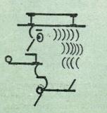
The way the work was carried out is as follows. First, the team tells Mr. Care the concept of what he / she wishes, after several proposals have been made from Care, one of them is developed and the final plan A form of being born. Her early icons were inspired by a variety of things, such as an unusual gadget, ancient hieroglyphics, and so on. For example, the symbols used for command keys are used in Finland 's 1950' sense of interest 'Saint John's ArmsIt is based on. The command key of Lisa was called "Apple key", but after Jobs used the apple mark as Apple's symbol, too much apple was too much, so I looked into the international symbol dictionary It marked another mark.
This is the current command key.
"Happy Mac" "Sad Mac" is care of Mr. Care. Care's icon gave simple and familiarity to average consumers, ie artists, lawyers, writers and chefs.
It is displayed when a fatal system error occurs in Mac OS X or earlier OSBomb markIt is care of Mr. care created under 32 × 32 pixel constraint.
Also create font for Macintosh. Until then, there were many fixed-width fonts, but she works on screen-based proportional fonts for the first time. Beginning with the font "Chicago", font families such as "New York" "Geneva" "Monaco" "Cairo" were reduced and displayed so that they are output smoothly when printed out.
Mr. Jobs strongly wanted the existence of proportional fonts, but Mr. Care showed something to Mr. Jobs on his job and never asked "Do you like this?" Because it was obvious that Jobs answered "no" because it was obvious. Because Mr. Jobs asked for a better job for the other party, if you asked, you prepared some options and seem to have said "Which one do you like?"
And the font named "Cairo" was born by this question method. Various pictograms were used from palm trees to dogs, and it was created to be able to use images with text. The dog's font "Clarus" became famous for "looking like a cow."
Although Mr. Care who contributed greatly to the GUI of the Macintosh, Hearts Feld says that she had "a sense of strange humor". For example, one day when Mr. Hertzfeld went to see Mr. Care's work, she was seriously making a portrait of Mr. Jobs of 32 × 32. Not only the members of the team, Mr. Jobs himself liked this portrait.
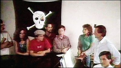
In addition, in 1983, Mr. Jobs worked for the Macintosh team, meaning to win freedom rather than doing an unfascinating work by binding by rules, "Let's become a pirate to become a navy At the end of that year, Mr. Care produced a huge skull mark pirate flag and put it in the team's new office. This flag is still affixed to the office and continues to show the spirit of the team's bounce.
Mr. Care later became Creative Director of Apple, but when Jobs stopped Apple and started NeXT, he joined the founding member. After leaving Apple, Mr. Care will be active as a graphic designer of NeXT afterwards. I am doing the work of IBM and Microsoft partner, and Windows 3.0 game "SolitaireShe also designed her card deck. There are also a lot of things by her on myriad icons like memo pads and various control panels.
And since 1996 when NeXT was sold to Apple, I started to work independently. We will do a lot of work for clients, including Facebook, Paypal, Glam.com and so on. Now in San FranciscoHold the design office, Selling signed works sold at a price of 99.99 dollars (about 10,000 yen) to 499.99 dollars (about 50,000 yen). Works in New YorkMoMA StoreBut it was treated.
CartoonCare's work is also an icon.
"My philosophy has not changed" is Care. "It's easy to remember and develop symbols that are meaningful.It starts designing the monochrome icon with the 32 x 32 pixel icon editor that Andy made and then a more robust tool and high resolution I created a vector image with Illustrator using the screen of But I think that design problems are solved not by tools but by considering things background and metaphor. And she is undertaking various jobs, but the basic approach to the work is the same, "The final goal is to create an easy-to-understand and easy-to-remember image and it works well on the screen. It is important to check the entire visual UI and mock-up many times to see if it is suitable for ".
Related Posts: