Graphic design that saves people's lives
Graphics with intense impact are more convincing than occasional sentences. In the parts related to human life, graphic design has played a variety of roles, the design that was once made and saved the lives of many people is summarized in the BBC Future.
BBC - Future - The graphic design that can help save save lives
http://www.bbc.com/future/gallery/20170927-the-graphic-design-that-can-help-save-lives
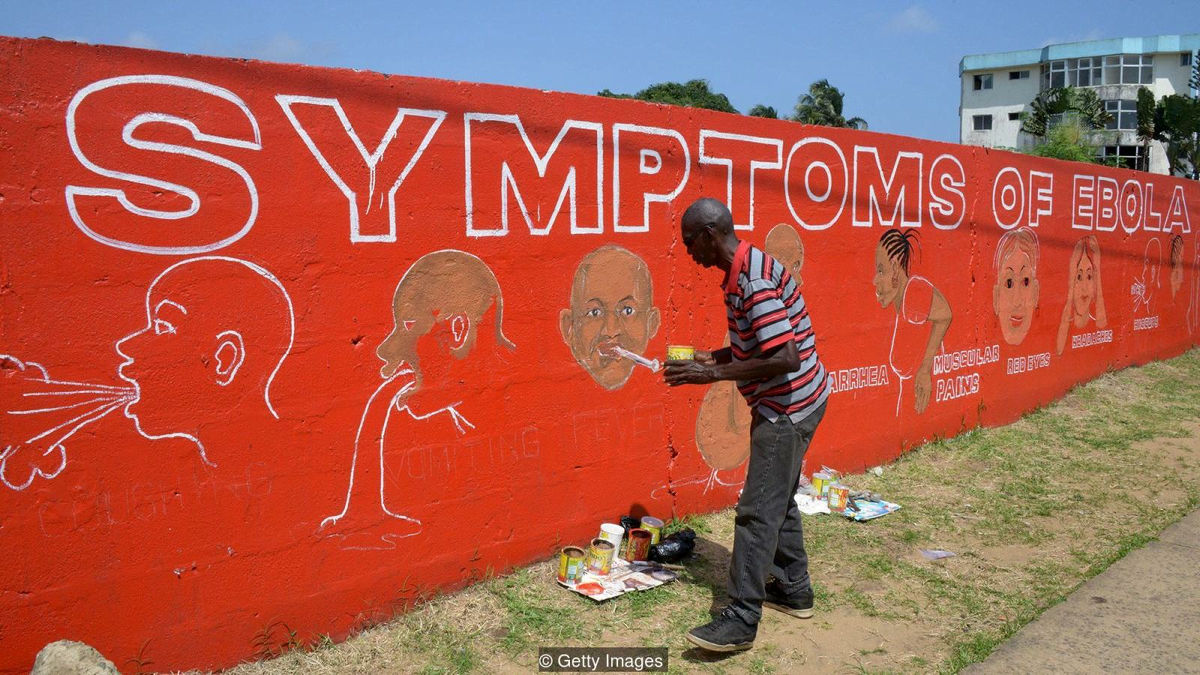
◆ Virus advertisement
A work by the street artist Stephen Doe, drawn in 2014, in the midst of Ebola hemorrhagic epidemics. In September 2014 a few months after the infection was confirmed in a small village in southeastern Guinea in March 2014, 2296 deaths were reported in five countries. In Liberia where multilingualism was spoken and only 43% of the population could read and write, there was a problem of how to educate people about the disease, knowledge was spread by way of illustrations and posters. It is a work of Doe who drawn symptoms of Ebola hemorrhagic on the wall.
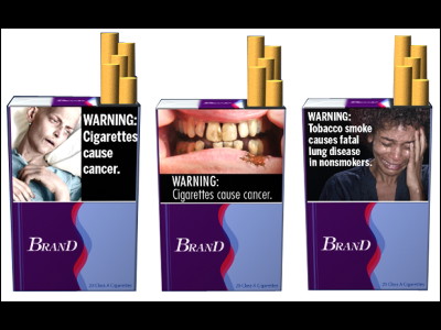
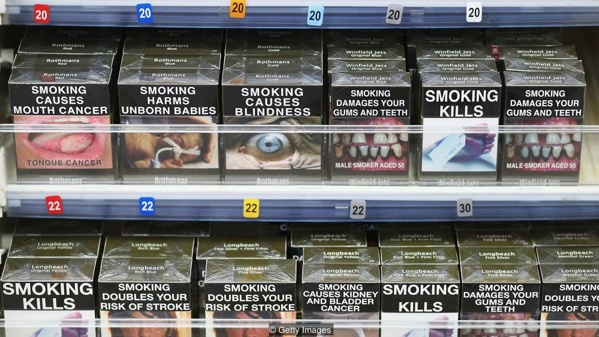
◆ "Ugly" design
Australia regulated the design of cigarette box for the first time in the world in 2012. At this time, the Ministry of Health and Aging asked a market research company to conduct an irregular investigation "find the world's most difficult colors". Seven studies for a total of 1000 smokers, the color "Pantone 448C" was chosen as the color associative of death, tar, mud and so on, it became used as a color of cigarettes.
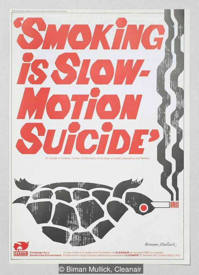
◆ Pioneer of posters
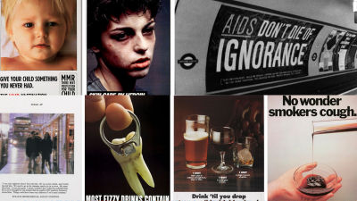
The following posters were created by artist and educator Biman Mullick. Mullick was a person who established anti-smoking organization "Cleanair" in 1972. About 50% of the population was said to have smoked in the UK at that time, Mullick who was concerned about the influence of active smoking created a poster appealing not to put a fire on the cigarette in his class. Mullick's art school worked told Mullick to withdraw the poster, Mullick said he continued to communicate the message. Mullick distributed 186,000 posters by 1984, and ultimately WHO has decided to be recognized for that achievement.
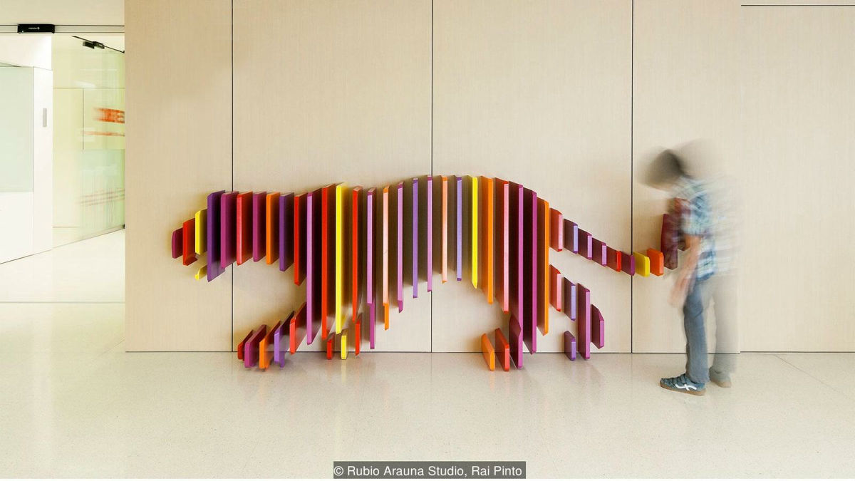
◆ The treatment method of fun
Until the 19th century there was no concept of pediatric / pediatric hospital, children's patients were lying on beds that were too big and treated as 'adult miniature version'. In today's medicine, however, it is known that children are biologically different from adults, not only different treatments and medications from adults, but also different "environments" are needed. Design company'sRubio Arauna StudioI'm doing a project to design a hospital, I divided the rooms with tigers, jellyfishes, elephants and so on, and made an interactive design that seems to allow hide and seek hiding. I changed the hospital for children to a warm, social playground rather than a place that feels loneliness and fear.
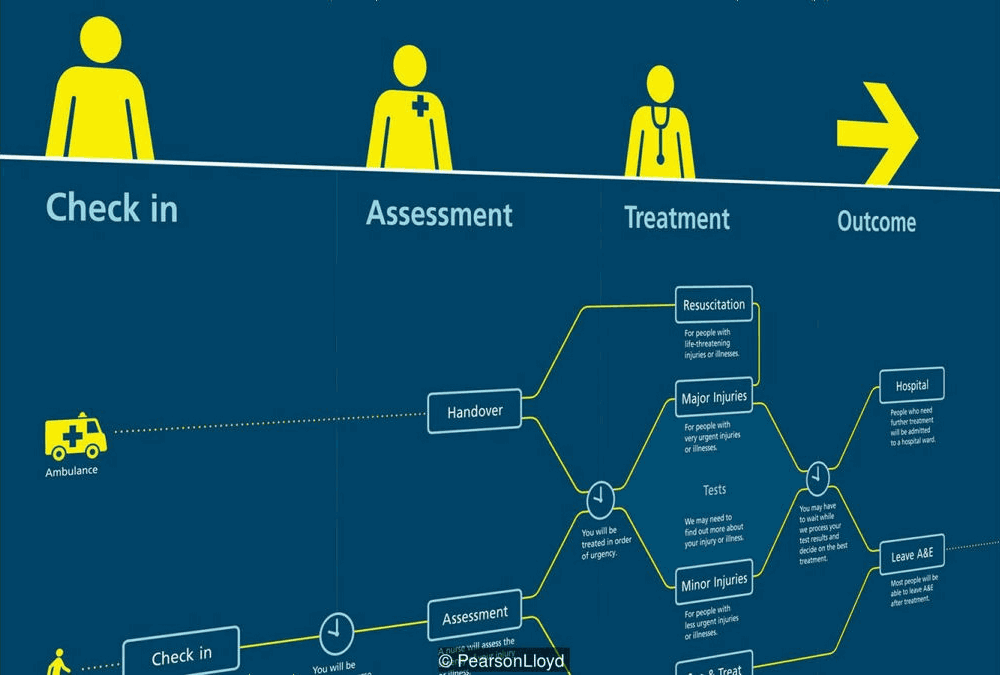
◆ Relaxing frustration
In the UK, violence from patients to medical staff is a problem, and the National Health Service spends $ 93 million annually to cope with the problem (about 10 billion yen). Even plaintiffs are getting irritated by patients with anxiety, as the waiting time is further increasing due to prolonged periods of time it is contributing to the problem that "design" in the hospital is to be taken in To Design studioPearson LloydHe encouraged me to calm uneasy patients by attaching a panel to the wall that will allow you to see the flow of treatment at a glance. In fact, in the hospital where the panel was attached, the violence incident decreased by 50%.
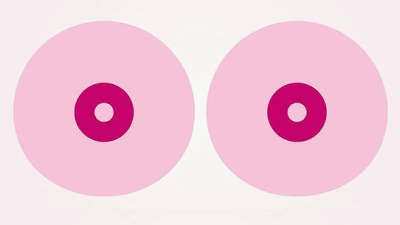
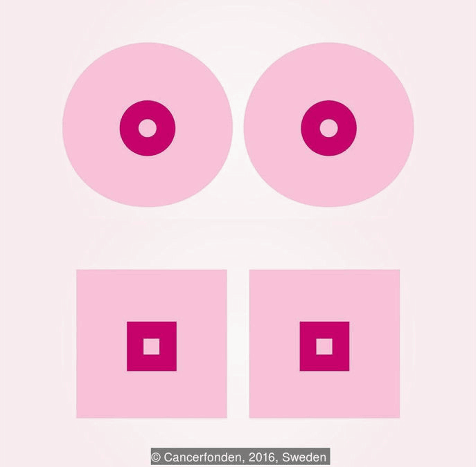
◆ Square look
In 2016, the Swedish Cancer Society's Swedish Cancer Society deleted the animation "How to check yourself the sign of breast cancer" as "inappropriate" by Facebook algorithm.
Swedish Cancer Society "Breast School" - YouTube
The Swedish Cancer Society proposed a way to draw a square in a breast to avoid crawling on Facebook. Facebook has since that time apologized to the Swedish Cancer Society.
◆ Indicate an emergency situation
Excellent design sometimes melts too much into everyday life and is difficult to find. "Battenberg · Mark" took the name from British traditional sweets "Battenberg Cake" in which pink and yellow fabric drew a checkerboard pattern. Battenberg Mark refers to a checkerboard pattern drawn on an ambulance vehicle in Europe, and its color varies depending on the vehicle, but even if viewed from a distance, it is immediately apparent that "that is an ambulance vehicle."

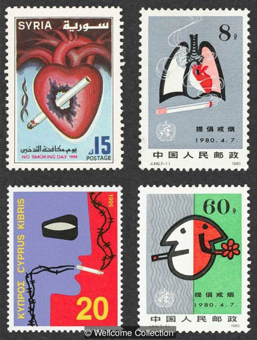
◆ Postal service
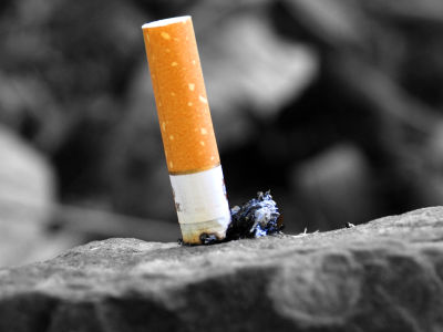
Numerous studies have concluded that adding to the cigarette package photos such as tumor, dead body, dark lungs will help to quit smoking. On the other hand, stamps that illustrate the horror of smoking have also appeared. As of 2000, 65 countries are making anti-smoking postage stamps and postal items, and the eye-catching design is said to function as "miniature of billboard".
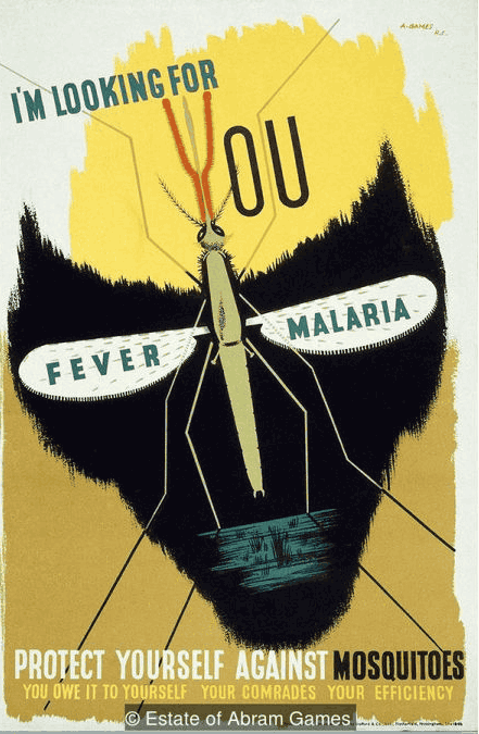
◆ Message from Malaria
Graphic designer Abram Games worked in cooperation with the government during the Second World War. Designed by Mr. Games who was known for combining graphics and typography to give a strong message. The following posters are designed to encourage soldiers to pay attention to mosquitoes.
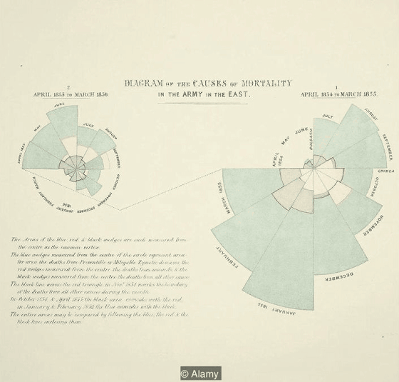
◆ Nightingale mortality map
Florence Nightingale, also known as the mother of modern nursing education, is also known as a pioneer in educational charts. The graph below, which shows the causes of soldiers' death using demographics, explains that soldiers died of infections in hospitals, not just wounds themselves. This graph also occupies a very important position in information design and is currently used as a "rose diagram".
Related Posts: