Why is it so daring to adopt a design that is hard to use?
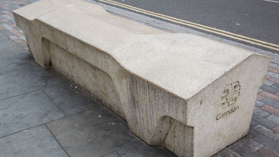
Parks, train stations, bus stops and other public facilities have benches and little space to sit well enough to say. However, many of such spaces have been devised to some extent so that they can not stay long. These design strategies are "Hostile architecture(Harmful environment) "or" Unpleasant Design (unpleasant design) ", but I will call on examples of art, design, construction related media99% InvisibleIt is summarized.
Unpleasant Design & Hostile Urban Architecture - 99% Invisible
http://99percentinvisible.org/episode/unpleasant-design-hostile-urban-architecture/
According to Mr. Gordan Savic and author Serena Savic of the book "Unpleasant Design", what is called "unpleasant design" is not a design failure example, but rather a design example that succeeded in inhibiting certain activities It seems to be. For example, if you think about placing a bench in a public space, you usually try to design a comfortable and cozy one. However, in public places and private spaces accessible by everyone, it seems that there is a case where you intend to incorporate "unpleasant design" intentionally, such as by homeless measures.
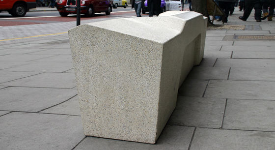
Also, the bench designed under such a design strategy is not good for comfortable sitting, so it also serves as a countermeasure to young people who hang out outside. These strategies are also taken outside the design, for example, stores wanting to restrain young people 's entry into the store sometimes play classical music, or they may sometimes flow high frequency noises that only young people can hear.
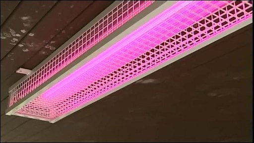
Besides, in an apartment in the UK, it seems that pink lighting is installed in the public space to prevent young people from hanging out.
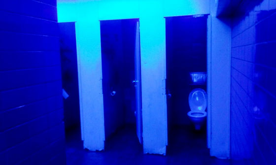
There are data that investigated what kind of effect the strategy adopting this "unpleasant design" actually exerts. For example, there is data that when lighting the public toilet in blue lighting, the effect of suppressing dragging in the toilet has been obtained. As you can see, color has an effect that works strongly on human mood, so it is very effective if it can be incorporated into "unpleasant design" etc. well.
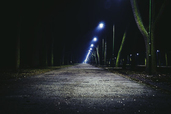
Blue is said to have a sedative effect and effect to create an unusual atmosphere that makes people uncomfortable, and in Glasgow, Scotland the street lights are made blue to reduce road crime. Also, in Tokyo to reduce the number of suicide in the subwayAdopting blue lightingdoing. However, although it is clear that there is a causal relationship between the blue light and the decrease in the number of crimes, it is difficult to conclude that the blue light is the direct cause.
Controlling the crowd with the color of light in public places has been done for a long time. According to Selena Savic,Bosnia-Herzegovina annexationIn doing so, the government employs bright street lights that are unpleasant to the street lamps of Visegrad to prevent people from gathering rallies at midnight due to rebellion and riots.
There are also places to arrange metallic thorns so that sitting in the shop and urination become difficult. Normally, it is necessary for security guards to pay attention if there are homeless people sitting in shop front, but by arranging metallic thorns and making it difficult to physically sit down, it is possible to keep those people away without dialogue That is the characteristic of these designs.
The fakir's rest - YouTube
This is a bus stop bench at the airport. It seems likely to be used for a short break, but it is obvious at a time that it would not be suitable at all for a long break.

Camden Benches in London is famous as a bench design that is difficult to linger over. Camden bench is a concrete lump with delicate angles on the top face. The edge part is sharp and pointed, not everything is inclined in a certain direction, and the angle of inclination changes at regular intervals. Camden bench looks like an ordinary bench, but it is impossible to keep sleeping on this. The reason is that the camden bench has no grooves, so there is no space to hide drag and garbage. Moreover, it is said that it has tolerance to graffiti by a special coating.

Whether it is an excellent design or an unpleasant design, the intention of the side who created it is hidden in the design. For example, regardless of smart phones that are said to be usability design, thorough usability is pursued with the intention of "letting customers purchase". On the other hand, there is a certain intention, such as "Do not want me to sit down at the shop front" on the designer's side, for street furniture etc. where unpleasant design etc. are adopted.
Whether these designs are considered "exclusive" or perhaps as "wonderful" are people, but, for example, "Because we do not want anyone to approach here, we placed metal scallops Even if it is a design such as "let's not sit down," it is very important that it is a decision decided for the user. In addition, adopting an unpleasant design seems to have a small surprise that it makes the appearance pleasant because there are many cases that it becomes irregular.
Related Posts:
