How to polish the sense of logo design and typography in town
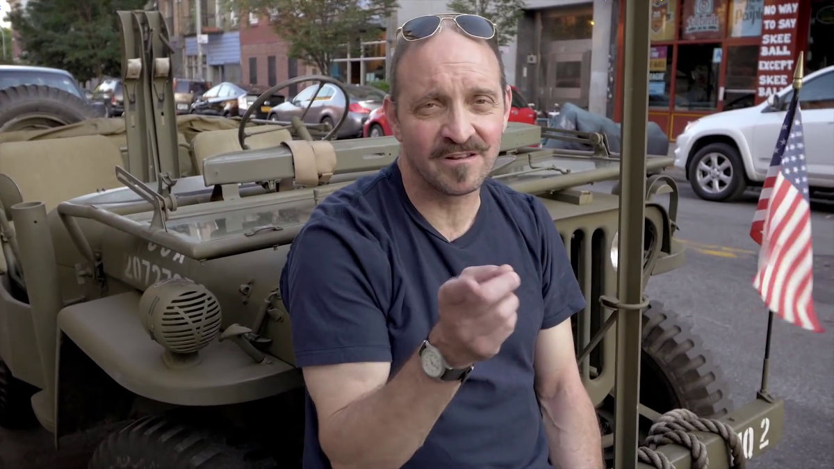
He has worked on numerous works as designers and his work is stored in the Louvre museum in ParisJames VictorMr. walking around the town in New York, watching the design of the signboard of the shop and explaining the font and typography is "Type Safari with James Victore"is. From the signboard of a totally irreplaceable city, it is finished in an interesting way even if it is not a designer, how to get inspiration for typography and logo design.
Type Safari with James Victore - YouTube
This is James Victor.
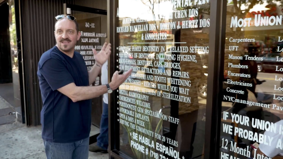
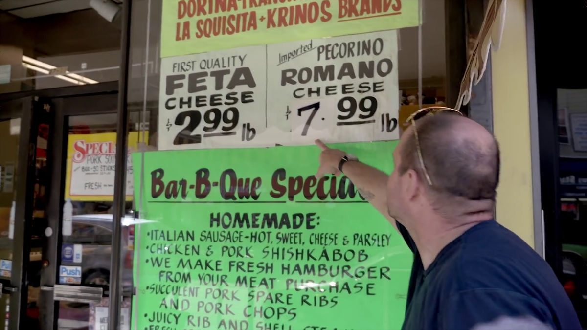
Mr. Victor's eyes stayed in the shop where all the menus are written in the window. Although it is not related greatly to typography, it is a good idea.
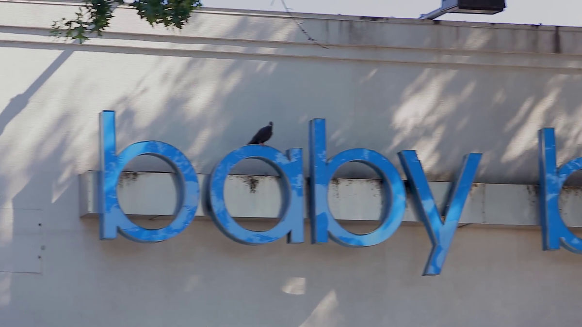
A sign of a shoe store with a needle on a bird 's eye.
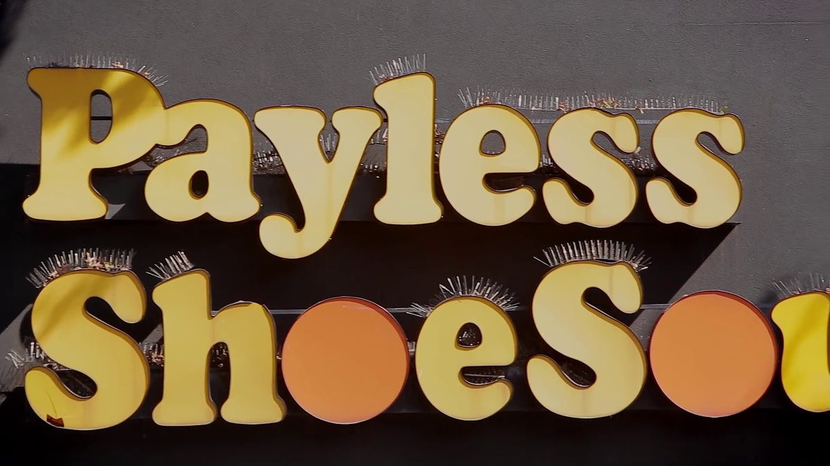
"By adding a bird 's needle,Surrealism"I lost a designer instead of feeling full," said Mr. Viktor. When I look at the signboard of the neighboring store thinking about what "one designer" is ... ...
There was a bird on the signboard. Because of the setting of the bird 's needle, I missed the accidental design element "bird".
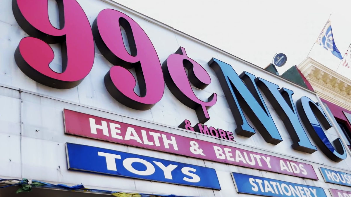
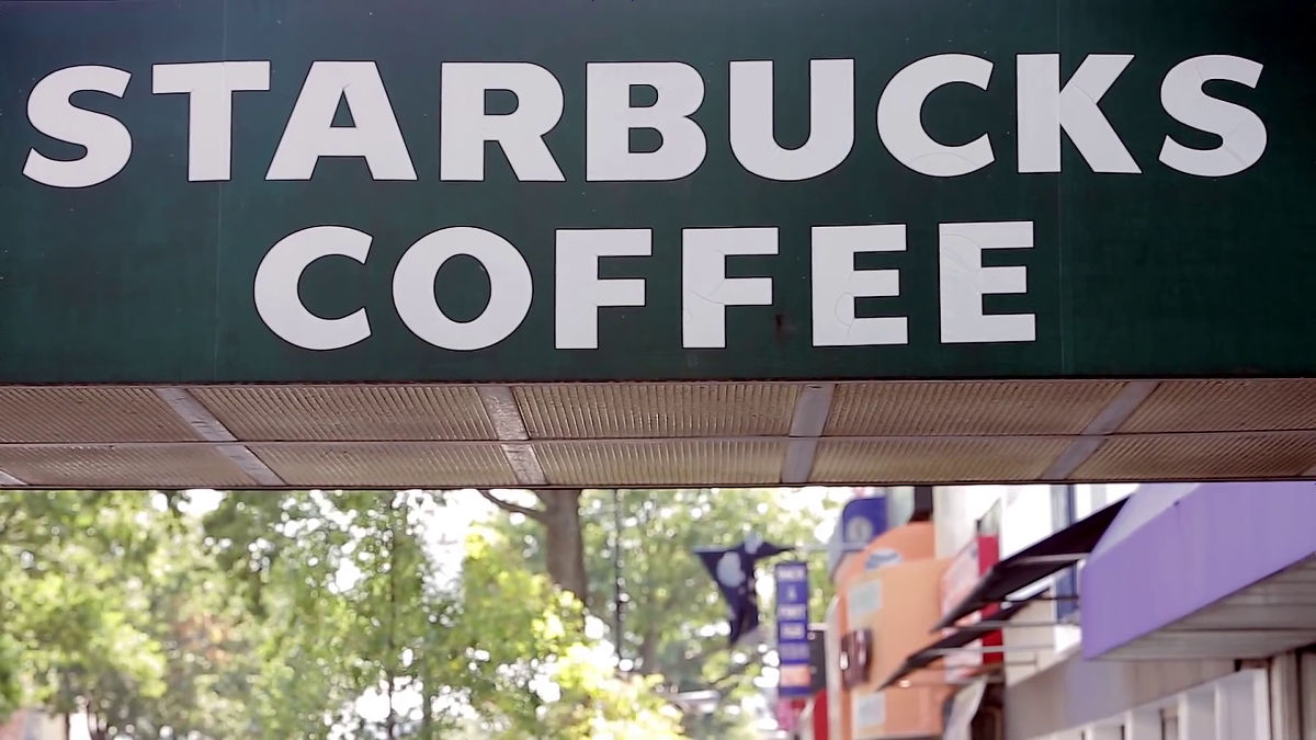
Mr. Victor "I do not know what kind of font Starbucks is using, but it is thick and ugly," he declined Starbucks signs.
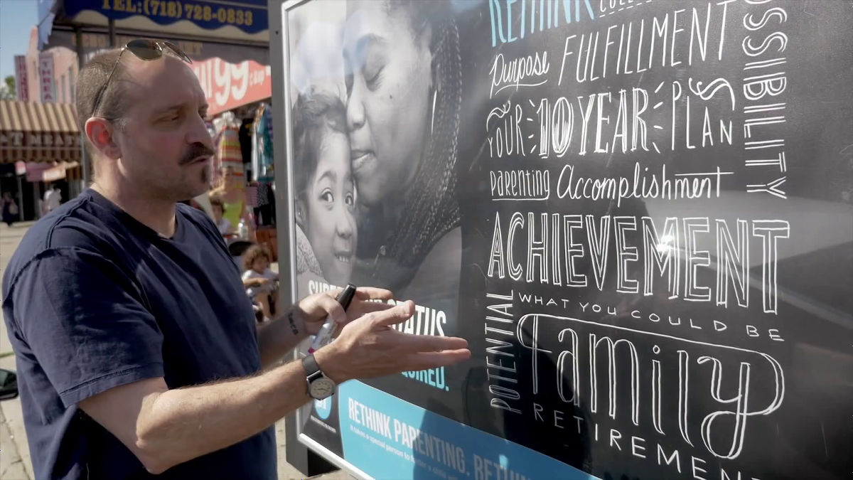
"From this poster I feel something like the admiration of a hired designer ... Although many words are lined up, the designers do not know what they want to tell. Before deciding which words to use, it is necessary to devise more ideas It seems there was a bad day, "stern opinion also pops out.
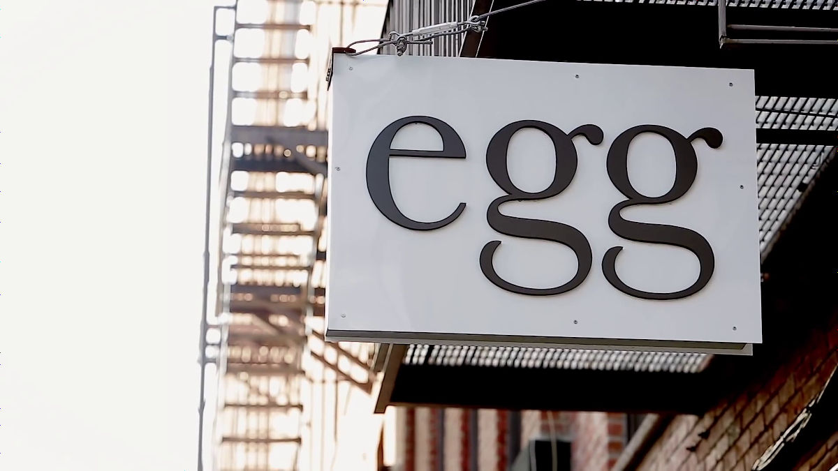
One of the signboards Mr. Victor liked is here. The sense of classic that comes out of old fashionedness is full of sense.
"From the design point of view, it is ugly to just use big fonts," Mr. Victor criticizes.
In a font that was drawn with a sculpture sword or a brush, he said "It is wonderful".
It seems that posters of real estate listed in the building has wasted advertising space.
"This sign is totally wrong, but it's wonderful to see who is shoping with font design and words alone," said Mr. Victor.
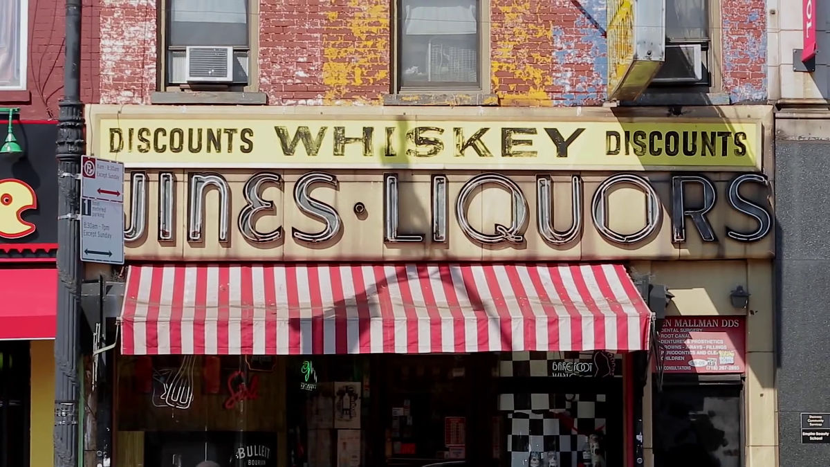
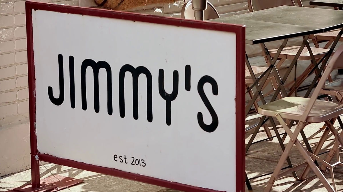
"JIMMY'SThe signboard designs a neon tube as a beautiful cursive body.
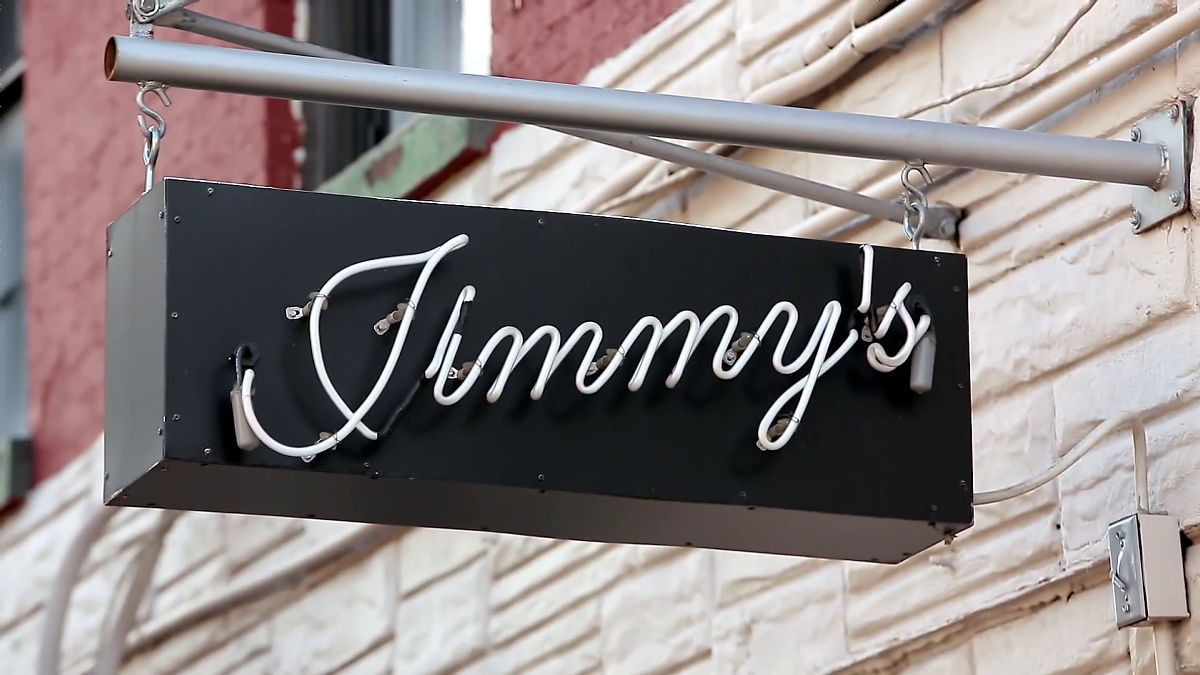
It is said that it is very difficult work to write a cursive body as a neon tube.
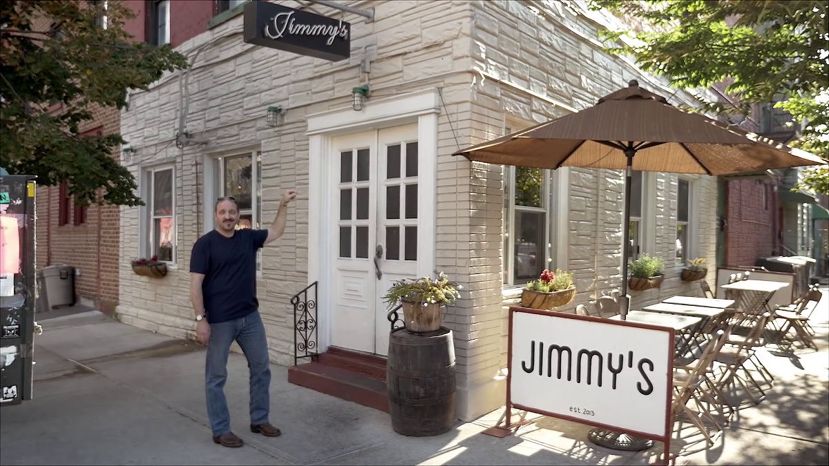
"Even this sign was also a biton if it was a neon tube," Mr. Victor said.
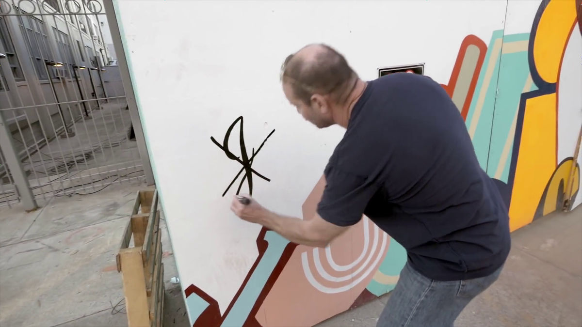
Street art combining various types of fonts ... ...
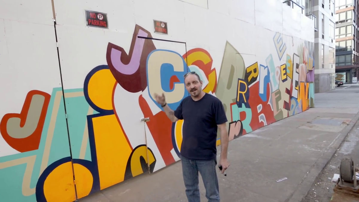
Mr. Victor contained only one character for promotional purposes and said "It was awesome if it was not for commercial purposes" while writing "x" to the letters.
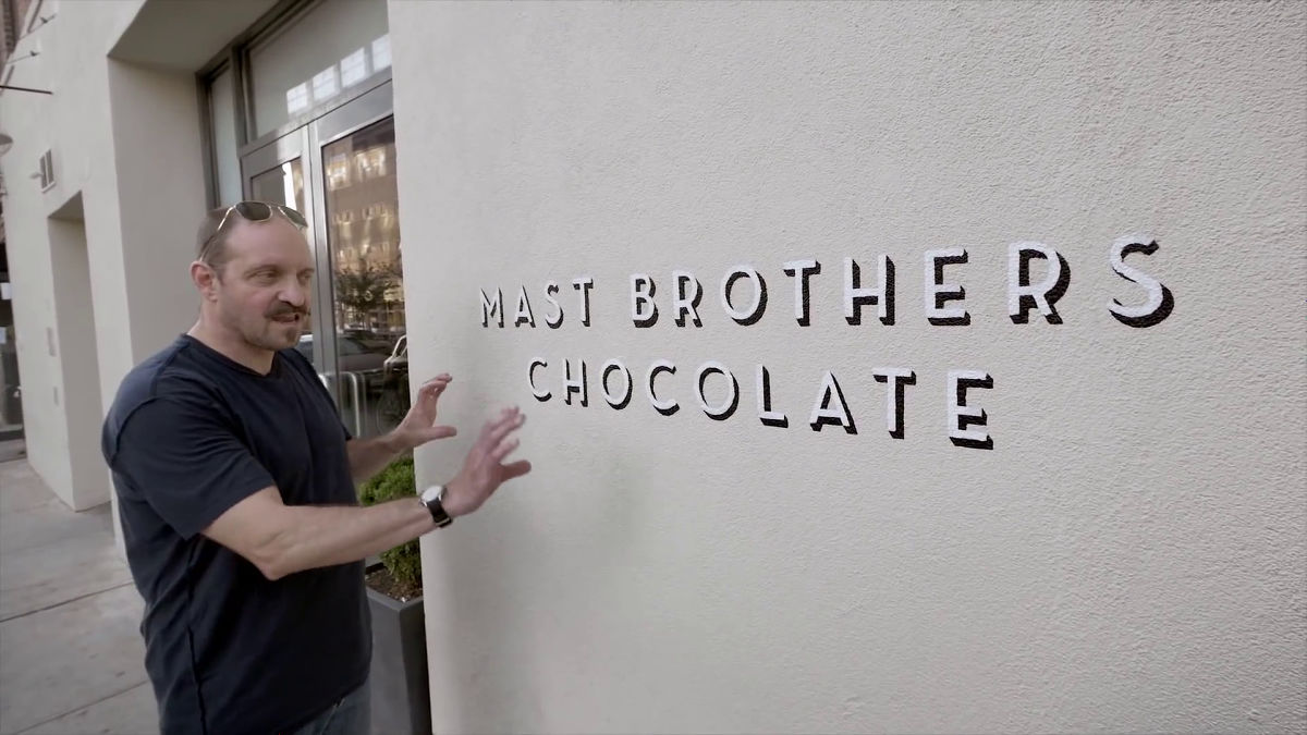
"This design is round and it looks a bit stupid but it is wonderful, it is a lot different from the logo of The Hershey Company selling chocolate," Mr. Victor will evaluate.
Design that expensive chocolate likeness is expressed well in font. It surely seems that it looks high just looking.
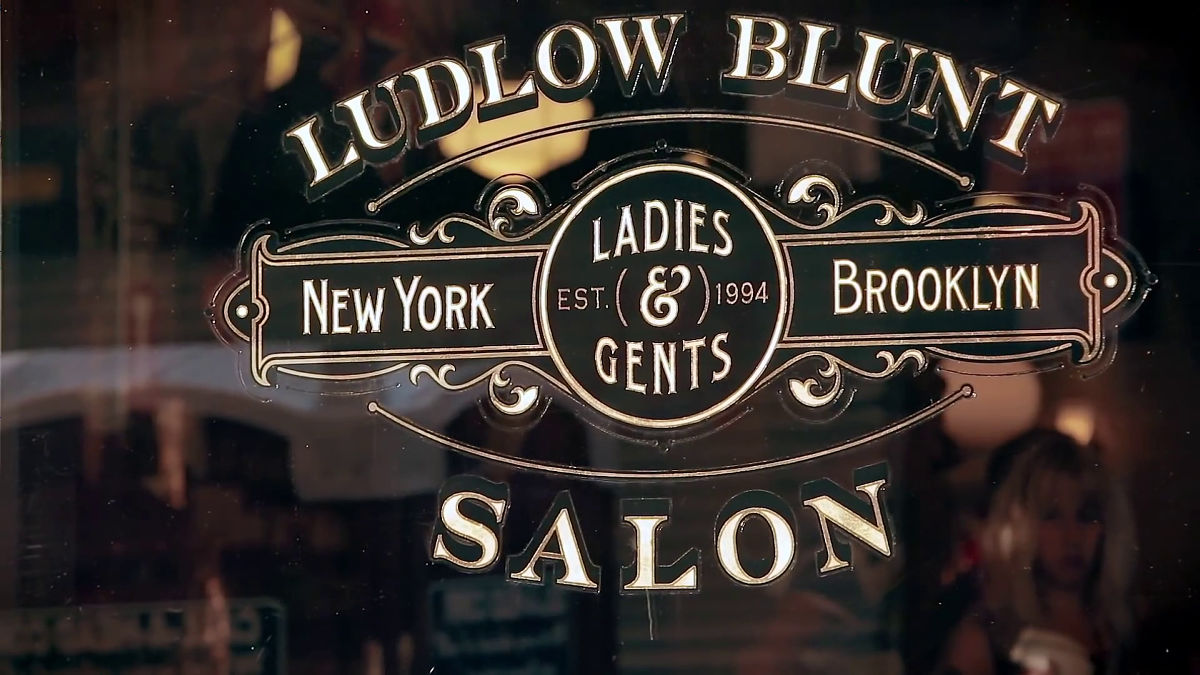
Although it looks like a beautiful font at a glance of a historic shop, Mr. Victor is criticized that "This font was designed to make it look outdated intentionally, it is not transmitted to the side that it is seeing."
Lastly I visited the British fashion brand "Paul Smith"is. Mr. Victor said, "The Paul Smith logo is designed like a designer's Paul Smith sign, of course it's not the sign that he wrote, but the warmth is coming. I like it very much. "

Mr. Victor said, "To create a wonderful signage or logo, always ask yourself if the design is beautiful or ugly," advises from the designer's point of view. Mr. Victor has a unique sensibility, but it is likely to be helpful if you keep it in your head.
Related Posts: