A photo book that understands exactly how the Facebook employee cafeteria was designed
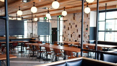
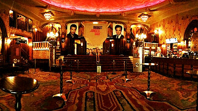
By companyOffice designThere are various, but not only inside the officeBuilding appearanceCommitment of the company also appears in dining halls etc. Facebook cafeteria is a design office handling hotels, cafes, etc.Roman & WilliamsAlthough it is designed by, wood is often used, it has become calm atmosphere like urban cafe rather than company dining hall.
Facebook's Cafeteria, By The Masters Of Rustic Chic | Co.Design: business + innovation + design
http://www.fastcodesign.com/1671447/facebook-s-cafeteria-by-the-masters-behind-the-ace-hotel
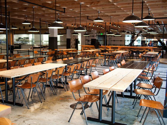
It is the chair that was used around the table in the school in the 1980s.
A round lamp and a blackboard on a wall, fancy space that seems to be a company canteen is a space.New York TimesAccording to the restaurant, the movie "Benjamin · Button Certain LifeIt is said that it was made while imagining the old school which comes out in ".
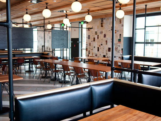
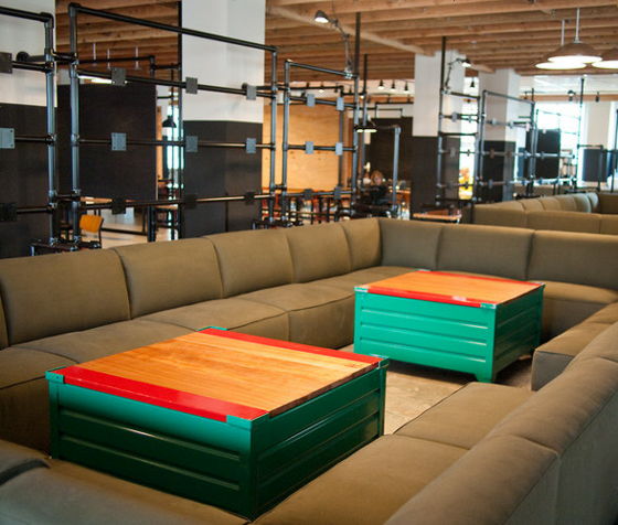
There is also a sofa seat.
The way employees actually are using FacebookNewsroomIt is up to.
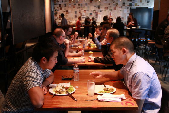
Ordered space created in the row. Meals are free.

Various photographs and magazine articles are stuck on the wall.

Everett Katigbak and Ben Barry, who is in charge of analog design on Facebook, are planning the construction plan of this cafeteria by chanceAce HotelHe began by meeting two of Roman & Williams' designers. Roman & Williams designs many hotels, cafes and so on, but when speaking of the company's designGoogle's officeInitially it seems hesitated to take on work as there was a modern image like. However, while discussing it, he decided to work on this cafeteria, focusing on the classical atmosphere such as halls using rafters and chairs used in old classrooms.
Related Posts:
in Design, Posted by darkhorse_log
