Instagram's new icon and UI were designed this way
SNS that you can shoot from photos and movies sharing "Instagram"Has renewed icons and UI on May 11, 2016. Heading the Instagram design team, which made the first major change since the service was launchedIanI have revealed what kind of circumstances Mr. has passed to the new design.
Designing a New Look for Instagram, Inspired by the Community - Medium
https://medium.com/@ianspalter/designing-a-new-look-for-instagram-inspired-by-the-community-84530eb355e3
Instagram Blog
http://blog.instagram.com/post/144198429587/160511-a-new-look
The development scene of the new icon of Instagram can be confirmed from the following movie.
A New Look for Instagram on Vimeo
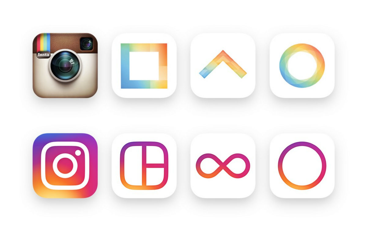
Although Instagram was the only application that edited and shared the photo at the beginning of the release, the photo layout application "Layout"And time-lapse photography enabled"Hyperlapse"You can create a movie that loops indefinitely"BoomerangDiversity was born as a result of releasing the family application called "Family app," and it has greatly grown as a service to share photos and movies. To support the growth of the innovative Instagram, the design team headed by Mr. Ian started to develop new icons and UI that can represent Instagram's past, present and future from 2015. I tried to reflect the growth of Instagram from release until now to new icons and UI.
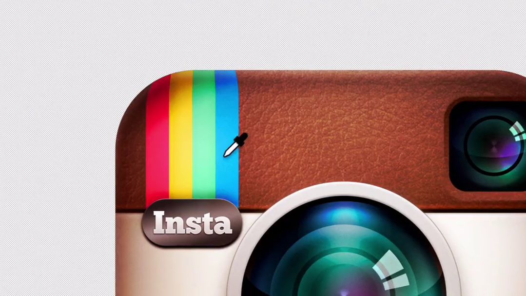
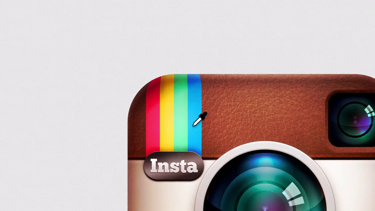
The original icon of Instagram is a stereoscopic and realistic texture like the real thing "Skew morphic designIt adopts a design that gives the feeling that it is touching the actual camera. The design team tried to design a new icon from the approach to make the original icon design contemporary, removed the original icon decorative part and aimed for a contemporary flat design, but "the flat design Was the new icon that adopted the technology really felt better than before? "
The flat icon does not reflect the visual elements of the original icon, so the design team will return to the origin and try to take "the element the user liked with the original icon" somehow into the new icon Direction change. According to the design team, users like the original icons are "Rainbow on the upper left of the icon" and "Camera lens". Furthermore, most of our employees drew a Rainbow Lens Finder, asking Instagram's employees to "draw Instagram's icon in 5 seconds to rely only on memory." Through these investigations, we decided the elements to incorporate into the new design, and the design of a new icon started.
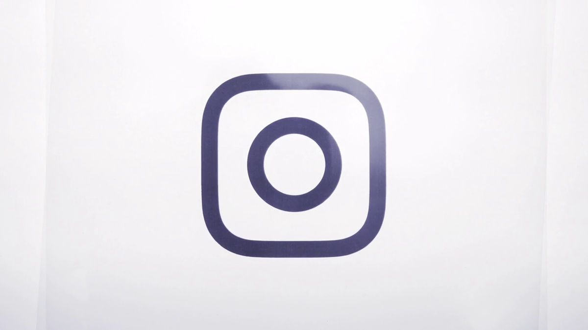
To make the design of the camera more flexible than the original, the camera is decided as a simple glyph. Actually, Instagram 's original icons are well - known full color and simple glyphsTwo versionshad.
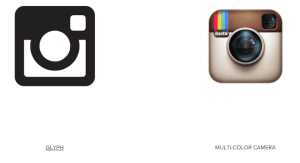
Since the previous glyphs were lacking in the strength of the icon alone, the design team decided to remove the unnecessary part from the full color icon and aim for the glyph to give a new character character. However, if the design becomes too abstract, glyphs are insufficient to express the history and soul of Instagram, and if it is overwritten too much, it has hit the wall that it will not know what changed from the original design. As a result of improvements made to improvements, we have reached the new glyph that represents the camera and is the cornerstone of Instagram.
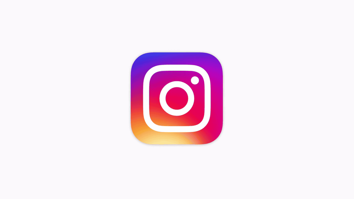
With the new icon, "Rainbow" which was popular with original icons is represented with a colorful gradation. At the beginning of the design, I intended to express it more conservatively than the gradation, but it seems to add warmth and energy to complement the simple glyph (design of the camera part).
The icon of Layout · Boomerang · Hyperlapse along with the Instagram icon has also been changed to the new design. For the new icons of the three applications, adopt the Instagram's new icon gradation and express the relationship with Instagram.
The UI has been changed to a simple one so that the user's contribution is the center of the application. If the gradation of the existence icon like the door which is the entrance to the application plays the role of "color", the space opened by opening the door is set as UI It seems that it made it simple.

Related Posts:


in Web Service, Smartphone, Design, Posted by darkhorse_log