Google announces a major renewal of Google+, focusing on communities and collections
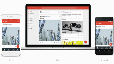
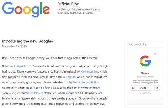
Google announced a major renewal of "social networking service" Google+ ". In this renewal, which is described as "new Google+", design changes have been made to the form that emphasizes communities and collections in response to users' trends, and the interface itself is also on the Web version, iOS version, Android version Changes were made to be similar usability at
Official Google Blog: Introducing the new Google+
https://googleblog.blogspot.jp/2015/11/introducing-new-google.html
Dive into the new Google+
https://plus.google.com/+LukeWroblewski/posts/jJvNS3mwxyv
Google was once trying to make Google + a system that could cross Google's entire service, but from the user the opposite direction from the direction I wanted, "I do not want to display my Google+ profile when using Google services" from users By receiving it,Convert strategy in July 2015. I made each service independent from Google+.
When Google checked the user's trends, Google + found 1.2 million new inflows into the "community" a day, and found that the "collection" that started five months ago was growing very fast It was. So, Google + was changed to a design that focused on these two.
Also, until now, it looked different from the Web (PC browser) and iOS, Android apps looked different, but a change was made to be similar usable from any terminal.
The new appearance of iOS version, web version, Android version is like this.
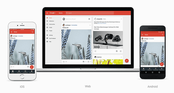
Collection screen. For example,Watch Project"The collection of antique clocks and so on has been posted, there are more than 40,000 followers.
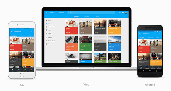
The content of each collection is like this.
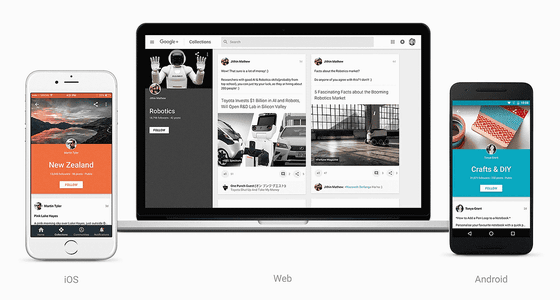
This is a community.

Many people are interacting on various topics such as "Explortation" "Vegetarian Cooking" "Vegetarian Cooking" "Astro Photography".

Originally Google+ started as a social networking service, so it may only be that we got back from the stasis that it became community-oriented.
Related Posts:
in Web Service, Posted by logc_nt


