"Kantar Information is Beautiful Awards 2015" summarizing the most beautiful infographic, data visualization etc
Overseas news mediaThe GuardianYaWiredDavid McCandless who works as a writer etc. analyzes vast amounts of information and presents it in an easy-to-understand mannerData JournalistYaInformation designerBut there are. A site that aims to visualize ideas, problems, knowledge, information etc. that McCandless manages is "Information is Beautiful"is.
In Information is BeautifulKantarAs a sponsor, a plan to honor excellent ones related to infographic and data visualization "Kantar Information is Beautiful Awards 2015We are doing.
Winners: Kantar Information is Beautiful Awards 2015 | Information is Beautiful
http://www.informationisbeautiful.net/2015/information-is-beautiful-awards-winners-2015/
The winning works for each category of "Kantar Information is Beautiful Awards 2015" are as follows.
◆ Data visualization (data visualization) department
Gold medal:Vaccines and Infectious Diseases
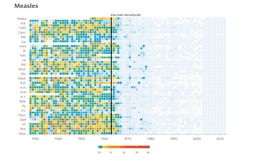
A graph that visualized the results of measuring the number of people infected with any disease despite being vaccinated in 50 states for about 70 years.
Silver award:A World of Languages
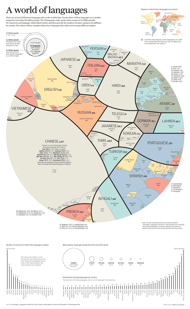
A diagram visualizing the 7102 languages that are said to exist in the world in which countries are used and how many people are used.
Bronze Award:The Rise of Partisanship in the U. S. House of Representatives
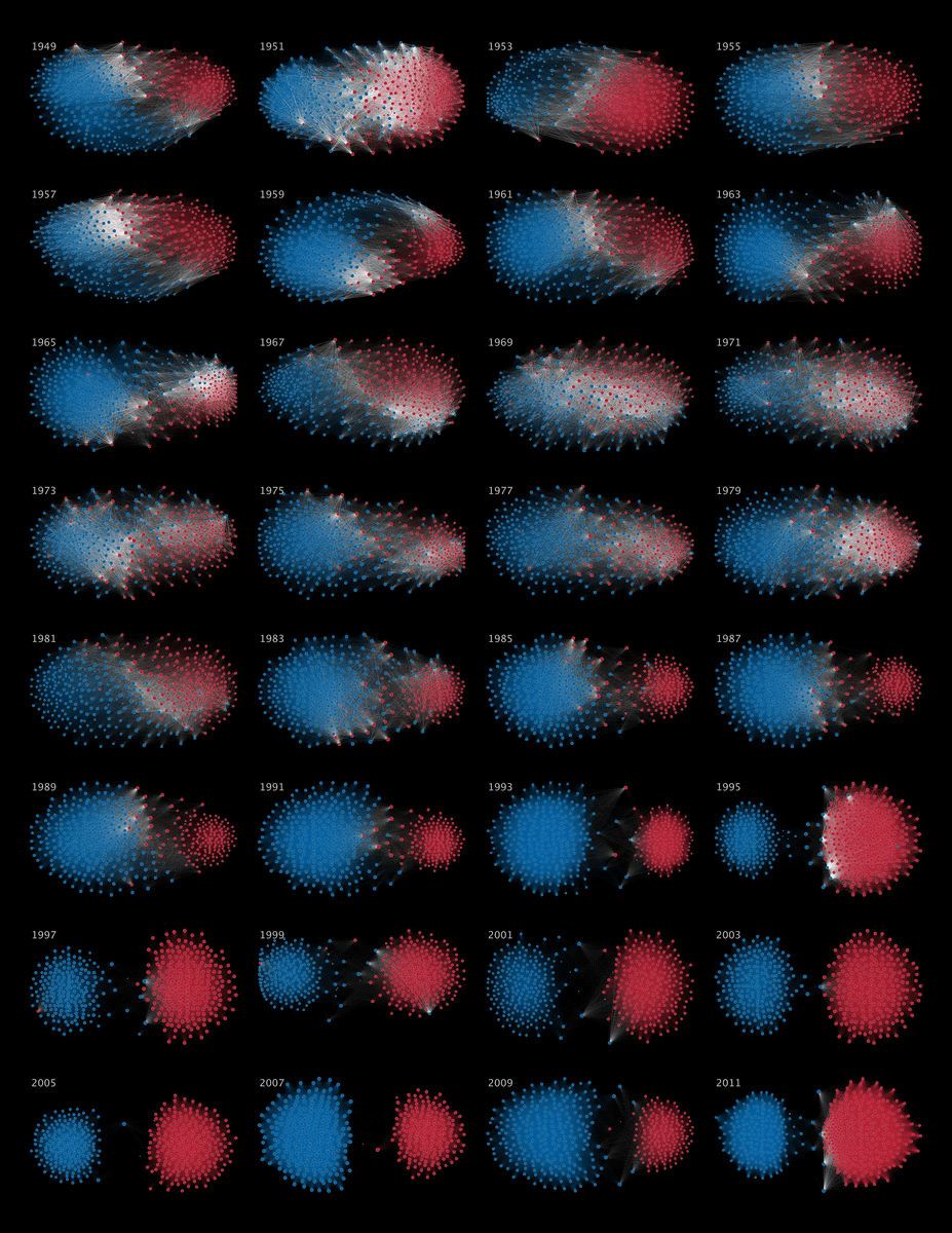
It visualized the political conflict within the US Congress over the past 60 years.
Excellent honorable mention:Close The Gap
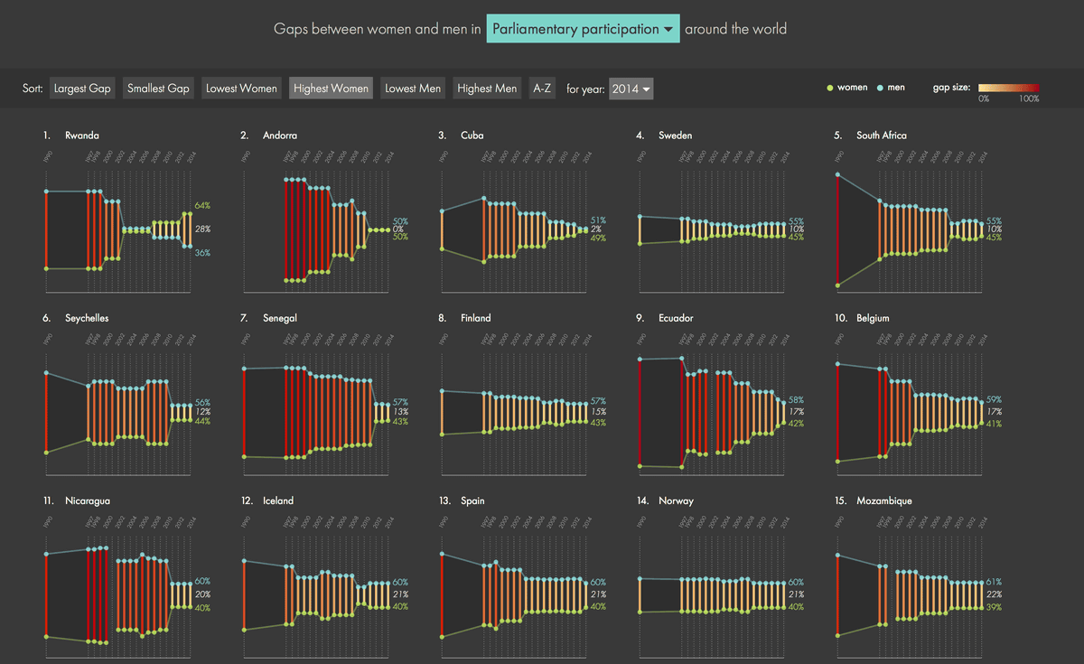
It is a graph of gaps between men and women of the world.
◆ Data Journalism Division
Gold medal:German Unification
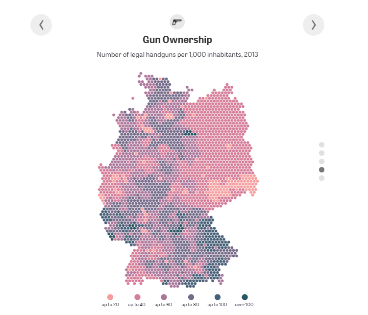
A graph showing the hand gun holding rate in the area corresponding to the former East Germany as of 2013. Although the Berlin Wall collapsed in 1989, it is clear that many residents possess guns even when more than 20 years have passed since then.
Silver award:Why Pinellas County Is the Worst Place in Florida to Be Black and Go to Public School
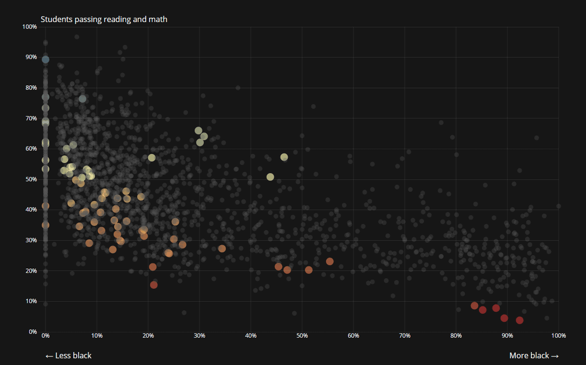
A graph showing that Pinellas in Florida, USA is the place not suitable for going public school for black people. The vertical axis shows read / write and math acquisition rates, and the horizontal axis shows the number of black students.
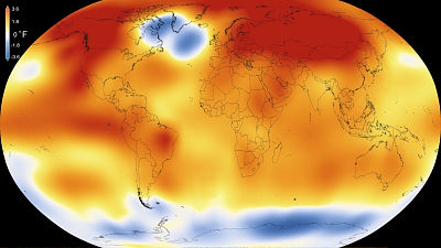
Bronze Award:What's Really Warming the World?
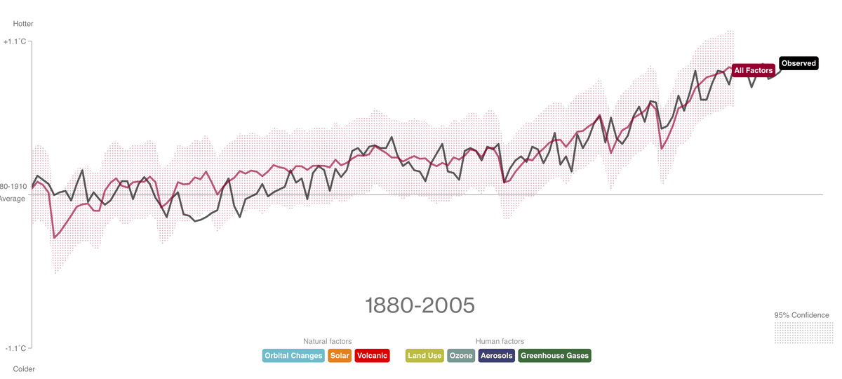
A graph showing how the world temperature has changed from 1880 to 2005.
Excellent honorable mention:California's Getting Fracked
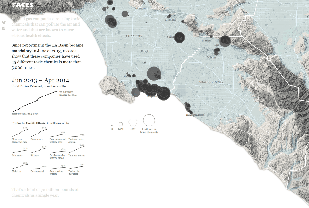
Hydraulic fracturing methodFigure visualizing the impact of natural gas development on California.
◆ Infographic department
Gold medal:Rare Earth Elements
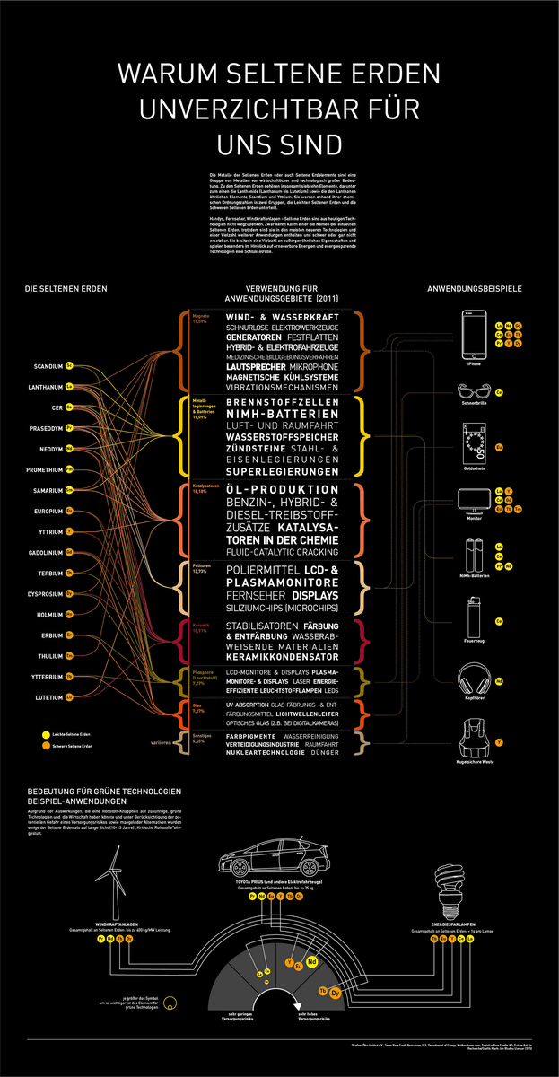
Infographics showing what kind of application rare earth is used.
Silver award:UFO Sightings
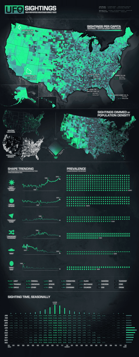
Visualize Infographics of UFO sighting information in the USA.
Bronze Award:Valar Morghulis
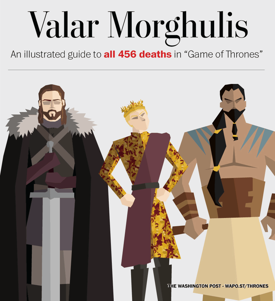
"game of thrones"Infographs that describe the causes of death and the dead places of 456 people who died in
◆ Interactive division
Gold medal:How quickly Ebola spreads compared to other diseases

A web page that simulates how many people are infected and how many people die after how many days of infection with Ebola including disease spreads.
Silver award:The Counted: people killed by police in the United States in 2015

A web page that counts the number of people killed by police officers in the United States in 2015.
Bronze Award:Track National Unemployment, Job Gains and Job Losses

A webpage tracking the number of people who got jobs in the US and those who have lost.
Bronze Award:Histography - Timeline of History

A web page that maps historical events that occurred over the past 400 years and summarizes them.
◆ Data Visualization Website Division
Gold medal:Visualizing Data

Silver award:FlowingData

Bronze Award:Visualoop

Excellent honorable mention:Visualcomplexity.com

◆ Internal project division
Gold medal:London Squared Map

Silver award:RPP Intranet

Silver award:DHL GoGreen Solutions Workbook

◆ Commercial customer department
Gold medal:Migration in the Census and in the News

Silver award:Rent, Salary and Price of Houses

Bronze Award:LA Dodgers Digital Trading Room

◆ Motion Infographic Department
Gold medal:The Fallen of World War II

Silver award:How many trees are there in the world?
It turned out that about 8 times as many trees are growing on the earth as forecasts of the past - GIGAZINE
Bronze Award:SYRIA'S WAR: A (5) MINUTE HISTORY
Excellent honorable mention:Charting culture
Visualize the appearance of culture and knowledge spreading all around the world over about 2600 years and it will be like this - GIGAZINE
◆ Free Data Visualization Tools Division
Gold medal:D3.js

Javascript library "D3.js" that makes data easy to understand and stylishly visible - GIGAZINE

Silver award:R

Bronze Award:Tableau Public

Excellent honorable mention:Quadrigram

◆ Private studio division
Gold medal:ACCURAT

Silver award:Domestic Data Streamers

Bronze Award:Periscopic

Excellent honorable mention:CLEVER ° FRANKE

"C ° F" which shows the relationship between weather and reaction on Twitter or Facebook - GIGAZINE
◆ Mini & Mobile Visualization Division
Gold medal:How to Build a Human

Silver award:What's across the ocean from You when at the beach, in 7 Fascinating Maps

Bronze Award:The Dude Map: How Americans Refer to Their Bros

Excellent honorable mention:Here's How Much of Your Life the United States Has Been at War

◆ Student Special Prize:Sara Piccolomini
◆ Best Team Award:Berliner Morgenpost
◆ Individual Prize:Tony Chu
◆ Data Visualization Project Division
Gold medal:Dear Data

Silver award:On Broadway

Bronze Award:2014 Annual Report

Excellent honorable mention:Surgeon Scorecard

◆ Community Statement
Gold medal:The World in 2015: Global population and the changing shape of world demographics - YouTube
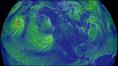
Silver award:Earth :: a global map of wind, weather, and ocean conditions

Bronze Award:Drones

◆ The most beautiful awards:Dear Data
Related Posts:


in Creation, Posted by logu_ii