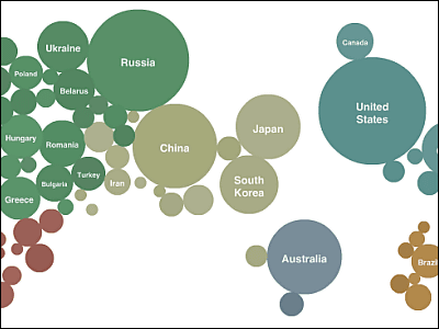
A prize candidate work of 'Information is Beautiful 2018' deciding the visualization of the best data is released at once
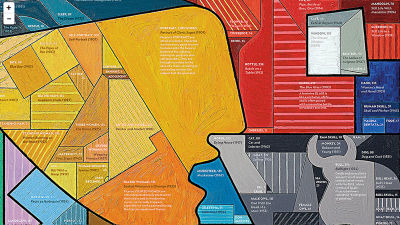
A 2018 prize-winning work of " Information is Beautiful Awards " will be elected shortly awarded for outstanding things from infographics and data visualization making information easy to visualize. Candidates that contend for the best visual information method of the year are full of rich ideas.
Information is Beautiful Awards
https://www.informationisbeautifulawards.com/
◆ Spring is Springing Earlier and Earlier
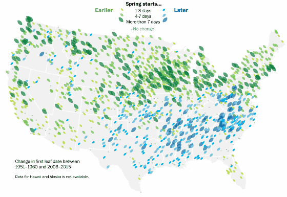
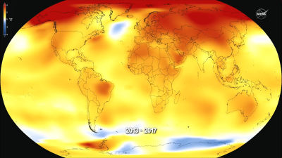
It visualized how early or delayed the "visit of spring" in the United States between 1950 - 1960 and 2006 - 2015. You can see well that the arrival of spring in the northern part of America is early, but late in the southeastern part.
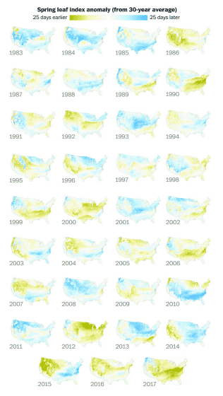
It is obvious that in recent years, in the majority of the United States, the tendency for spring to come earlier tends to be seen, if you look at the early / late arrival from the normal year at a stretch for 30 years.
Spring is springing earlier and earlier - Washington Post
https://www.washingtonpost.com/graphics/2018/national/early-spring/
◆ Satellites: 60 Years In Orbit
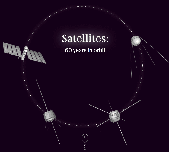
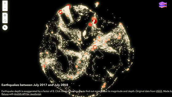
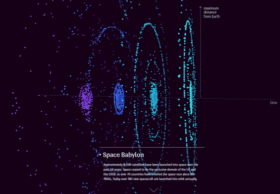
Since Sputnik plan , more than 8000 artificial satellites have been launched from more than 70 countries. Satellites: 60 Years In Orbit, which explains data on artificial satellites orbiting the earth by 3D map, provides rich visual information unique to web applications.
Three-dimensional depiction of the distribution of artificial satellites in chronological order from 1957 to 1971, 1972 to 1986, 1987 to 2001, 2002 to 2017. When you mouse over each point, it seems that the information on the launched artificial satellite is displayed.
Спутники
https://dc.ria.ru/dc/kay-n/2017/satellites/
◆ 20 year history of national team appearances in the FIFA World Cup
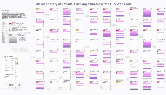
It is an infographic graphic of 20 years' data on competing countries and their results of football festival 'FIFA World Cup'.
The data of each country is indicated by a square with an obi. Brazil, Argentina, Italy and other countries of the main battle have long had little margin, and football developing countries such as Japan are colored with squares at the top so that the history of football is becoming known.
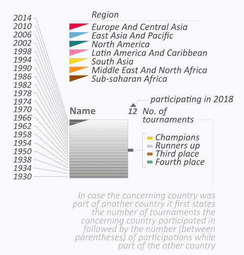
World Cup national team appearances datavisualization - STUDIO TERP
http://www.studioterp.nl/world-cup-national-team-appearances-datavisualization/
◆ I Am As Tall As ...

The height of the head chief representing the country was converted into data by image.
When you enter your height, a gray figure appears, so you can intuitively understand the height of the great men of the past.
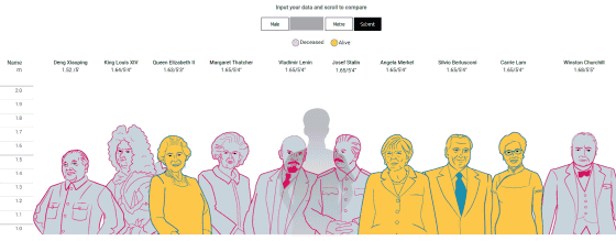
I am as tall as ...
https://multimedia.scmp.com/culture/article/leaders-height/index.html
◆ 2017 MLB Pitcher Heatmaps
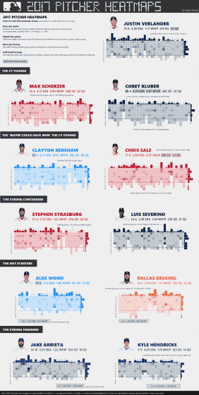
The one-year indicators and inning data of the major pitcher of the Major League Baseball (MLB) in 2017 are recorded on the dot.
Each dot represents data of the pitching content of each inning, and the upper bar records the general data of the day. By dragging the mouse over the dot and graph, detailed data can be displayed.
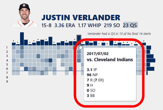
2017 MLB Pitcher Heatmaps - Jacob Olsufka | Tableau Public
https://public.tableau.com/profile/datavizard#!/vizhome/2017MLBPitcherHeatmaps/MLB
In the short list of "Information is Beautiful 2018", you can see a number of works that are inspired by ideas and beauty. Information is Beautiful 2018 excellent works will be announced on December 4, 2018.
Related Posts:
in Design, Posted by darkhorse_log
