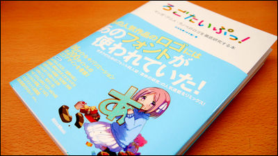
"Good comic design" which highlighted about 170 works of about 170 works of manga whose ideas and secrets were hidden
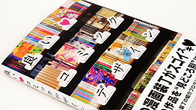
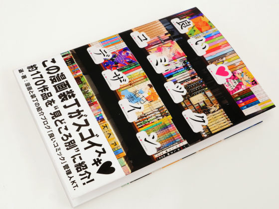
Of course not only the content of the work, but also the hinted intentions and ingenuity are attached to the manga's bindings, there are things that can be seen for the first time by arranging the gimmicks or not in the title logo or composition, secret There are about 170 works collected that are hidden "Good comic design"is. The work is divided into categories, and it has become a book that you can feel the fun of "comic books" which are not usually focused attention.
Amazon.co.jp: Good Comic Design: KT .: Books
http://www.amazon.co.jp/dp/4756246915
So, this is "good comic design"
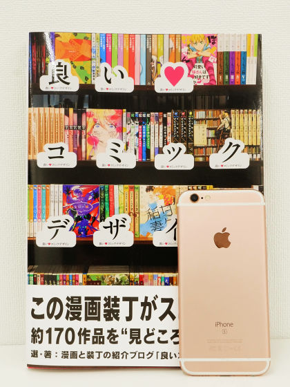
The size is 25.8 cm × 18 cm × 1.5 cm, this is about compared with iPhone 6s.
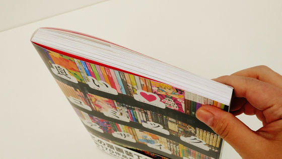
Because it is 208 pages in all, it is rather thick.
The book can be roughly divided into "Beautiful gimmick · Fun gimmick"Special print · gorgeous book"Attractive in color"Fascinate with the surging"Composition and Motif"Title logo and arrangement"Cover · cover, door · etc."Parody · ● ● windSo, first of all we will look at "a beautiful gimmick and fun gimmick".
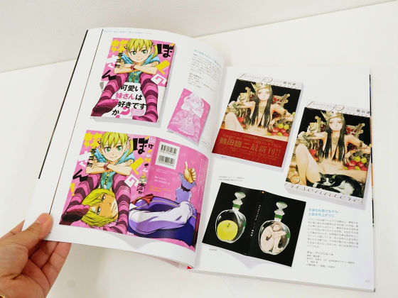
The first thing that appeared was that the younger sister was swayed by her sister's older brother "My sister!". It is a binding that girls straddle the belt with both feet ... ...

When you remove the obi, Sisukon's older brother will appear from under the feet.

Girls high school students send eccentric daily life at a boarding school "It will be ruffled in the spring."Girls' face is doodled with characters such as" Isono -! Nipple Sumo Wrestle! "And" Lifetime Moratorium Period. "

This is because I am writing a title, polka dots, scribbles etc. on the clear cover. When you remove the cover, a simple body cover appears.

When decomposed it looks like this. The left side is the body with the clear cover hung, the middle is the main body cover, the right is the state of the clear cover only.

The cumulative issue number of 17 million copies serialized from 1996 to 2000Huang Shinji"Complete version is like this, connecting the cover of 1 to 18 volumes is like a scroll.

The characters of the cover of the even number and odd number are facing each other ... ...

Background was connected to 18 volumes and 1 volume of the final volume as well. It is a calculated design unique to the complete version.

A girls-dozen doctor raging in Shanghai in the late Qing Dynasty raging to opponent "Grateful deadAlso the vertical winding connects vertically. Even if the vivid hue alone stands out, if you consolidate it, the impact will further increase.

Between 1994 and 2001 serialized "MONSTER"The complete version is a total of nine volumes, and if you collect nine covers it will be designed as if you are hanging various photos on the wall. When connected as follows, the size is about 64 cm in width × 44 cm in width, and it is said that each picture frame is given a fine foil pushing.

Continue to the chapter "Special printing / luxury bookbinding". The future that succeeded in extracting inexhaustible energy from "coil", the collector of fraudulent coil and female android approaching the darkness of the coil "Dimension WWhat area is special printing ...?

How, a fluorescent paint shining in the darkness was used.

You can check which part is shining from the following.

"Mahoro-san" of battle android is hired by middle school student "Misato Yui" who lost parents as a maid "Mahoromatic"Various special processing is given for each volume.

For example, if the part of hot cake isBurko printingIt has been ......

Part of the photoChisimi printingIt is being done.

To the mufflerFoamed inkIt is used.

What was chosen as a "fascinating by surging" work is a mysterious life form "killing kidney" becomes a teacher, and letting students fall down and assassinate themselves to grow "Assassination Classroom"Was chosen. It is a cover on which the face of killing is drawn, but it creates variety by changing colors, patterns, facial expressions and so on.

Love comedy manga based on "contemporary shrine maidens exterminate youkai"Maiden of the morning mistAlthough the background, layout, composition etc. are almost the same throughout the whole volume, the situation of the season's relaxation and the story is reflected.

"Title logo and arrangement" is unique "Mr. Koizumi who loves ramen". It is a manga in which girls eat noodles without a mountain and a valley, but it is a title that was greatly laid out with the impact on the front cover.

A small Koizumi is drawn in the gap between letters. It is calculated by Mr. Koizumi who was drawn smaller in the back than the illustration drawn largely in front by the combination of illustrations and letters.

There was also a cover that used a unique logo as a title.

A high school girl who can not grab a knife for her daughter who loves taste high school teacher struggles with cooking for her motherLightning and lightning". The soft and dynamic feeling font which is like the letter "No" is used, and the layout of characters etc. has been changed according to the illustration.

Drawing the struggle of the young lady who started doing anything in Europe in the early 20th century "Giselle Allan"...

When opening the cover cover you can enjoy it as a picture of one.

Up to this point it is a cover of a common type, but Gisel · Allan is characterized by the fact that the back side of the cover is printed with different beautiful patterns depending on each volume.

The cover page looks like a cover of a foreign novel outside. By giving backwards and sticking to the cover, we are improving the texture as a "book" of the work.

Neit's hero who inhabits the days unexpectedly suddenly entered to an isolated island by the hands of strange men and can make a killing with bombs with people who were also brought to the island "BTOOOM!"The cover of all volumes is framed with a green frame.

Looking closely, each volume was finished in a game software package like Xbox 360 or Xbox One.

And at the end, looking and looking looks like famous manga ... ...

"If you look closely it is totally incorporating the parody element that the title and illustration are different"Heavily!Cover of. Higotonita serialized from 2009 to 2011 has a lot of parodies and hommages of works by the same Kadokawa Shoten who also have the same work contents.

"Good comic design" is a blog introducing manga & bindings "Good comic"The manager, KT., Gathered cartoons of excellent bindings for each category. In addition, Amazon can purchase it at 3132 yen including tax.
Amazon.co.jp: Good Comic Design: KT .: Books
http://www.amazon.co.jp/dp/47562469151

Related Posts:
