The iOS 8.4 plans to make a big change in the "music" application, new features and new designs look like this
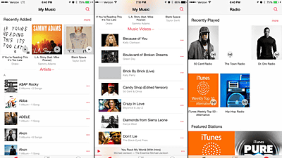
Delivery started just on 9th April 2015IOS 8.3The next version of "IOS 8.4"It seems that the design of the music player application" music "application is completely redesigned. The newly designed music application is now available for beta version of iOS 8.4 which is released for developers ahead of the other.
Apple previews revamped Music app with iOS 8.4 beta ahead of WWDC streaming service launch | 9to5Mac
http://9to5mac.com/2015/04/13/apple-launches-ios-8-4-beta-with-revamped-music-service/
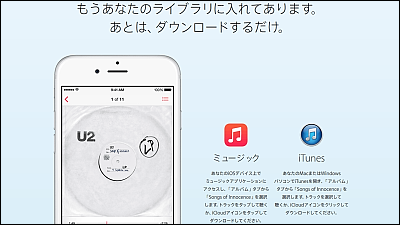
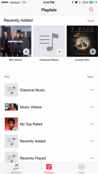
With the new music app, the design will be new, and adding favorite image images and explanations to the playlist created by you will make it easier for users to find your favorite songs more fun and easy. It seems that the design of the application icon on the home screen is the same design as the current one.
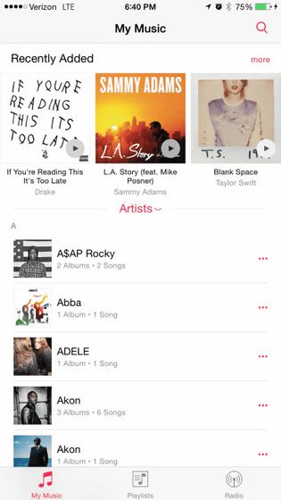
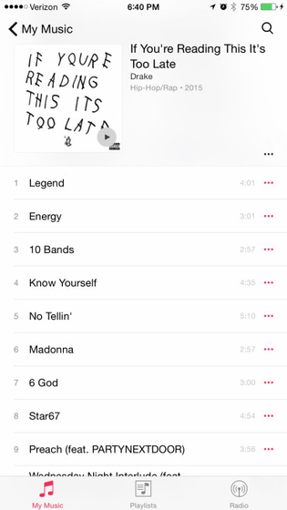
This is divided into three main screens, "My Music", "Playlist", "Radio", and the top of the "My Music" and "Playlist" screens is the item "Recently Added" Has been added. Even though the item "purchased" exists in the playlist of the music application so far, the song purchased in iTunes was added automatically, but the newly added "Recently If you look at "Added" recently added albums and songs are being displayed, it seems to be easier to find the songs you want. Also, you can play / stop the songs shown here just by tapping the artwork.
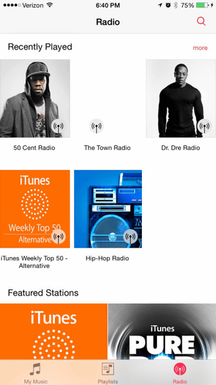
The following screen is "Radio" screen,ITunes RadioIt is made to be easy to use. Radio also added the item "Recently Played" at the top of the screen, allowing you to quickly navigate to your favorite radio you listen recently. You can also make it easier to find recommended radio by registering your favorite songs and artists.
When all songs saved in the terminal are displayed from "My Music" it is like this.
The screen displaying the playing song has also been slightly changed in design, and the area of the playing player at the bottom of the screen is getting bigger. It is also possible to skip the currently playing song to the corresponding terminal immediately with AirPlay on this screen.

In addition, a screen called "Up Next" that allows you to immediately check which songs will be played back next is added. From here you can play with the song order, add songs or delete them.

In addition, the magnifying glass icon is arranged everywhere in the music application, and by tapping it it is possible to search for songs instantly from anywhere. Since search has "Radio" and "My Music", it is a feeling that it seems that you can immediately listen to songs not stored in the terminal.

Since search history is also displayed, you do not have to worry about "that song that you searched for this ... ....".

When playing a song, a mini size player will be displayed at the bottom of the screen, so you can play and stop anytime, anywhere.

When listing each song in a list, tap "...", add it to the next song to be played back, add it to Up Next, delete song data from the terminal, delete songs from the iTunes Store You can also find and delete songs from the playlist.

In addition, the artwork of the song can be easily added / changed from the application.

In addition, it is also possible to add artwork to the playlist.

In the iPad version of the music application, the screen is divided and displayed.

The screen under play is like this.

Even just new features that have been found at the moment are content that can reach considerably itchy and it seems that it will be a long-awaited update for users who are enjoying music with the genuine music app from day by day. Beta version of iOS 8.4Apple Beta Software ProgramYou can only use some users registered in.
Related Posts:
in Software, Smartphone, Posted by logu_ii
