A simple UI developed by former CEO of Opera, but a sophisticated browser "Vivaldi" preview version review
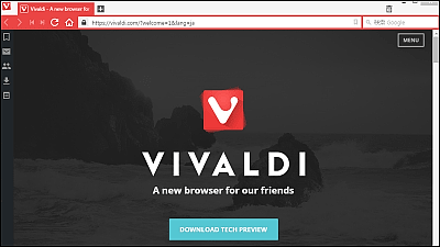
Norwegian software development company and browser "Opera"Developed by Jon von Tetzchner, former CEO of opera software offering"VivaldiThe preview version of "is released.ChromiumIt is said that Vivaldi, which was customized based on the base, is a high-performance browser for heavy users, so I actually tried using it.
Vivaldi - A new browser for our friends
https://vivaldi.com
After opening the above URL, click "DOWNLOAD TECH PREVIEW".

Click "Save file".

Launch the saved installer.

Click "Execute".

Click "Accept and Install".

"Vivaldi" will start automatically when installation is completed. The UI is based on the flat design, the page displayed immediately after the default launch was the official website of Vivaldi.

In the upper left corner of the window are "Back", "Transfer", "Rewind", "Fast Forward", "Refresh" and "Home" buttons.
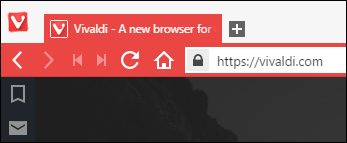
Click on Vivaldi in the upper left to display basic menus such as "file", "edit", "display".

There is a panel displaying the menu on the left side.

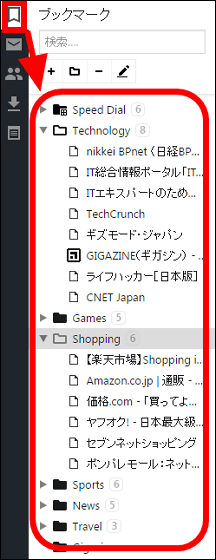
Click on a bookmark icon on the panel to display your favorites. By default, "Nikkei BP Net", "TechCrunch", "GIGAZINE" etc were registered in "Technology" folder. "Rakuten Market", "Amazon", "Price .com" are registered in the "Shopping" folder, and we are holding down the major places.
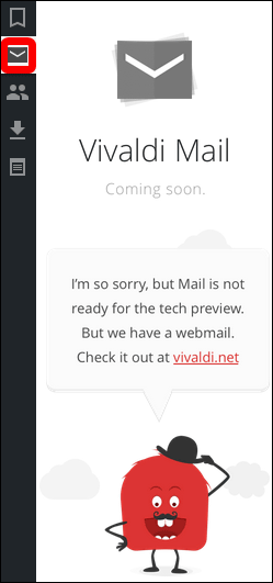
Although it seems that you can access the registered mail account with the mail icon, it is not yet implemented in the preview version, so I expect it in the future.
From the icon of the lower left gear, you can check / change various settings.

In "design" you can change the tab and panel position. The setting screen is very simple and easy to understand, so there are not any elements to confuse the user, so even people who do not use much of the browser are likely to get lost.

"Navigation" allows you to check and change the mouse and keyboard shortcuts.

When I actually opened GIGAZINE it looks like this.

Vivaldi changes the color of tabs and menus according to the opened URL. If it is "Yahoo! JAPAN" in red ... ...

"Google" is blue, and so onFaviconThe color changes according to.

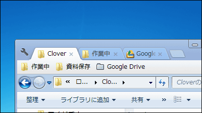
One of the features of Vivaldi is the tab. For example, open GIGAZINE, open articles in a separate tab, then right-click the tab and click "Group Similar" ... ...

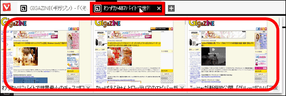
The three open tabs are now one. You can display a preview of each page by hovering the mouse pointer. Tab management can also be done manually, while clicking on the previously integrated tab ... ...
Drop on the tab you want to merge ... ...
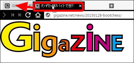
All the tabs were put together into one. It is a useful function for people who open pages anyway with browsers.

Another thing that I felt useful is "quick command" which can be displayed with "F2" and "Ctrl + Q".

When you enter a keyword in the box, you search for "keywords" from "bookmark" "history" "URL", and if you choose "prescribed search", you will see the search results on Google.

As long as you use the preview version of Vivaldi, the tab function is excellent and the design is also refreshing, so user-friendliness is a good impression. I felt the quick command was useful enough that I could hardly relinquish using it once. However, because of the preview version, the operation is somewhat chunky, and I'm looking forward to seeing how much improvement has been made in the official version.

· Additional notes 12:45 on February 9, 2015
According to Jon von Tetzchner, CEO of Vivaldi, it turned out that the browser achieved 400,000 downloads in a week from the release of the preview version.
Vivaldi Browser Downloaded More Than 400k Times So Far - Phoronix
http://www.phoronix.com/scan.php?page=news_item&px=Vivaldi-Browser-400k-Downloads
Related Posts:
