What is the logo that Sony did not use while selecting it by public offering?
ByWarrenski
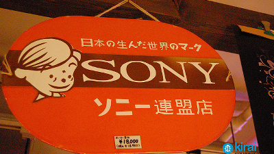
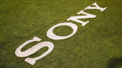
It was born in Japan after the war, after that it jumped out to the world and now the brand from Japan known worldwide is "Sony"is. 4 letter alphabet was designed "SONYAlthough the logo is often seen in town like town, TV, net etc every day, in fact there have been attempts to revise the logo by publicly recruiting its logo once. However, the selected design is not actually used, it is in the storage.
The Sony Logo That Never Was | Co.Design | business + design
http://www.fastcodesign.com/3038869/the-sony-logo-that-never-was
The public offering of the design was made in 1981 (1968) when Sony celebrated its 35th anniversary. When we made a public recruitment to the whole world to redesign the logo that has been used until then, we received approxi- mately 30,000 applications from all over the world including North America, Europe, Asia, and of course Japan It was.
A specialized team promoting the contest first narrowed down from 30 thousand entries to 59 entries. The selected design proposal was selected by Sony's Board of Directors, Designers, Sales Headquarters, Mr. Akio Morita, who was a director at the time, and the following three designs were selected as the best work .
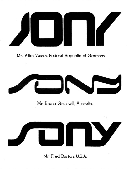
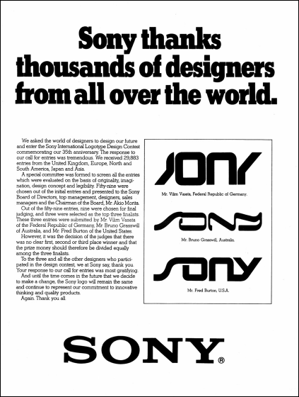
Three winners of the contest are Mr. Vilim Vasata of Germany, Bruno Grasswill of Australia, and Mr. Fred Burton of the United States of America, Sony's "Superiority is hard to make" certified all three as contest winners, winning 3 Contest is finished by dividing equally. An advertisement page to publish the results of the contest was posted in Time magazine.
ByGreg Prichard
Both are exactly the design of the taste symbolizing the '80s', but as a result these logos never saw the eyes of the days. The reason seems to be that Mr. Morita and Mr. Ibuki judged that "The current logo is clearer and better", but it seems that you can understand that the judgment was correct when looking at the following logo below. Clarendon (Clarendon) It is said that the current design using a font's boldface, or similar typeface, is very simple and easy to understand.

The documentary "Sony History" published on the site of Sony was also introducing the essay.
Departure of "SONY brand" episode 2 Tagline with impact
In 1981, when Sony celebrated its 35th anniversary in 1981, there was also a public offering from the world "Create a new logo" from the world, but in the end Ibuka and Morita said that "The current logo is clearer and better" The design made in 1973 has been kept since then.
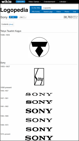
In the site "Logopedia" which gathered logos of various companies, you can see the transition of the logo after Sony's predecessor "Tokyo Communication Industry" (Higashi-Nakamoto) and the company name was changed to "Sony".
ByLogopedia
Needless to say, the role that the logo plays is very large in communicating the images of companies and brands to the world. Even though the above three designs were adopted, it seems likely that the judgment at that time was correct when considering whether or not it was alive in the 2000s. Although Sony has been emphasizing brand image for a long time, its attitude is summarized in the following words talked by Oga, the former president.
Departure of "SONY brand" fourth episode brand image, number one
"The four letters of SONY are the greatest assets, but we have to think about why the brand image has become so high, because it will be Sony's action indicators and management indicators in the future," Oga Says.
Related Posts:
in Design, Posted by darkhorse_log
