A new design of Google Play adopted at the next Android "L" will be released
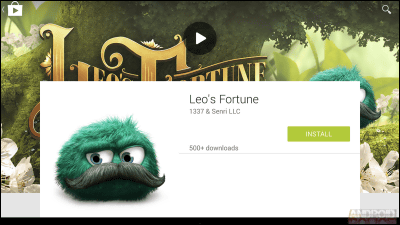
Google's next Android OS "LOkay.Material DesignA new design UI is expected to be adopted. Google already has released a new design of Google+,Android PoliceThe UI capture image of Google Play that adopted the new design currently under development is released.
Exclusive: Google Prepping Play Store Update That's One Step Closer To Material With Beautiful New Listing UI
http://www.androidpolice.com/2014/07/13/exclusive-google-prepping-play-store-update-thats-one-step-closer-to-material-with-beautiful-new-listing-ui/
"Designed by Android Police has been released from the following while putting down the notice that it may be changed in the release of the official version because all the captured images released this time are official release beta version design."
First of all it's a tablet terminal design. The current Google UI design looks like this.
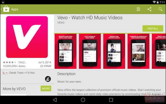
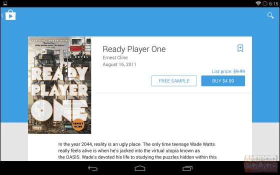
In the new design, cards are displayed on the background image, the information that was messy was carefully selected and made into a simpler design.
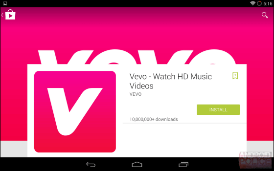
A movie thumbnail whose size was small ... ...
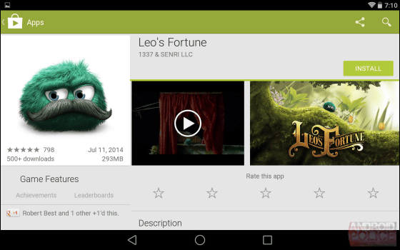
It is inserted large in the background.
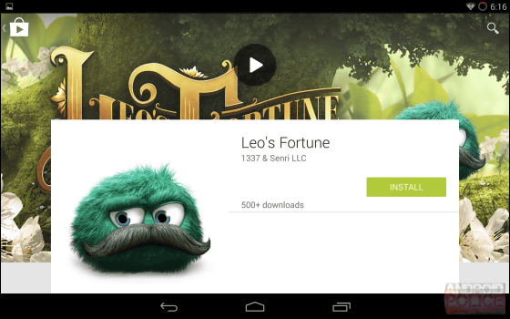
Text information that was packed with small size characters ......
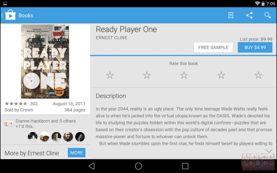
It was driven to the lower side, and the top screen got a neat impression.
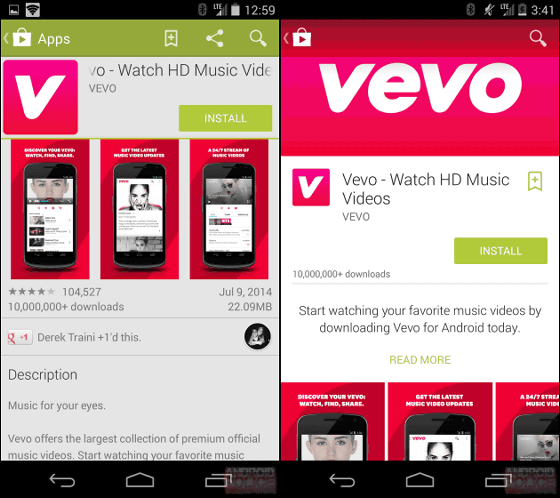
When comparing the current design (left) and the new design (right) with a smartphone, it looks like this. The current design where the amount of information is large and messed up is changed to a simple design.
The thumbnail movie has also been changed to a card type thumbnail full of the horizontal size of the screen.
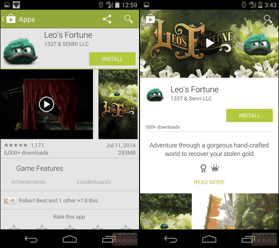
In the current design, the button icons "BUY FROM $ 12.99" and "RENT FROM $ 4.99" that are arranged vertically are arranged side by side along the new design, and it seems that it is easy to tap easily.

The new Google Play UI design will also be refined to "simple and easy to understand" based on Android L's Material Design concept.
Related Posts:
