A method for improving the quality of the user interface "What is the user interface?"
Portions touched when a user operates something or interacts with information, such as a keyboard or touch panel that operates the PC, steering wheel and pedals when driving a car, or a web page operation screen, is collectively calledUser interface(UI), The evaluation of the product may be greatly influenced depending on the finish condition. It is a UI design that is one of the important items when planning products, but especially on YouTube, a method for improving UI quality on websites is published.
The User is Drunk - YouTube
What talks about techniques for good user interface designWill · DableMr. He is a web consultancy company in Melbourne, AustraliaSquareweaveI am the one who leads.

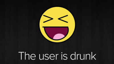
Mr. Davle's method is to design an interface assuming that "the user is drunk to drink"The user is drunk(User is Jipparai method) ".
Before that, first explain "What is an interface?" Although it seems that there are many things like keyboards and buttons to think to the head when listening to the interface, Mr. Davel is about "interface" ...

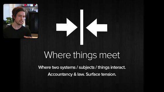
I will talk about the recognition that I returned to basics, "a place where two things face each other".
The interface reflects the structure of the real world. For example, when you open the door you will find that the lever is easier to use than the knob that grips and rotates, or even more convenient if it is an automatic door, but this is a difference in usability that appears when you use the login screen There are things that also lead to ease.
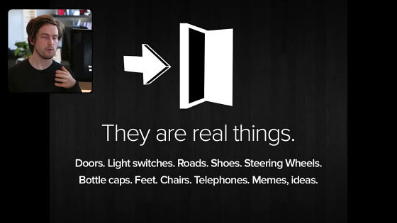
"Besides that, it is easier to open the bottle cap that can be opened by hand than the bottle with the crown that needs a bottle opener," said Dave, who opens a bottle of beer. This is also one of the "user interface".

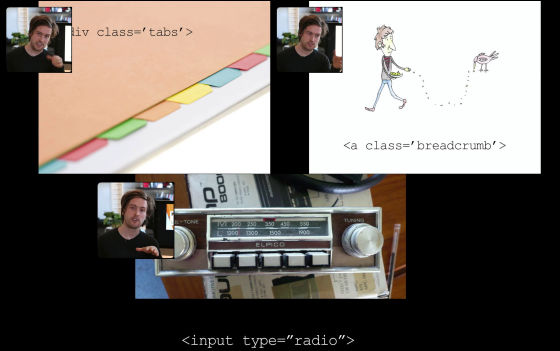
For example, you can express pages in tabs,Breadcrumb(Breadcrumbs list) can be displayed,Radio buttonIt is said that the method such as using the method reflects the actual tool around us on the web screen as it is.
An excellent UI is what it feels as if it does not exist.

And the excellent UI makes it possible to operate natural without having to stand like a barrier.
Then, what kind of state does "poisoning" mean?
It can be said that the front is blurred.
Even if the site is drunk and the visibility is blurred ......

It clearly understands the contents.

When you are drunk, your attention is distracted.
In such a case it becomes important that the "devise to surely lead the user to the correct spot" and the explanation about the core will start from here.
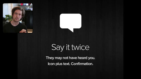
In order to correctly recognize, it is effective to tell the same thing twice. As an example of a real society, for example when you are running on a road in Australia you may notice that a sign indicating speed limit is displayed twice. This is a mechanism for surely informing the driver of the restriction information by displaying the same contents again several hundred meters even if it was overlooked for the first time or it could not grasp the contents well. It is effective to combine icons and letters, or to display a confirmation dialog.
It is also important to pay attention to the user's emotions. In the place of drinking, a very close friend is sometimes starting fight fight after a moment, but in the case of the web the situation is even worse. People who do not like web pages, it's going to be goodbye to close the page with just one click, so attentiveness not to hurt the user's mood is important.

The effective way to do that is "Over the shoulder test". It is a method of giving a PC to the test user, actually showing the page, asking various operations and observing the situation from behind the user over the shoulder. This test is an effective way to know how the user feels, since it is possible to determine at what stage the user is actually troubled or irritated by the user.

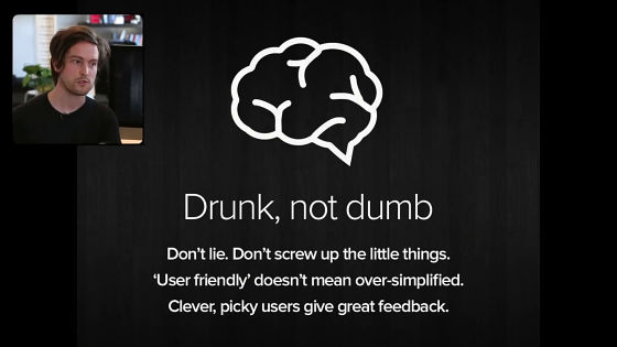
And thisThe user uses the Jopaharai methodThe important thing to understand with is to recognize that "Users are not stupid even though they are drunk." Even if a person of IQ 160 is drunk, that person's IQ remains 160, and it does not mean that he has never lost his intelligence. It is not good to use simple words easily or to overly simplify. If the power user is the partner's content, the site should also take appropriate countermeasures for power users.
Many users actually touching your UI are not drunk. As users continue paying attention to many events and tasks in their daily lives, there is no remaining capacity to pay attention to the UI that you have installed on a certain website You should be aware of that.

So then when you actually design the UI should you drink alcohol and work in a drunk state?
Mr. Dable says that the answer is "there is nothing like that." "If you are drunk, production efficiency will fall, so you should not work drunk," he said,Feelings of drunk peopleWe are talking about the necessity of considering the structure of the UI. In addition, on the screen is "YES" as if it is just saying "You should get drunk" that is why ... ...

It seemed that I wanted to drink as soon as possible.

Apart from the last joke, it seems that it is good to incorporate the technique "user is Joparai method" in order to avoid self-satisfaction that is often prone to design when designing UI.
Related Posts:
