What is the new font "Sitka" that makes the page easier to read?
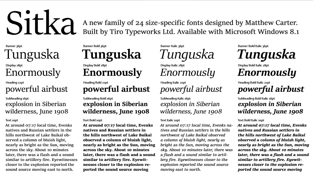
"Reading View" has been added as a new function that can make the web page easier to read in "Internet Explorer 11" which is standard equipment in Windows 8.1, and when this new function is turned on, a new standard font adopted from Windows 8.1 One of "SitkaYou will be able to browse with.
Introducing Reading View in IE 11 - IEBlog - Site Home - MSDN Blogs
http://blogs.msdn.com/b/ie/archive/2014/03/04/introducing-reading-view-in-ie-11.aspx
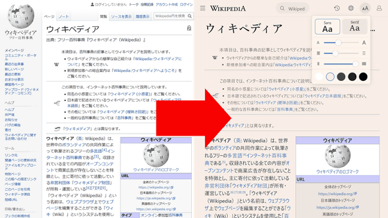
The new Reading View display of IE 11 makes it easier to read web pages you want to read, such as blogs and articles, no additional installation is required, and it supports all languages.
To use the Reading View display Touch the "Reading View button" next to the address bar to switch it on or off. If it is a keyboard it can be converted to full screen with "CTRL + SHIFT + R", and it can be restored with "Esc". Leave the Reading View screen and click Swipe or "Backspace" to return to the previous page. Even articles that can not be read unless you click "Next" are also equipped with a function that allows you to read everything by simply determining and scrolling automatically.
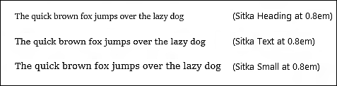
When displaying Reading View, the font in the page is automatically converted to "Sitka" font. "Sitka" is designed to make the web page easier to read, and said that it is also suitable for printing. "Character interval" "character size" "X (X) heightFor example, as shown in the image below, even the size of the same 2.0 em is adjusted to make it easier to read depending on the part used.
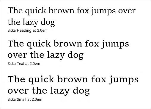
It is a font that sticks to "readability" by being optimized by the text in the page such as "headline", "body", "display size" "small", and this adjustment can be made with the same font family or different weight It is effective, it is designed to give top priority to readability on any size screen.
Related Posts: