Why the Amazon Mega Drop Down Menu is a Smooth Operation Secret
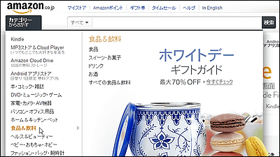
It is also adopted in Japanese AmazonMega Drop Down Menu, It became clear why Amazon menus are made easy for users to use. Improving usability is a very useful knowledge for online shopping sites with the most prominent proposition.
Breaking down Amazon's mega dropdown - Ben Kamens
http://bjk5.com/post/44698559168/breaking-down-amazons-mega-dropdown
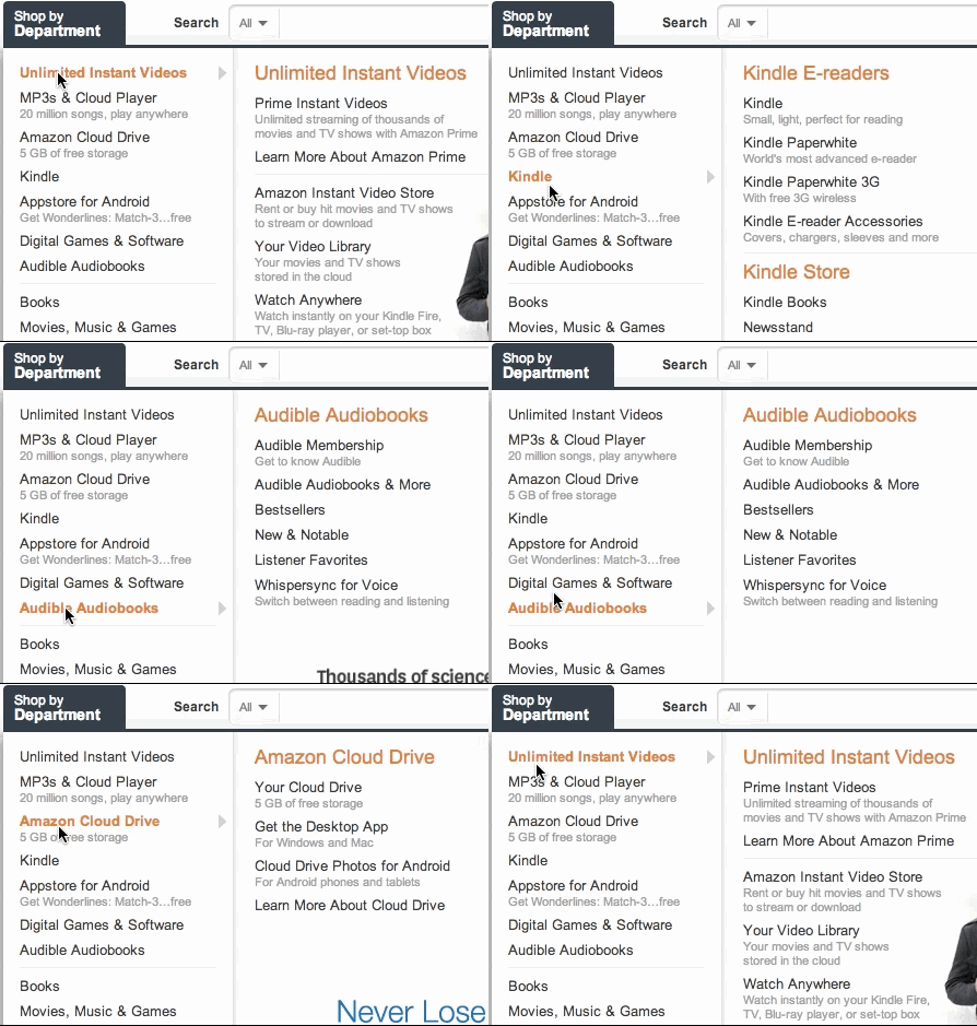
First of all, this is a mega drop down menu that lists Amazon categories in the upper left. A similar menu is also adopted in Japanese Amazon, and moving with the mouse cursor upwards moves really smoothly.
In the case of a normal menu, the submenu opens a little behind as follows.
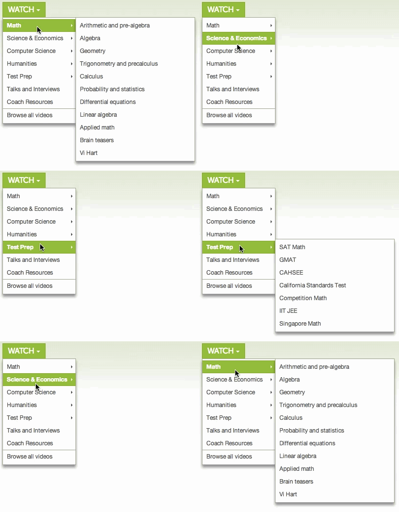
Why open a little late, if you open it quickly, when you move the mouse cursor diagonally from the main menu to the submenu at the shortest distance as follows, the focus will be lost from the opened menu and will close For. In order to prevent this phenomenon, it is the usual menu that is designed to open a little behind.
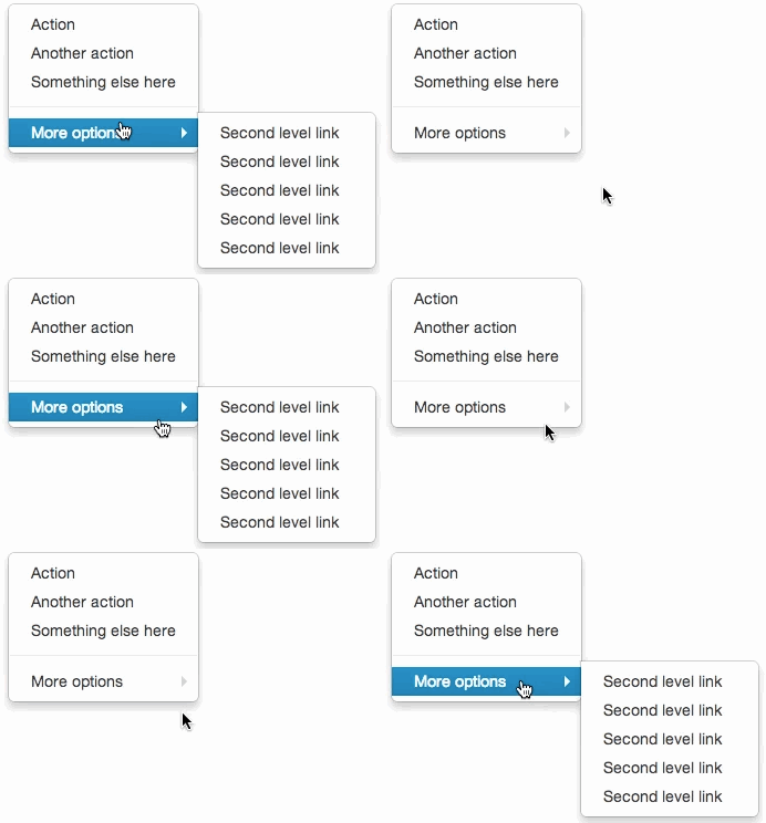
However, despite omitting the ingenuity of "this is a bit late", Amazon has made it easy for anyone to select a menu even if you move it diagonally. The secret is a blue triangle shown in the image below, and if there is a cursor in this part, it is specified that the submenu will continue to be opened a little longer. And when it is out of this triangular zone, it opens the next sub menu quickly. Amazon has succeeded in compatibility with ease of operation and ease of operation by this.
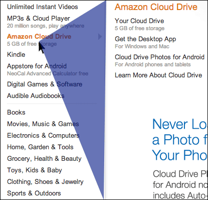
I want to introduce this mechanism even at my site! For jQuery plugin for "jQuery-menu-aim" for jQuery for the person who says, it should be useful if you say "It is certainly better for you to make it move like Amazon" is.
Kamens / jQuery-menu-aim · GitHub
https://github.com/kamens/jQuery-menu-aim
Related Posts:
in Web Service, Design, Posted by darkhorse
