Choosing "Concept" to create is "Game Design", "GRAVITY DAZE" core game design and how to make GUI
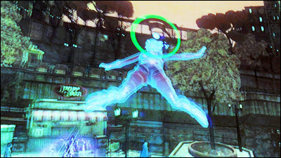
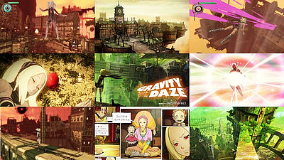
"GRAVITY DAZE"Is a system of new sense of manipulating gravity, features of" PlayStation Vita "such as touch panel operation are well incorporated into the game. In the middle of development, there was hardship that hard changed from "PlayStation 3" to "PlayStation Vita", but the process of making the best use of it was a bit different from ordinary games. Detailed contentCEDEC 2012I asked from the producers.
The girl falls in the sky ~ Core game design and GUI of "GRAVITY DAZE / gravity dizzy: perturbation in her inner space in returning to the upper layer" constructed in open field ~
http://cedec.cesa.or.jp/2012/program/GD/C12_P0070.html
Junya Okura (Okura):
Sony Computer Entertainment, senior game designer of JAPAN studio, Okura.
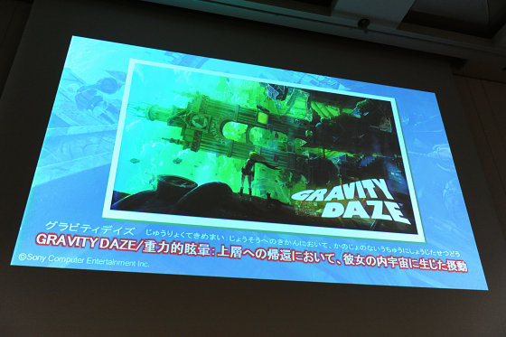
This session will be sent to me as a lead game designer of "GRAVITY DAZE", Nagaoka who took charge of the entire action around, and Noto who was responsible for GUI surroundings. It consists of two parts, Part 1 and Part 2. Thank you. First of all, I will introduce the title easily. "GRAVITY DAZE / Gravity dizziness: perturbation in her inner universe at the return to the upper layer'S the features of' PlayStation Vita 'Free RoamingIt is an action adventure game. The hero can manipulate gravity and fall in the direction of your choice and involve objects. It is a story to fight various sufferings while fighting with unknown enemies called "Nevi" in the aerial city "Hexabir" using that power.
You know in 90 seconds! "GRAVITY DAZE" video - YouTube
First of all, I will talk about the way to establish a game style "gravity action adventure".
Development of "GRAVITY DAZE" started at the beginning targeting "PlayStation 3". thenMr. Okuyama DirectorIt seems there was an image that a puzzle element is a strong game among them. We were thinking about manipulating gravity to obtain objects indirectly by interfering with the object and making the movement route of the main character by standing on the wall by changing the direction of gravity. It was unexpectedly surprising and there was every possibility at this point.
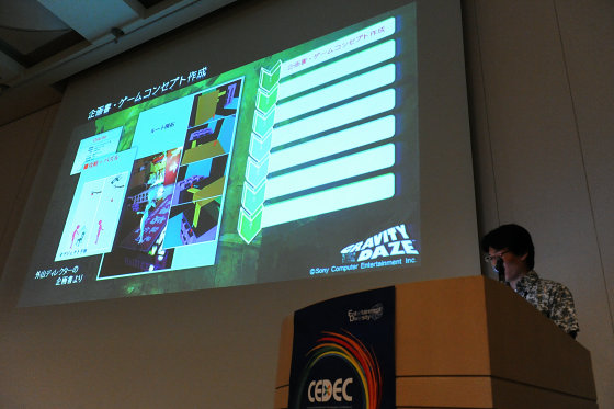
First of all, I did brainstorming with the team. We talked about various things such as game play, stage town, character, enemy, setting of world view. At the same time I created a lot of image boards and expanded the visual image. At this point there is a chaotic state of anything. By outputting each image and deciding one by one at the judgment of Mr. Toyama, gradually the world view of "GRAVITY DAZE" gathered together.

With numerous ideas coming out, we decided to aim for free-roaming action adventure games with gravity operation as the main axis, by making it an adventure-like configuration set in a field playing field. We made a specification called "specification overview" together with specifications of movement by gravity operation which is the heart part of the game and decided to prototype in the next phase.

There was not a concrete game image yet at the initial stage of the project. We repeated brainstorming and explored the visual image. In order to clarify the game image, "specification overview" is also made at this time.

And I picked up what I should prototype to make the core part of the game. The purpose of the prototype is clear, "Whether moving with gravity change is funIt is to verify. Since nobody has experienced the movement by gravity manipulation yet, I can not imagine "It is established as play in the first place", and I do not know whether it is interesting until actually trying. It is very important to prove that it is worth verifying and making it.

First of all, we made a temporary model crisply, we created a simple demonstration program that we can gravity manipulate in it and walk and fly on the wall. What I found in this test is that it is surprisingly fun to run through the wall by gravity manipulation. If there was an attractive city, I was able to imagine that it would be a lot of fun if I flew around and explore there freely. This proved that the key system of gravity manipulation could be the main element of the game.

Next we tested various level designs. I tried to make various topographies such as an aerial maze and a closed space and tested what kind of terrain structure and links are suitable for this game and whether it is fun. As a result, I understood various things, so I will introduce some of the examples. This is a completed photograph, but it is very complicated that a person judges gravity "down" from visual information. If you briefly explain the mechanism, you can say that you are guessing the "down" direction by comparing the information coming from the vision with the past experience. Therefore, the more the familiar ones in the visual information, the easier it is to guess the "down" direction.

For example, in this geometric design terrain, the direction of gravity of the hero has already changed, but it is very difficult to intuitively judge the "down" direction when seeing this I think. Actually, this is the actual bottom (the arrow direction of the image). The situation is that the hero is standing on the wall. If you look closely, the main character's hair and scarf are hanging downward, but it is not kind of not to know until you carefully observe those specifications, knowing these specifications.

So, please see here (right figure). I think that you can understand the original "down" direction simply by looking at it. In this way, the direction of "downward" is understood somewhat because there are countless opportunities for finding a direction in a complex structure like a town. We have the ability to judge the "down" direction empirically from such things. Even in fantasy cities it will pass. In this work, we introduced elements of the city even in a special action stage and so on so that the player can keep the sense of direction.

Also, some players work unconscious psychology of trying to guess the correct direction of gravity from somehow actually visible. The noticeable topography that is likely to be the standard should not be easy to tilt. The action stage called the different dimension stage here seems to be a chaotic world, but in fact it is the standard that makes it easy to use for judging up and down, especially the big one is all in the correct direction of gravity.

Moreover, even if the player moves the camera and looks in any direction, it devises so that the terrain which becomes the standard of the vertical sensation is set as much as possible on the screen as much as possible. The town has a big three-dimensional structure both up and down, ship flying in the air, etc. We try to reflect as much as possible on the screen.

By prototyping, the direction of game design has come to be seen. It is a free movement, opening feeling is a core of fun, and if you strengthen your puzzle elements by tightening the limitation, a good place will be spoiled. Therefore it was concluded that it might not be suitable for a severe root puzzle. It is most fun to have flying freely around the city-like structure.

What we did during the prototype period is not just gameplay verification. Create characters, background image boards, create temporary background data, research various shaders, plan an event, create a story, and create a concept image movie.

Concept image We will talk about movies. When there was direction to a certain extent, there was a story saying "Make a concept movie" from Aoyama Director. It is made by integrating game designs and visual artifacts that we have made separately so far, if you look at this you can see the game "GRAVITY DAZE".

By creating this concept movie, the image of "GRAVITY DAZE" which was uneven each one was able to be shared by team. As a game design I decided to aim that the contents of this movie can be experienced by the user as it is.
Development was proceeding smoothly, but suddenly it decided to shift to development on "PlayStation Vita". Mainly, the gravity action seems to be compatible with the motion sensor of "PlayStation Vita", and the time to release the game was near the launch of "PlayStation Vita". We took this forward positively, decided to reduce the size of the team once, and to reshuffle it.

However, since "PlayStation Vita" was a completely unknown hard at the time it was not known whether what we were going to do until now could be realized, so I decided to reset the game design once. First of all, we verified "PlayStation Vita" with a motion sensor and a touch panel. What I found out is that the motion sensor has good compatibility with gravity action, while the touch panel was bothersome to change the home position by combining with the button, it was impressive that the compatibility is not very good. However, there are many things that can be realized with "PlayStation Vita", and it turns out that there is no need to change the big policy.

On the other hand, in terms of game design, I was hitting a big wall. That means that the gravity action "likeness" is still missing. At that time, I thought that impact of gameplay was still weak merely by changing gravity direction, and I was seeking out how to make it more like gravity action. However, adding the new element easily makes the game difficult to understand was making the situation a troublesome thing.

And at the timing of the second half of development we had discussions among game designers. By meeting "PlayStation Vita" you can get a highly novel movement action using a motion sensor, and there is also an attractive worldview weapon. So, I judged that even this alone can fight enough. And, after having specialized in "movement by gravity manipulation", it was decided to merge well with the familiar and safe touch as a game well.
Here at last, it can be said that the game concept that "action adventure game" is "GRAVITY DAZE" has finally been established, moving the city freely by manipulating gravity, solving various incidents with that power.

This is a summary. It is very important that prototyping is a project that can not express fun with words clearly. It is also important to share the image with the team. New things are difficult to understand, it is very important that team members first understand. Also, there is a belief that everything must be innovative, much more conscious of new things. However, when aiming for a novelty game, I think that this danger is unavoidable. The point is that it is important to recognize it properly.

Next, I would like to drill down on important matters to make the project with a highly novelty concept "game". Nagaoka will tell you.
Yasuhito Nagaoka:
In "GRAVITY DAZE" this time, I was in charge of planning around the player action etc. Highly novel projects have demerits, not just merit. The merit is to be able to appeal freshness, originality and stimulate user's curiosity. The disadvantage is that it is hard to communicate what kind of game it is because there is no precedent.

Users are looking for not only "freshness" but also "sense of security" at the same time.

Let's look at this by castle making. Concept is a castle tower. Game design is compared to this structure. The highly novelty and attractive concept leads to the place where "there is a wonderful castle tower." Since the castle can not be built alone, the castle will be the first to be found, including stone walls, moats, castle walls and castle bodies. And each element has its format set to some extent because the castle is a "castle".

If it says in the game there are some formats due to the accumulation of predecessors. System, basic operation,Enemy behaviorThere are many things that have been accumulated so far, but as with castles, they have a certain format as a "game" to a certain extent.

In game design, it is important to decide "which element to select?" Rather than the individual novelty of that element.

In extreme ways of expression, it is my opinion that creation is "concept", and choosing "game design" is my opinion.

I think that it is exhausted to dig into the concept that what is important for making the right choice in game design is important. In other words, it is to clarify what game you are making is "What kind of experience is given to the user and what kind of feeling is produced as a result"? By being clarified, it is the judgment criteria of element selection at the time of game design, in other words, "Constitution" of title production. The first thing is to make this constitution.

So, the format example. "OO" is an act of occupying the majority of game play, "△ Δ" is a concrete player, for example, "game playing a game with a player feeling △ △ by playing ○ ○" What is the feeling of that?

Even when saying "the player goes to ○ ○", for example, if it is RPG, there are various elements such as fighting, searching, growing, so it will not be possible to write "○ ○" in a single word, There should be a common category word connecting multiple actions. For example, "I will try and experience what I played during my childhood summer vacation".

"It makes me feel △ △" is not an abstract thing that interpretation is interpreted by people, but it is actually "becoming a nostalgic feeling like returning as a child"My birthplaceI'm talking about it, but I can quote (laugh). It is important that content that can obtain common understanding within the team is important, and it is important to have a common recognition that "Oh, that kind of feeling".

As it goes to the next STEP 2, it is necessary to evaluate the concept this time. It is only saying "I understood what I want to do" to clarify. After that it is important to "evaluate" the concept to make a thick concept of core.

As a criterion of evaluation, first of all, is there validity of the validity evaluation, "Is it really △ △ feeling if you answer?" Next, as an evaluation of uniqueness, "Do you feel △ △ other than to ○○?" It means that there are other ways to feel more like this, and if that happens, it will not be able to be evaluated as uniqueness. Finally, as an evaluation of appeal, "Do users think that they want to feel △ △"? It is a good concept if we satisfy these three.

So, in the case of "GRAVITY DAZE", where "manipulating gravity" is to do ○ ○, "feeling of floating and thrilling like falling into the sky" becomes △ △, this is It is the concept part of the action.

In that case, it will become a story "It is not necessary to fly in the sky, but feeling to fall into the sky is essential". When I told you it is not good to fly as a result of drilling down on the conceptDance skillInstead, it is theoretically derived that it is essential to have a mechanism of aerial movement that is very aimless to decide the target point in the air and linearly move in that direction.

There is a prototype based on aerial movement, if it is an action that makes use of it based on that, it is compatible when saying that it depends on the terrain depending on the terrain when becoming an athletic action and it is hard to make a game It is derived that it would be better to make a battle action centered on enemy.

In the air moving system, I thought that it would be a good idea to make the mechanism of unique battle simple and easy to understand, I thought that it is better to make it easy to understand the system of gravity kick that can be output with 1 button and the core "to aim here" I am prepared to make it easy to understand.

In other words, if the concept is clear, what to choose in the specification can be logically derived to some extent rather than intuition.

It is a summary. The new title means not only "freshness" but also "sense of security" is important. It is "concept" to create, "game design" to make the right choice based on it. And it is important to evaluate the "concept" and share it with the team. I will return to Okura again.

Okura:
Let's talk about the production flow of level design done with "GRAVITY DAZE". What I was aiming for at "GRAVITY DAZE" is to emphasize the existence of the virtual world. What I mean is to create a living virtual world that does not feel the convenience of the game system while playing the game.

Normally, after the player character jumps and runs, the speed and height and basic game system are determined to a certain extent, after designing the field based on it, design by the artist is done at the end.

However, the team of "GRAVITY DAZE" had some challenge. This is also one of the effects of changing the development hard. Although the game system is still under development and can not be determined immediately, in the situation that the schedule can not be timely unless field creation is started immediately, it can not be realized by the conventional method.

How can we solve this problem and achieve a sense of existence in the visual world? Although it is said to be misunderstood in the extreme, it is dared to say. Based on the world view setting, we took the method of making the city led by the artists. However, as you all know, this is that terrain data inconvenient for the game system will be created. In extreme cases it may become something that can not be used in the game. Therefore, it is unlikely that backgrounds are usually created in this way.

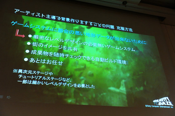
We have overcome this problem with various ingenuity. First of all, it is a game system that does not require strict level design. In this game, strengthening the game like the root puzzle spoils the feeling of opening by free gravity movement. Conversely, in the city there is no need to do such a puzzle-like design. By eliminating this restriction you can design the city relatively freely. Next is to share the image of the city. There were many image boards of detailed parts of the city drawn by artists, so we can predict what kind of town will be made and point out any problems in advance I was able to make oral corrections. There is an automatic build environment that allows you to check the deliverables from time to time, and the artists are always up-to-date programs that allowed me to test-play the city I made. So you can quickly locate the problem and fix it. Also, even in the environment of the game design side, we always organized the event using the latest background data, so it was possible to request correction immediately as soon as there was any problem. I will leave it to you. It was a team where the motivation of artists was full and everyone moved independently, so I went on to ride it. It can be said that everything was done in teamwork. By the way, after the game designer had set up and played verification in the different dimension stage and the tutorial stage, the artist made it.
The one with the biggest head in the level designcollisionis. To be able to go everywhere by changing the direction of gravity makes it impossible for everyone to deceive you. I can not communicate at all with the method "You can not go ahead from there after placing a wall in a bad location." This was what I knew from the beginning of the project. So, I decided not to think dare to say what I did. Because it could end up picking the bud of possibilities. Although saying that, I can not afford to keep my eyes closed forever, so I took such a method. Character behavior that depends on collision is not done as much as possible. What we say is that the gravity has changed in every direction and character behaviors that depend on topography etc. are not done. For example, I was able to loosen the collision rule by not trying to fall off from a riding helicopter, supporting the landing on a narrow foothold, or not doing such things. Although it is about the topography creation system and flow of mass production, the town is made by combining parts like a block. For that reason, collision troubles in specific places are unlikely to occur, and if you correct them all are corrected, it is easier to make corrections.

The remaining two are craftsmanship of the player program and try and error only. Although becoming psychic theory when attached, it is a part directly linked to ease of play, so adjustment was done until the last end.

Finally I will talk about the merit obtained by overcoming these difficulties. "It is easy to build a world with real existence without being bound by the convenience of the game system", it is exhausted to this. Because it is directly connected to the game concept of "GRAVITY DAZE", this merit is very important. You can make use of many of the many ideas coming out of the artist, and you can significantly reduce the time to exchange detailed designs.

It is a summary. What I aimed for in the game design of this work is "collaboration" between "gravity manipulation" and "living city". To do that, you should not create a world that is "just" convenient for the game system. I did the opposite approach of making "a game system for enjoying the existential sense of the city" rather than "level design tailored to the game system". I think this is the most important point.

Here Part 1 is over. Next I will move on to the GUI story.

Shinji Noto:
From here we go into the GUI part. I am Noto who was in charge of GUI and graphic design at "GRAVITY DAZE". Thank you for your time today. Today I will talk about how to express the map navigation of "GRAVITY DAZE", how to use a new user interface called a touch panel, the background from the early stage of these two productions to the completion.

First of all, we are talking about map navigation. At the beginning of the development, as members of our team eventually saw what kind of game "GRAVITY DAZE" would be, it was a time when it was not yet clearly seenFree RoamingAbout the other games and games that we made in the past, I gave ideas as a trigger. Speaking of free roaming, it is what is displayed at the lower right of the play screen of the above picture. The shortest distance to the destination is displayed on this map and it functions as a car navigation system in essence. We thought this was a classic part of free roaming. In addition, since I already had a map making work with "GRAVITY DAZE" before, "GRAVITY DAZE" is a game that allows you to freely move in 3D space. I thought at first.

However, actually, as a prototype, when the hero flew at high speed in the sky, it became clear that nearby information such as a mini map flowed rapidly and was not useful at all.

In normal free roaming games, characters move, but in the case of "GRAVITY DAZE" all car navigation concepts based on the road will collapse when the main character floats in the air. Also, trying to represent a huge town in 3D results in processing problems when the camera is embedded in the building.

I finally decided to adopt navigation with a simple and primitive 2D map, by re-partitioning.

The shortest distance of not only walking and riding a car but also a game that can fly through the sky, that is, a game that can move without being bound by the terrain is a straight line connecting points from the current position point to the destination point. After displaying this destination on the game screen as it is, once the player headed towards that point, I settled on the idea that someday I should reach the destination.

The white dot in the center of the screen is the destination. If you leave this point in the center of the screen and fly, you will arrive at your destination someday.

If the obstacle is on the way, it is navigation that the player judges, turns around and goes to the white point again, but I think that this was too good kinda good feeling that it was too kind .

One of the reasons why we made it 2D is the existence of a smartphone. Just as we started to develop iPhones began to spread, I found that the compatibility of touch screen with 2 M Google Maps is tremendously good. There is something that we have made 2D map with judgment that there will be no way to go thoroughly roads even though there is already a model that is already close to the model solution.

I decided to go with 2D, but I was lost as to what style to express. The idea that came up is like a magazine for women, a town magazine, an illustration map in sightseeing spots, "Kyoto Temple Tour Map" or "Tsukishima Monjayaki Map".

This is the image of the map actually used in the game. The size etc. of the building which is drawn by the illustration is drawn largely according to the appearance impression, and it ignores at all. In other words, we focused on only the landmarks that are the landmarks of the player. I think that this also matched the game which moves at high speed while watching the scenery of a distant place.

The terrain created by the level designers etc. does not make it under conditions that fit well in a balanced manner at 16: 9. It becomes an irregular shape. As a result, margins usually appear on the screen. We cheat as we draw clouds, but it is very painful. However, using the illustration map, I could draw the main motif of each city in the margin, and I was able to use the irregular shape in reverse.

"GRAVITY DAZE" does not specifically incorporate highly novel ideas and technologies. I was originally a graphic designer who is not a field farm, but I think that the process of design including GUI is always continuous problem solving. When I was in graphic design, it was a case or client that had troubled problems, but since I started to make games, I think that it was only a specification or a game director that had problems that were in trouble. Although it is the process of design to solve many problems one by one, there are times when you can solve multiple problems at once with the approach from the art side and inspiration. Although it can be said that it is an ideal form of problem solving, in the case of "GRAVITY DAZE" this time it was a map using illustration.
I will move on to the talk about touch panel from here. Because it was a function that I used for the first time, there was considerable trial and error. As the touch panel itself is one of the Uri of the new hardware "PlayStation Vita", as a first party to "GRAVITY DAZE" it is now impossible for the mission to bring out the best of the hard functions to the nature .

Originally, even player actions have managed to do something well using the touch panel, but as a matter of fact the weight of the physical buttons increases as importance is placed on the high responsiveness of the game, as it is a game centered on action I will. Therefore, the specification of the touch panel was to be absorbed by the GUI. In other words, it is judged that you can abandon the specification of the conventional target cursor which is selected with the arrow key and decided with the button, and it is done by direct input by one finger. It will lead to trial and error on how to operate comfortably only with the touch interface.

Firstly I thought that if the user does not tell me it will not touch the screen. Like the conventional hardware, "PlayStation Vita" has both a cross key and a physical button, and it was necessary to prevent such things as "I can not start the game even though I was hitting a button". In "GRAVITY DAZE" there is a character of a hero's pet, or a mascot, but in the place where touch input is required all the cat prompts the user to input the touch with the idea of displaying the icon of the paw of the cat Did.

Especially at the beginning of the game, putting down the apple on the screen by touching and dropping it puts on it gives the user the impression of "first touch from button input".

Usually we hold and hold mobile phones with both hands. Since the normal action operation during the game uses the physical button, it is impossible to touch the touch panel unless you release the hand holding the button once by all means. It may be troublesome if you do this many times and the user may not want to do the game itself. So, when holding "PlayStation Vita" with both hands, I tried to concentrate the touch button at the position where it touches just by slightly extending the thumb from the physical button, that is, touching the both ends of the screen.

There is a problem that it does not know whether it was able to input because there is no tactile feedback as a weak point of touch input. Even if you touch a bite with your finger, some people touched with your fingertips, others touched with your fingers' belly, and people touch each other differently. There are parts that users only have to learn by repeating trial & error around that part, but it is necessary to give feedback that prompts learning from the game as well. In the case of "GRAVITY DAZE", the effect that the fingertip touches surely emits light is inserted so that you can see where the fingertip is touching.
It is something that I understood for the first time by touching the iPhone, but the behavior of the UI and visual feedback that matches the reality is very important for the touch panel. There are things like inertia that the fingers move without stopping or bouncing back when you go to the edge of the screen and hitting back again. Since Apple thinks that he studied around it and made it well, it is very helpful, but it seems that there are only important points and a lot of patents are taken. We are thinking to value feedback to users so that they do not conflict with the delicate points.

Also, there is a disadvantage that you can not see the part you are trying to press with your finger as a weak point of touch input. In "GRAVITY DAZE", in the area where the buttons are densely popular, we expand the button once around the finger pressing the screen and respond with the idea of pressing the button you want to push again.

The operation of "GRAVITY DAZE" was finally combined with touch panel and physical button. From the usability point of view, there is no regret in that judgment, but from the viewpoint of consistency of rules and reliability of feedback, there are points of reflection on whether the last axis has blurred or not. I think that the problem of coexistence of this touch panel and physical buttons will become a big issue even in future software development.

thank you for your attention.

Related Posts:
