This is the secret of "iPad 2" packaging design, thorough rationalization and simplicity Explained & Photo Review
Apple has clearly distinguished the process from buying and opening it from other companies' products, improving the satisfaction of the user experience and satisfying ownership. These series of packaging designs are simply founders of impact and Apple's philosophy to speak, in short it is the founderSteve JobsIt is not based solely on aesthetics of the aesthetic but it is understood that we are considering usability thoroughly and that it is established on that basis and it can be understood well from the actual concrete packaging design .
so,"IPad 2Let's see what kind of ingenuity Apple makes packaging design.
Photo review of packaging design is from the following.
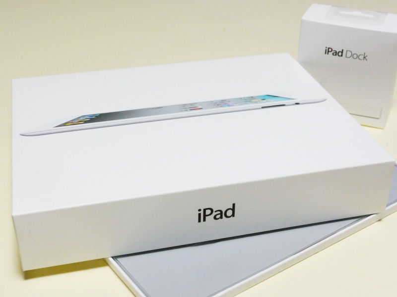
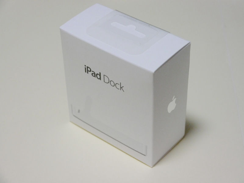
This is the package of iPad 2
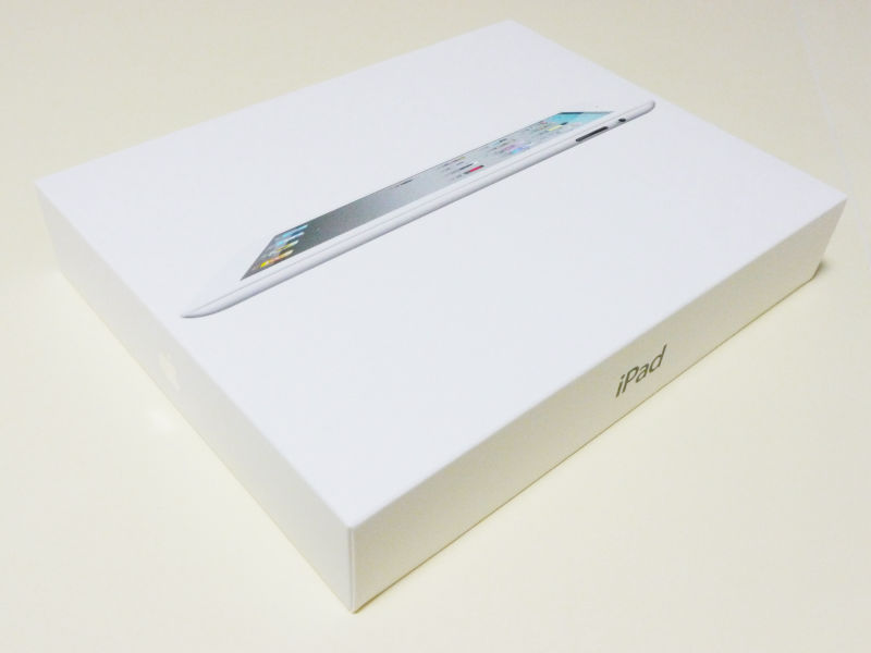
It is a system that opens in this way, it is not a method of sliding products out from the side of the box or sideways. This is designed to open the box so that the liquid crystal surface of the iPad 2 is littered, and putting it at the top in the box, "As soon as I opened the box my iPad 2 looked like a face It is understood that it aims at being "to give out". It certainly does not lower the expectation feeling when I bought it, this is playing a role in directing the mood of "Oh!" When I opened the box.
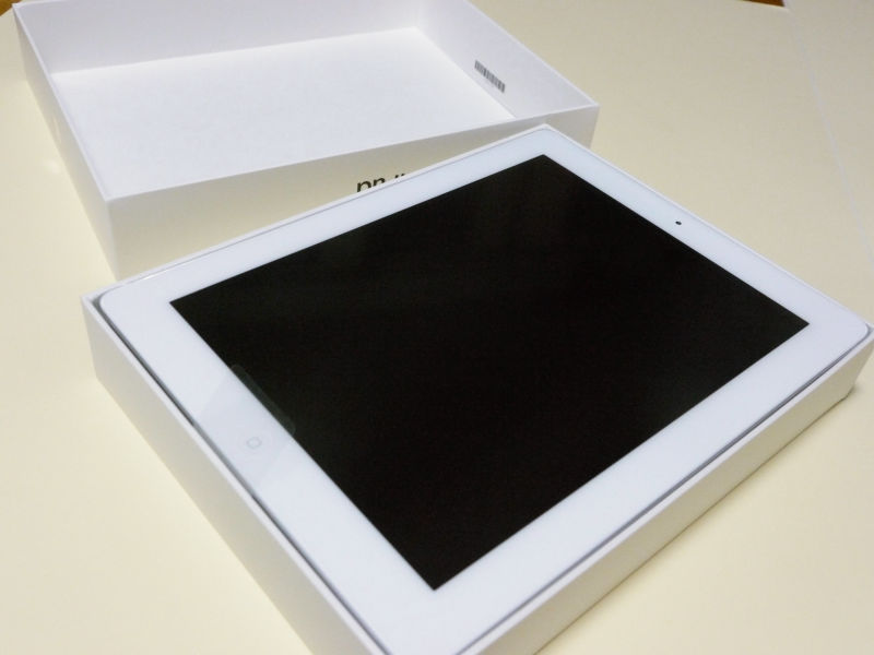
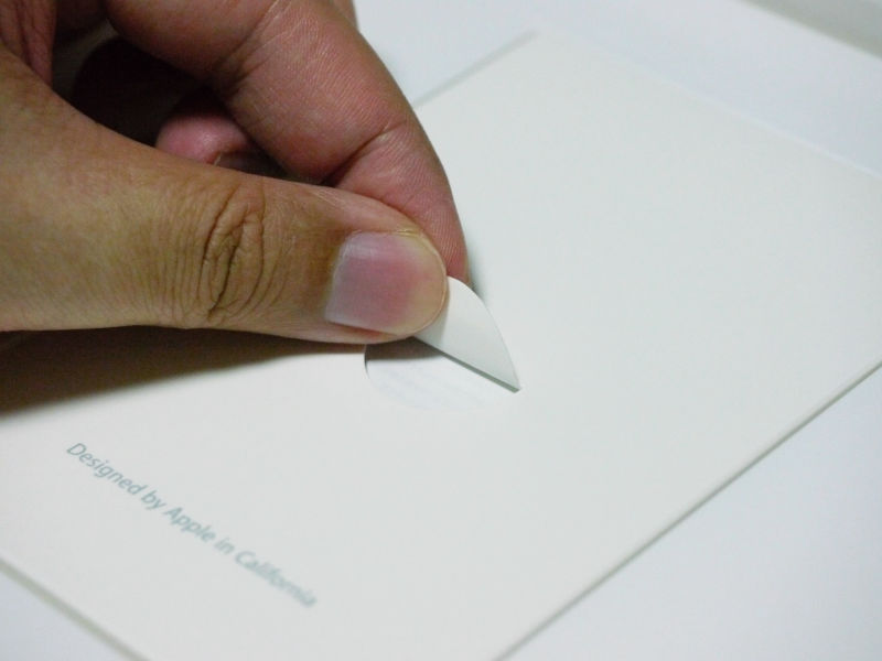
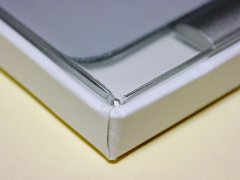
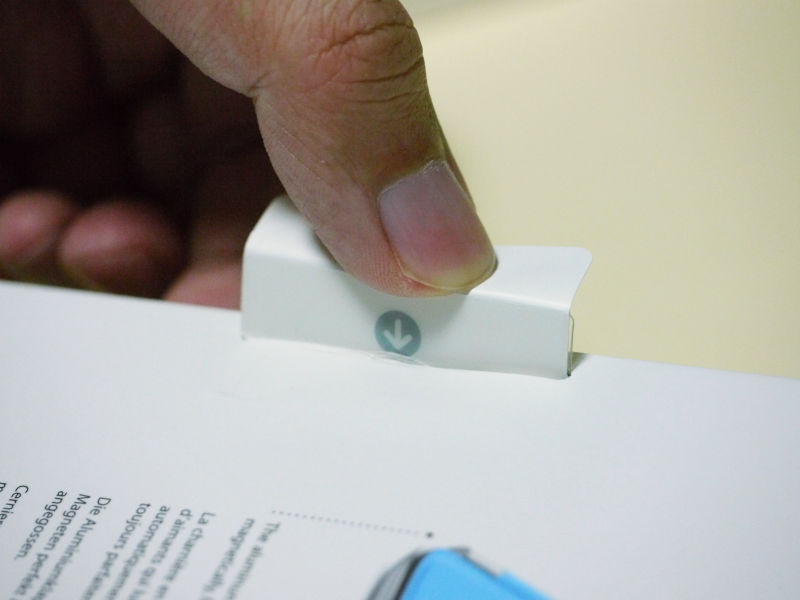
If you think carefully, in the case of other companies' products, bubble wraps are caught between the lid and the liquid crystal side of the main body, and cushioning materials that absorb impact like shrinking foam polystyrene are contained. For iPad 2 it is not. The reason is to prioritize the user experience "to face the iPad 2 as soon as you open the box" as mentioned earlier. However, even though the surface of the liquid crystal is covered with reinforced glass, this is too unprotected with this.
So there is one contrivance, cushioning material is stuck inside the lid of the box how. Although it is obviously cheaper to put cushioning material between them simply, it is clear that the fundamental principle of packaging design that gives priority to the user experience by adhering to the inside of the lid is present without blurring You can see that it is. The following photographs make the cushioning material part stand out.
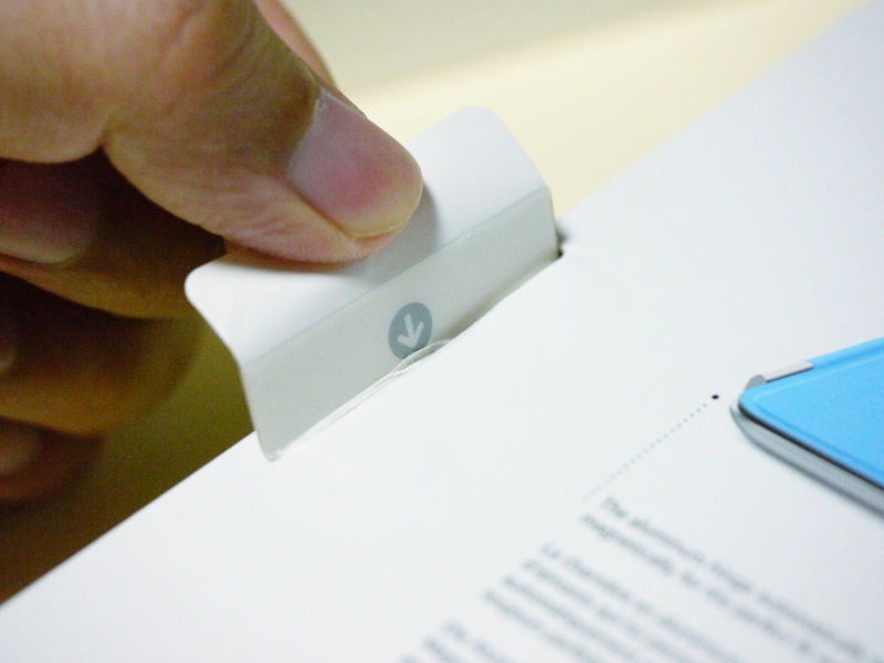
As you can see, there are no margins on the top, bottom, left, and right, and it is difficult to take out as it is, but this transparent film has become prominent as Pyro Piro, and it is explained with words that "You should pull this out" I can understand without it.
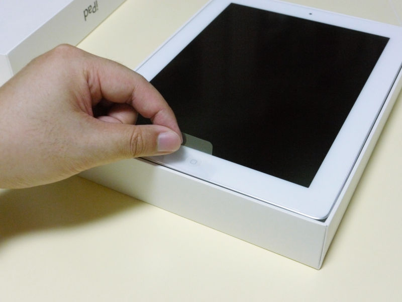
The reason not to explain by words, intuitively and to know what to do next is not just a usability point of view, Apple products to release around the world, explanations by national language Because it becomes a tremendous amount when attaching a sentence and it becomes hard to read unnecessarily.
Also in the menu only English (United States), English (UK), French (France), German, Traditional Chinese, Simplified Chinese, Dutch, Italian, Spanish, Portuguese (Brazil), Portuguese (Portugal) , Danish, Swedish, Finnish, Norwegian, Korean, Japanese, Russian, Polish, Turkish, Ukrainian, Hungarian, Arabic, Thai, Czech, Greek, Hebrew, Indonesian It corresponds to the word, Malaysian, Romanian, Slovak, Croatian, Catalan and Vietnamese, and if all these are written, the explanatory sentence for understanding interferes with the extra understanding .
That's why "If you see it intuitivelySystem is adopted.
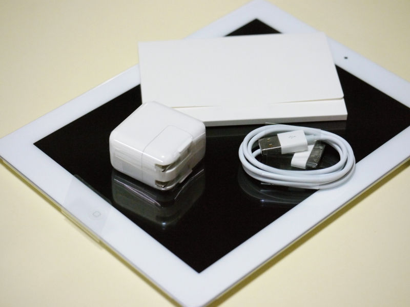
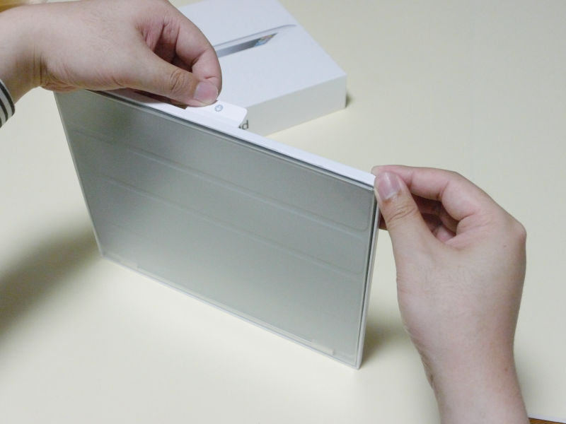
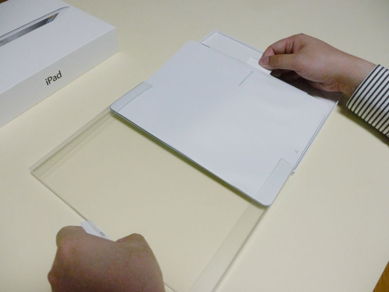
It will become like this when you pinch with it. You can remove the iPad 2 with this.
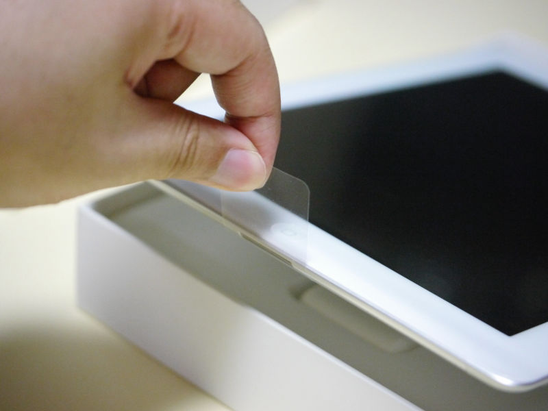
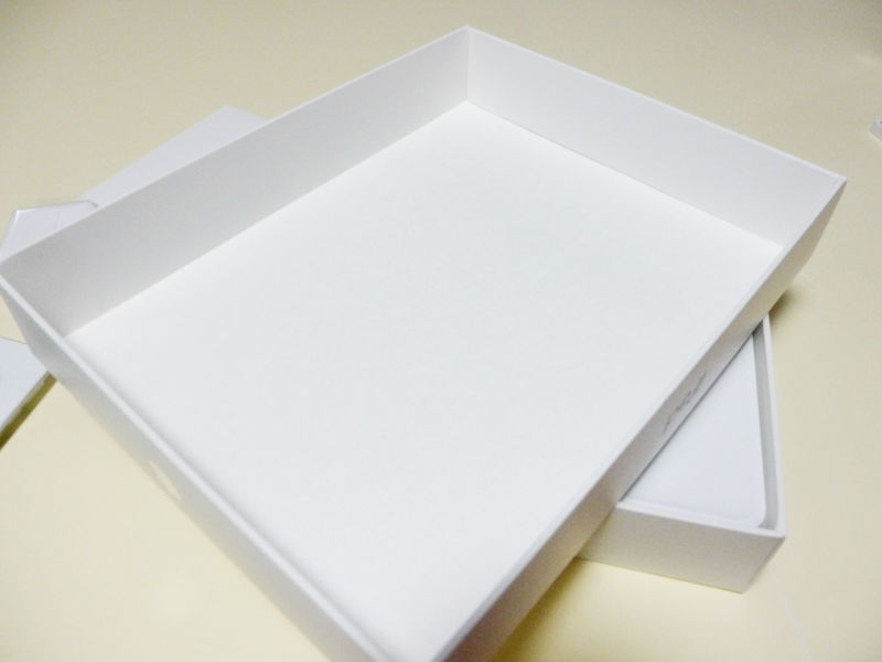
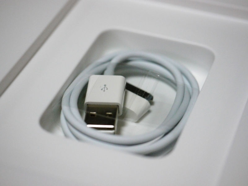
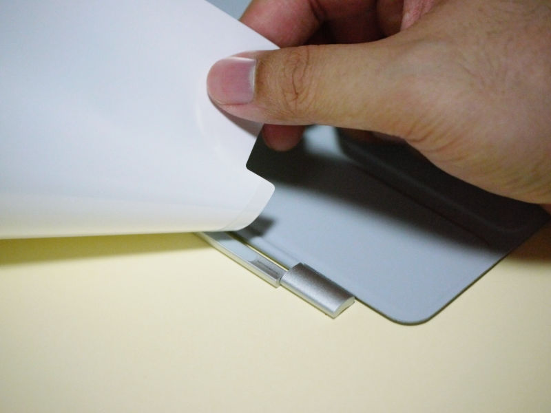
When you take out the iPad 2, you see nature and two things at the bottom.
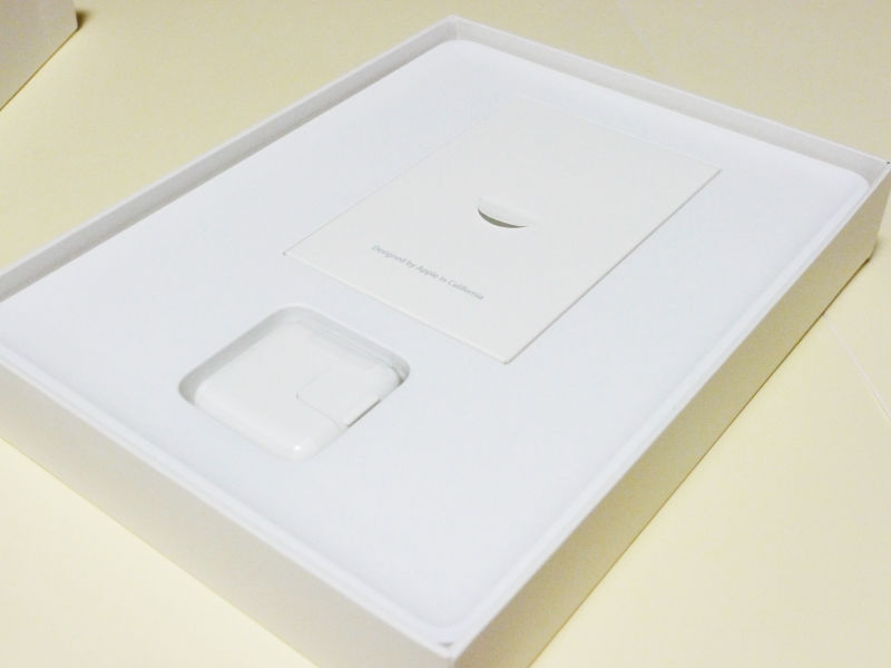
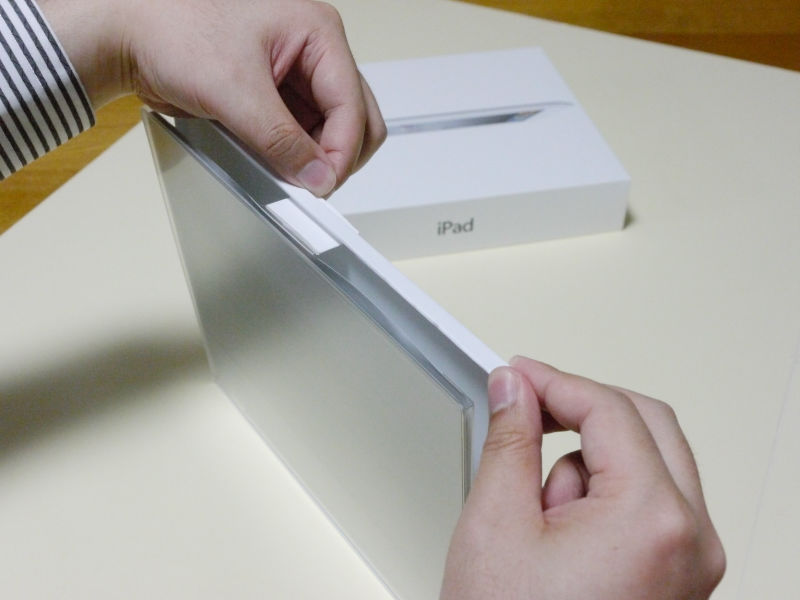
Like the 10 W USB power adapter for charging, the transparent film comes out with the same way, so you can see that pulling it is enough. It is easy to understand by adopting the same method as the iPad 2 just before, so it will not be possible to reach here unless you take out the iPad 2. So if you can take out the iPad 2 you can retrieve it naturally. The method of pulling this transparent film has been adopted here and there, and it can be seen that it thought about a method that can be used in as few places as possible, but in every aspect.

It will look like this when it is taken out.
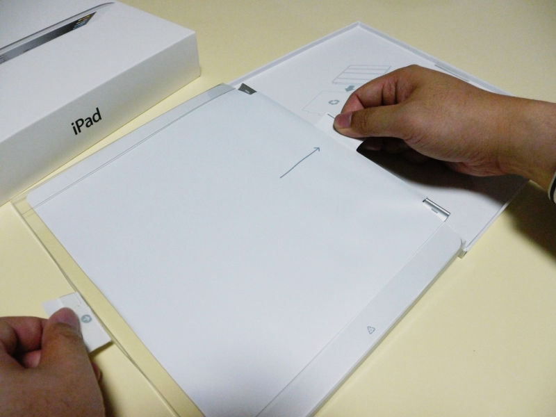
More precisely, "pulling" is a common action, so you can pick up this paper package coming out after taking out iPad 2 and pull it.
Then there is something further below that

I came out with an Apple Dock connector USB cable. Even here, we are thoroughly stating that "there is something further under it when something goes out", and you can take out nature and all the packed items. Unlike competitors' products that are pushing accessories into strange gaps, by making them stand out like this it prevents the trouble of forgetting to bring out accessories from the box.
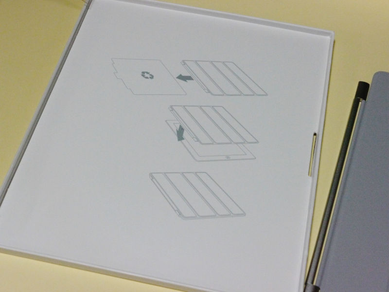
Well, this paper package looks like this. Let's open it.
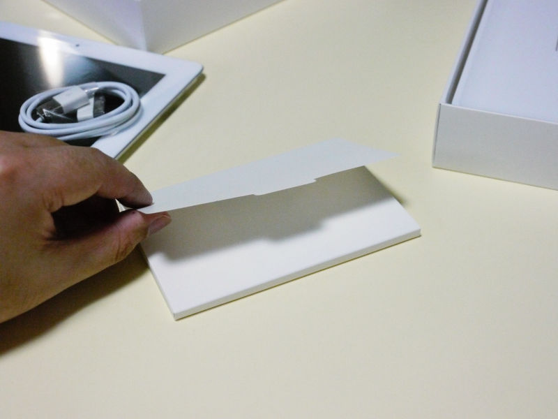
Then it is designed to open in this way, so that you can see everything that was wrapped inside.
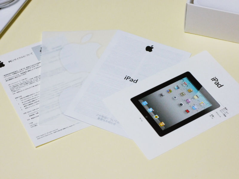
4 pieces of explanation · announcement · seal · explanation of PC recycling are included in the inside. If the direction to take out from this paper package is to slide out from the side, if it is the same as the general product of another company, you can check whether you can take out all that is inside, looking in from the side of the box, upside down It is obvious that it contains this 4 pieces as long as it is open with this puzzle and this also obviously also makes it difficult for the user to overlook the Apple package It is the part that feels the will of the design.
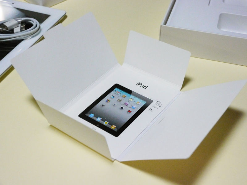
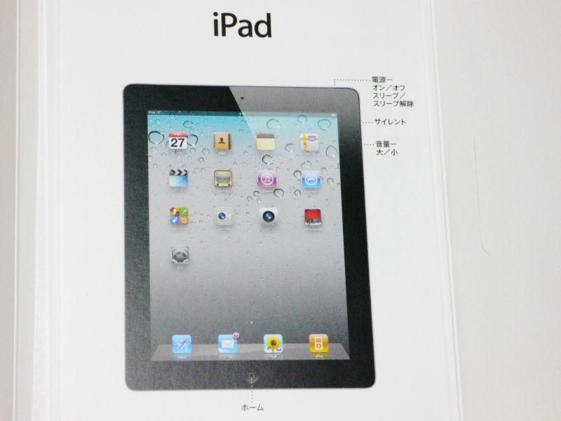
Instructions themselves are simple and simple
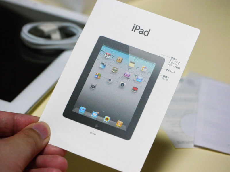
This is the only surface.
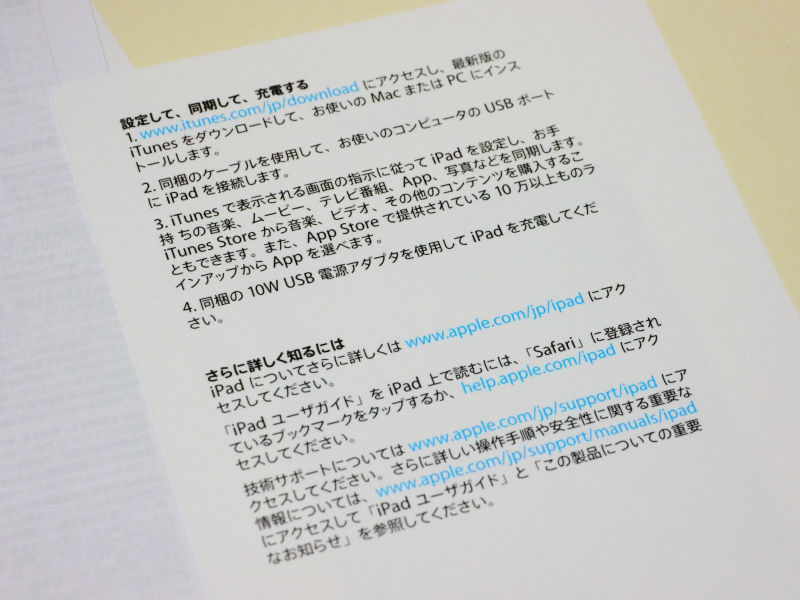
The back side is narrowed down to setting, synchronization, charging, and more than that, look at the official website, and it has become. Even if you have written a lot of instructions, those who begin to use them thoroughly are minority. For the time being, most people should turn on the power to use it, especially if it is an Apple product, there should be many users "I want to touch first!" That is why I will keep the explanation until I touch it at the very least and let me use iPad 2 while keeping the expectations and excitement when opening the package by using it anyway immediately. In other words, as this package itself costs money, it sometimes implies that you save costs by omitting instructions. Instead of omitting the cost of instructions, we are turning that money into packaging design, thereby improving quality and user experience.
After all, this is all that is in that big package. Although it should be able to store it in a more compact package if you want to do it, even if you raise it dare to create a lot of wasted space, you can see clearly that you emphasize the user experience. In addition, conversely, by making a lot of empty space in the package itself by raising it up, it also fulfills the role of cushioning material, at first glance it seems that it is useless only by design aesthetics and philosophy Even with that, I can understand that it is trying to rationalize thoroughly, to eliminate waste, to make it simple, and to understand well.
The idea of this packaging design is thorough, for example the same as Smart Cover for this iPad 2 only cover.
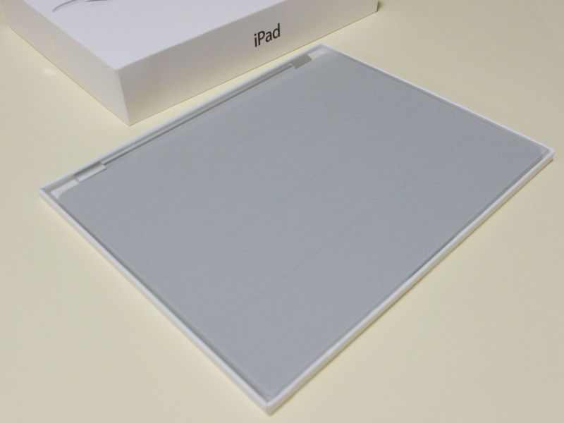
The surface is not an image picture of the product itself, but it is made to make the product itself stand out by making it a transparent cover. In the case of the iPad 2, since it is a simple plate of white and black as it is in a state where the power is not turned on, actually it does not do much, but if it is a cover, there are actually various colors, rather than printing an image photograph poorly It is a design that was conscious of putting it in the shop called transparent, making it more noticeable and easy to understand.
The back side is like this.

In this way, even if you do it again, "Pull this place" and say Hirobiro. Let's pull it.

When pulling it out, you can see that there is something on the back side as well. Moreover, it is an arrow when looking carefully.
In other words, it can push in this direction.
As for what actually happens ... ...
It will be like this. The transparent part of the table is out of the mechanism.
Next time you open it there is a Piroppi in the middle again and the direction is indicated by the arrow.

Pull this way.
I will come out when the cover is done.
And this pulling part itself sticks to "Smart Cover" in this way, peeling quickly, no marks left.
Instructions on how to do this after taking out "Smart Cover". I omit the explanation with the letter also.
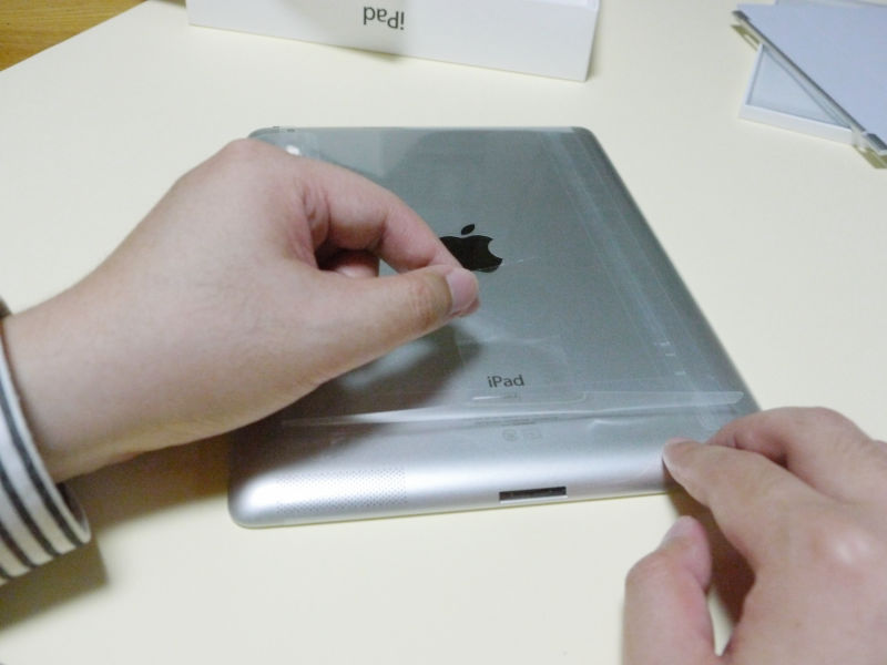
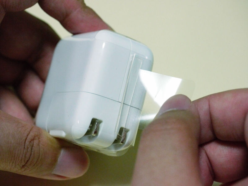
The "pulling" mechanism is the same when peeling the protective film of the iPad 2 itself like this
The protection film of the USB power adapter is also the same, a "pulling" mechanism.
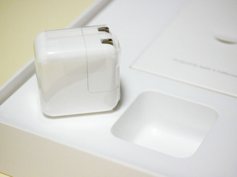
Although we derail slightly, the packaging design that you can see by seeing with this eye is on the extension line of the product design itself, this USB power adapter is quite blatant. All the corners of the main body itself are rounded, in order to ensure safety. If it hits right angle it hurts and it is dangerous.
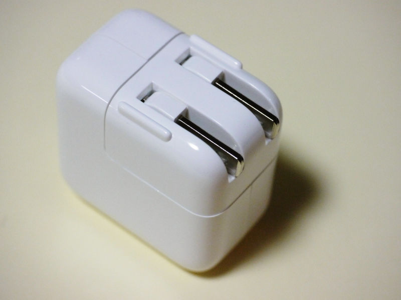
Still it is obliged to protrude the outlet portion by solving this way

Insert the supplied USB cable here.
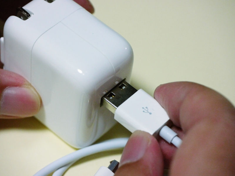
Then it becomes like this.
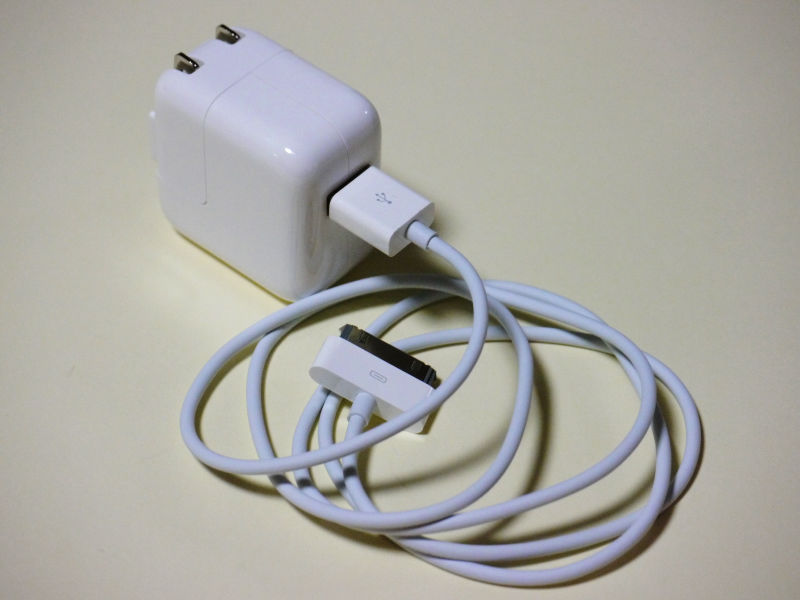
Synchronization with the personal computer and charging are made to use the same thing centered on the attached USB cable, not only the concept of trying to reduce the number of parts as much as possible, but also the packaging design and the fundamental to make it as simple as possible Are the same.

Let's take a look at the optional dock "iPad Dock"
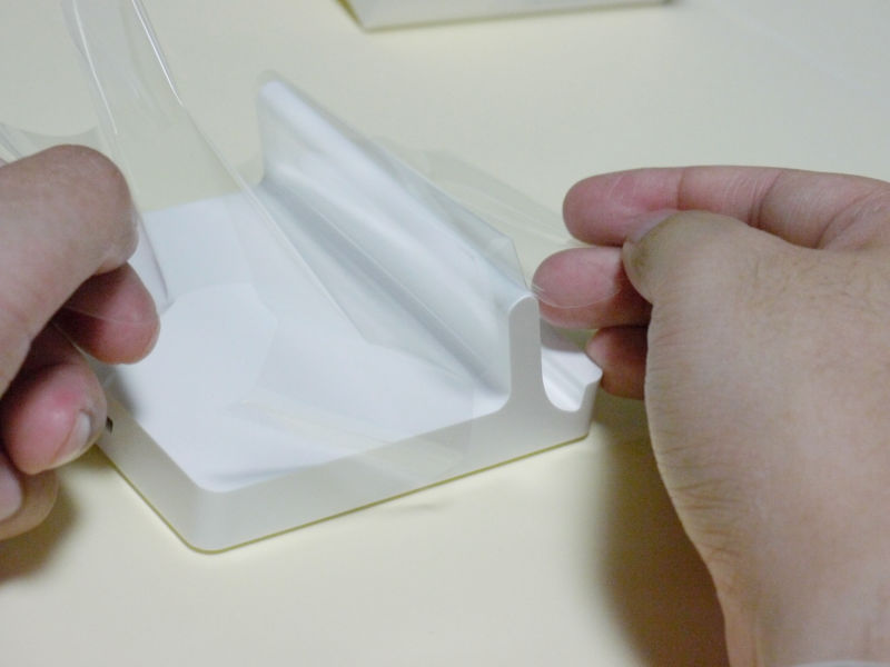
In the same way, you can open it by pulling it here. Or, in addition to here, there is no "pulling" part. If you pull it you will feel that it sticks quite strongly.
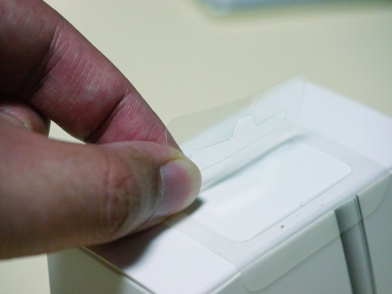
But in this way, if you put more than a certain amount of force, you can peel off the rest. Unlike the strong adhesive material of the past, adhesion ingredients do not remain too much.

It opens with a spur.
I also pull the transparent film in the same way. A little bit.

Peel and peel off

Stroke
Along this characteristic curve, you can remove it for a moment
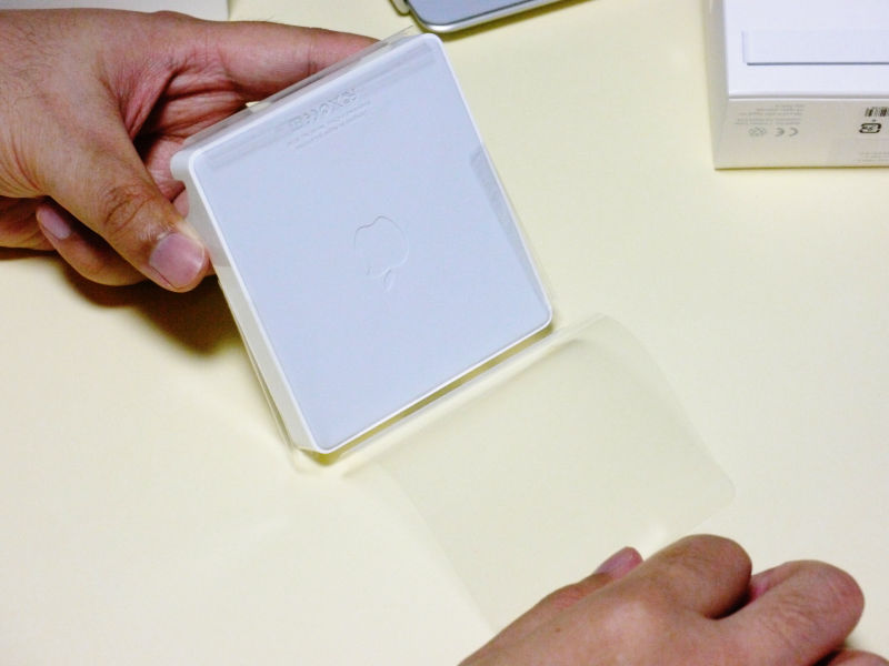
This dock itself is also splendid and excellent design
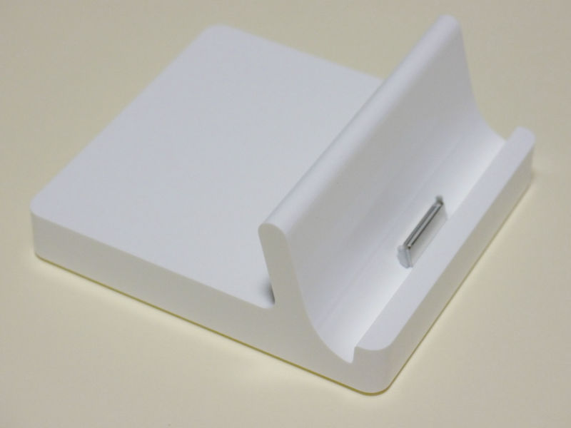
If it is a regular product, the logo will be placed on a white, large face that always looks like a table, but in the case of Apple, the logo is placed on the rubber-like non-slip portion on the back.

Although this also means "to make the surface clean and simple", the logo on the back side is not printed, if it looks closely, the material itself is dented. The reason is that there is more caution than a flat surface, and the one that is uneven increases friction. In other words, the Apple logo is not only design-wise but also irregular, which is a wasteful design.
Moreover, when thinking carefully, since the back side is surely visible when peeling off the film, it is a mechanism that absolutely notice the existence of this logo, "When putting a logo in this place behind the table, It is unfriendly with modest assertion, and it is surely Apple! " The function as a slip prevention, the simplicity of not daring logos on the table, we realized both of them.
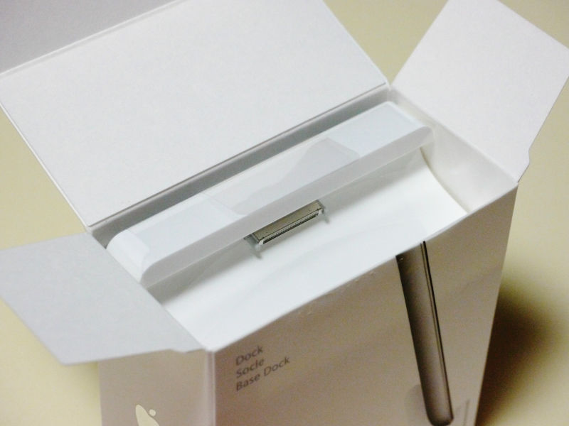
To reduce the number of parts and simplify, you can use the accessories for connection between the dock and iPad 2

Insert with this feeling
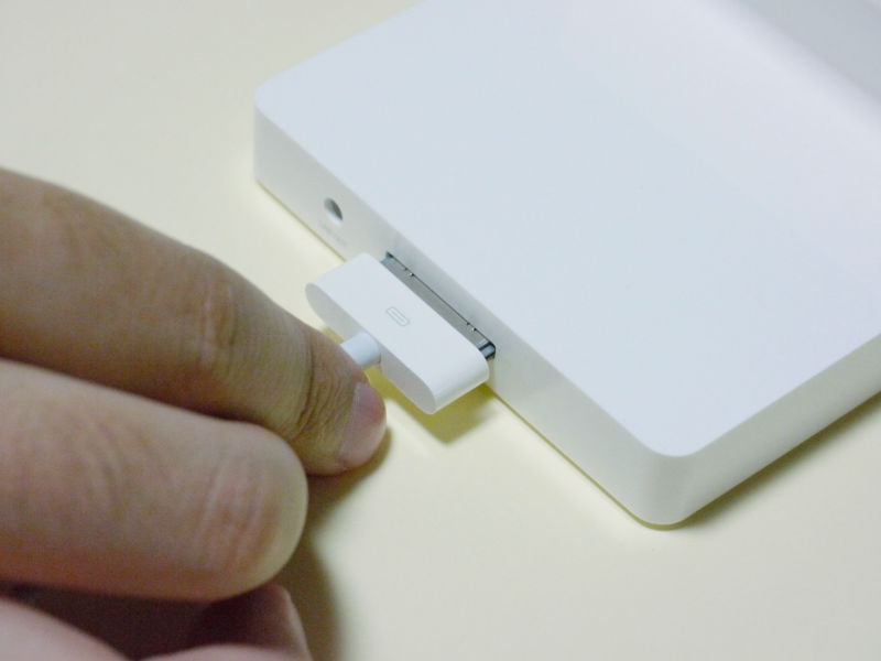
It will be
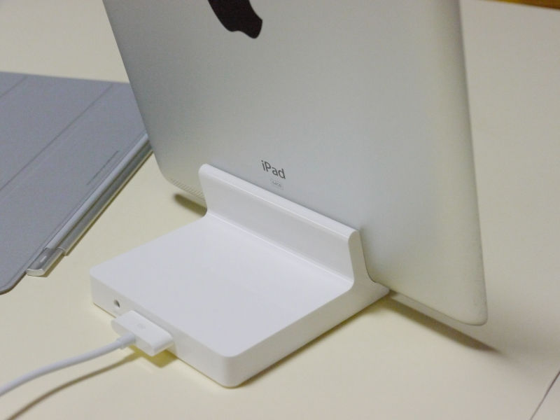
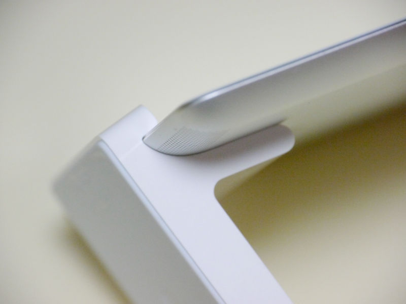
Please note that this dock is exclusive to the iPad 2, so as you can see, it is a form that fits perfectly.
In this way, Apple considers packaging design and product design both in the same way of thinking with exactly the same design, and taking into consideration the functionality, usability, and furthermore the cost, it is completely useless design Establish, never Steve Jobs's hobbies and aesthetics, not just preferences,Thorough rationalization and simplicityYou can understand that it is at its root.
Certainly it is convinced in a sense that Apple can be enthusiastic as long as it is thoroughly done.
Related Posts: