A map showing how much employment has been lost in the US

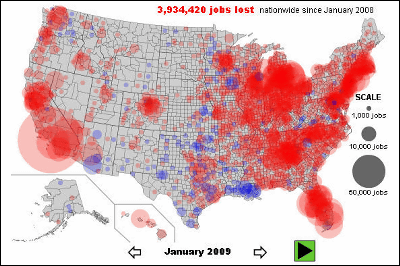
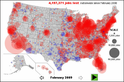
There seems to be a map showing how much employment has increased or decreased in the United States. Looking at this map, employment is suddenly lost from a certain time and you can see how severe the American economic situation is. It also makes it easier to see which areas of employment are being lost.
Details are from the following.
An interactive map of vanishing employment across the country. - By Chris Wilson - Slate Magazine
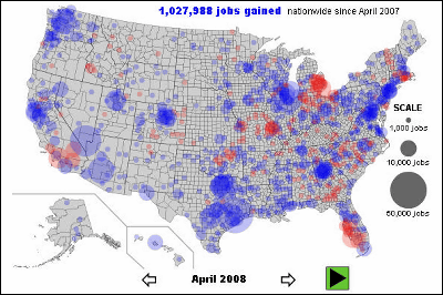
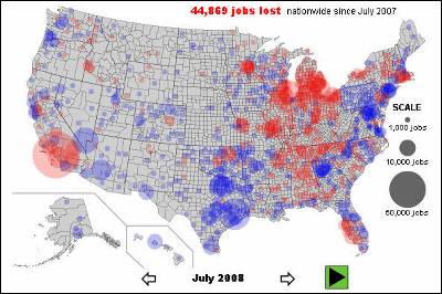
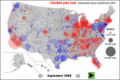
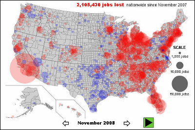
This is a map showing the change in the number of employees. Where employment has increased in blue areas where employment is lost where red is becoming red. It is stated how much employment number has changed in the total above. Also, with the original source, when you hover the map on the map, the increase and decrease of the specific city's employment is displayed.
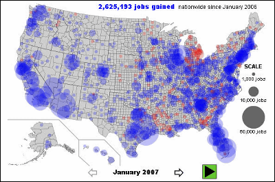
From January 2007 to June 2008, you can see that the total number of employment is increasing or decreasing but the employment is increasing.
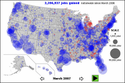
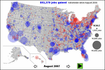

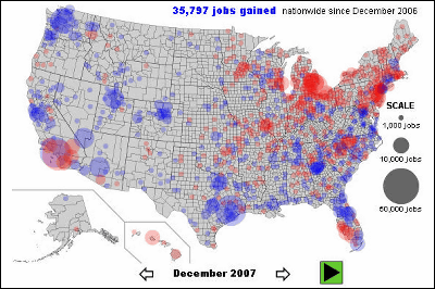
For the first time in July 2008 total totals are negative.
In September the minus entered the 6 digit range.
In November 2008, the number sharply increased and it will exceed 2 million. Especially the situation in the eastern part is terrible.
The number of lost jobs doubled thereafter.
In February 2009, about 4.2 million jobs seem to be lost.
Related Posts:
in Note, Posted by darkhorse_log


