Japanese Amazon is testing a new site design
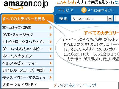
JapaneseAmazonThere is a test of a new design and it seems that this design is suddenly displayed depending on the person. Unlike old old designs, new designs have become more convenient in various ways, and Amazons which did not understand well what is somewhat easier to use might be.
Details are as below.
Amazon.co.jp New site design introduction
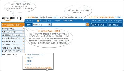
Four items of "seeing items", "searching", "saving", "purchasing" are concentrated on the top page and it is easy to do, and the width of the search form is also expanded. The "Wish list" and "Shopping cart" buttons also become conspicuous, and always display useful links such as "Amazon points", "Gift Certificates", "Bargain Information" etc. in the top area. The color has changed, and it seems that the blue color of the upper navigation bar got a bit brighter.
So this design has already been adopted by overseas Amazon, so you can easily try it from the following link.
Amazon.com Online Shopping for Electronics, Apparel, Computers, Books, DVDs & amp; more
http://www.amazon.com/
Related Posts:
in Web Service, Posted by darkhorse
