It will become like this when changing the map of the world to various data
We changed the size of the world map according to the size of alcohol consumption and military expenses etc in each country. For example, if the map is a map according to military expenses, America is becoming too big or exports of toys are so big that China is so big that Asia is distorted.
Details are as follows.
How the world really shapes up | the Daily Mail
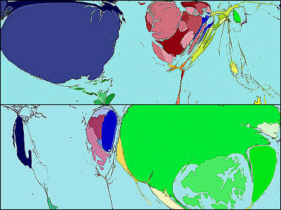
Alcohol consumption map. According to the image, Germany is quite large. It seems that Luxembourg and the Czech Republic are considerably consuming.
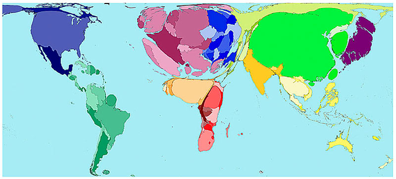
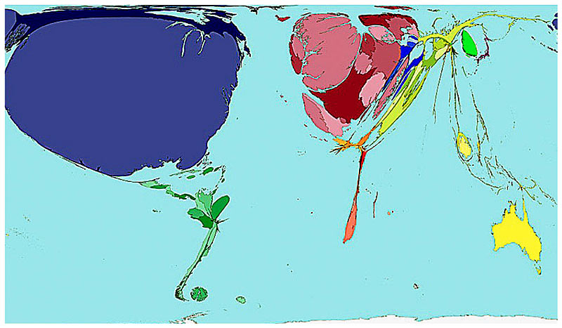
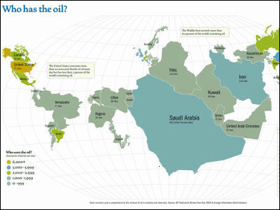
Military expense map. The United States is outstanding, followed by China, Japan and the Western countries. Australia, South America, Africa are few.
House price map. It is considerably high in Japan and Europe, cheap in Africa and South Asia. In the UK it seems that a housing boom is just happening.
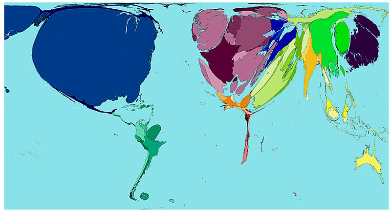
Export map of toys. It is a map that does not know what form is originally, but top is China. The light green part is Hong Kong, it is not a country, but it seems to be the export base next to China. It seems that export industries of toys were boasting in the UK in the past, but it has almost disappeared.
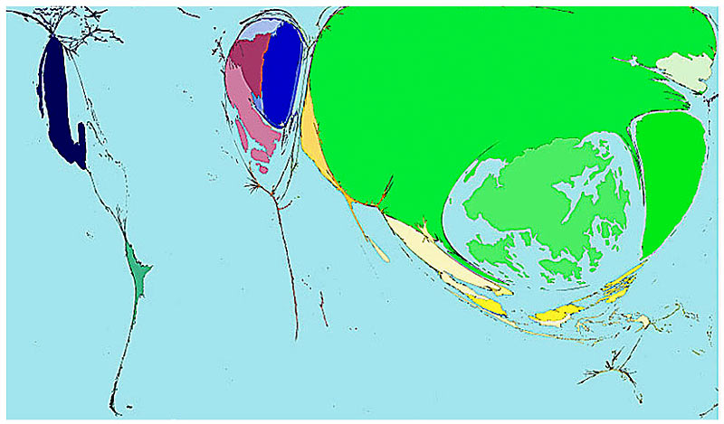
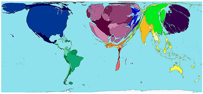
This is a toy import map. Anyway, the huge is America, Britain and Europe. Almost no Africa. Japan is not outstanding unexpected.
There are other HIV epidemic maps etc.
Related Posts:


in Note, Posted by logc_nt