You can see something you could not see in 'Population Mountains' showing the population distribution of the world on 3D map
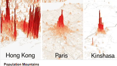
Journalist Matt Daniels made a public release of " Population Mountains, " which displays the population distribution of cities around the world on the map in 3D, so that the characteristics of each city can be seen at a glance. A city with a gentle slope like a mountain in the population distribution, a city with a clear distribution of distribution like a building, etc. are clearly understood, and when it is combined with the problems of each city, it becomes very interesting It is.
Population Mountains
https://pudding.cool/2018/12/3d-cities-story/index.html
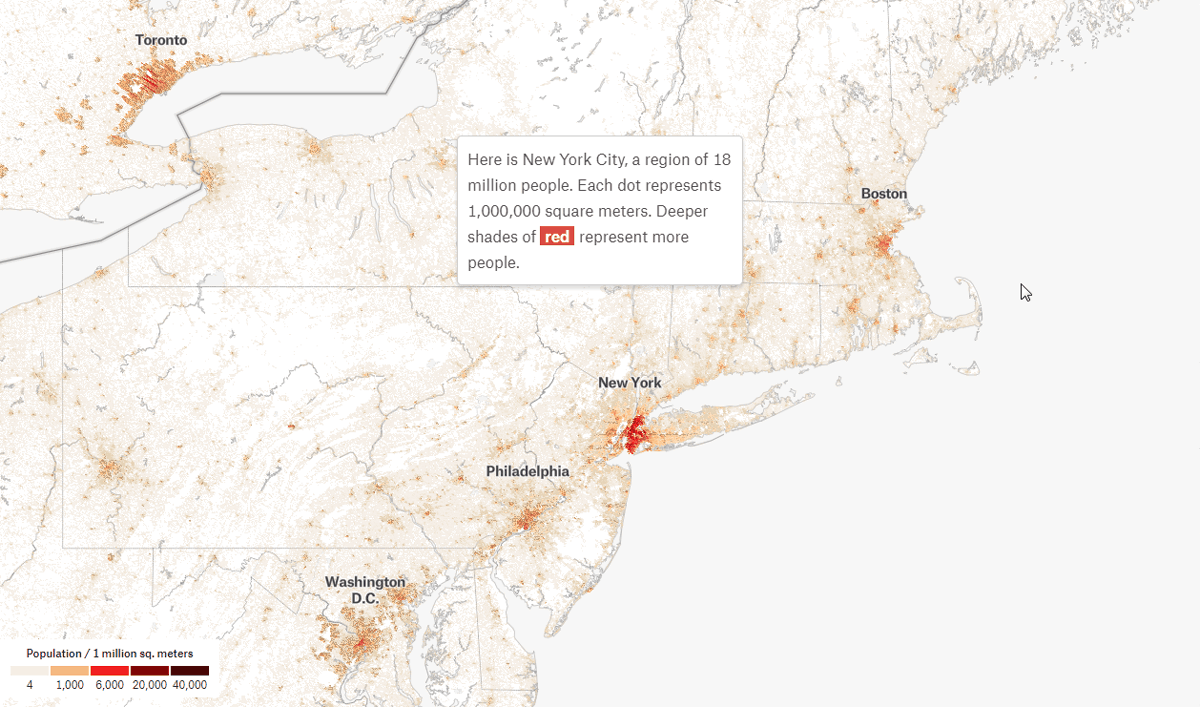
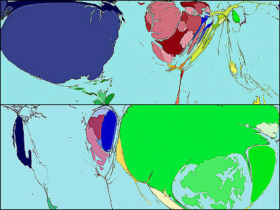
When you access the above page, the following map will be displayed first. The red darkness on the map shows the large population, one dot means one million square meters, and the more dots the color is, the more population there are. On the upper left of the screen is Toronto in Canada, along the coastline from the left from Washington DC, Philadelphia, New York, Boston. Especially the red in New York is bright and you can see that there are many places where more than 6000 people live per million square meters. As you scroll through the screen of the webpage ... ...
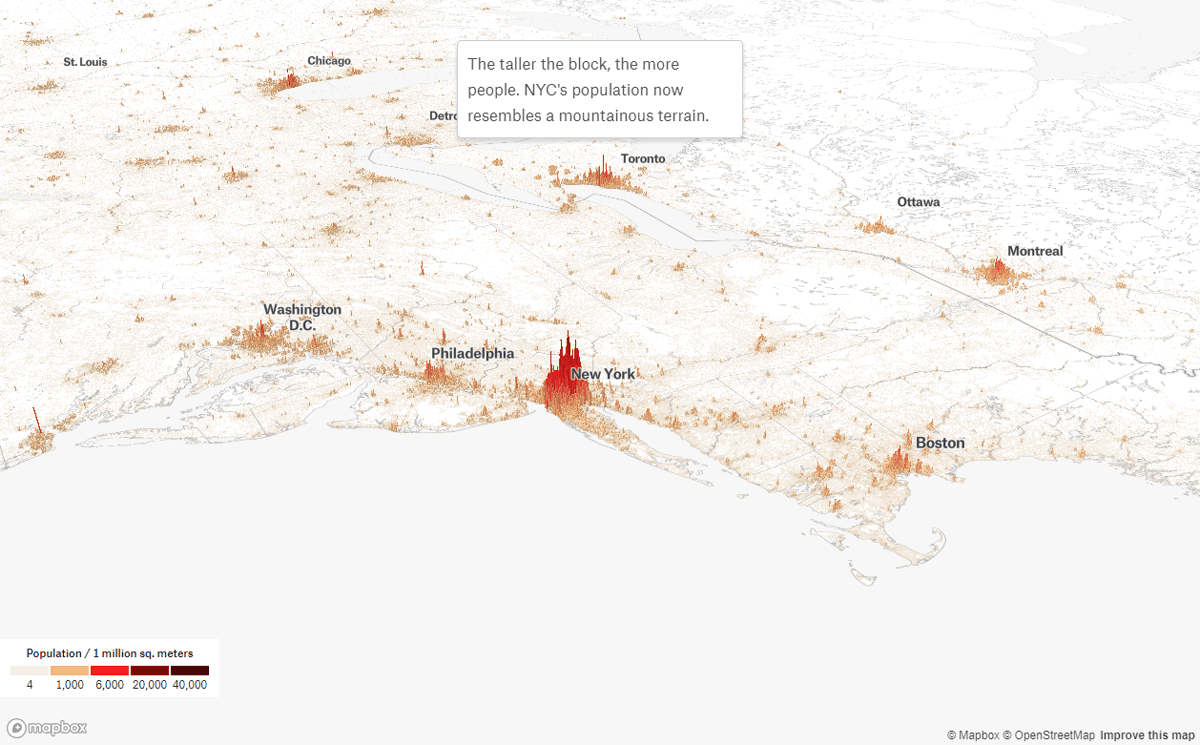
Next time the map is on the 3D map. The dot height also expresses the population per million square meters, and you can see that the inclination of the "mountain" in New York is particularly steep. It was intuitive to understand the population density which was difficult to understand by planar color coding.
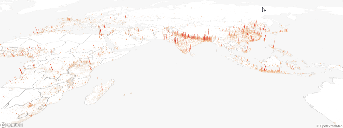
Looking at the 3D map on the scale of the world map looks like this.
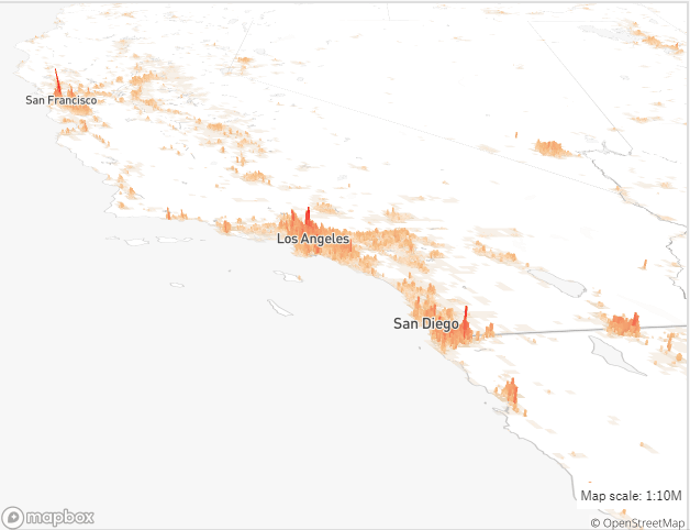
Looking at the population distribution in 3D, we can see how the population concentrates in different cities. For example, in San Francisco, Los Angeles, San Diego in the USA it is an impression that independent mountains with "center" lined up beautifully ... ...
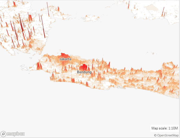
In Java, Indonesia, although population concentration is seen in Jakarta and Bandung, the population is distributed throughout the island.
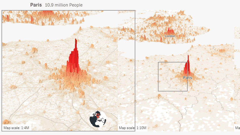
Furthermore, looking at Paris in France it is like this. The map on the left is an enlarged map of the right side. In Paris "vertex" is clear, and the slope is steep mountain. People also live in the suburbs, but the areas where people do not live are also clear.
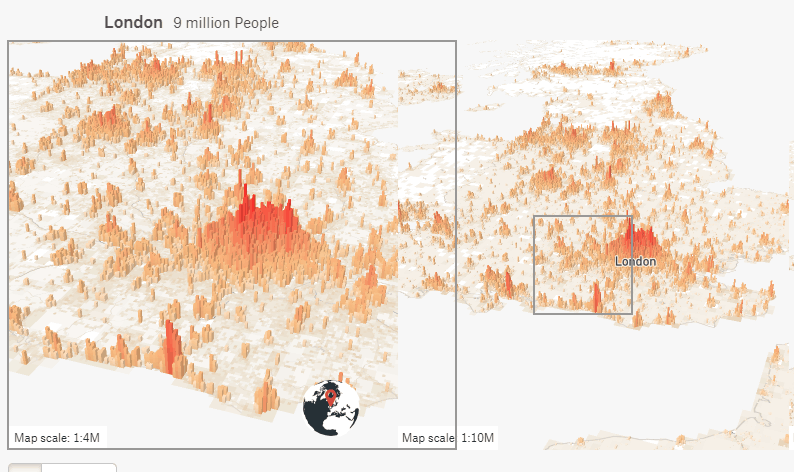
Meanwhile, London in the UK has become a relatively gentle mountain, people live in all directions compared to Paris.
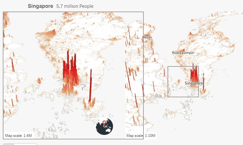
In the case of Singapore it looks like a skyscraper that lined up rather than a mountain. In Kuala Lumpur, Singapore listed as a successful example of urban planning, the population has increased rapidly over the last decades.
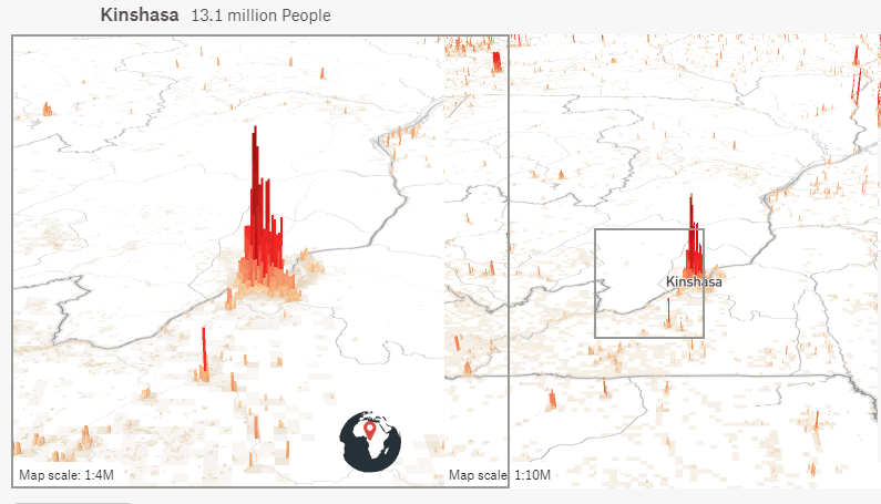
Kinshasa of the Democratic Republic of the Congo, counted as one of the cities that grew rapidly since around 2001, is out of the map. This is believed to be due to the difficulty of access to the city center from the surrounding area, unlike the suburbanized cities in Europe, because the transport network has not developed.
Angola's capital city Luanda is said to have the world's highest price. Luanda also has a clear difference in the population distribution between the center and the rest of the city. It is said that in Luanda the population will reach 12.1 million people by 2030.

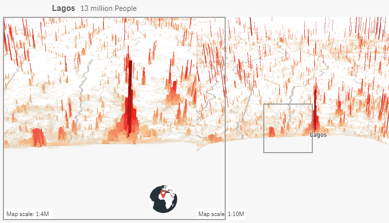
Compared to Kinshasa and Luanda, the city is spreading around Lagos in Nigeria. Lagos is expected to become the world's largest city by 2100.
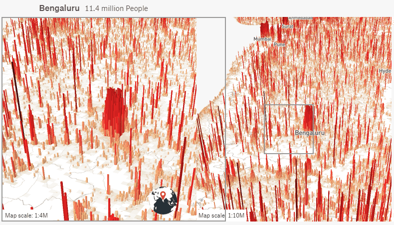
The whole country was stained red in India.
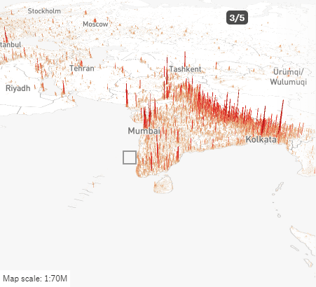
Especially in Bangalore you can see a red lump, but this is because Bangalore is called "Indian Silicon Valley" and the university and laboratory are concentrated. However, the rapid growth of Bangalore is not planned, pollution is a problem, diseases are increasing, and there are an increasing number of people leaving Bangalore. Some view that Bangalore prosperity will not continue in the future.
Below is a map of China.
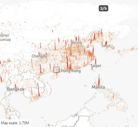
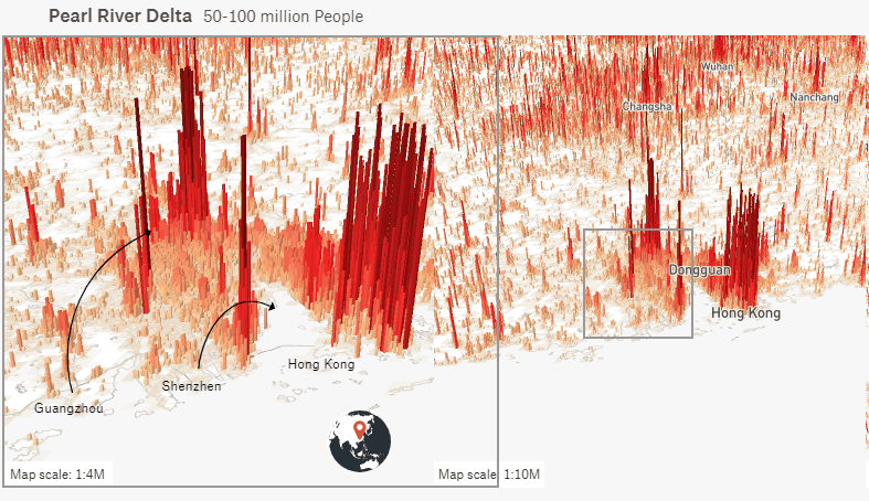
In the Pearl River Delta, the population of Guangzhou City, Shenzhen, Hong Kong is prominent, but as the center grows, the population increase is also visible. The Pearl River Delta said the British population is comparable to Britain.
Related Posts:


in Note, Posted by darkhorse_log