How was Google's office built?
It is a famous office space from Google, but there are people who designed it of course. New York workplace consultancy company DEGW and Los Angeles based Clive Wilkinson Architects are in charge of designing and designing Google headquarters in California.
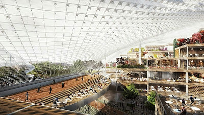
The concept of a new workplace design that we have reached through long meetings seems to be aiming for an open office space to do creative activities and change the concept of working to relax.
Further details are as follows. There are also Google's initial office plan that was unpublished so far and the unusual office panorama.
Behind the Glass Curtain | Metropolis Magazine
Basically, Microsoft designed the head office with consciousness of the university as called "campus", Google seems to design it as "boutique hotel". According to the designer Wilkinson, the image is like the "town square", the lobby where the visitor comes in is compared to the "waiting room", and the huge staircase is attached to the center. There is a certain atmosphere like the station and the square square in front of the station as it is told. There are a lot of young people who hang out in front of the station, and a design like that may bring out the feeling of being able to relax.
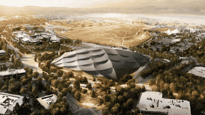
A look of the Google head office building group from the sky
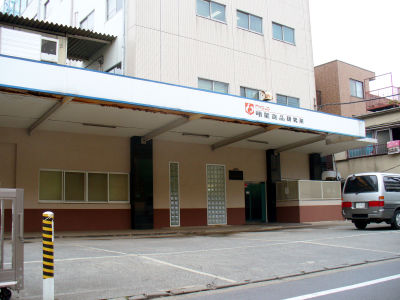
In the Google head office building before being redesigned. It seems that SGI used it.
Initial rough design
In addition, it seems that this office design process is also playing a role in making the air in the workplace friendly. It seems that there are many requests that you want to design an innovative and unusual workspace as a common tendency, but in the case of Google this time, the people working are various races, the right brain and the left brain as well In light of the fact that there are a lot of tasks requiring a large number of tasks and requiring a concentration force of an order of magnitude, we have studied various working environments, and it seems that it was designed to be sufficiently established as a living environment.
Proposal to partition with glass wall
Final floor plan. It is designed to allow light to enter anywhere
The final design one step forward design
So during the meeting work for design etc., two founder of Google did not show much interest in design aesthetics or that kind of thing, how to put an example of labyrump and a variety of toys which is also a kind of symbol for Google I heard that he was struggling to do it. So why was it eventually like feeling like a toy box ...?
Sketch of idea how to connect public space and private space
Design that came out at the end of the idea of where to store books and magazines
The famous cafeteria was not designed.
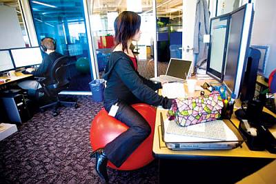
This central staircase seems to have been built on the assumption that it sits there and opens a laptop computer.
It seems that it was extremely difficult to make a design plan. Because Google is essentially a workplace where people from engineers work, we have to explain what kind of reasoning leads to the conclusion that this design is good, and on what basis it is this It seems that it was necessary to present various reasons and plans such as what will happen when design is adopted and what can be solved. Therefore, the team of the design office that he was responsible seems to have twisted his head if it was not even from morning till evening.
Those incorporating the colorful parts of Google
Ultimately, when deciding on the design design, present all types of samples, take a questionnaire to Google employees, how to actually utilize the space, what you do with the doctor As a result, it seems that it turned office design including zones based on 13 different designs. For example, in a clubhouse style office zone there is a billiards table and there is a lounge. It is already a messy ....
Place for brainstorming
Workplace that I can concentrate ...
Furthermore, we set them as markers 5 and 6 and divided them, so that the shared space was designed to come to the center of all. That is why it was made in the middle of the staircase. By using glass breaks to create an open atmosphere, it is easier for people to come and go and communicate with each other while concentrating on work by stereoscopically combining them. Did you say that the hard work of the past worked as fruit around here?
Also, the reason for the large number of glass on the outer wall seems to be that two founder urgently requested that air and natural light be taken into the office. Therefore, it seems that sunlight and the wind blowing outside are designed to plug in as if it is an office doctor and blow. In order to make use of plenty of light, the ceiling is made of polyester fiber covered with acrylic, reflecting light and delivering light to everywhere evenly.
View from the side how sunlight is plugged in
Workplace separated by glass
Newly designed light panel
Looking at this way, I've done a lot of different things.
By the way, the office updating GIGAZINE also moved to the newly reformed office building 4th floor from the first floor of the company building at the end of last month. Because there is too much difference between heaven and earth, I will report it as an article. Look forward to next week.
Related Posts:

in Design, Posted by darkhorse_log