Update to make the standard 'red' color slightly darker in Word, PowerPoint, etc.
Microsoft has announced that it will update the standard red color for Microsoft 365 to improve accessibility. This change applies to Microsoft Word, PowerPoint, Outlook, and OneNote for Windows and Mac.
Improving accessibility: Standard red gets an update in Microsoft 365
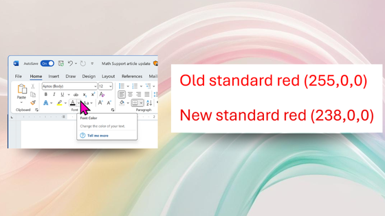
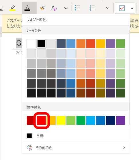
The color that has been decided to be changed this time is the 'standard red color' surrounded by the red frame below.
According to Microsoft, the previous standard red (RGB: 255,0,0) did not meet the contrast standards of the Web Content Accessibility Guidelines (WCAG) when used as body text on a white background. Therefore, Microsoft has changed to a slightly darker red standard (RGB: 238,0,0) to increase the contrast ratio and meet the WCAG standards.
You can compare the actual colors in the table below.
| RGB | Color Code | color |
|---|---|---|
| 255,0,0 | #FF0000 | |
| 238,0,0 | #EE0000 |
While the difference in color tone is hard to notice at first glance, improving color contrast makes red text easier to read, especially for people with visual impairments or color vision deficiencies.
This update is available for Windows version 2411 (Build 18324.20012) and later, and for Mac version 16.92 (Build 24120731) and later.
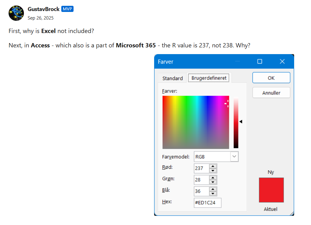
In addition, a question was posted on Microsoft's official blog asking, 'Why isn't Excel included? And why is the value of R in Access , Microsoft 365's database management software, 237 instead of 238?' However, at the time of writing, there was no answer.
Related Posts:


in Software, Posted by log1i_yk