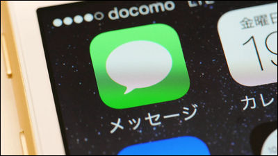
Pointed out that Apple practices a design that makes messages from Android users 'dare' green to make them uncomfortable
In the messaging app '
One trick Apple uses to make you think green bubbles are “gross” | UX Collective
https://uxdesign.cc/how-apple-makes-you-think-green-bubbles-gross-e03b52b12fed
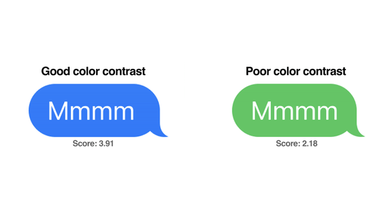
Mr. Sue prefaced that ``green is not difficult to read,'' and emphasized that the contrast of ``white on green'' and the light green chosen by Apple are the worst visibility. Guidelines for making web content easy to use for people with disabilities 'Web Content Accessibility Guidelines (WCAG)'Even if you test it, the green displayed on the iPhone can have a very low score compared to blue. I understand. Su notes that this score is considered a 'fail' in accessibility testing, especially for visually impaired users.

``Color contrast is important because it affects readability, and readability is everything in messaging apps. Thanks to the dark blue, iMessage users have a good experience when interacting with other iMessage users. and have a bad experience when interacting with Android users.'
The iPhone is popular with young users, but it is also reported that problems such as bullying are occurring among young people in the United States, especially because the bubble is green.
'Given Apple's vast design resources and talent, it's no coincidence that Apple intentionally chose a green color that makes reading Android's messages more tedious to keep users sticking to iMessage.' Su pointed out. “Apple builds great products and services like iMessage, and it makes good business sense to keep them dedicated to their users. Accessibility is a fundamental pillar of good design, though. So it's almost a universal rule for designers to never sacrifice accessibility,' he questioned the status quo.
Related Posts:
in Software, Smartphone, Design, Posted by log1p_kr
