Why are text links now displayed in blue?
You can move from one web page to another by clicking the link text that uses a
Why Are Hyperlinks Blue
https://blog.mozilla.org/en/internet-culture/why-are-hyperlinks-blue-revisited/
Liese Blanchard, a web designer at Mozilla, explains why hyperlinks are blue in the past, looking back at the history of web browsers.
Why are hyperlinks displayed in blue? --GIGAZINE
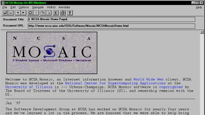
In a previous discussion, Blanchard pointed out that Mosaic version 0.13, released in 1993, was the first browser to display hyperlinks in blue. 'We could determine that Mosaic was the first browser to use blue hyperlinks, but we couldn't clearly determine why hyperlinks were blue,' Blanchard said. ..
Hyperlinks have been displayed in black for many years before Mosaic displayed them in blue. As a new hypothesis that this turned blue, Mr. Blanchard said, 'It is thought that RGB phosphorescent monitors are now readily available, whereas many monotonous phosphorescent monitors were able to generate only one color until then.' It is written as.
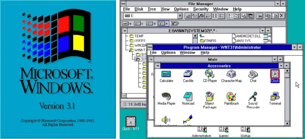
In addition, Blanchard considers why blue was adopted. In Windows 3.1 , released by Microsoft in 1991, hyperlinks were displayed in green. So, 'Before Mosaic version 0.13 adopted blue hyperlinks in 1993, there was something that browser developers Marc Andreessen and Eric Bina changed hyperlinks to blue. There must be no difference. '
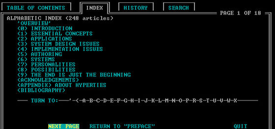
While investigating the origin of the hyperlinks that turned blue, Blanchard got the information that 'Ben Shneiderman has a connection with the blue hyperlinks.' Schneiderman was the person who developed the early hypertext system, and was also the professor at the Human-Computer Interaction Institute at the University of Maryland as the professor in charge of HyperTIES developer Dano Stroff, who appeared in 1983. I have. HyperTIES is software that should be called the ancestor of hyperlink that adopted hypertext, and the background was black and the text color was cyan.
At the time, Schneiderman said he was testing different colors for text display, 'red improves the visibility of links, but reduces the user's reading and memory, while blue is the background. Even if it is white or black, it has high visibility and did not interfere with the user's memory. ' ..
In fact, Schneiderman and his team published a hypertext-related
Furthermore, in 1988, Schneiderman and his research team published eight papers related to hypertext, all of which emphasized the importance of changing the color of letters.
Then, in 1989,
It is clear that Berners-Lee was aware that many hypertext-related papers were published in university research and hypertext conferences, and that he used blue in hypertext. 'Of course,' says Blanchard, who thinks he knew. However, it seems that blue was not adopted for the hyperlink of the web browser that Berners-Lee was developing at that time.
Later, in 1990, Berners-Lee and other developers began to participate in the hypertext standardization workshop, but even at this point there is no mention of adopting color for hyperlinks. .. However, it is not hard to imagine that Berners-Lee wanted to pursue readability in hyperlinks, as the workshop report mentioned that visibility was verified in hypertext. ..
In addition, a report by another researcher who participated in the hypertext standardization workshop also mentions that 'hypertext requires dynamic expression using colors and the like.' Therefore, 'Multiple papers related to hypertext were published and the importance of color was emphasized, and the industry standard of hypertext gradually became blue, which means that hyperlink will adopt blue. It led to, 'Branchard said.
In System 7 released in 1991, the background of the text when the icon is selected turns blue ...
Introduced in 1992, Windows 3.1 also uses blue as the color to indicate its active state when a folder or icon is clicked.
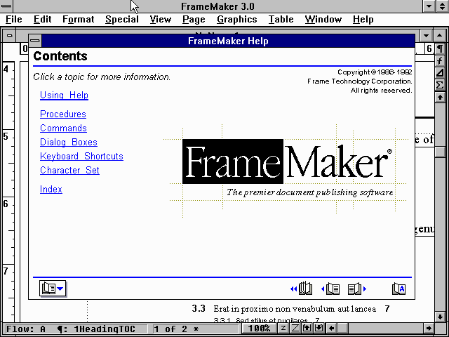
And even in FrameMaker 3.0 for Windows that appeared in 1992, the hypertext turned blue. 'Dark blue was the first case of hypertext being adopted,' said Blanchard, citing the fact that FrameMaker 3.0 for Windows was partly due to the adoption of blue, partly because it was compatible with color monitors.
After that, Mosaic, which first adopted blue in the hyperlink of the browser, appeared, but while it is unknown the direct reason why blue was adopted, 'Mosaic developers are the same as Tim Berners-Lee. It's clear that he knew of previous research, or that blue was being adopted as an industry trend, 'Branchard wrote.
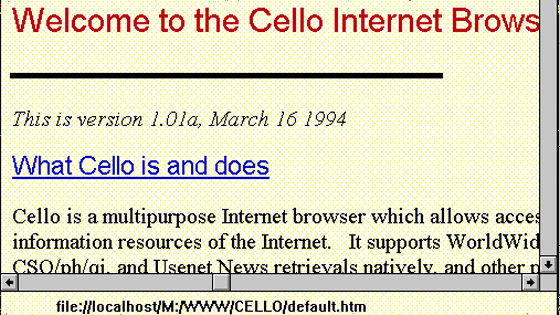
In addition to Mosaic, Cello and others have adopted blue for hyperlinks at an early stage. By 1993, 'because blue was becoming the industry standard for hypertext,' Blanchard points out, although it's unclear exactly what applications and papers have affected developers. I am.
Related Posts:


in Note, Posted by logu_ii