What are the 'only two points' to be aware of in order to triple the success rate of membership registration?

Needless to say, 'how to get users interested' is important when operating some kind of service, but 'getting interested users to register' is also an important factor.
Two lessons on reducing sign-up friction
https://bbirnbaum.com/two-lessons-on-reducing-sign-up-friction/
Cortado is a service that collects information suitable for each user from RSS and Twitter and sends it by email every day. Mr. Baanbaum, who decided that Cortado's development was advanced to some extent, tried to post the service in several forums in order to attract the first users. Initially, very few users who visited the site completed the membership registration, but Bernbaum says that it was possible to increase the success rate by roughly dividing it into two devices.
◆ 1: Do not design conductors that require the user's interest “twice”
Initially, the registration form looked like this: Once he asked the user to send his email address and sent an email to register to that email address. Sixteen people registered their email addresses from this registration form, but only six people clicked the link in the email. The problem with this line is that we had to get the user's attention twice, like filling in their email address and looking at their mailbox and clicking a link.
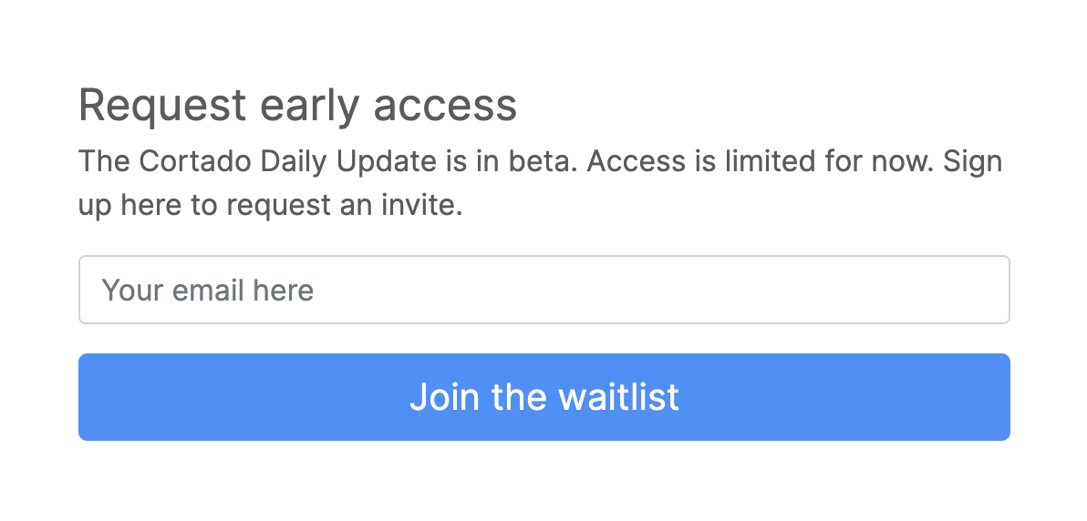
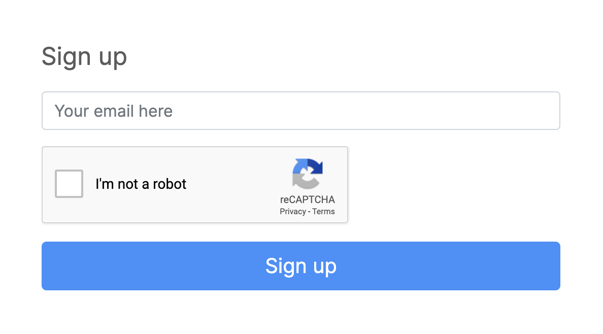
Therefore, Mr. Baanbaum said that he only changed to send a confirmation email to the entered email address and immediately move to the password setting screen. It seems that he introduced reCAPTCHA in order to avoid access by bot because the procedure for member registration became easier.
◆ 2: Make sure the link in the email is instantly visible
Initially, the confirmation email for member registration was the following message. The problem is that there are two links in this email, so when Mr. Baanbaum asked his friend to register as a member, he stepped on the link to the top page and said ' I can't do that '.
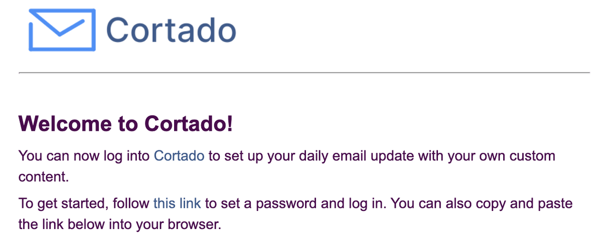
Therefore, Mr. Baanbaum made the number of links in the message one. I thought it was a relief, but Mr. Baanbaum got a message from one user that 'the link was not listed in the email'.

So, Mr. Baanbaum changed the design so that he could know where to click at the moment he saw it. Bunbaum said that many users were fortunate that some users sent me an email that the link was not properly given up.
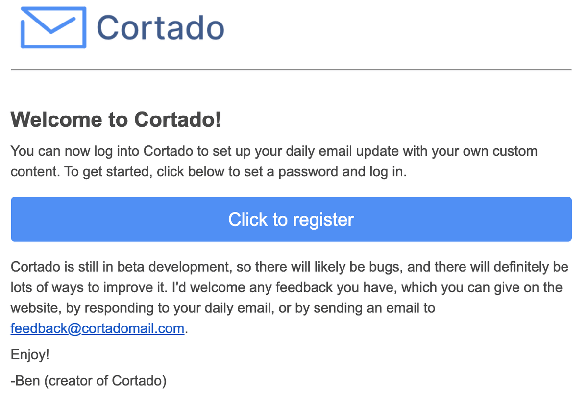
It can't be said that the changes in emails are the only cause, as other parts of the site have changed slightly, but by making these changes, the membership rate of visiting users has increased significantly from 5% to 18%. I was able to raise it to. Bernbaum says he saw how many users fail to register because of an easy mistake to make and learn how important it is to carefully design the registration leads.
Related Posts:


in Software, Web Application, Posted by log1d_ts