Making until the logo of the manga `` Brave and part-time life of company livestock '' is created
In the fantasy x company labor full-color comic ' Brave and livestock part-time job (desma) life ', the title logo that shows the image of the work at a glance is used in the door picture and the first episode last. We will send you the making with the commentary of the designer on how the logo design reflecting the color of the work was created.
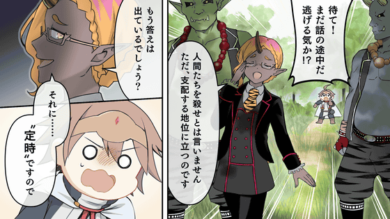
Manga can be read by clicking the image below. Please send your impressions and comments to the last Twitter link of the manga or the
The title logo for 'Brave and Livestock Lives Together' was created by Mr. Ryo Hiiragi , a designer who designs many logos such as ' No Game No Life ' and ' Grim Notes '.
Nice to meet you, freelance designer Hiiragi Ryo.
I am in charge of logo design, light novel / comics binding, package design, etc.
This time, I will explain about making logo design.
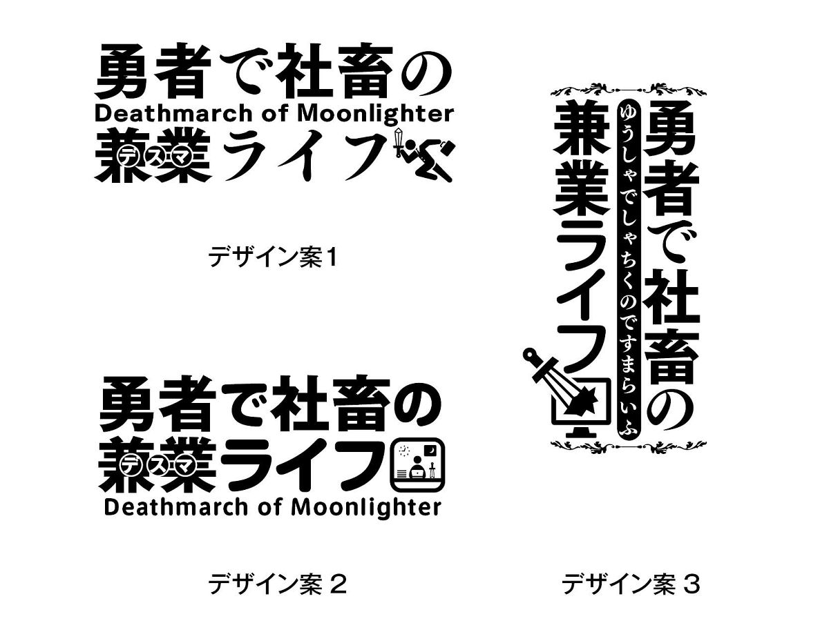
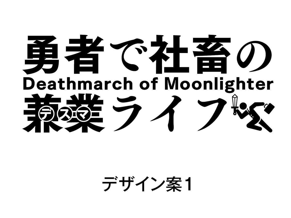
Ryo Hiiragi: First, I created three initial roughs. In order to create a fantasy feeling, while giving the overall comicality, 'Maru Gothic body = comical feeling' and 'Mincho body = fantasy' I use it in the form of `` feeling. ''
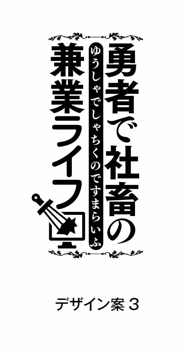
Ryo Hiiragi 'The three are the most fantasy-like images. The icons are based on the hero who is a company employee (slaughter) but must swing his sword.'
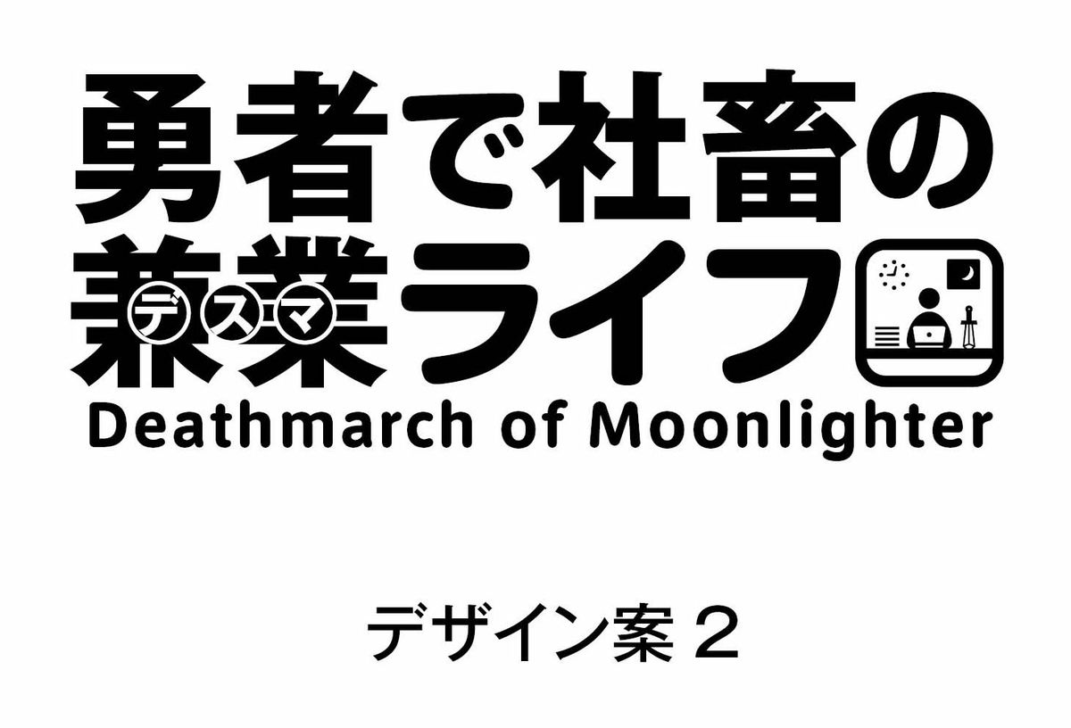
Ryo Hiiragi: The area around the characters is softer than in Design Plan 1. This is a form in which icons that are overtime at the company are placed in the same position as in Design Plan 1.
Ryo Hiiragi: Unlike 1 and 2, it is vertical rather than horizontal, and the character surroundings is based on Plan 2. The icon here is 'I do not want to work' rather than working (PC with sword Is destroyed) ''
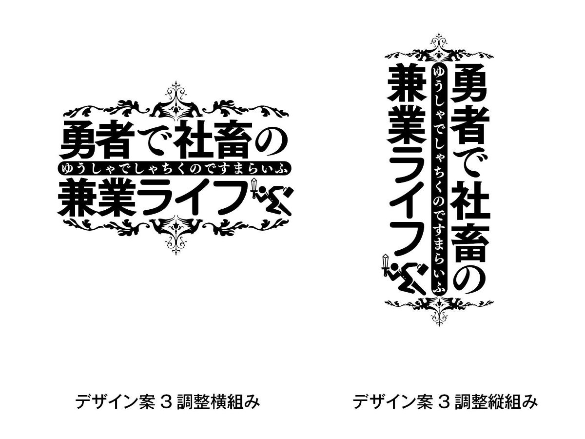
As a result of superimposing the wishes and findings of the editorial department and manga authors, 'the design with the emblem decoration & hiragana in the center of the plan 3 is good' 'the icon is especially favorite of the plan 1' run with a sword and bag ' , So we asked for a retake in the form of 'adding 1 icon to 3 design proposals' and 'I want you to create 2 vertical and horizontal patterns'.
Ryo Hiiragi 'The basic plan consisted of design plan 3. We replaced and added partial elements of design plans 1-3. Crests (patterns) at the top and bottom of the logo to strengthen the overall information volume and impression ) And readjust the balance. ''
Ryo Hiiragi 'Because the basic structure has been solidified the last time, I will start to work on the color scheme. The main words are composed of three words,' hero ',' company animal ', and' part-time job life ', and the overall outline is doubled to improve readability. In order to create a sense of unity, the color of the entire edge and the color of the crest ruby are the same. '

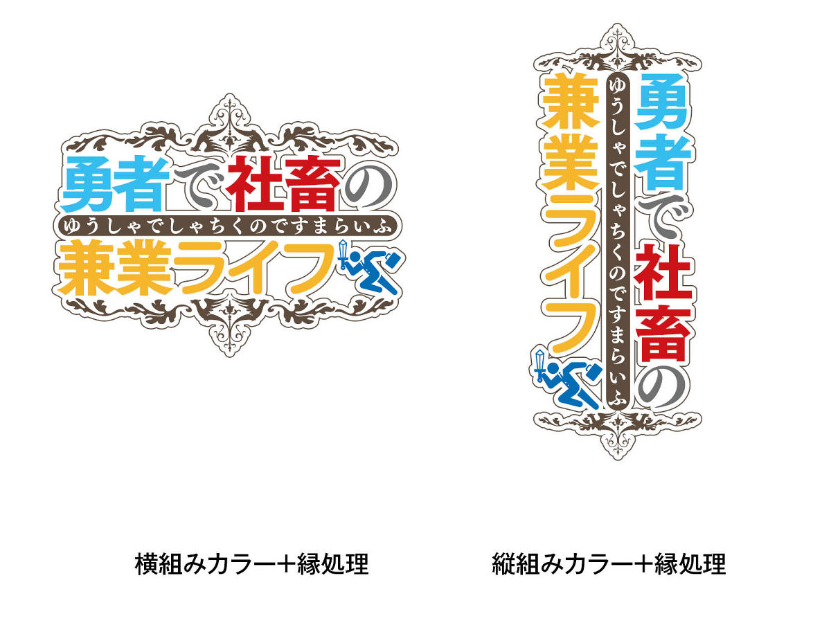
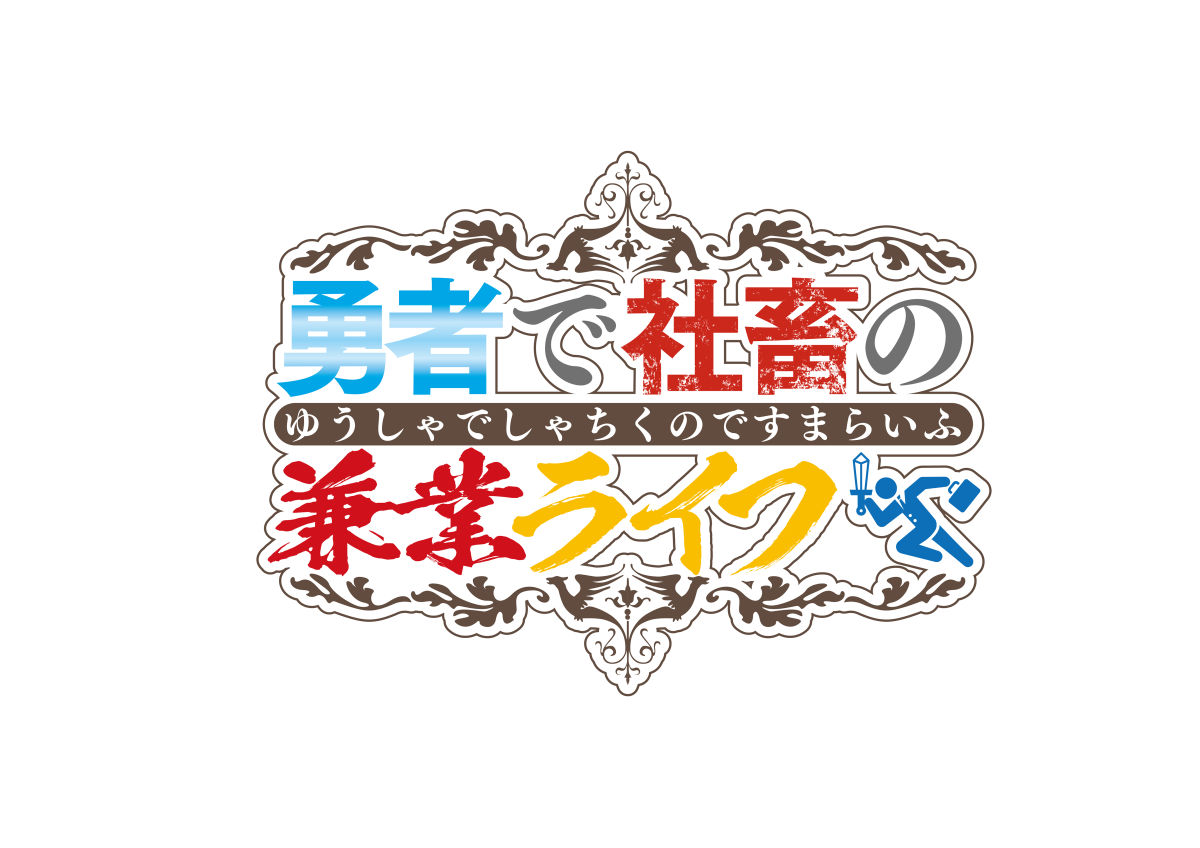
Design advanced to the finish. Because the effects of “Braves” and “Slaughter” are full of design, “Part-time work life” feels flat, so we proposed a design that would not make the “Part-time work” part too gorgeous.
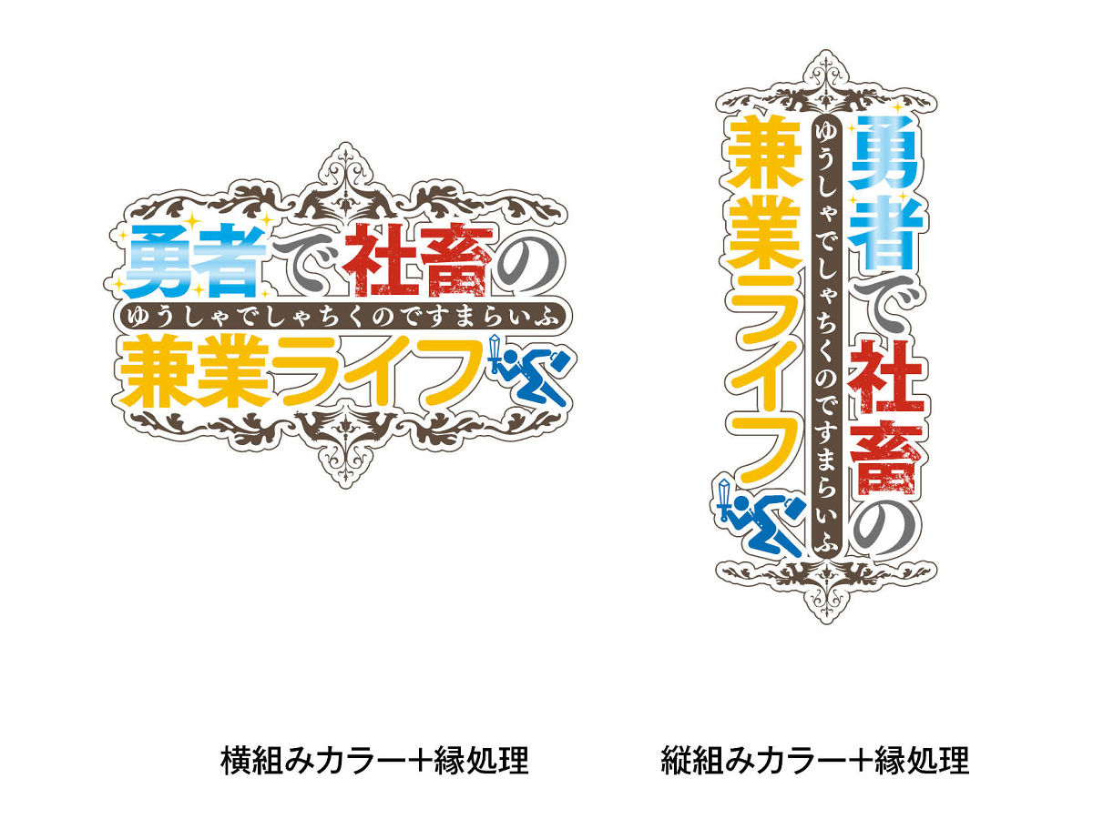
In the modified design, the ruby was put on top of the text, and the image of the work was made as if it had been hit with a 'side job'. Ryo Hiiragi: It is unusual to change the basic composition from this stage, but the image may change depending on the color scheme, and as a result of interacting with the editor, this time the impression change due to the color scheme will increase the part of 'part-time job life' We changed the format and emphasized 'Desma', which is the key point of this work, and made the color scheme consistent with that of the livestock.
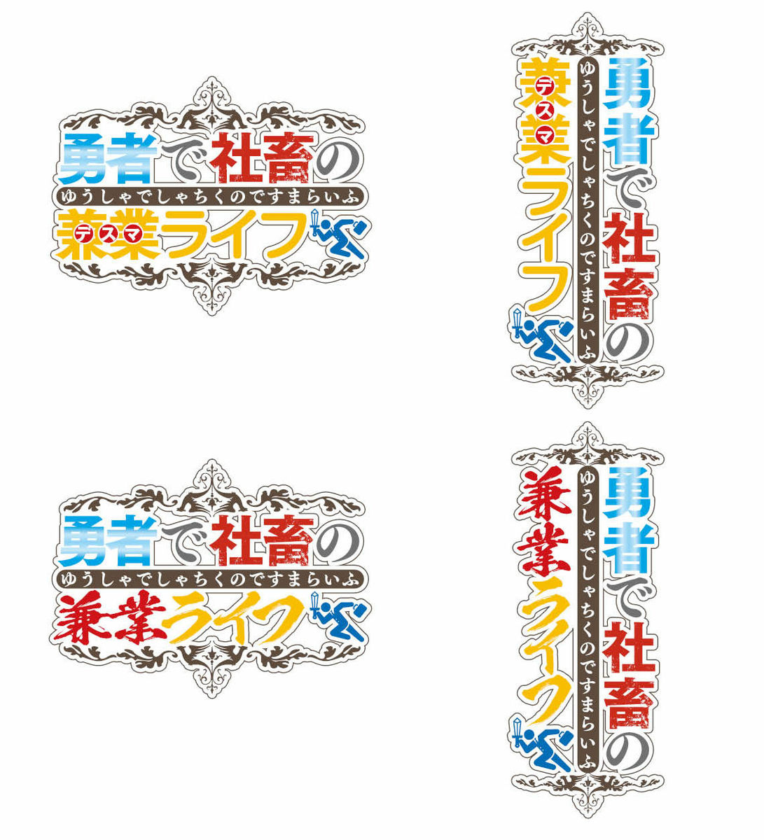
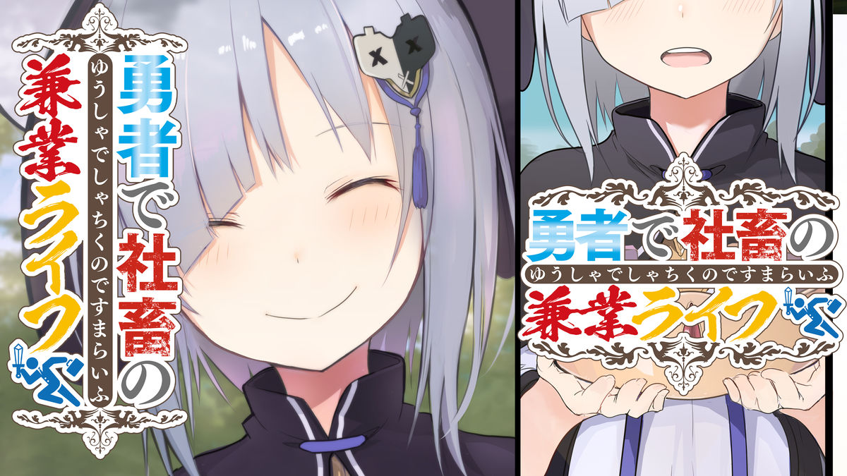
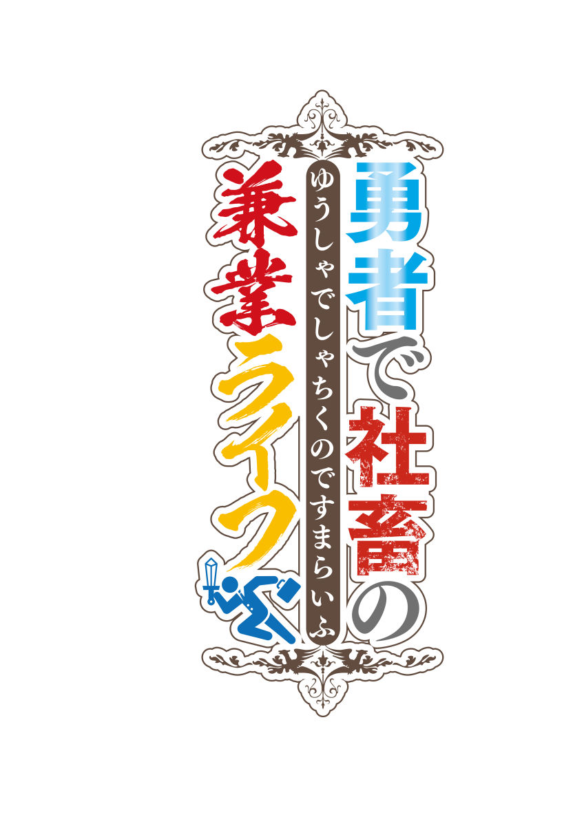
Finished logo. The vertical version and the horizontal version can be used depending on the contents of the door picture and other purposes.
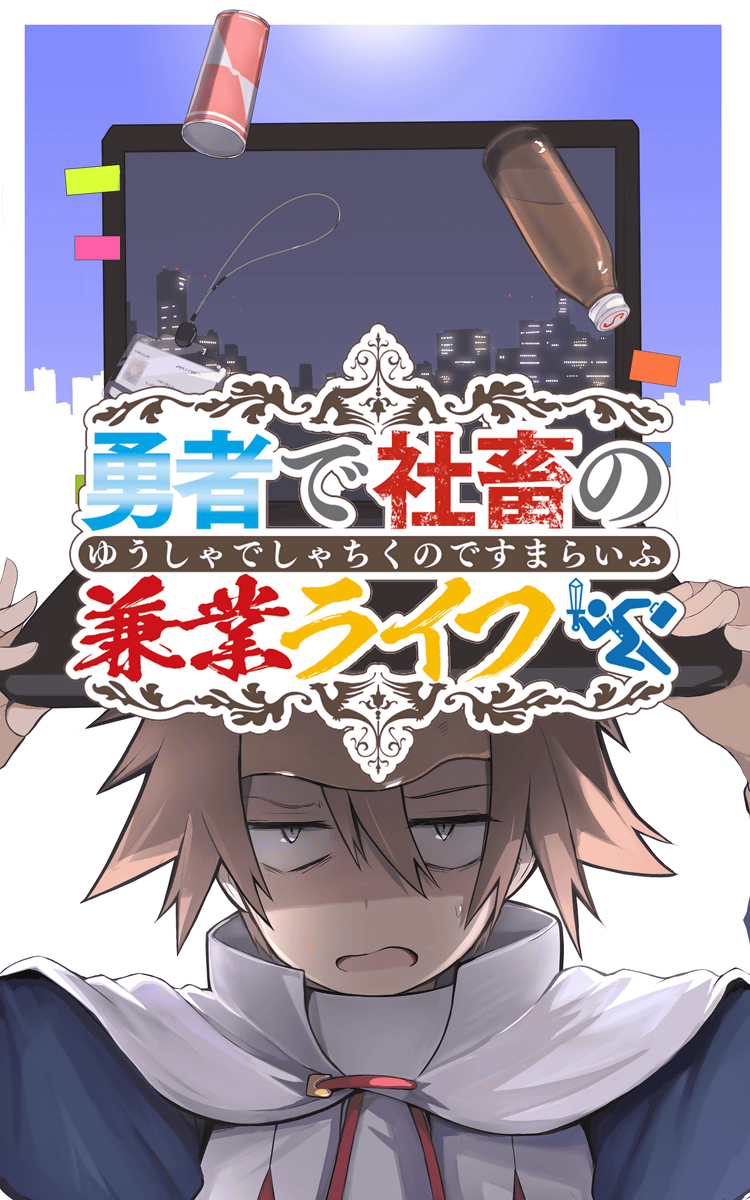
The first story door picture using the completed logo looks like this.
Related Posts: