'Programming Fonts' that summarizes the free font for programming that makes it easy to distract misleading characters such as O (Oh) and 0 (Zero)
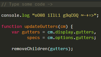
If you read a sentence is a human being, if you make mistakes in the input, you can easily read it and read it correctly, but because there is no such flexibility in the computer, when you program, exactly one word at a time You must enter characters. At this time it becomes a problem that "O (o) and 0 (zero)" and "I (eye) and l (el)" such as "it looks the same to humans but internally different" It is difficult to find these mistakes by eyes. Since the free font for programming which made it easy to distinguish such confusing characters was packed in " Programming Fonts ", I tried to see what kind of things are there.
Programming Fonts - Test Drive
http://app.programmingfonts.org/
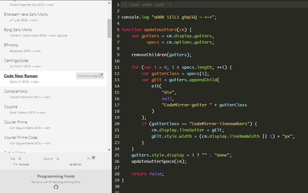
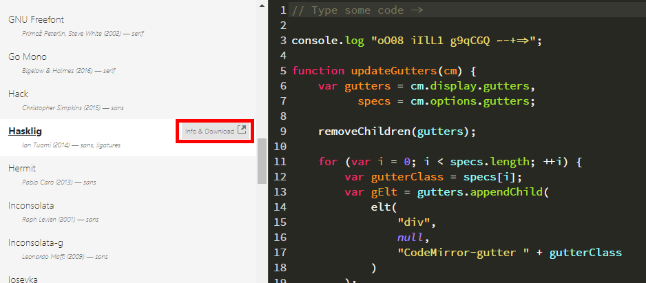
When you open the site you will see a screen similar to the one below. If you select the font you want to see from the left, the right sample code will be displayed in the chosen font. If you like it you can go to the font distribution page by clicking "Info & Download".
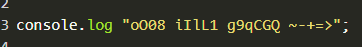
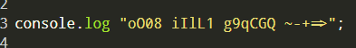
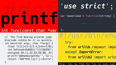
Among the sample code, it is easy to make mistakes in the third line, and you can compare it by looking at it. For example, the figure below is " Code New Roman " font. In addition to being hatched at zero, the lower case letter Ell has a horizontal whisker above and below to make it easy to distinguish.
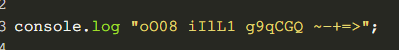
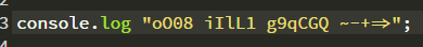
The figure below is " Average Mono " font. Oh and zero have different widths. Ell is like the figure 1, but it can be distinguished because the upper beard is not straight but rather straight.
The font " Borg Sans Mono " is characterized by a ligature when you enter "=" and ">" in succession. From the number 1, the bottom horizontal bar disappeared.
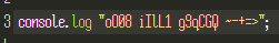
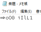
In " Hasklig " there is a midpoint instead of a hatched line at zero. In addition, "=>" is also displayed together with this font.
Anyway, it is the font " Fifteen " that feels the intention to compress the width. Since the width is narrowed to the limit that can be suppressed, more characters can be displayed on one line.
Some fancy as if looking at retro game, there was a name that makes play Press feel " Press Start 2P ".

If you like fonts you can download and actually use them. This time I will try using "Hasklig" introduced above. Click "Info & Download".
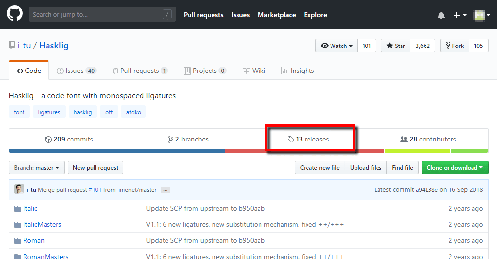
Hasklig is distributed in GitHub. Open the Release tab.
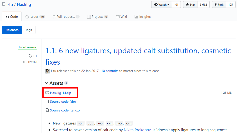
A new version is coming up. This time, click "Hasklig -1.1.zip".
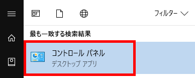
Next let the PC read fonts. This time I tried on Windows 10. Open "Control Panel" from the start menu.
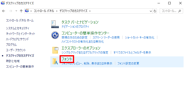
Click "Customize Desktop".

Since there is an item "font", click it.
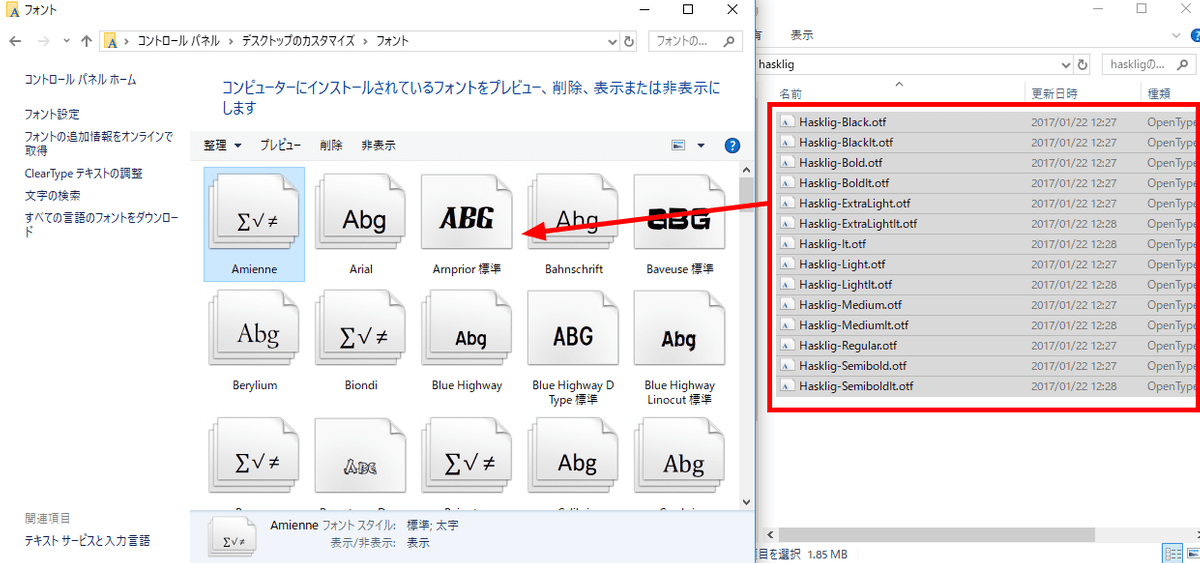
Then the folder for font is displayed, so drag and drop the contents of the zip file you downloaded earlier and install the font. The Hasklig used this time is distributed by OpenType , and the license is SIL Open Font License 1.1.
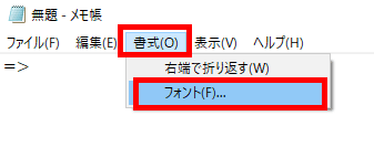
After that you can set the font with a text editor OK. For example, in case of "Notepad", it opens because "Font" item is in "Format".
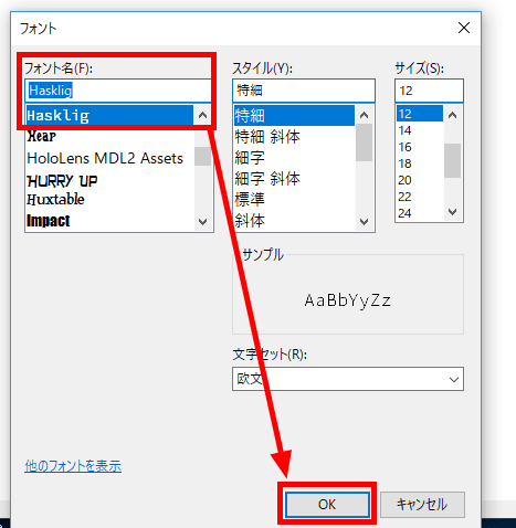
Select "Hasklig" that you installed earlier from the font name and click OK.
The font is now "Hasklig".
I spend considerable time reading code when programming, but I can expect to improve work efficiency by using fonts that are easy to read for me. "Programming Fonts" is a recommended site for people who want to change the font used for programming because only fonts suitable for programming are gathered.
Related Posts:

in Review, Web Application, Posted by log1d_ts