A paper that summarizes in detail the "how innovative user interface of Windows 95 was developed"
bym 01229
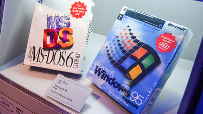
Microsoft released as a successor to Windows 3.1 in 1995Windows 95Is also known as a leading figure in showing sales of 4 million copies in just four days from the launch and spreading PCs to general households as well. One of the reasons why Windows 95 was generally accepted is that the design of the user interface, such as the start button and right click implementation, was innovative at that time. In the following blog, a paper written by Mr. Kent Sullivan of former Microsoft employee "About how the user interface of Windows 95 was designed"User interface of Windows 95: Case study in usability / engineering"Is introduced.
Designing Windows 95's User Interface - Socket 3
https://socket3.wordpress.com/2018/02/03/designing-windows-95s-user-interface/
Development of Windows 95 started as the successor OS of Windows 3.1. At that time, the design team set two goals of "designing so that everyone can easily learn the operation of the computer if there is a computer and Windows" and "design so that users of Windows 3.1 so far will be easy to use" I set it roughly. That means that we challenged the challenge of "to develop an OS that would make people interested in common people who have never touched a PC without forcing inconvenience to existing Windows users" .
byRoger Schultz
In the development process up to that time, it was said that designing the system earlier, verification of ease of use and design was done most often at the end. In Windows 95, however, work to consolidate the visual design was done in parallel with system development. The design team adopted an iterative design process of making mockups using paper and computers, testing it, and modifying the design based on the results. And, after having prototypes of Windows 3.1 and Windows 95 actually used by beginners and existing Windows 3.1 users, I also investigated what kind of problems there are.

As a result, various things turned out. For example, a beginner is not sure how to efficiently manage the window, and when the minimized window is hidden in another window, it is said that a lot of cases were confused that "the window has disappeared" . Furthermore, once you terminate the program, you can not see the location of the program or how to start it, and you will see a scene where the internal storage will soon be buried as it installs each time "the program has gone" It was done.
Also, the prototype of Windows 95 prepared early in the development was designed to change drastically from Windows 3.1 daringly, but the existing Windows 3.1 user is confused by too much design The result was also obtained. As a result, the design team was forced to redesign the Windows 95 user interface significantly.
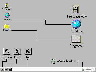
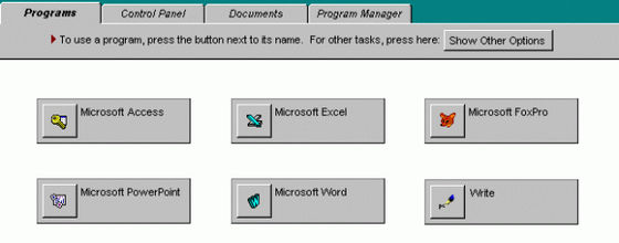
Therefore, apart from normal, I began to design based on the idea of preparing a user interface for beginners. The design team prepared a panel like the image below, but the beginner had to learn two patterns of "operation for beginners" and "normal operation", after all, the beginner The problem of becoming unable to leave the user interface for beginners emerges.
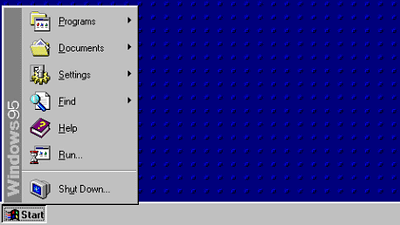
It was the implementation of the start menu and the task bar that was devised there. Starting Windows 95, you can access the program with one click from the start menu and even if you minimize the window, you can easily manage it by watching the task bar.
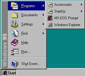
In addition, printing and setup wizards, dialogs such as "Open" and "Save As", help and search items were also implemented.

In Windows 95Cairo ProjectAnd the two projects for system development called Chicago Project were in operation,The pursuit of perfection Cairo project that has been slowly progressing will be canceled half a year before the releaseSystem development was twists and turns, etc. On the other hand, for the design of the user interface of Windows 95, thanks to the iterative process of design and test and the attitude to quickly pursue the problem revealed by the test, the article was not significantly changed in the final product, It is tied.
Related Posts:


