Graph showing that wealthier people become increasingly wealthy and are responsible for economic growth

ByDanny Kekspro
62 people of "Ultra-rich" who stand at the top of economic disparityHave the same wealth as half of the world populationI know that. The graphs of how income growth rates differ between wealthy people, the middle class, and people with low incomes are graphed, showing how much the wealthy people are playing economic growth, the disparity has expanded in a progressive way It has come to be able to understand a variety of things.
You're not imagining it: the rich really are hoarding economic growth - Vox
https://www.vox.com/policy-and-politics/2017/8/8/16112368/piketty-saez-zucman-income-growth-inequality-stagnation-chart
Non-profit organizationEPIAccording to the survey, when I saw the rise in workers' income from 1948 to 2015, I heard that there is a turn point in 1973. Until 1973 the economy grew with the aftermath of World War II and incomes for both workers who earn income on a hourly basis and workers who earn income on a production basis were improving. However, from 1973 onwards, income from workers who earn income on the basis of productivity has improved, while income from workers who earn income on a hourly basis is sluggish.
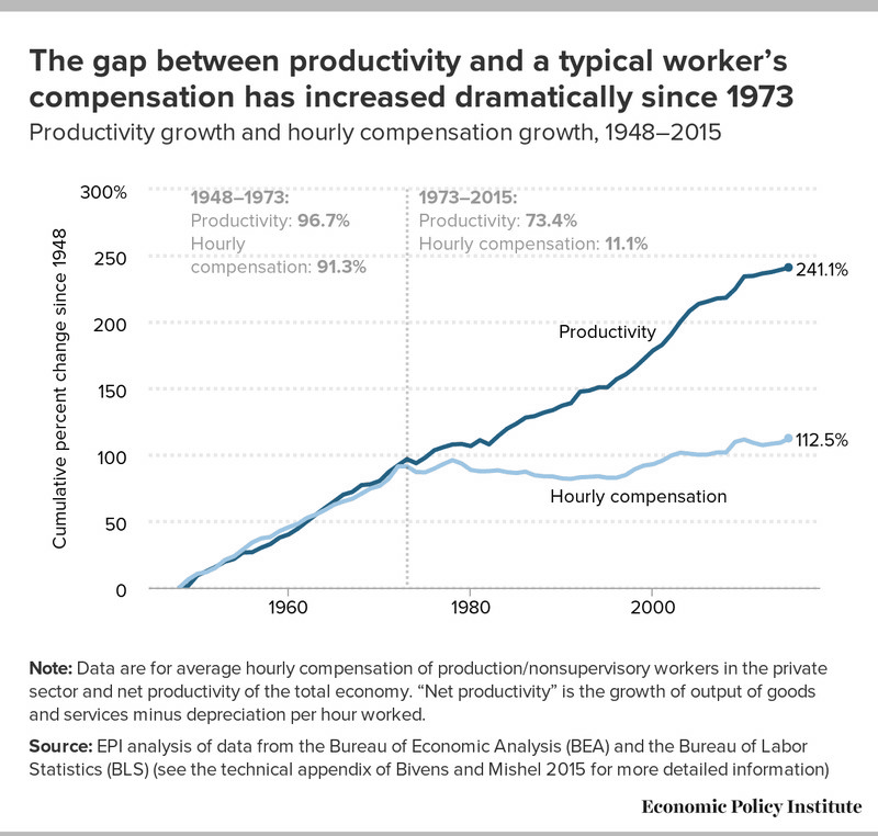
Furthermore, it is pointed out to the income of workers that the share of top 1%, or 0.1%, 0.01% has increased markedly when seeing the share of pre-tax income. Looking at the figure below, we can see that by the 1970s less than 4% had exceeded 10% in recent years.
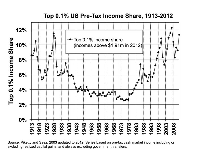
These graphs are often used in the context of "failure to reallocate wealth by the government". However, conservative economists and policy analysts have challenged such analyzes. The main argument of the opponent is "The above graph is the income before taxation,Food stampYaMedicaidWe do not consider public benefits such as "Graph isConsumer price index(CPI) is used to adjust inflation, which is claimed by many economists, "exaggerating inflation" "The share of the top 0.1% people isUnited States Internal Revenue ServiceIt is based on the data of the final return declaration. This is excellent in a number of respects, but excludes tax-exempt benefits that employers receive from their employers, such as health insurance or pension contributions. Also, although the final return is submitted in units of several types such as a couple without individuals / children or a lot of children, the number of each unit is decreasing due to the declining birthrate. As a result, when you look at individual units, the growth of the actual income amount will be larger than the data shows. " With the above factors, it is claimed that the revenue increase of the middle class actually is bigger than the graph shows, since the 1970s.
However, Economists Toma Piqueti, Gabriel Zackman and others are considering public security such as health insurance, pension, food stamp, Medicaid, tax-based(PDF file)Analyze income data. At this time, changes in the income of individuals, not family members, were investigated, so the influence of the declining birthrate pointed out by conservatives is taken into consideration. Also, it is said that "slower-growing inflation metric" was used instead of CPI.
In other words, I analyzed after considering all the criticisms of economists who disputed the graph of EPI, but the increase trend of people's income shown by this is as follows. The vertical axis is the annual average economic growth rate from 1980 to 2014, and the horizontal axis is the percentile of each income stratum.
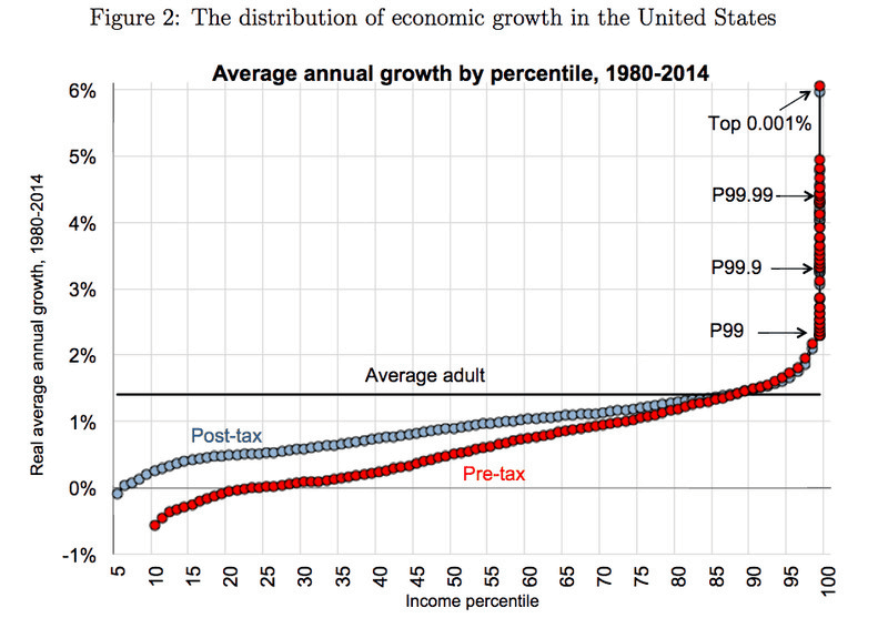
Again, the top 1%, 0.1%, 0.01% income growth is dramatic, you can see that the growth rate of the top 10% and other people's income is significantly different. The red graph is the pre-tax income, the blue graph is the income after taxation, and there is a layer where the revenue growth rate is going backward when looking at only the pre-tax income. The average American economic growth rate is 1.5% a year at a rate of "not bad", but the top tier is an economic growth rate of 3 to 6% per year.
Also, comparing the revenue growth rate of each income group in 1980 with the revenue growth rate in 2014, it looks like this. In 1980, you can see that the income growth rate of high-income earners is less than 2%, and the growth rate has declined as the income decreases. There are various opinions on this cause, but it is thought that the marginal tax rate that was operated in the 1950s is one reason.
The Broken Economy of the United States, in One Simple Charthttps://t.co/HPqxHDUmsCPic.twitter.com/5SnIx3TiLr
- Gabriel Zucman (@ gabriel_zucman)August 8, 2017
However, it is 39.6% as of 2017, whereas the highest tax rate in the 1950s was 91%. In the 1950s, lobbying and other activities were not done so much as CEOs raised their wages as taxpayers reduce taxpayers, but now CEOs can earn more wealth through wage negotiations. It is also thought that such a mechanism creates inequality in wealth. Mr. Piqueti and Zachman also pointed out that high income earners at that time were not enthusiastic about raising the wages because of the high marginal tax rate. Also, even if imposing a high tax rate, high-income people do not go away from beneficial economic activities.
Conservative economists, on the other hand, had only a small number of people charged with 91% even in the 1950s and because there were also loopholes, many of the wealthiest people at that time had a 42% He insisted that there was not much difference from the current 39.6%. It is said that it is costly to raise the current tax rate as in the 1950s.

Related Posts:


in Note, Posted by darkhorse_log