Failure example where about 50% lost users even by changing the design of the site

ByWicker Paradise
Service that deals from icon news to salesIcons 8"In the blog posted that 47% of users were lost as a result of drastically changing the design of the website. On the blog, it is written up to the analysis result of how you lost the user and why you lost, which is interesting content.
How We Lost 47% of Our Users After a Redesign | Icons 8
https://icons8.com/articles/how-we-lost-47-of-our-users-after-a-redesign/
At the beginning of the service, Icons 8 was a service to develop and sell icons, but since it is impossible to keep making new icons every day, we implemented the function "request icon". A request icon means that one of the users requests "I want this icon!" And another user votes for the request. Icons 8 seems to have progressed smoothly as Icons 8 operated the service to create and sell the icon of the request that got the most votes of the day apart from the main icon sales service.
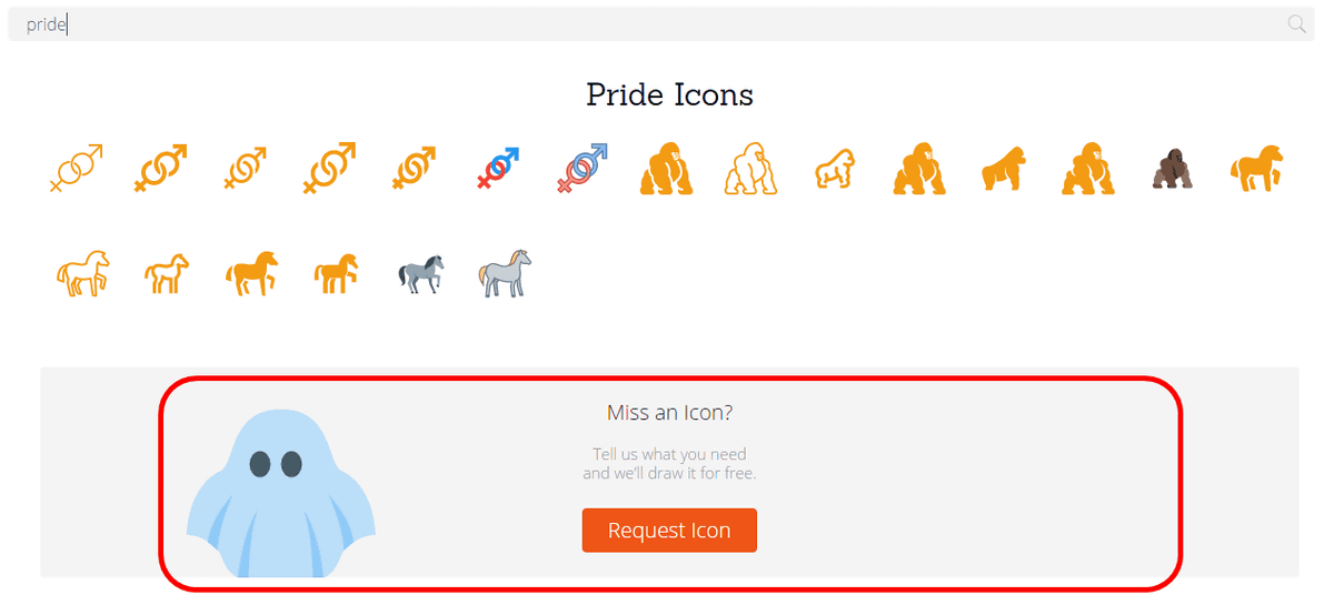
Although I changed the menu design slightly, the number of users decreased, but after that I succeeded in increasing the number of users little by little every day. In addition, we succeeded in dramatically extending the number of users by changing the icon search screen. Previously, only the icons caught in the search were displayed in the result of the keyword search, but after changing the design, "I can not find the icon you are looking for ?, please request" Please ghost illustration In order to display it with attached, we set up a button to guide you to the landing page of "request icon" there.
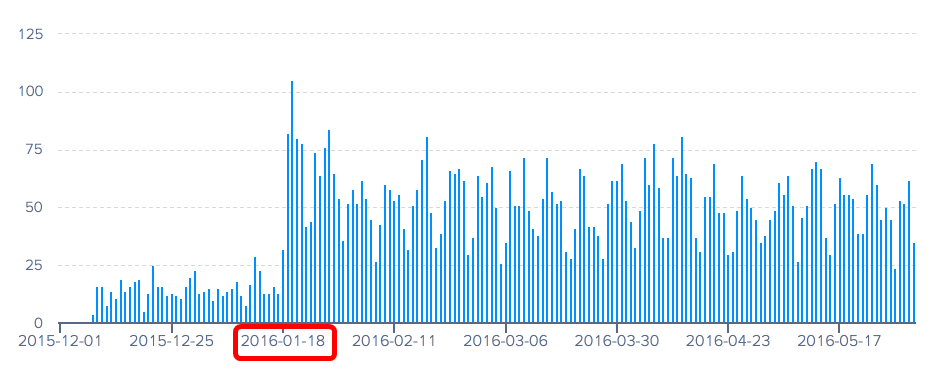
This design change was applied on January 18, 2016, and the number of users using the request icon increased from that day at a stretch. Below is a graph showing the everyday trends of the number of users of request icons, showing that the number of users is rising at a stretch from January 18, 2016.
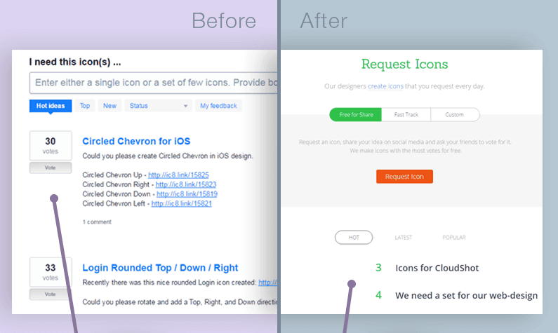
Thanks to successful design changes on the search result screen, Icons 8 decided to change the design of the request icon landing page as well. The left side of the image is the front of the design, the right is the landing page after the design. After the change, it became a simple design of contemporary style.
However, after changing the design, although the number of users of Icons 8 has hardly changed, the number of users and the number of votes of request icons is reduced by about 50%.
Icon designerAndrew BurmistrovHe was ordered to conduct a usability survey, and investigated why the number of users drastically decreased. In the survey, what the user most wanted to know on the request icon page is "Is the request icon function working normally?", The second thing you want to know is " When will it be released? "
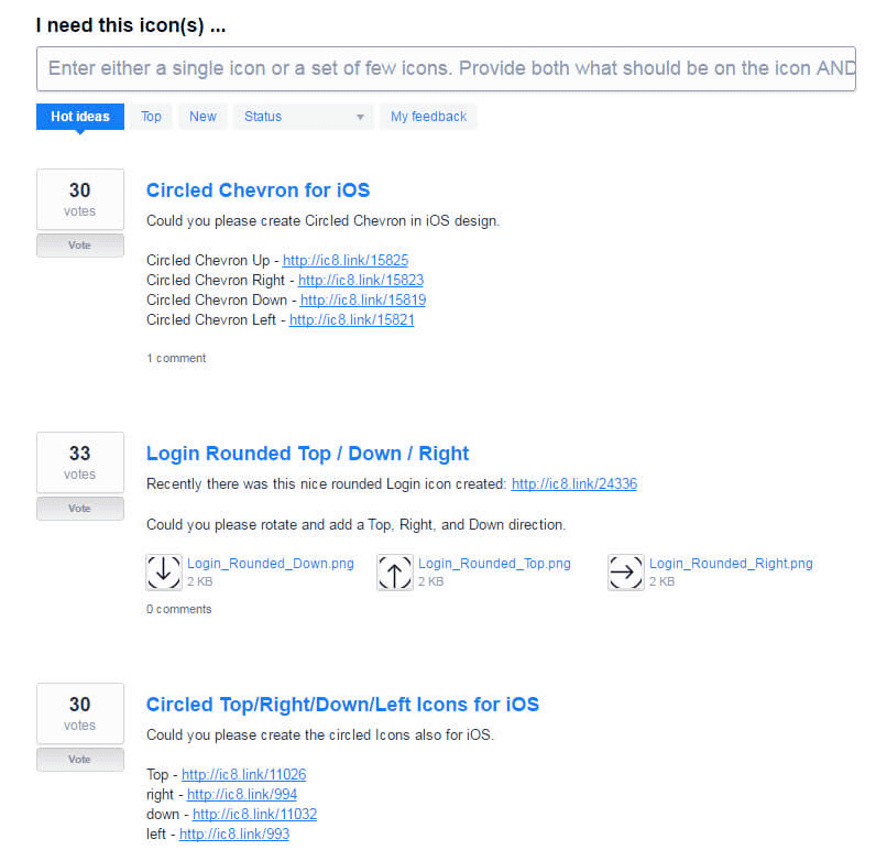
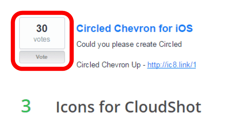
According to Mr. Burmistrov, the user wants the most "whether the request icon function is working normally" is included in the old design, but it was not included in the new design. As shown in the image below, "Older votes (30)" is clearly stated in the old design, and under it the button for voting "Vote" was arranged.
However, although the number of votes (3) is displayed in the new design, because of a design that is too simple, whether the number "3" indicates the number of votes, indicates the current ranking or indicates the time until the voting deadline It was not mentioned at all and the user was obliged to have a doubt that "the request system is working properly".

Burmistrov analyzed that deleting the comment function was one of the reasons for losing the number of users. In the old design, users were communicating in the comment section, but by losing the comment function, there is no communication between the users, so that users are worried that they do not know whether the service is functioning normally or not It seems to have become.
Furthermore, it was one of the problems that moved the "icon explanation column" to the screen after clicking. There used to be an explanation column explaining what the design is like and what it can be used because the icons are arranged in the landing page and the voting is accepted. However, with the new design, a description field of the icon is set on the screen displayed after clicking the icon receiving the vote. It seems that it was to save space by deleting the explanation column, to make it possible to see many icons at once without scrolling the screen, but it led to disappointing results.
Icons 8 will change to a design that made use of what I learned from this mistake in order to regain the lost user. Failure of Icons 8 seems to be helpful not only to the person who operates the website but also to those who intend to operate in the future.
Related Posts:


in Web Service, Design, Posted by darkhorse_log