Summary of points that changed in "Android N Developer Preview 2", Emoticons are more humanly & Launcher short cut etc.
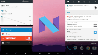
The next Android OS "Android N" Developer Preview 2 (2nd version for developer preview version) has been released. In addition to being fixed in the Developer Preview released in March 2016, new functions are being added.
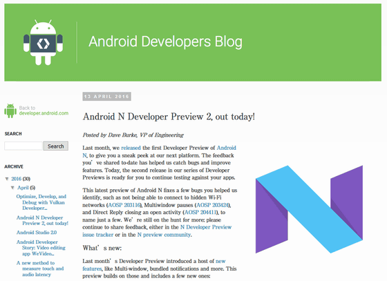
Android N Developer Preview 2, out today! | Android Developers Blog
http://android-developers.blogspot.jp/2016/04/android-n-developer-preview-2-out-today.html
Here's everything that's new in Android N Developer Preview 2 [Gallery] | 9to5Google
http://9to5google.com/2016/04/13/android-n-dev-preview-2-features-gallery/
◆Support for 3D rendering API "Vulkan"
First of all, the change point is "VulkanSupport. Vulkan will reduce the load on the CPU and will bring out the performance of the hardware more.
◆Launcher Shortcut
As a pretty big change, it is now possible to register a specific action of the application as a shortcut to the launcher. Specifically, you can say "send a message to a specific friend", "navigate to the house", "see the next TV program with a media application" and so on.
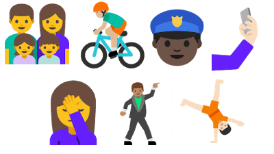
◆Supports Unicode 9 emoticons
Unicode 9 emoticons that "humanity" became stronger than past emoji are supported.
This is "human emoji".

And "activity emoji". I feel like an illustration ... ....

◆Bug fixes
Besides this, a bug that you can not connect to Wi-Fi in stealth mode, a bug that multi-window stops, and a bug where the "direct reply" function is forcibly terminated, which was found in Developer Preview, has been fixed.
◆Change appearance of folder
When creating folders with multiple icons on the home screen, four representative icons were displayed in the square with rounded corners so far, but the design has been changed, the icon is removed in the circle It looked like it looks like it.
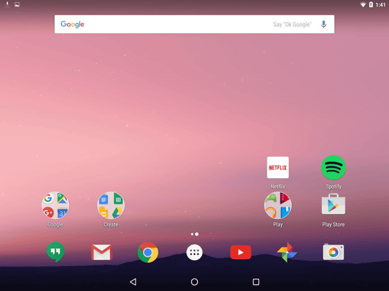
In addition, the summarized icons are aligned with the upper left, the upper right, the lower left, the lower right, and when the number of icons is three, the lower right was free, but according to Tim Schofield, the third design It was said that it was displayed to the center.
A new look to folders on the Android N Dev Preview 2!Pic.twitter.com/GOvcVZ76AZ
- Tim Schofield (@ qbking 77)April 13, 2016
Related Posts:
in Software, Smartphone, Posted by logc_nt
