Why should designers put the button 3 pixels to the left?

ByUgo Cristofori
For designers, the details of the design are very bothersome, but it is said that the difference is not conveyed to anything other than the designer so much, "Is it possible to improve the product just by moving the button by 3 pixels?" However, as a product designerGoogle VenturesI am working atBraden KowitzSays, "Even so, the designer should stick to the details", he talks about the reasons why the details should be stuck and how to tell it to other people.
Why you should move that button 3px to the left | Google Ventures
http://www.gv.com/lib/design-details
◆ Design is not done only for appearance
ByBytemarks
· Increasing confidence when setting details properly
As guidelines for customers to measure trustworthiness on-line are "visual design", "copyright", "dialogue", so in design where trust stands, design becomes an important element Kowitz Says. As if to support this, Stanford University is doingThe Web Credibility ProjectIn the project of doing research on what is necessary to gain the trust of people on the Internet, among themWebsite designIt is very important to know.
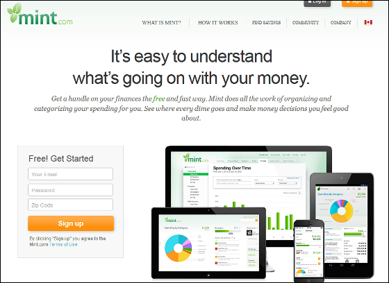
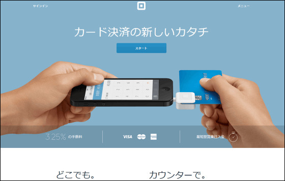
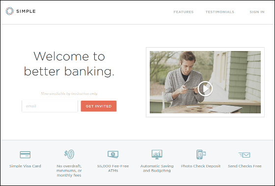
For exampleMint·Square·SimpleAlthough it is a new product service shortly after it is released, both websites are properly designed to the details, both of which are money handling services, while customers I have succeeded in obtaining trust without giving me a sense of uneasiness.
First of all, Mint.com website design of individual asset management service. It is based on white and has a clean image by using green as a fade color.
Mint - Personal Finance, Budgeting, Money Management, Financial Management, Money Manager, Budget Planner, Free Budget Software, Online Banking
https://www.mint.com/
IPhone and iPad etc can be substituted for credit card payment checkoutSquare.
Square - Credit card transaction with iPhone, Android, iPad.
https://squareup.com/jp
Simple of the banking service is also a clean image.
Simple | Worry-free Alternative to Traditional Banking
https://www.simple.com/
· Proper detail improves ease of use
I shaped a monkey.MailChimpLooking at the logo makes me smile, the top page that got rid of Google's extra things gave me a sense of security, and as I was watching a sophisticated Apple interface I felt the ecstasiness of it, so that the details of my hands The design seems to have the power to make people's feelings bright.
Human brain is tied to emotion and deep part, depending on whether you are irritated or happy, the way you approach the problem will change drastically. If you are in a happy mood you can find work on websites and apps like puzzles instead of fighting and you can find the way to the goal as if you are adventurous as work becomes more complicated. Don Norman wroteEmotional DesignIn fact, the book that mentions this point, in the end, properly designing the design makes the feelings of people brighter and makes it easier to use the product.
◆ Improve the design at once
ByJordanhill School D & T Dept
If you need a lot of help to use the product, solving one problem will not give you a smooth feeling. Filling one of the bumpy road holes does not make the road flat enough to say that the road is easy to walk.
As a result, development teams usually spend a day to fix bugs, but please set a date for collecting and modifying designs by piggybacking on this. We will summarize the points to be modified in the design as a spreadsheet and prioritize the problem. At this time, there is no problem even if you can not improve all the listed points. Just by making small changes, at the end of the day the ease of use of the product should be visibly improved. As development team people concentrate on product "ease of use" over the course of a day to fix bugs, they will improve the design and make you feel better for "easy to use".
◆ Be aware of feedback methods

ByRyan O'Hara
Even if the web designer does the design, it is the engineer who implements it. Therefore, in order to raise the quality of the product, it is necessary to interact with the engineer and the design, but Kowitz says that he / she has failed in the interaction. At one time, Mr. Kowitz talked with an engineer and got some consensus on the design proposal and sent some mockups to the other party. But the product that the engineer showed on the next day showed that the product being created was one that did not carefully design Kowitz.
Although it was not a pleasant thing to say what the engineer made, but when I pointed out the wrong point of design, after that the engineer has not asked for feedback. Since quality improvement was not done, the quality remained low, just a negative spiral occurred. From this, Kowitz came to think that "90% of the functions are attributed to engineers and the role of designers is about 10%". But the designer can finish the product perfectly by changing the details of the interface a little bit.
And when doing feedback, before the engineer sees the design file, say "I want you to understand my intention before checking it," so that the designer correctly informs the design intention each time It is said that there is.
◆ Avoid the iceberg "Customization"

ByDavid Blackwell.
"Custom Buttons" that allows users to customize products themselves can easily be created with Photoshop, but in order to create one product, "to emphasize off", "where the double click is required Avoid emphasis of "to read from right to left in Hebrew and ArabicRTLSupport "AccessibilityEvery effort is made to properly design the product, such as "to conduct a test of the product".
If you get lost in design, it seems to hit the iceberg of this "customization", but in many cases, creating an effective custom design takes more skill than creating an effective built-in design. Kowitz said, "If you do not have time to polish custom designs, you should do a built-in design even if you are bored.
Related Posts:

in Design, Posted by darkhorse_log