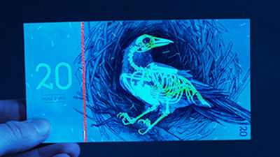
A collection of posters that gloriously designed 27 types of verbal abuses which should never be said to web designers
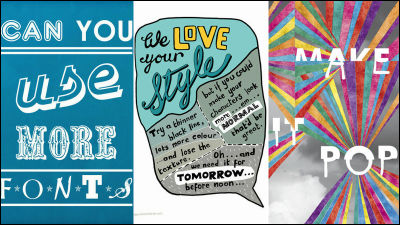
"There are too many margins" "Make it a little more interesting" "Make it pop" "Can you use the images you got from the Internet?" "Hey, did not you think so much? Ireland's web designers, animators, illustrators, directors and others expressed poster words that clients wanted to say most.Sharp SuitsAlthough it is a project called "Sharp Suits", there are 27 words that should never be said to web designersBuzzFeedIt is summarized.
Home - Sharp Suits
http://sharpsuits.net/Home
27 Things You Should Never Say To A Designer
http://www.buzzfeed.com/regajha/things-you-should-never-say-to-a-designer
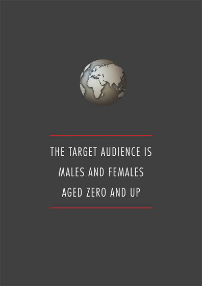
◆ 01: The gender of the target is male and female, the age is over 0 years old
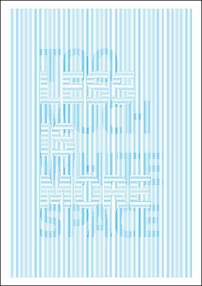
◆ 02: "Less things are richer thingsBut, this has too much margin
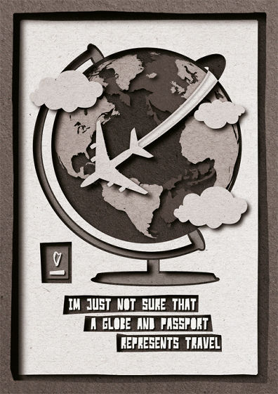
◆ 03: I can not imagine expressing a trip with the globe and passport
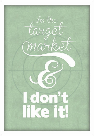
◆ 04: I belong to the target market, but I do not like this!
◆ 05: Make it a bit more fun

◆ 06: I understand that "This is it" when you see it

◆ 07: I liked it. But does snow look a bit warm?

◆ 08: Keep the cold elements modest and increase the elements that look like happy by as much as 25%

◆ 09: I'd like it like this, but do not copy it, keep the same feeling, make sure you understand differently!

◆ 10: Everyone knows that girls under 25 do not wear skirts

◆ 11: I want you to destroy the Internet

◆ 12: Make it pop

◆ 13: Using more fonts

◆ 14: I really like this color. But can you change it?

◆ 15: I want a picture that everyone is enjoying in a group

◆ 16: Are you using a Mac? Are you using a PC? I am DELL, but

◆ 17: Make the logo bigger

◆ 18: If you turn this over in Photoshop, you can see the front side a bit more ......
Is it?

19: I like your style. But what to say your personality more ... ... Uh ... .... It would be great if you made it a bit more normal. Also, make the black line thinner, use more colors, eliminate this texture, I want you to finish it by noon of tomorrow

♦ 20: Can you take pictures from the Internet and use it?

♦ 21: Do you see a woman in this picture, consuming 300 kilocalories?

◆ 22: I wonder if I can win the award?

♦ 23: Let's hear the result. In the report

◆ 24: I feel that red is not good at Christmas

◆ 25: Low resolution? I do not know well ... But if you can not make the image bigger any more, how do you zoom in on the screen?

◆ 26: Client "How much are you?" Designer "50 euros per hour (about 6600 yen)" Client "Can you come and meet us?" Designer "Of course, 100 euros per hour (about 13,000 It is ")" Client "What will happen if I help?" Designer "500 euros per hour (about 66,000 yen)"

◆ 27: Here, I got much better than before. Do not you think so?

Other than that, on the Sharp Suits website, "How quickly can you draw?" "Is this picture too old for grandma?" "Can you make a pig sexy?", Which was sublimated as a unique poster You can see a number of verbal abuses directed at creators.
Home - Sharp Suits
http://sharpsuits.net/Home

Related Posts:
