Why is it absolutely not to use "black" in design?

ByWebtreats
Black is a color that can make other colors stand out or show the whole thing mysteriously when used well, but the color that we normally think is "black" is not really black but "close to black Dark color "in many cases. "Pure black" which is almost not found in nature suffers overwhelming other colors and is difficult to handle, so you should do what you should do when you want to use blackSegment.ioCEO of Ian Storm Taylor has summarized.
Design Tip: Never Use Black by Ian Storm Taylor
http://ianstormtaylor.com/design-tip-never-use-black/
Taylor from the art teacher in childhood, college eraRhode Island School of DesignOne of the things I heard many times in the class of "There is a trick" Do not use black in the work ".
Although it is difficult to find truly black things, we tend to think that it is "black" when we see something with a dark hue. Although it tends to do when drawing a picture, the letters on the road and blank sheets are not black, and the shadows that can be made on objects are not really black.
Taylor realized this fact when I was a high school student. Mr. Taylor was imprisoned in the art room with art lover friends, and at that time his art teacher Zamula showed works of various artists. What Zamula always reads is an artistWayne ThiebaudIn Mr.'s art collection, he said to Taylor, "Look at the bright silver shadow he draws" pointing to a bright silver that has fallen on people and objects. Mr. Thiebaud's picture was just an example of "the shadow is not black".
In the following figures, the shadow of the soles of the feet is painted in silvery.

The picture and interview of Mr. Wayne Thiebaud, a painter over 90 years old, can be seen from the following movie.
THIEBAUD VIA MORANDI on Vimeo
Orange, green, shade shadow painted with blue.
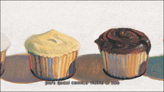
Orange or light blue / red is also used as a shade. The shadow is bright light blue.
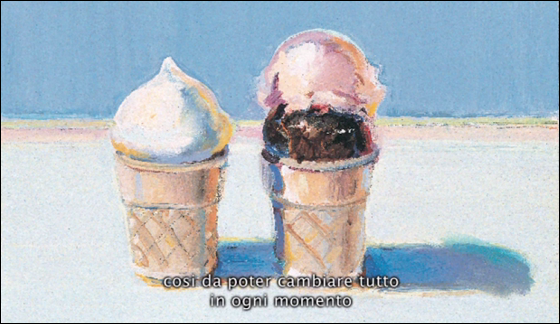
Perhaps "Although the shadow in the picture is not black, I think that the picture is different from the reality." Taylor thought about the same thing, Zamula did experiment with a blue light bulb. She first attached a blue light bulb to the clamp light and took out a white ball normally used in the photograph from inside the cabinet. Then, under the clamp light, put the ball on the table and switched on the light. Then the shadow of the ball appeared as an orangeish color instead of black.
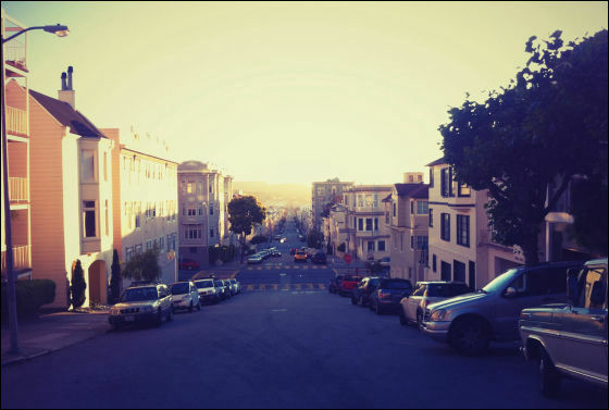
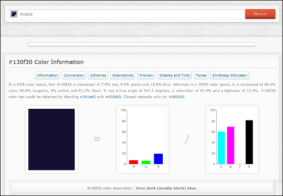
Also, looking at the picture below, it is a shadow that tends to be expressed in black, but the color code of the darkest part is not # 000000 # 130 f30, you can see that it is dark blue.
This is the color information of # 130 f30.
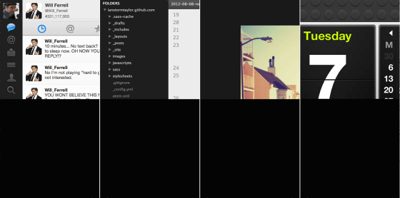
If you place black next to some carefully chosen colors, black will overwhelm the other colors. Because black is not a natural color it stands out. The dark gray which received the light which is routinely around us is a dark gray rather than a black dark gray because it is influenced by the light which is colored, even if it is dark gray rather than black I will.
For many of the applications we use on a daily basis, many things look dark gray. It is very close to black, but by using a slightly kept color, we try not to overwhelm other elements on the screen.
The work posting siteDribbbleComparing the dark part above with pure black looks like this. Even though you think it is "black" at first glance, you can see that it is not black when compared. This is not just a problem of color brightness.
When you actually use gray, adding a bit of color will disappear monotonously. The amount of color to use increases in proportion to the darkness of that color, so if it is black on the street photo above, the saturation is 69%, so light gray only requires 3%.
TaylorSegment.ioWhen designing a color palette to design, it adds a little yellow gray to yellow orange according to the above rule. It is only 2% when making bright gray and 22% of yellow orange in the case of darkest gray. These processes are done with Photoshop color picker.
However, it does not necessarily mean that yellow orange is good. For example, Facebook is a very unified interface, but all dark gray incorporates the Facebook color blue.
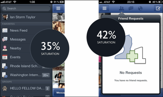
"Which color should be incorporated in gray?" Is a difficult problem, and choosing a natural color that fits the whole atmosphere is a problem for Taylor as well. However, it is a trick that can be used in a wide range of scenes when designing websites and applications such as designing posters and posters, "When thinking about using black, please ask yourself" Is it really black? ", Taylor I am recommending it.
Related Posts:
in Design, Posted by darkhorse_log
