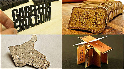
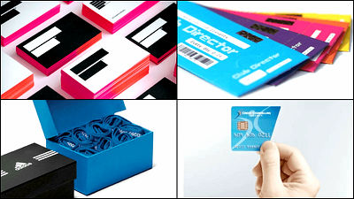
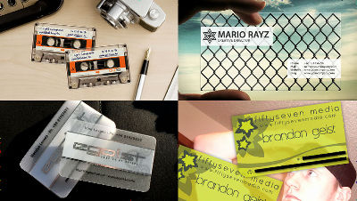
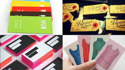
41 kinds of unique and innovative patterns of business card design
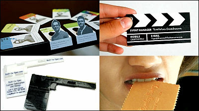
When you meet a person you can have a slightly different business card to not only make it the topic of the topic it is possible to leave your impression on your partner and even if many business cards overlap, it is easy to find, "Oh, that card ...... "It also makes it easier to remember. It is a business card to decide such a first impression, but it is difficult to think of an excellent design, so that it tends to get bad after allVandelay Design BlogIs gathering innovative and unique design cards.
40+ Inspiring Business Card Designs that Create a Big First Impression | Vandelay Design Blog
http://vandelaydesign.com/blog/galleries/inspiring-business-cards/
◆ 01:Square square business card with hamburger designed restaurantChef BurgerOf things.
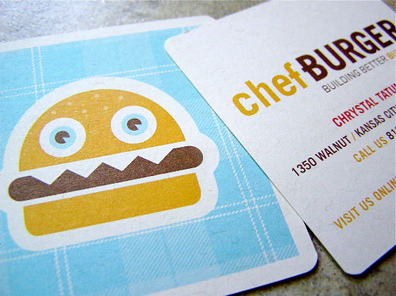
ByDailypoetics
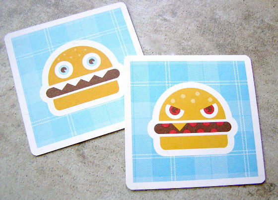
Facial expressions vary depending on the type of burger.
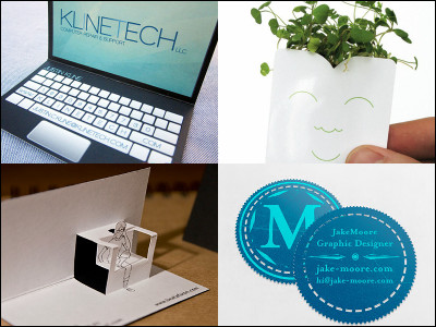
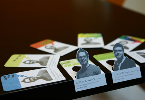
◆ 02:Design OfficeREACTORIt was a business card that pops out.
◆ 03:Window frame-like designUnique business card.
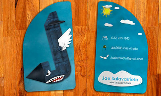
◆ 04:NaturalLeaf design.

◆ 05:Colorful blown business cardsIlprogettoThrough the design office.

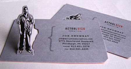
◆ 06:A man also pops outActual Size business card.
◆ 07:Cool lookingWaterproof business card.

You can see unevenness better from the side.

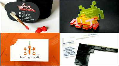
◆ 08:Business cards using metallic materials are computer / engineer'sSteve WozniakIt was designed for him.

◆ 09:Information is written next to the icon,Unique and easy-to-understand business cardsIt is becoming.

◆ 10:SophisticatedBusiness card with a suit.

◆ 11:You can differentiate using tactile sense by changing material as well as design. This is not paperBusiness card made of wood.

◆ 12:Kristina MiletievaThe business card made byRound design.

◆ 13:In the shape of cook 's hatIt is cut..

◆ 14:FirmlyI'm gripping a pencil.

◆ 15:A lot of hairpin that sticks to you looks like hairMysterious design.

Looking from the side like this.

◆ 16:Not only color but also decorated materialsReal biscuitsIt looks like.

Business cards are baked every ten days, and they can actually eat.

◆ 17:Retro FormA unique business card.

◆ 18:I cut a part of the edgedesign.

◆ 19:This is a rubber materialPistol type business card.

At the beginning this is like this. Cut it by yourself to make it a pistol shape.

◆ 20:Classic atmosphereViolin business card.

ByMyMetalBusinessCard
◆ 21:Whiskey barrelsIt reminds me.

◆ 22:PhotographerIt is a design that you can understand at a glance.

It is folded in half and information is written on the inside.

◆ 23:I'm afraid I will hit my mouthBeard business cardIs a web designer and developerJake CaputoDesigned by.

◆ 24:Can be assembled into a boxBusiness card.

◆ 25:PhotographerNATHAN JONESThinks business cardCamera LensIt is in the form of.

◆ 26:Clothes tagShe looks like a colorful business card.

◆ 27:It's like looking down at the coffee cup from abovedesign.

◆ 28:Radio Presenter hasMicrophoneIt is a retro atmosphere like.

Having it in your hands like this.

◆ 29:Fax of pretty elaborate design jumps outBusiness card.

◆ 30:When a crease is put in, only the business card on which the keyboard was drawnChanging like a piano.

◆ 31:This is a photograph taken by a photographer,Tied together with a ribbon.

◆ 32:It is a standard rectangular design, but a bitFashionable atmosphere.

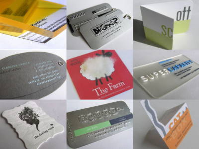
Looking closely, there are unevenness on the surface, and the details are made carefully to details, such as being stuck with the material.

Paper thicker.

◆ 33:It was oldCardsA business card printed with a pattern of.

◆ 34:Business cards of interior design companies are simple and elegantfinish.

As you get closer, you can see the state of embossing well.

◆ 35:The dice is a landmarkDdq designBusiness card looks three-dimensionalDice business card.

◆ 36:I used a transparent materialBusiness cards have a stylish impression.

◆ 37:Black logo on black backgroundBecause it is written, it looks tight.

◆ 38:According to the design of the knife and forkMetal frameA business card made with.

◆ 39:An owl-like logo mark is a landmarkDu Bout Des YeuxThe shape of the logo as it is as a business card.

◆ 40:Handwritten scissors and pencilsRetro business card.

Looking at diagonally is like this.

◆ 41:At last it is likely to want to say "cut"!Business cardwas.

Related Posts:
in Design, Posted by darkhorse_log
