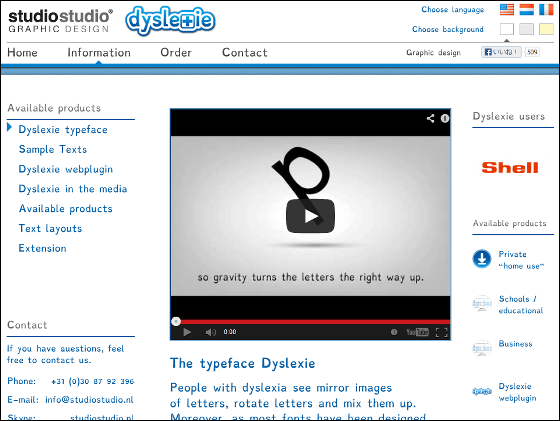
Dyslexie font that made use of design that makes it easy to read even for dyslexia

ByBy Janine
Despite the fact that there is no abnormality in general understanding ability etc., obstacles with remarkable difficulties in reading and writing of lettersDyslexia (dyslexia)I call it. Edison, Tom Cruise, Steven Spielberg and others are also suffering from dyslexia, and in the United States about 20% of people have survey results that somehow have symptoms related to reading disorders, but with dyslexia Even if you have fonts that let you read letters "Dyslexie"is.
Typeface Dyslexie for people with dyslexia - studiostudio
http://www.studiostudio.nl/
As a remarkable example of dyslexia, there are things that the numbers "7" and "seven" can not be understood as the same thing, characters can not be memorized accurately by being turned over and over, There are also various other symptoms such as not understanding the difference between the two letters, it takes a lot of time until understanding of the letters and words, the arrangement of characters looks distorted, the letters themselves look double.

ByThe bbp
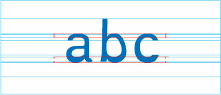
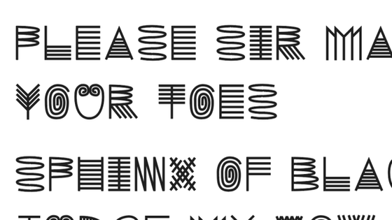
So, in order to prevent the alphabet 's upper and lower sides from being turned upside down, Dyslexie is designed with the roundness of abc changed in thickness up and down.
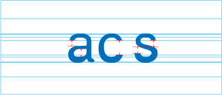
Since acs is similar in shape, we adjusted the position of each space and made each shape clear by opening more space.
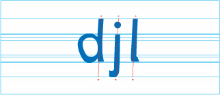
Djl is a design that tilts slightly to the right and changes each part so that each line does not go straight.
The alphabet with similar shapes such as b and d was devised so that it would not look like a mirror letter by letting the characters change.

In addition, f, h, p etc are kept as it is, devised so that the stroke part is lengthened for easy reading.

Since marks and capital letters such as dots and commas are used at the beginning and the end of the sentence, make it more distinctive so that you can read sentences and sentences separately.

V, w, y and so on change the design so that the position of the cut back of characters does not overlap.

Small letters like x and o got bigger sizes and wider spaces.

There are grooves in letters n and m, too, making the design clearer by making the groove deeper.

The space between letters and letters and the space between words is also wider than usual.

It is possible to actually type letters with Dyslexie font from the following page.
Try out the typeface Dyslexie - studiostudio
http://www.studiostudio.nl/en/information/sample-texts/

Enter a character in the text box under "Your own TEXT" and click "Read your own text in Dyslexie".

It is displayed with such feeling. You can purchase fonts from "Did you like the font? Click here to order!"

There are various kinds of fonts for private use, school use, business use, web plug-in, publishing, etc. The price of private font set with regular, bold, italic bold and italic is $ 69 (about 6800 yen) It has become.
Related Posts:


in Design, Posted by darkhorse_log