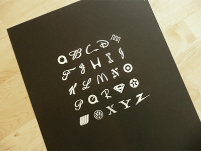
An alphabet poster made of a famous logo like a quiz trying out the memory power of the viewer and brand recognition
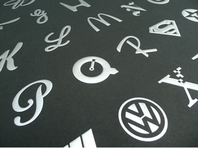
I will introduce posters that are very useful for font designers and business branding and advertising professionals who take 26 letters of the alphabet from famous companies and brand logos respectively.
Some of the logos used are somewhat unfamiliar to Japanese people, but most of them are something that everyone has ever seen. However, even with the logo that should be seen on a daily basis, it is difficult to extract only one letter, or it seems like a quiz that I can remember and remember. If you try to remember how many, it will be a bit of a brain train.
Details are as below.The Best Part - Official storefront powered by Merchline
This poster is in FloridaOrlandoResident graphic designer and artistJason DeanBy Mr. The size is 18 x 24 inches (about 46 x 61 cm),blackWhenWhiteThere are two colors of 500, each with a serial number and autograph. It is sold at the site of the author at each 50 dollars (about 4500 yen).
Besides using ink, it is gathered in a finish with a minimal and luxurious feeling by pushing a silver foil on a black background and a gold foil on a white background. Also, if you decorate it on a wall, "This is what is it?" It may be a good poster in that it will become.
White × gold.
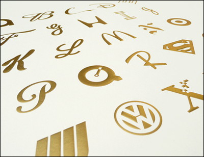
Although alphabet has 26 letters, many people may notice that there are only 25 letters here, but because "V" and "W" are represented by one logo.
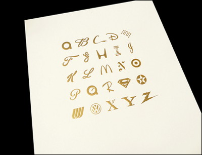
Among them, "M" is the most commonly seen by Japanese people on a daily basis and has high awareness? People who eat cereals every morning, "K" for Mac users, "Q" for Mac users, "H" for car drivers may also be seen very often.
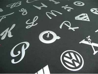
I think that there are things that can not be remembered easily though it is familiar from the things that you can understand immediately, but is not it that few people understand all of them?
So the answer is as follows:
A:ABC (American Broadcasting Company)
B:Budweiser
C:coca cola
D:Disney
E:Enron
F:Ford
G:GE (General Electric)
H:Honda
I:IBM
J:Johnson & Johnson
K:Kellogg
L:Eli Lilly
M:McDonald's
N:New York Times
O:Target(Actually, it does not mean "O", but an American discount store representing "targetLogo)
P:Paramount
Q:QuickTime
R:Ray-Ban
S:Superman
T:Texaco
U:United Airlines
V and W:Volkswagen
X:Xerox(However, it is not a brand new logo that is used for posters but old logos with high awareness)
Y:Yahoo!
Z:Zenith(It is not a Swiss watch manufacturer but an American appliance manufacturer)
Related Posts:
in Design, Posted by darkhorse_log
