Diagram showing distribution maps of diabetic patients in the United States

People with diabetes are increasing in Japan, and it is becoming a movement to review from the lifestyle habits, but in the United States seems to be about 70,000 people dead in diabetes annually, so it is serious enough to enter the top ten cause of death It seems to be a problem.
It is said that there are diagrams comparing such distribution charts of diabetic patients in the United States and by age, sex, race type etc.
Details are from the following.
American Diabetes Association Home Page
Diabetes in the US
This is a drawing showing distribution maps of diabetic patients in the United States.
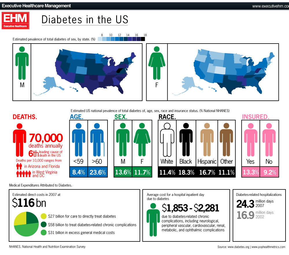
Let's take a look at each one. This is a distribution chart showing in which provinces many people with diabetes are shown by gender. Both men and women can see that West Virginia has the largest number. In Colorado, Minnesota, Montana, there are relatively few people with diabetes, with 6.1% of diabetes patients aged 30-59 years and 19.9% of those over age 60 in the fewest Vermont provinces.
Next, age, sex, race, insurance subscriber / nonsubscriber comparison of people who died of diabetes. It is 8.4% when it is 30 to 59 years old, but it is rapidly increasing to 23.6% when it is over 60 years old. By gender, people who are more male died of diabetes than females are about 2% more than women, and black people are the most popular in terms of race. In addition, compared with insurance / nonsubscribers, the number of people who have insurance is about 4% higher.
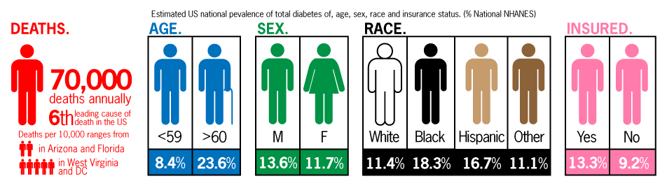
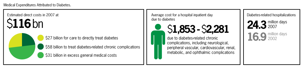
Figure showing how much the cost of diabetes in 2007. It costs $ 116 billion (about 10 trillion yen) only for medical expenses related to diabetes, and you can see that a huge amount of budget is spent.
Related Posts:


in Note, Posted by darkhorse_log