'Easing Wizard' that makes it easy to use CSS easing functions
CSS
Easing Wizard - CSS Easing Editor and Generator
https://easingwizard.com/
Before easing functions existed, it was common to use JavaScript to animate web elements. However, specifying the position of a web element over time required applying formulas to a coordinate system. While uniform linear motion can be achieved with a linear formula, complex movements required the application of complex mathematical formulas. Easing functions free us from this hassle.
The simplest easing function to use is linear, which, without parameters, performs a monotonic, uniform linear motion.
The easing function to achieve this behavior is specified as follows, simply specifying 'linear'.
[code]
animation-timing-function: linear;
[/code]
Although the animation specification above is simple, when actually implementing the animation, it can appear too monotonous and unnatural. Therefore, we will specify parameters to add variation to the movement.
The easing function that achieves this behavior is specified as follows:
[code]
animation-timing-function: linear(0, 0.75 25%, 1);
[/code]
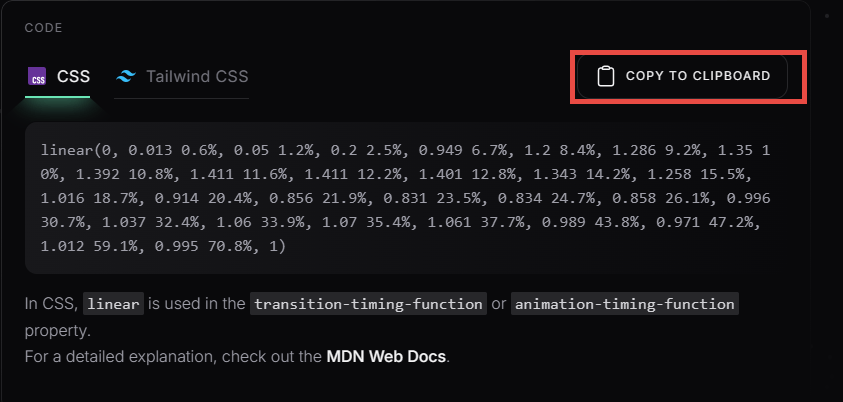
Specifying more elaborate parameters allows you to create even more interesting movements. However, as parameters become more and more complex, even the designer may not know what to do and where to make fine adjustments. For example, consider the case of specifying a spring-like movement.
The easing function that achieves this behavior is specified as follows. When it gets this complicated, it becomes difficult to maintain.
[code]
animation-timing-function: linear(0, 0.015 0.3%, 0.059 0.6%, 0.128 0.9%, 0.256 1.3%, 0.505 1.9%, 1.168 3.3%, 1.47 4.1%, 1.576 4.5%, 1.632 4.8%, 1.667 5.1%, 1.68 5.4%, 1.673 5.7%, 1.646 6%, 1.601 6.3%, 1.517 6.7%, 1.35 7.3%, 0.869 8.8%, 0.689 9.5%, 0.575 10.2%, 0.549 10.5%, 0.538 10.8%, 0.54 11.1%, 0.557 11.4%, 0.641 12.1%, 0.753 12.7%, 1.1 14.3%, 1.219 15%, 1.293 15.7%, 1.315 16.3%, 1.299 16.9%, 1.238 17.6%, 0.938 19.7%, 0.855 20.4%, 0.802 21.1%, 0.786 21.7%, 0.795 22.3%, 0.835 23%, 1.038 25.1%, 1.102 25.9%, 1.136 26.6%, 1.146 27.2%, 1.138 27.8%, 1.11 28.5%, 0.971 30.6%, 0.932 31.3%, 0.908 32%, 0.901 32.6%, 0.917 33.7%, 1.038 36.5%, 1.06 37.3%, 1.067 38%, 1.053 39.3%, 0.968 42.2%, 0.954 43.5%, 0.965 44.8%, 1.021 47.6%, 1.031 48.9%, 1.024 50.2%, 0.985 53.1%, 0.979 54.4%, 1.014 59.8%, 0.99 65.2%, 1.007 70.7%, 0.995 76.1%, 1.003 81.5%, 1);
[/code]
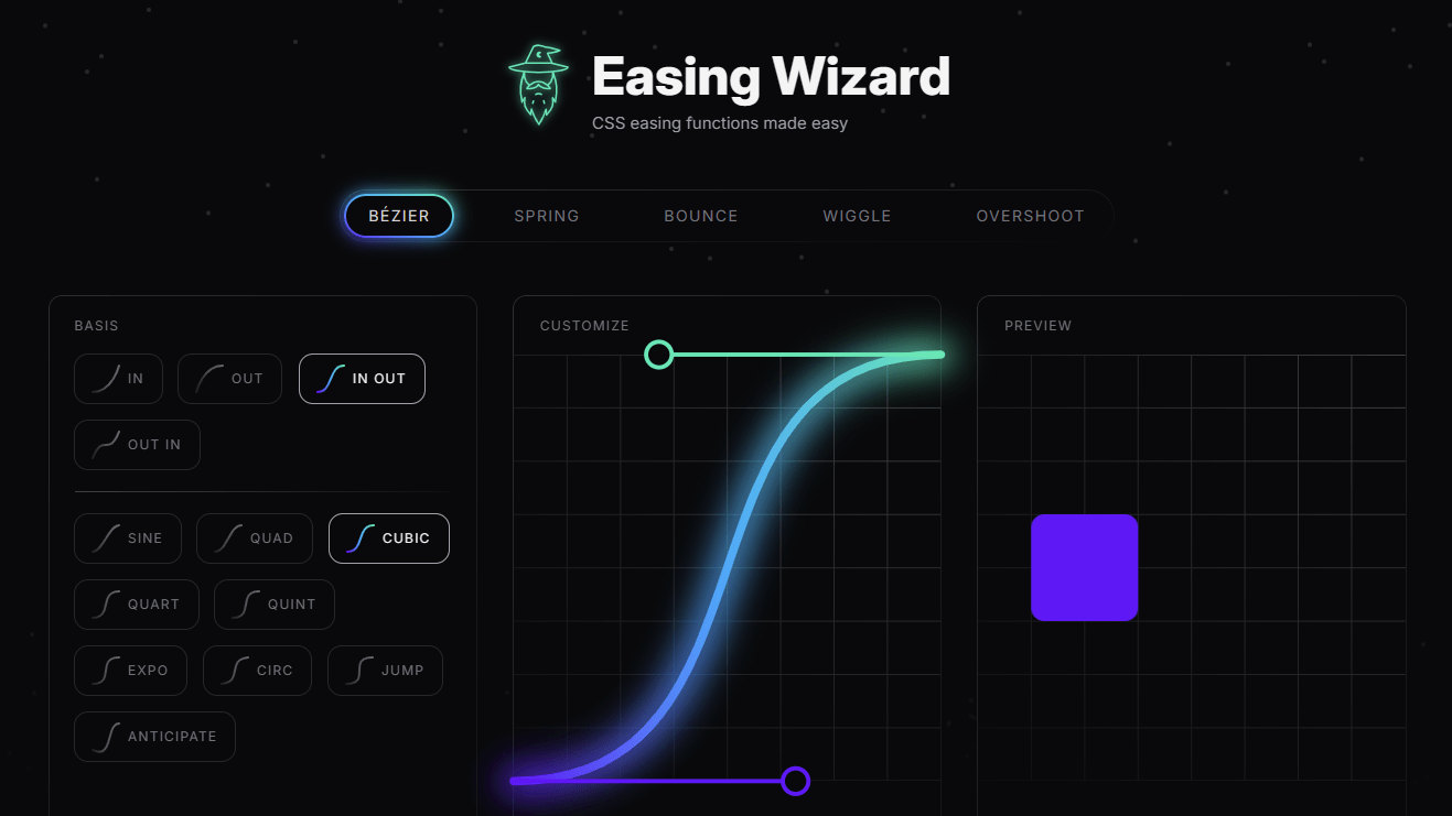
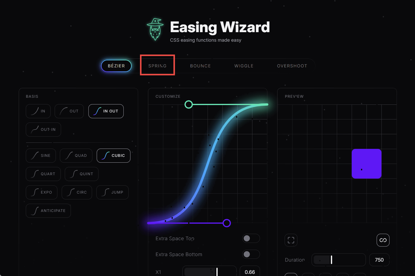
Now that we understand how difficult and tedious it can be to create animations that will interest the viewer, let's open the Easing Wizard . At the top of the screen, there is a section to specify the type of animation, and you can select the animation you want to apply from the following options:
・BÉZIER : Action specified by cubic-bezier()
・SPRING : Spring-like action
・BOUNCE : Bouncing action
・WIGGLE : Twitching motion
・OVERSHOOT : The action of going too far and then coming back
First, we want to try out the 'spring-like movement' mentioned in the previous example, so select 'SPRING.'
On the right side of the screen, select BASIS (basic operation) from the following seven options.
・HEAVY : Heavy movements
・BOUNCY : High vibration action
・DROP : Light operation
・GLIDE : A sliding motion
・SNAP : A flicking motion
・LAZY : Slower SNAP operation
・ELASTIC : Flexible SNAP action
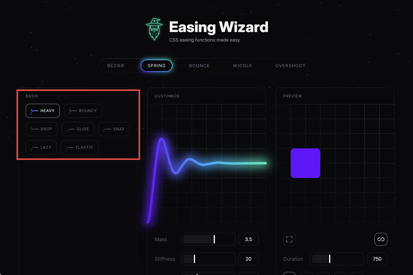
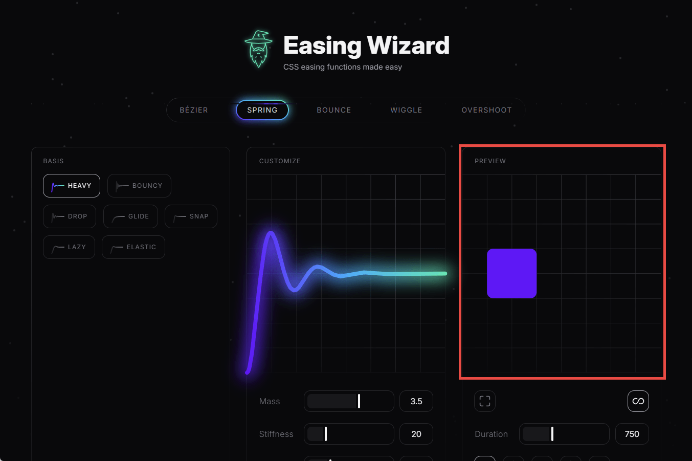
A graph in the center of the screen shows how the selected action will behave over time, so you can visually see whether it is behaving as expected.
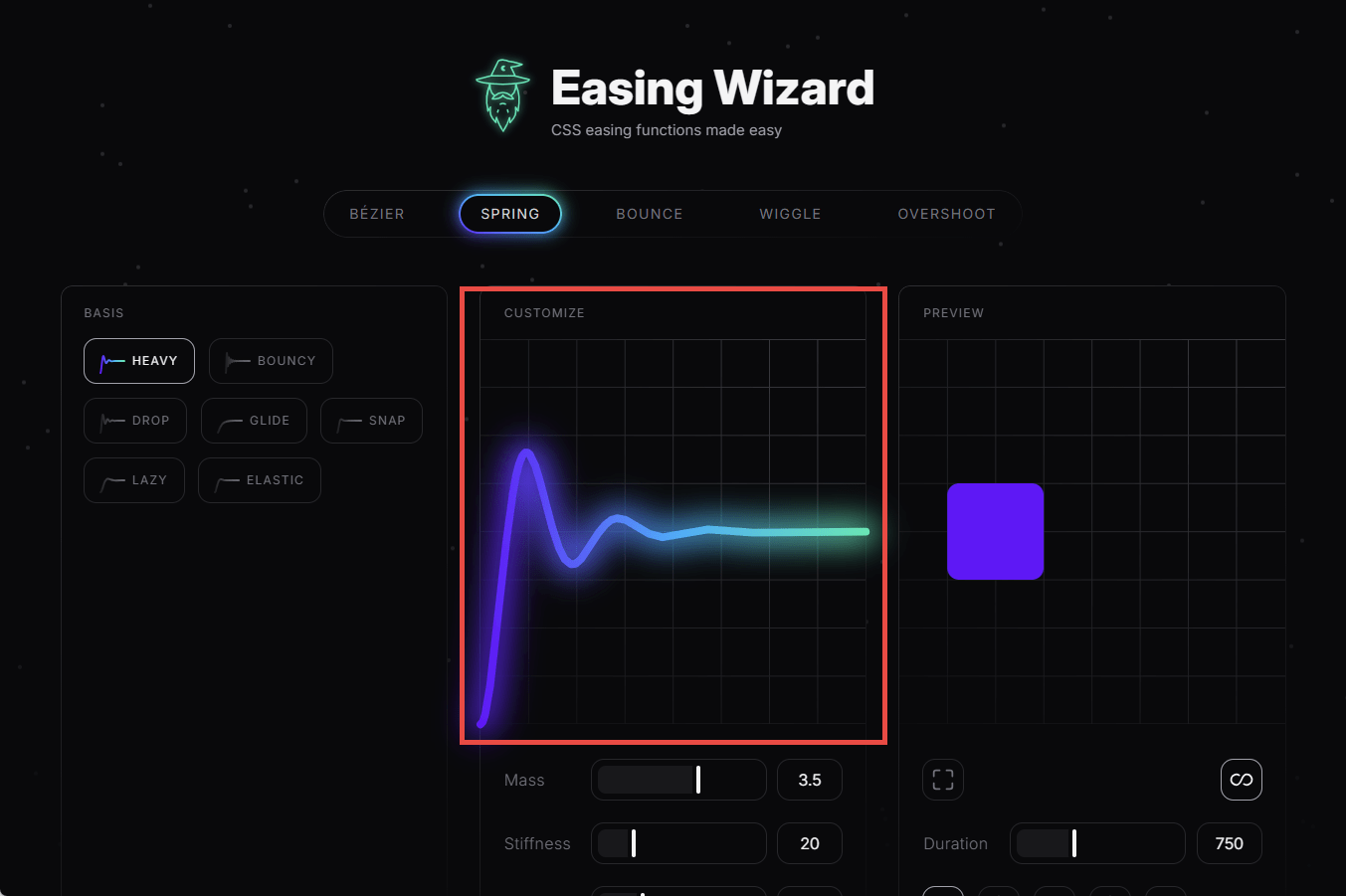
In addition, an animation demo is displayed on the left side of the screen, so you can get a sense of it.
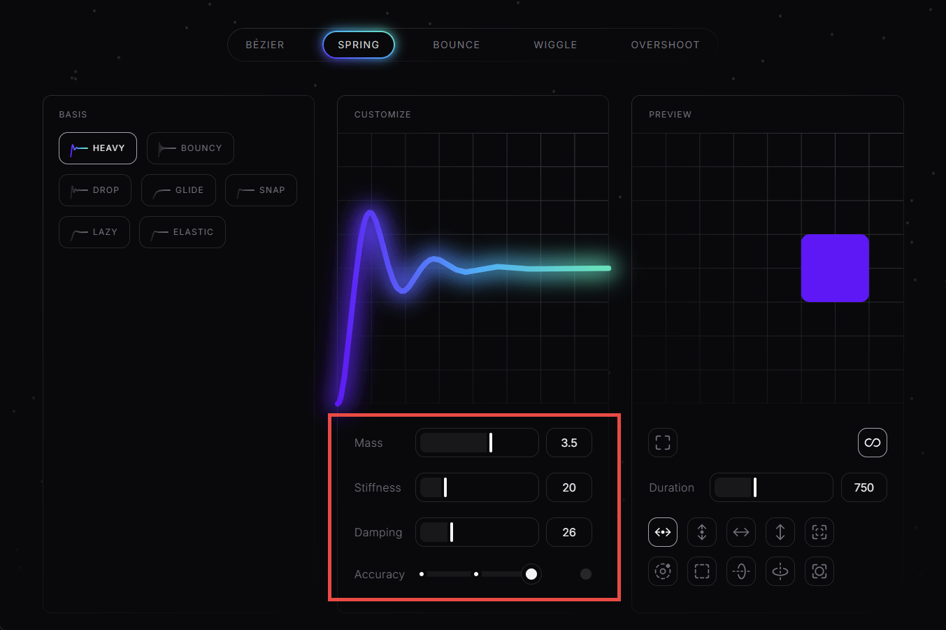
If you scroll down a bit, you'll see controls in the middle for customizing the animation behavior. The available adjustments are:
・Mass : Size
・Stiffness : Hardness
・Damping : Amount of damping
・Accuracy : Smoothness
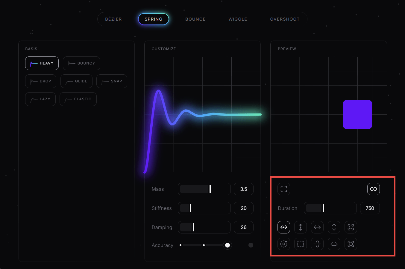
To the right of it are controls for controlling the animation demo display. The default animation is a repeated horizontal movement, but you can change it to vertical, or animate it with resizing, rotation, etc. You can also compare a monotonous uniform linear movement with a shadow display, and adjust the animation time.
Scrolling further down reveals the easing function code that creates the animation. You can choose between CSS and
Looking at animations other than 'SPRING,' one that is particularly interesting is 'BÉZIER.' The cubic-bezier() function defines
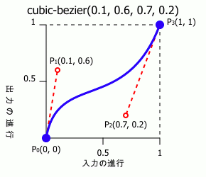
However, even after looking at the code, I still can't quite grasp what kind of curve it will produce.
[code]
animation-timing-function: cubic-besier(0.1, 0.6, 0.7, 0.2);
[/code]
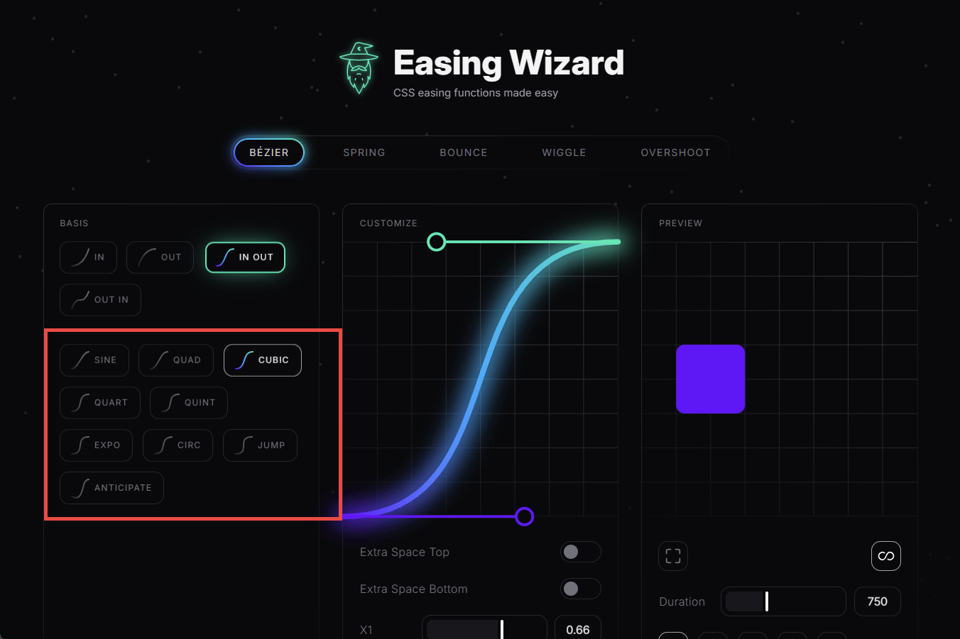
So we will use the Easing Wizard again. When you select 'BÉZIER' from the animation type, the BASIS will be one of the following four options.
・IN : Starts moving gradually from the starting point and reaches the end point at the fastest speed
・OUT : Starts moving at the fastest speed from the starting point, gradually slows down, and stops at the end point
・IN OUT : Starts gradually from the starting point, reaches maximum speed halfway through, gradually slows down, and stops at the end point.
・OUT IN : Starts from the starting point at the fastest speed, slows down along the way, and reaches the end point at the fastest speed
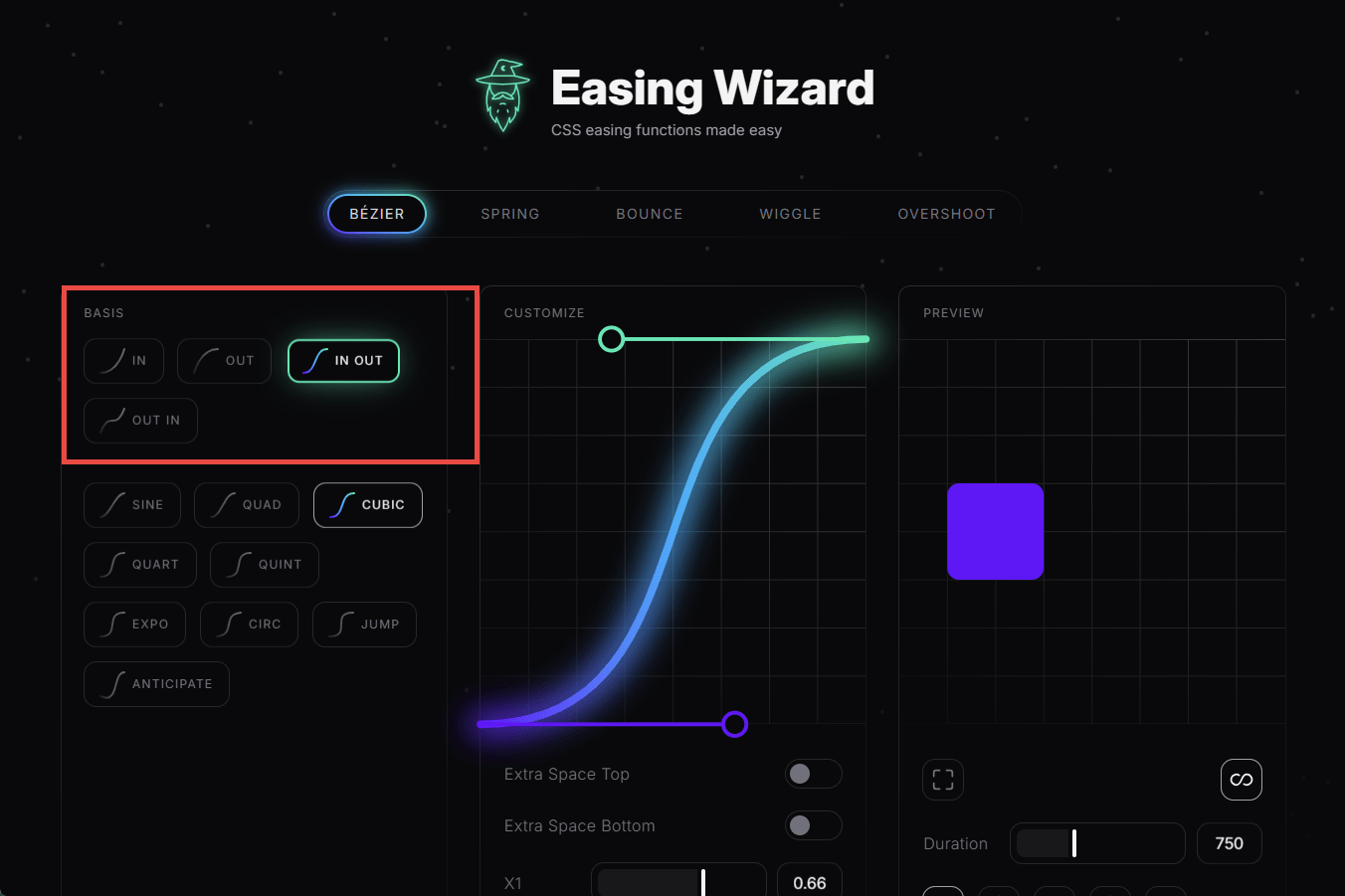
In the case of BÉZIER, you can choose more detailed behavior depending on the BASIS you select.
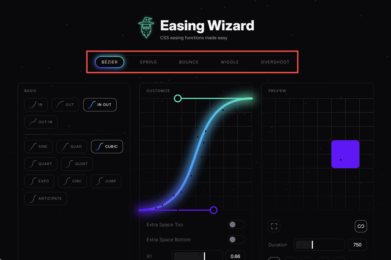
Customizing BÉZIER is different from other methods in that you specify the coordinates of the intermediate points, as explained below in the cubic-bezier() function.
・X1 : X coordinate of midpoint p1
・Y1 : Y coordinate of midpoint p1
・X2 : X coordinate of midpoint p2
・Y2 : Y coordinate of midpoint p2
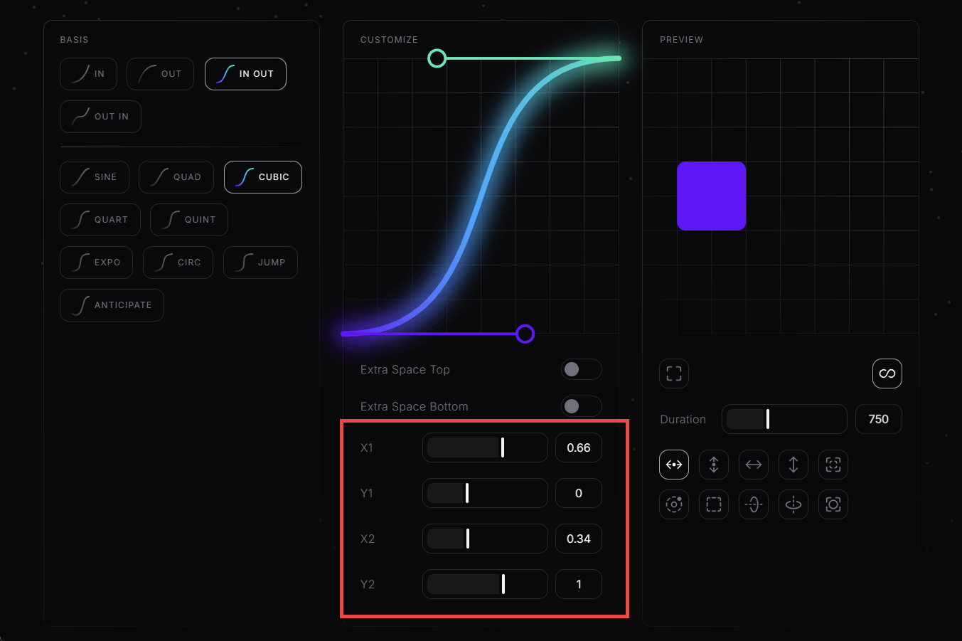
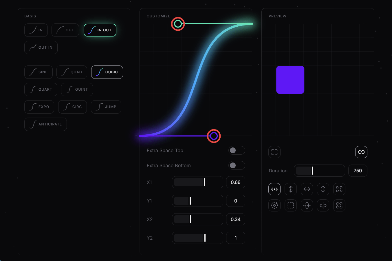
You can also directly manipulate the coordinates of midpoints by dragging and dropping them in the graph. This method of customization is more convenient because you can directly see how the shape of the graph changes as you manipulate it.
In addition, you can specify the following:
・Extra Space Top : Add space above the graph
・Extra Space Bottom : Add space below the graph
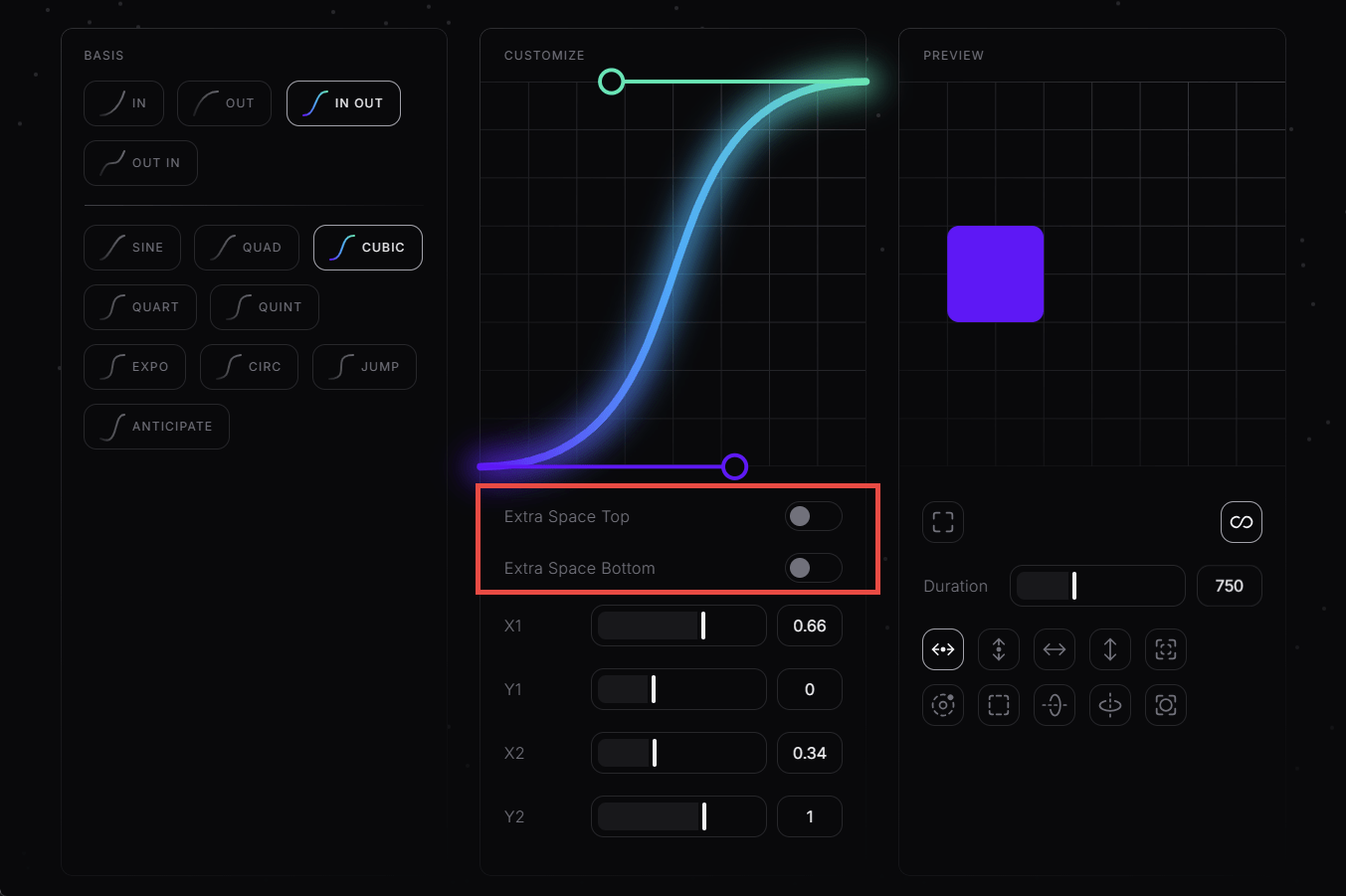
Turning both on will add space above and below the graph, allowing you to set the midpoint at a position that extends beyond the top or bottom.
The customized generated code looks like this:
[code]
animation-timing-function: cubic-bezier(0.665, -0.573, 0.415, 1.764);
[/code]
When I applied the CSS, it was properly reflected in the animation.
Related Posts:


in Review, Web Application, Posted by log1c_sh