Artists have been wrong about the depiction of shadows in paintings for centuries.
From the ancient Roman era until
The Art of the Shadow: How Painters Have Gotten It Wrong for Centuries | The MIT Press Reader
https://thereader.mitpress.mit.edu/the-art-of-the-shadow-how-painters-have-gotten-it-wrong-for-centuries/
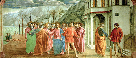
It seems that the expression of shadows often looks correct to the human eye, even if it is physically incorrect. The following is a fresco called ' Tribute Money ' created in the 1420s in the Bunrakacci Chapel in Florence, Italy. The shadows of several characters appear to be accurately depicted in this fresco.
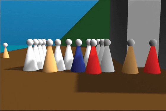
However, if the building and people are actually arranged like in ``Tribute Money'' and the light is shining so that the shadow extends to the left, the shadow will not look like a painting. If you look at the 3D model that reproduces the ``Tribute Money'' object created by Meeko Kuwahara, it is obvious that the shadow of the building should overlap greatly with the shadow of the person.
Furthermore, unnatural shadows are also drawn in the religious painting '
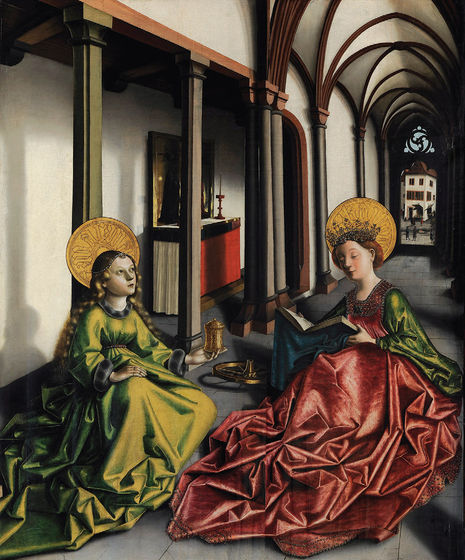
'
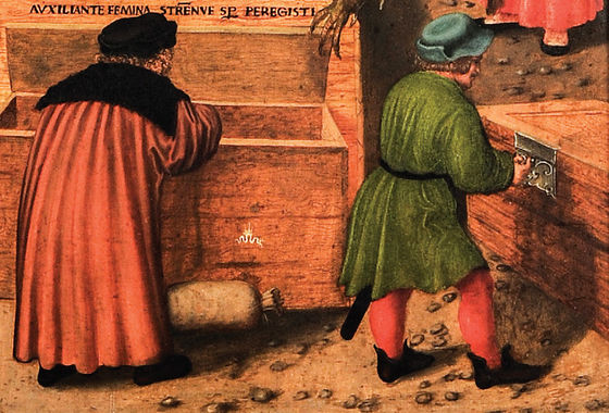
Der Sterbende, Epitaph des Heinrich Schmitburg , painted between 1472 and 1553, depicts two men standing in front of a large box. The shadow of the man on the right extends accurately from the ground to the box, but for some reason the shadow of the man on the left only extends to the ground and does not cover the box.
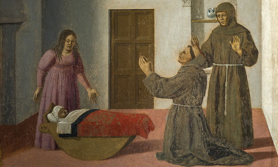
However, there are some works, such as
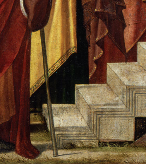
In '
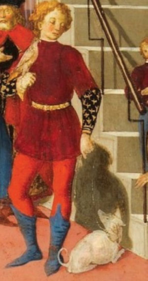
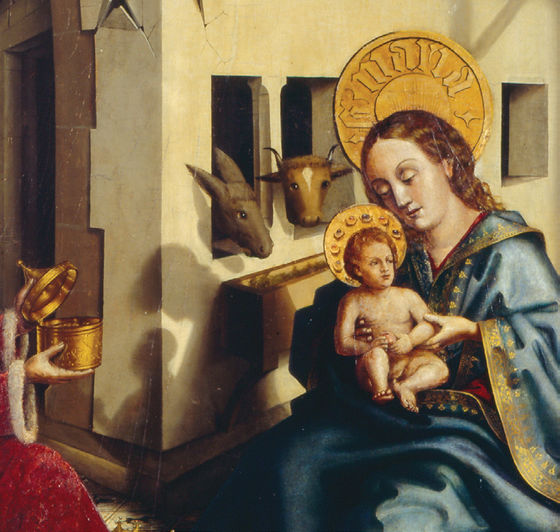
In '
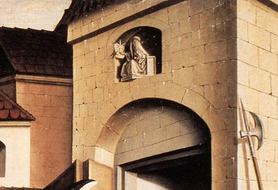
Witz's depiction of shadows is not completely accurate, but it is a level of detail that sets him apart from other artists' depictions of shadows.
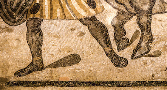
Triangular shadows were commonly used to express human shadows. Below is a triangular shadow drawn in '
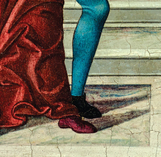
On the other hand, there are some that express shadows as inverted triangles. It seems that the method of ``representing shadows using triangles'' as mentioned above was distorted at some point, and shadows were now drawn using inverted triangles.
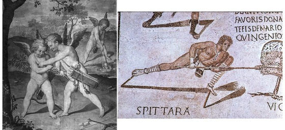
There are also shadows that extend from the left and right legs and connect like a horseshoe. Below is 'Amor, Anteros and Amor Lethaeus' on the left, and 'Magellius mosaic' painted around the 3rd century on the right. In both paintings, you should be able to see that the shadows extending from the left and right legs of the figure merge in the middle.
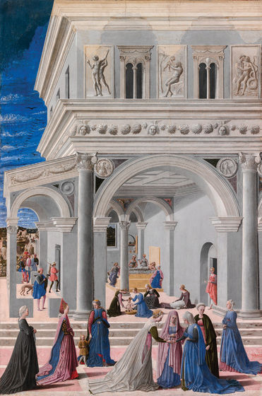
Another example of
Related Posts:
in Art, , Posted by logu_ii
