[Obvious] Bruce Blackburn, who designed the NASA symbol, dies
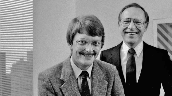
Graphic designer Bruce Blackburn, who has a reputation for modern and minimalist designs, such as the four-letter red symbol of the American Aeronautics and Space Administration (NASA) known as the 'worm' and the 1976 War of Independence 200th Anniversary logo. It was discovered that he died on February 1, 2021 at a nursing home in Colorado, USA. I was 82 years old.
Bruce Blackburn, Designer of Ubiquitous NASA Logo, Dies at 82 --The New York Times
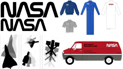
The NASA symbols devised by Mr. Blackburn are as follows. It has a simple design with only 'NASA' written in thick red letters, and the two 'A' s are especially designed to remind you of a rocket. The symbol devised by Mr. Blackburn was called a 'worm' because of its appearance.

The first symbols adopted when NASA was established in 1958 are as follows.

In addition, the symbol adopted by NASA at the time of writing the article is the second generation designed in 1959, which is called 'meatball'. After the worm symbol was abolished in 1992, it was adopted again in the NASA logo.
The Apollo program of the 1960s drew worldwide attention to the American space exploration program, and NASA wanted to create a more advanced image. Therefore, we abolished the meatball symbol that has been used since 1959 and are looking for another design. The order was received by Mr. Blackburn and his colleague Richard Dunne, who ran a small design company called 'Dan & Blackburn' in New York.
The worm symbol devised by Blackburn et al. Has been adopted and has been in public use since 1975. However, in 1992 NASA abolished the worm symbol as part of its organizational restructuring and re-adopted its predecessor, the meatball symbol.
Mr. Blackburn described the meatball symbol as 'clumsy and sloppy, not a symbol that represents the future,' and was very angry at the abolition of the worm symbol and the re-adoption of the meatball symbol. It seems that it represented.
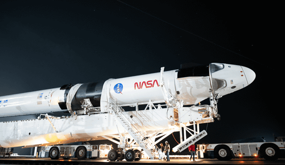
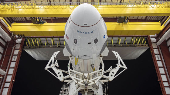
However, when NASA adopted SpaceX's Falcon 9 for its launch vehicle in 2020, the worm symbol was once again in the light of day and was heavily drawn on the side of the launch vehicle. 'I think my dad was happy to know that the worm symbol he designed was back in space,' said Blackburn's daughter.
by NASA HQ PHOTO
Blackburn also designed the American Revolutionary War 200th Anniversary Symbol in 1976. Using the three colors of red, white, and blue used for the Star-Spangled Banner, the design creates a white star in a soft curve, and it is printed on everything from stamps to coffee mugs.

In a short documentary film ' Blackburn ' that chased Mr. Blackburn, released in 2016, Mr. Blackburn described his design style as 'programmatic and permanent to the general public. 'The art of design is a solution to a problem and a visual breath of life,' he said.
Related Posts:


in Note, Posted by log1i_yk