The glacier equivalent to three times the total ice of the Alps every year is lost

by
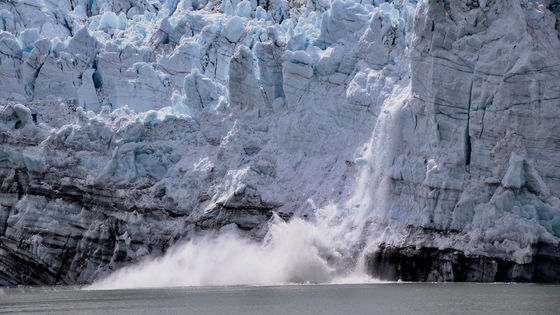
A total of 9 trillion tons of glaciers lost from the earth over the 55 years from 1961 to 2016 were published in the science journal Nature on April 8, 2019. Even if the figure is too large and it is said that 9 trillion tons, it does not come to a pin, but it is equivalent to as much as 27 billion aircraft equivalent to the Boeing 747 type passenger plane also called a jumbo jet, foreign media Mashable says.
Global glacier mass changes and their contributions to sea-level rise from 1961 to 2016 | Nature
https://www.nature.com/articles/s41586-019-1071-0
The ice lost by Earth's glaciers weighs as much as 27 billion 747s
https://mashable.com/article/glaciers-melting-climate-change/
It was the international research team of Dr. Michael Semp, who studies geography at the University of Zurich, who presented the research results that 9 trillion tons of ice were lost from the earth in 55 years. According to research results, an average of 335 billion tons of ice melts each year, which is three times as much as ice in the entire Alps.
The following image, created by the European Space Agency based on Dr. Semp's paper, shows on a map the distribution of ice lost between 1961 and 2016.
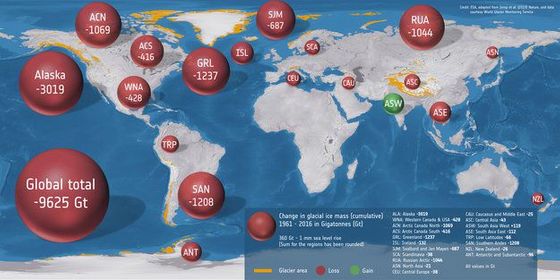
The loss of ice in Alaska is particularly pronounced, melting at a rate 2-3 times that of other areas. According to NASA
by
When the ice melts, it does more than just rise the sea level. The sea has the function of absorbing the huge amount of heat emitted on the earth, and the sea absorbs 90% of the temperature that human beings generate and emit greenhouse gases. It is not difficult to imagine that if the sea absorbs heat and the sea temperature rises, the ice is more likely to melt, but the sea absorbs not only heat but also carbon dioxide, and if the temperature rises the absorbed carbon dioxide decreases To do. In other words, as the sea ice melts due to global warming, global warming progresses at an accelerating pace.
The impact of global warming is about to reach a serious area. Robert Rode, a senior researcher at the non-profit organization Berkeley Earth in the United States, has published a movie on Twitter showing an animated transition of surface temperature from 1850 to 2018.
Animation showing how the distribution over Earth's surface of the annual average temperature anomalies has been shifting due to global warming since 1850. #GlobalWarming #ClimateChange pic.twitter.com/HNUmJaZS2l
— Robert Rohde (@RARohde) March 29, 2019
The movie starts in 1850. The horizontal axis represents the surface temperature, and the vertical axis represents the percentage of the surface area that the temperature occupies.
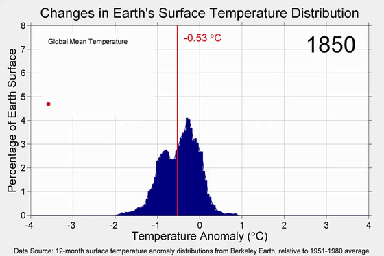
The temperature on the surface continues to go back and forth for about 100 years, but as it enters the 1940s, the temperature starts to rise gradually, and the bar graph starts to move to the right.
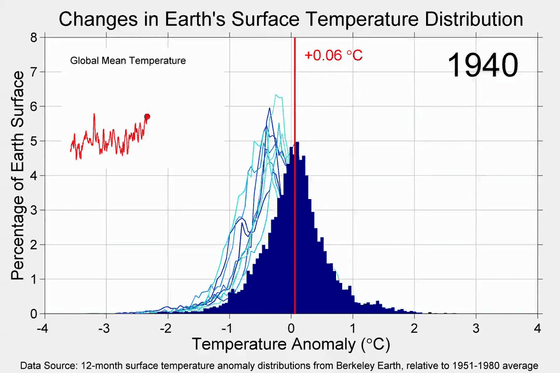
It will be visible and heat up in the 2000s.
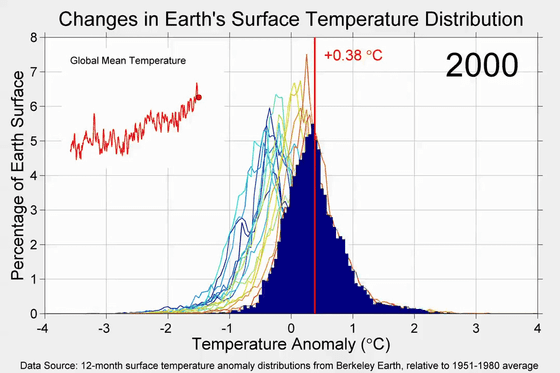
And in 2018, the bar graph shifted to the far right. If you look at the upper left line graph that shows the average temperature, you can see that the temperature is rising almost right.
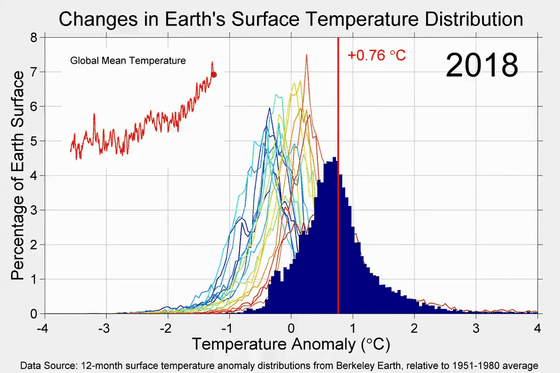
NASA's oceanographer Josh Willis suggested to Mashable that these dramatic changes are by no means capricious of nature, 'global warming is apparently caused by human emissions of greenhouse gases. It is said.
Related Posts:
