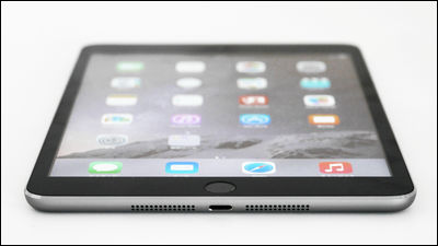
IPad comparative photographs of the past that you can see well that "iPad Pro is close to two iPad Air"

Even among the iPads of the past, overwhelming performance and big screen are making it ugly "IPad Pro"is.Opening ceremony and photo reviewSince it has already been posted in GIGAZINE, I tried to compare the iPad Pro side by side with multiple iPads actually, "How is the iPad Pro changed compared with the previous iPad?"
IPad Pro - Apple (Japan)
http://www.apple.com/jp/ipad-pro/
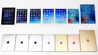
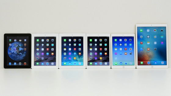
That's why I mobilize the iPad in the editorial department of GIGAZINE. The first iPad from the left, the new iPad (3rd generation iPad), iPad Retina display model, iPad Air, iPad Air 2, iPad Pro. You can see clearly that there is a difference in size between iPad and iPad Pro as well as between iPad mini and iPad.
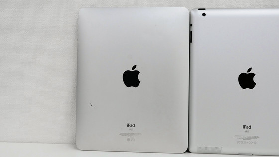
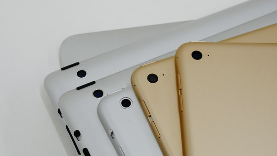
The back is like this. We have consistently adopted a metal body from the beginning, never used a glass panel on the back like the iPhone.
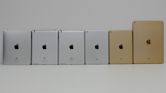
The first iPad that looks like other iPads only on the back.
Up to the iPad Retina display model, materials like black plastic were used for the Apple logo on the back ... ...
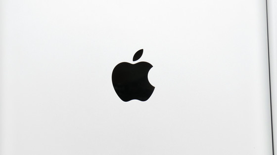
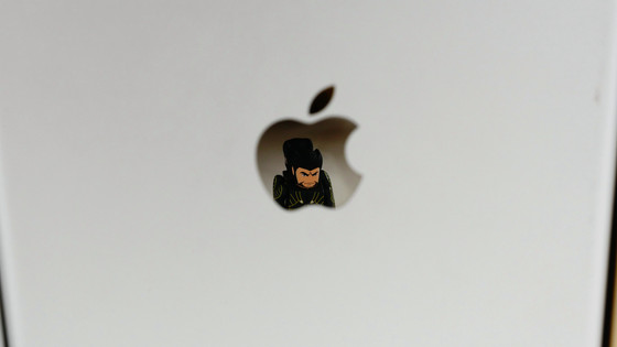
Since iPad Air, metal parts polished like a mirror are adopted.
Only iPad Pro is overflowing and it is too big, but when you arrange the first iPad, 3rd generation iPad, iPad Retina display model, iPad Air, iPad Air 2, iPad Pro from below, it is like this. From the iPad Pro, four speakers are placed on the top and bottom so that you can focus on sound quality, so that you can wrap it in overwhelming sound even if you have it in any orientation.
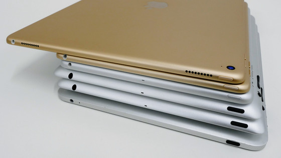
The power button changes like this from iPad Air to metal parts.
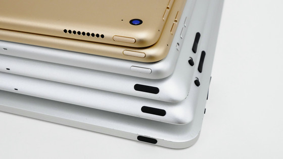
The volume control button has also changed from iPad Air to metal parts. However, the manner mode button is missing from iPad Air 2 for some reason, and it is not arranged also in iPad Pro.
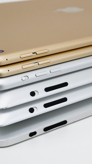
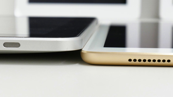
The bottom is like this. Speakers from the original iPad are located on the bottom of the main unit and are now located on both sides of the central Lightning connector from the iPad Air. As the number and arrangement of the holes are changed each time, it is clear that Apple has constantly been working on improving around the speakers.
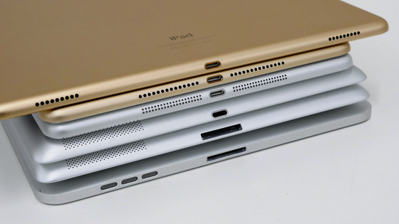
And left side. From the first generation to the iPad Air 2, no terminals or buttons were arranged on the left side, but in the iPad Pro a terminal for a special keyboard called Smart Connector appeared in the center of the right side.
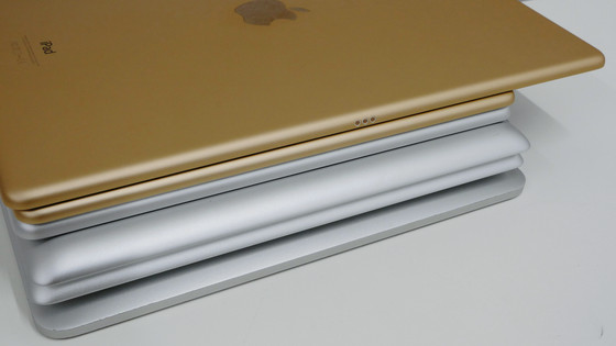
Apart from the original iPad, the camera is located at the upper left of the back.
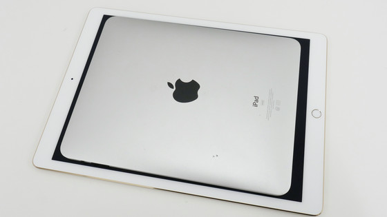
The 12.9 inch display of the iPad Pro is bigger than the first iPad.
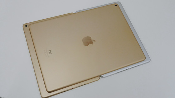
Looking side by side with iPad Air and Air 2 under iPad Pro like this. The iPad Pro is about the size smaller than the two iPad Air sizes. That should be that, iPad Pro's display size seems to be 78% larger than iPad Air 2.
Compare the thinness of the original iPad and iPad Pro. The raised part of the back is about the same as iPad Pro.
From the left 3rd generation iPad, iPad Pro, iPad Retina By arranging the display models like this, the iPad Pro is overwhelmingly thin ... ...
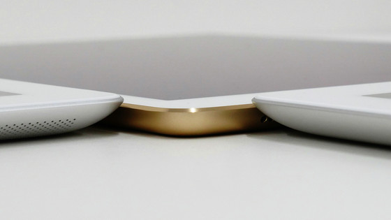
Even if you see the iPad Air and iPad Pro side by side, the overwhelming thin design that iPad Pro is thinner.
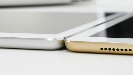
However, iPad Pro is slightly thicker than iPad Air 2.
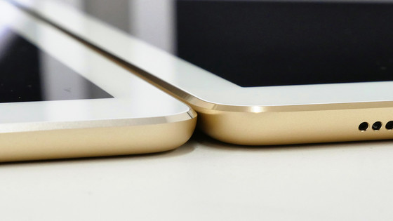
That's why the design of the iPad Pro has changed almost entirely from iPad Air and Air 2. The big change is that the built-in speaker has evolved to four.
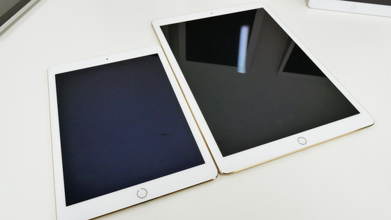
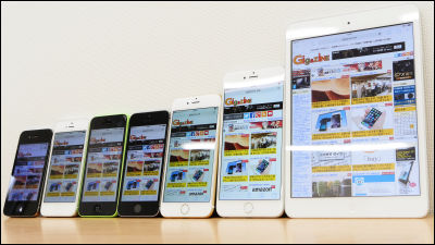
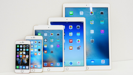
As a bonus, I tried iPhone 6s with display size of 4.7 inches, 5.5 inch iPhone 6s Plus, 7.9 inch iPad mini 4, 9.7 inch iPad Air 2, 12.9 inch iPad Pro. As the numerical value is the largest display size is between the iPad Pro and the iPad Air 2, probably the next is the possibility of an 11 inch tablet appearing as "iPad Pro mini" ... Naka Nara is.
Related Posts:
