'Project Faces' technology that can create new fonts freely from Adobe comes up
Software company Adobe gave a keynote speech to showcase the new technology being developed at
Adobe MAX 2015-Sneaks-Project Faces-YouTube
One of the headaches in designing is choosing the right font for the project. If you don't want to use an existing font, you may want to distort the font, but it takes too long.
Adobe is developing an application to solve the problem. A demonstration was made that the prototype of the application was run on the iPad. There is a large 'P' on the screen with two adjustment bars below it.

Slide the top bar to the right to make P thicker.

When the lower bar is moved to the left, P becomes smaller with a specific part as the reference point ...
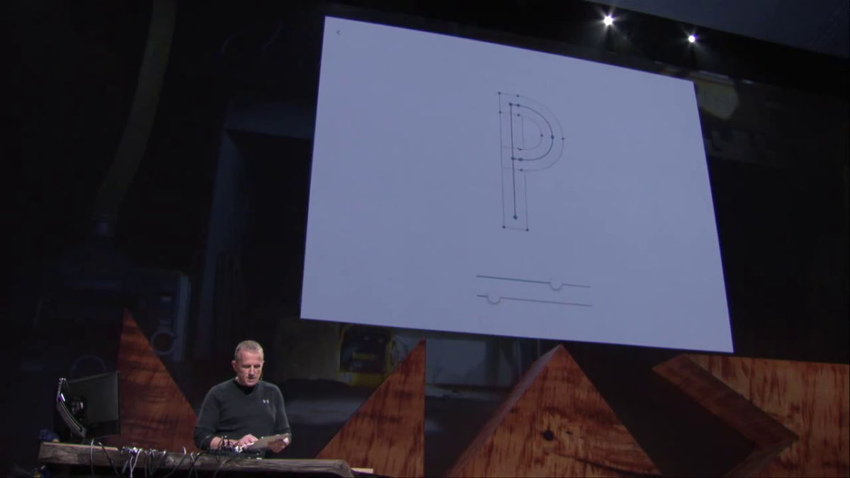
It becomes big. This is a new technology called Project Faces that analyzes the font skeleton and adjusts its shape freely.

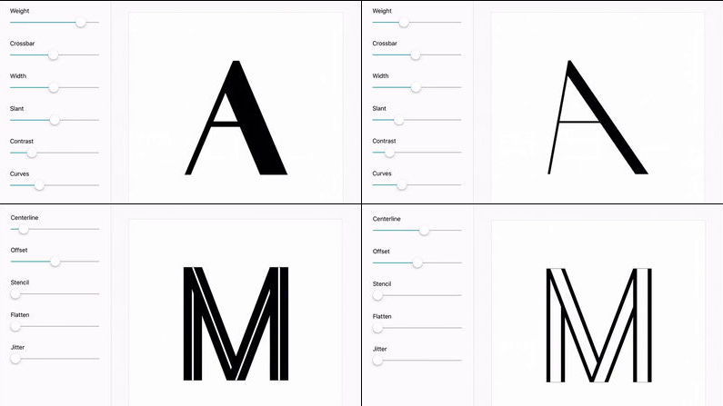
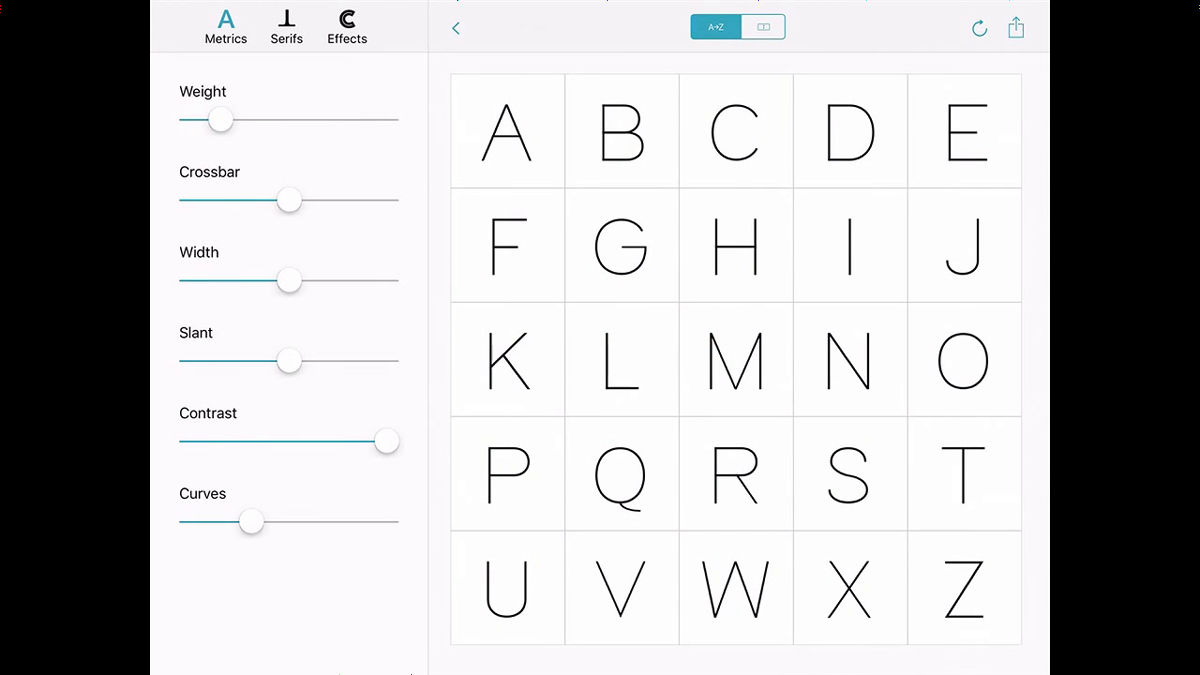
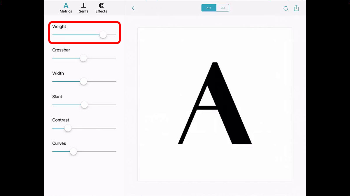
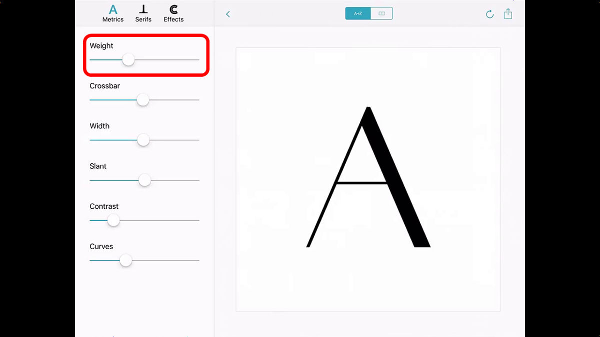
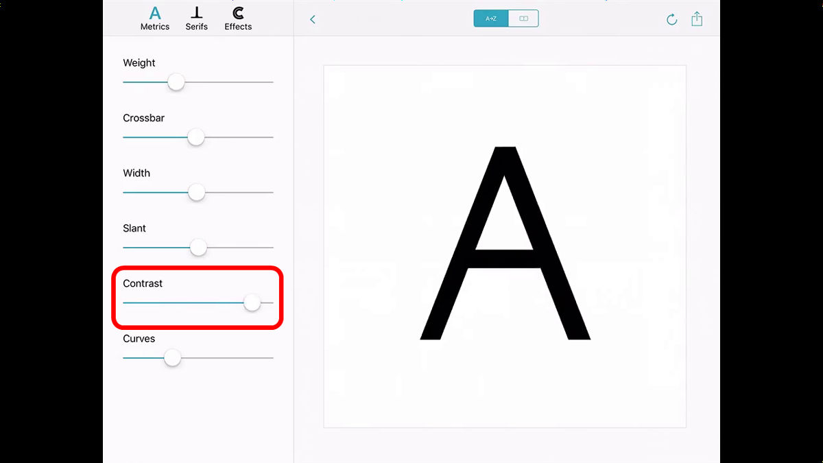
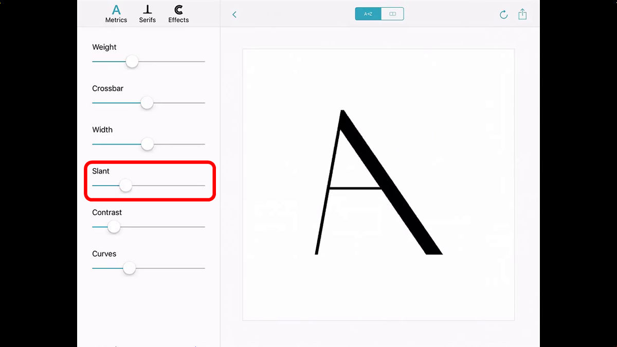
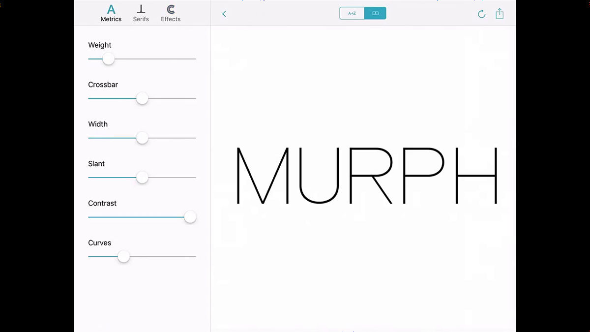
This is the screen of the app prototype. On the left of the screen, adjustment bars such as 'Weight', 'Crossbar', 'Width', 'Slant', 'Contrast' and 'Curves' are displayed.
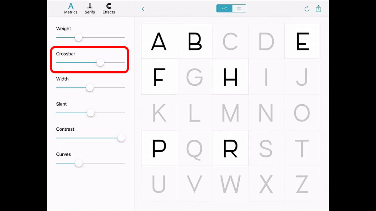
When you select the alphabet and move the Crossbar to the left, the horizontal crossbars between the vertical lines move upwards, and the font changes to a close up.

Slide to the right to lower the crossbar position.
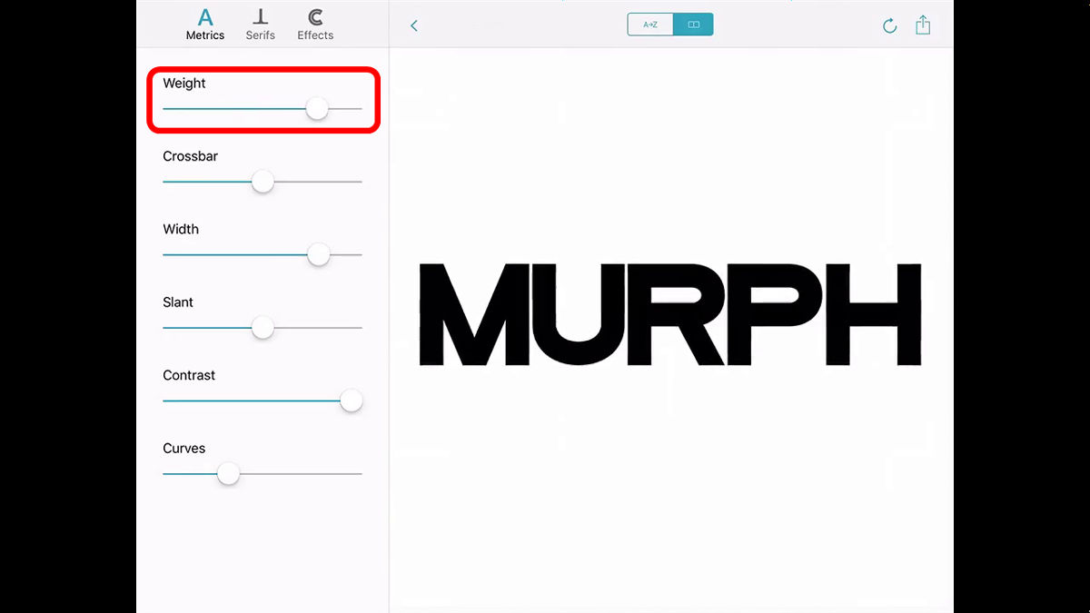
Swing Weight right to make the line thicker.
Shake to the left to make the line thinner.
When adjusting Contrast, the line thickness of the entire character changed.
Slant adjusts the slope.
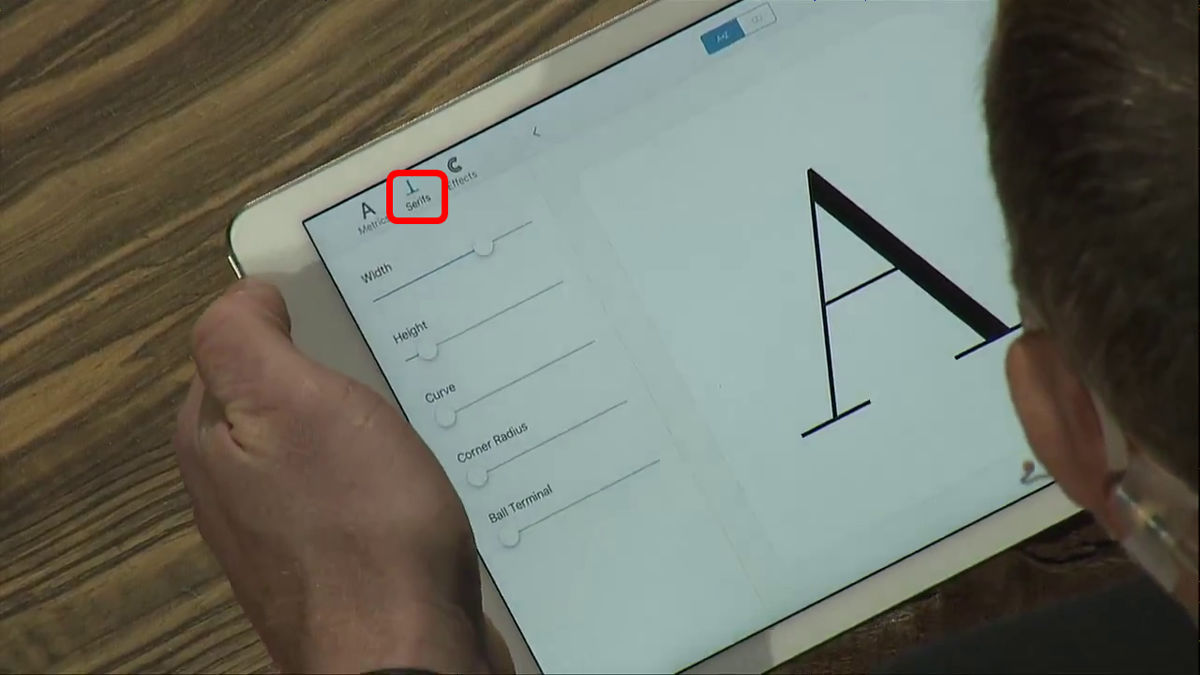
What surprised me was the menu called 'Serifs', which allows you to adjust the line serifs that decorate the writing and closing parts.
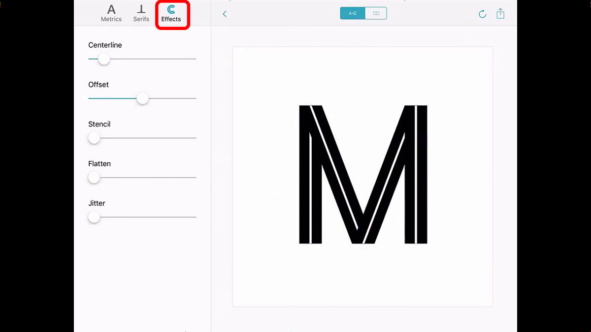
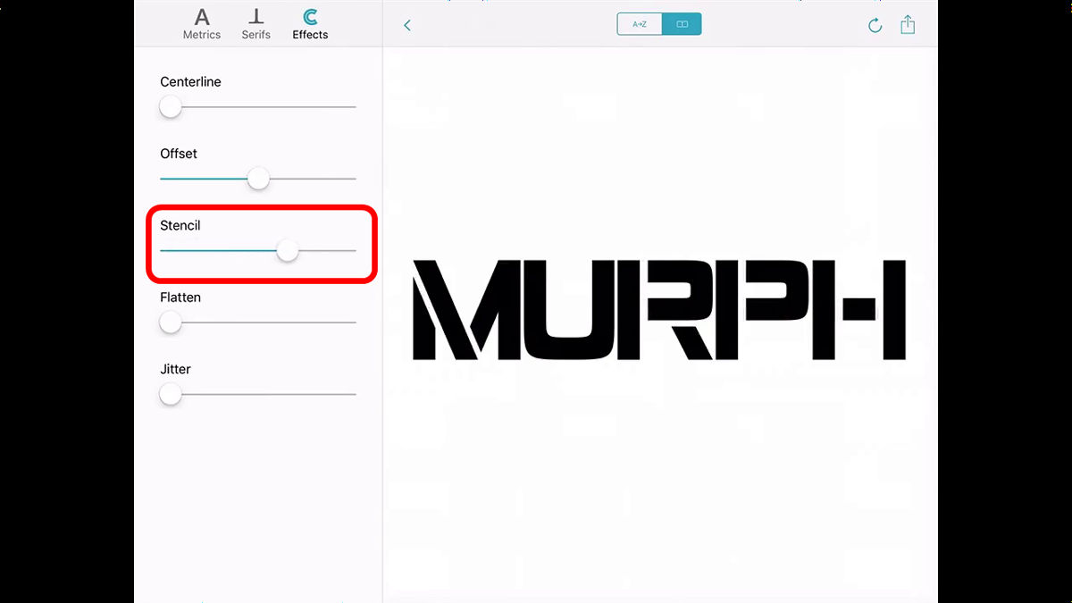
A demo of the menu called 'Effects'.
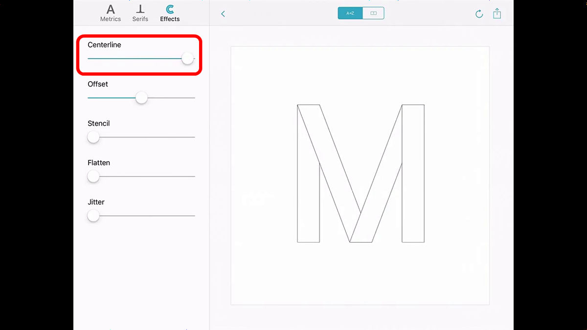
Let's adjust the Centerline.
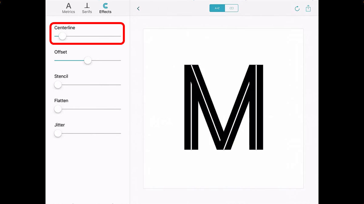
When I swung Centerline to the right, the white line at the center of the font skeleton became thicker.
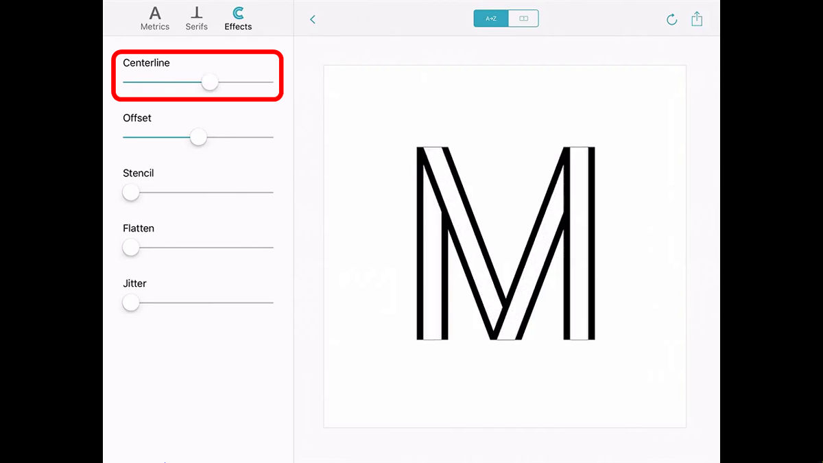
Shake all the way to the right and only to the outline.
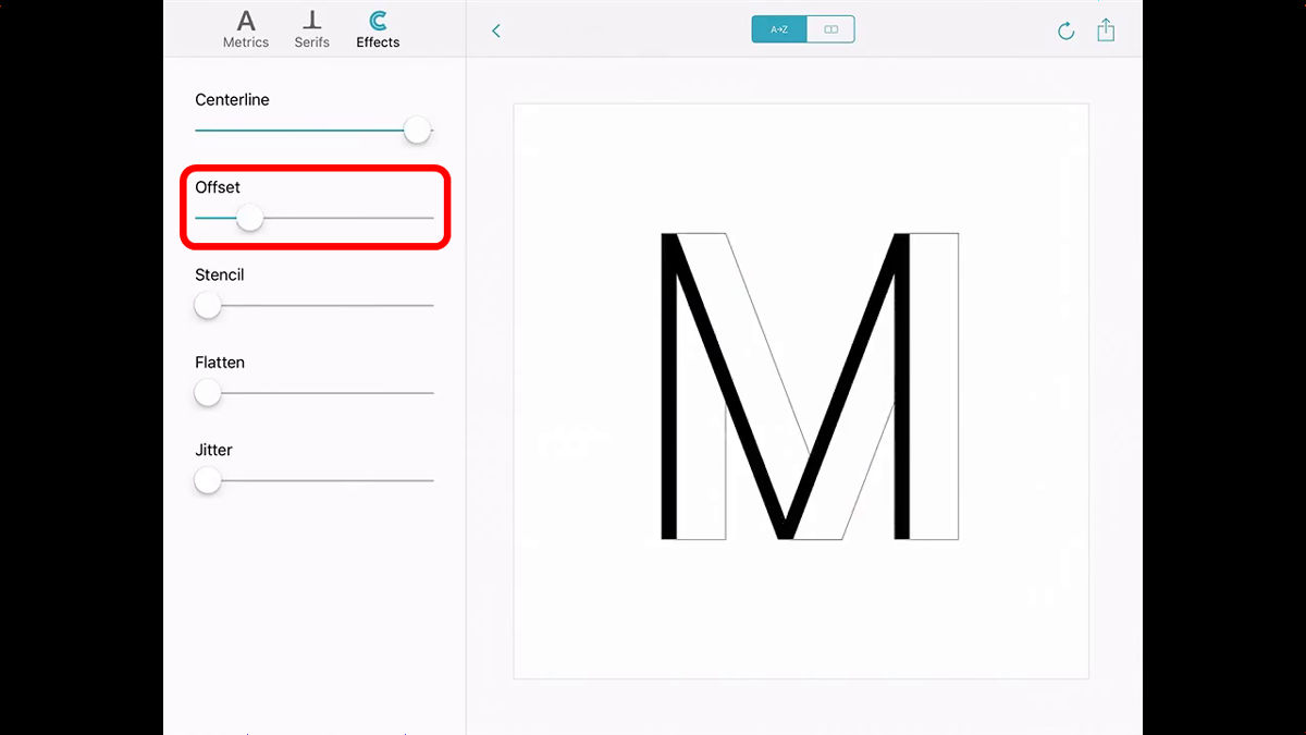
Next is 'Offset'
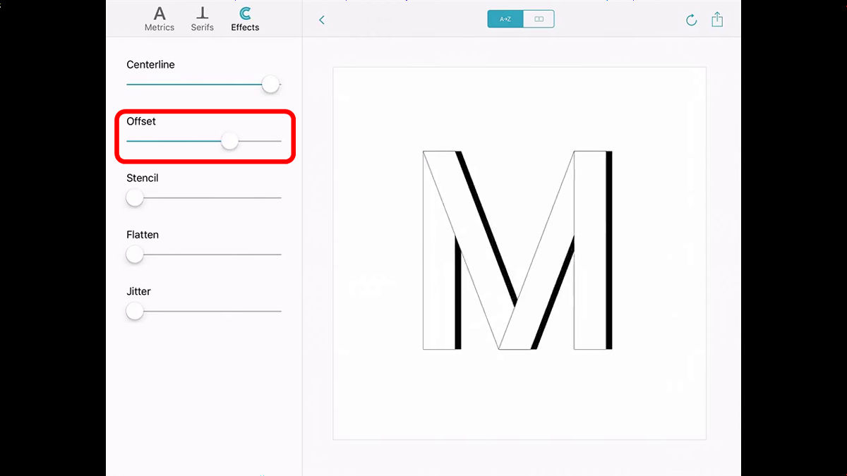
When sliding to the right, the font deforms into a shape with the center line sticking forward.
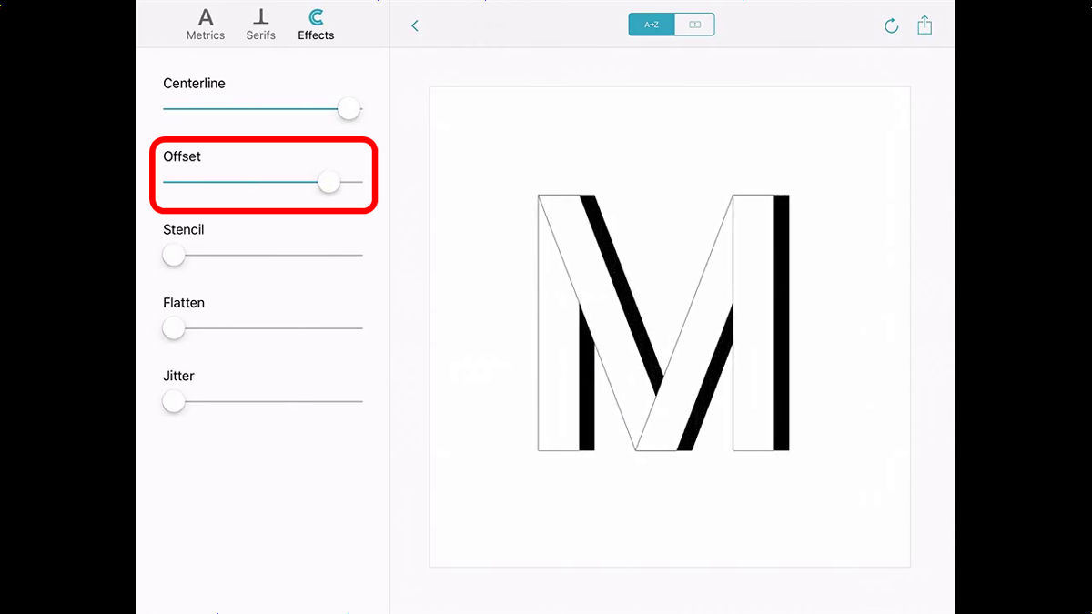
If you shake Offset to the left, it looks like this.
This time, a demonstration of design using words.
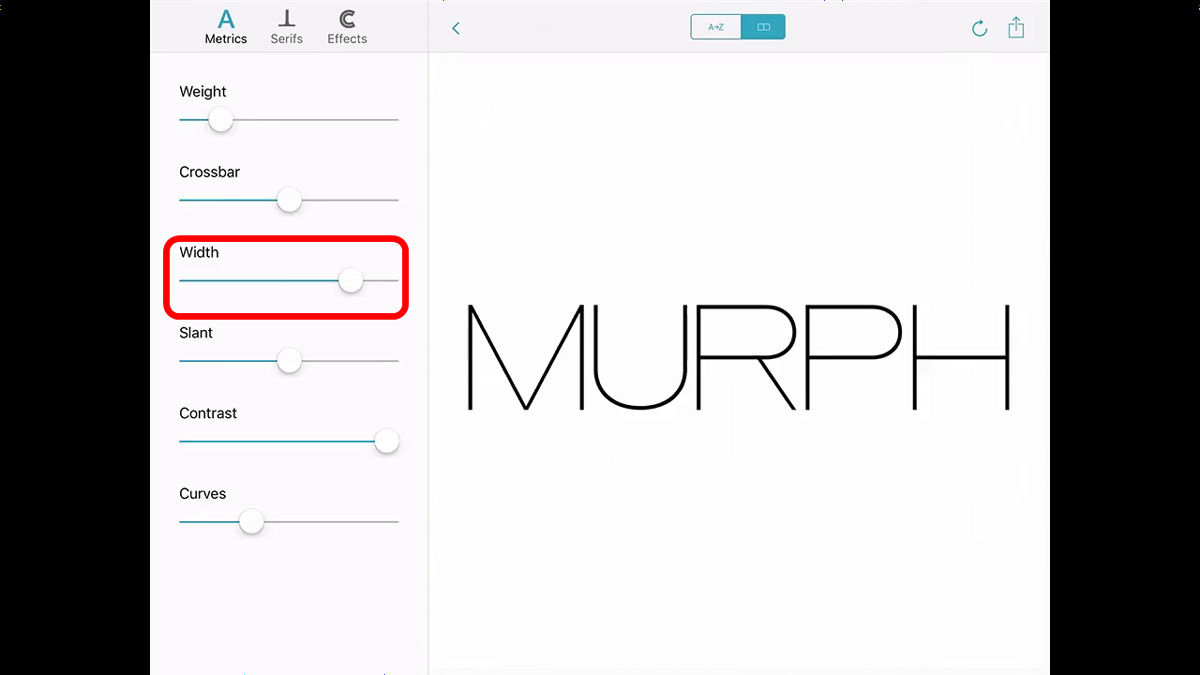
First, swing Width to the right to make the font wider.
Next, make the line thicker with Weight.
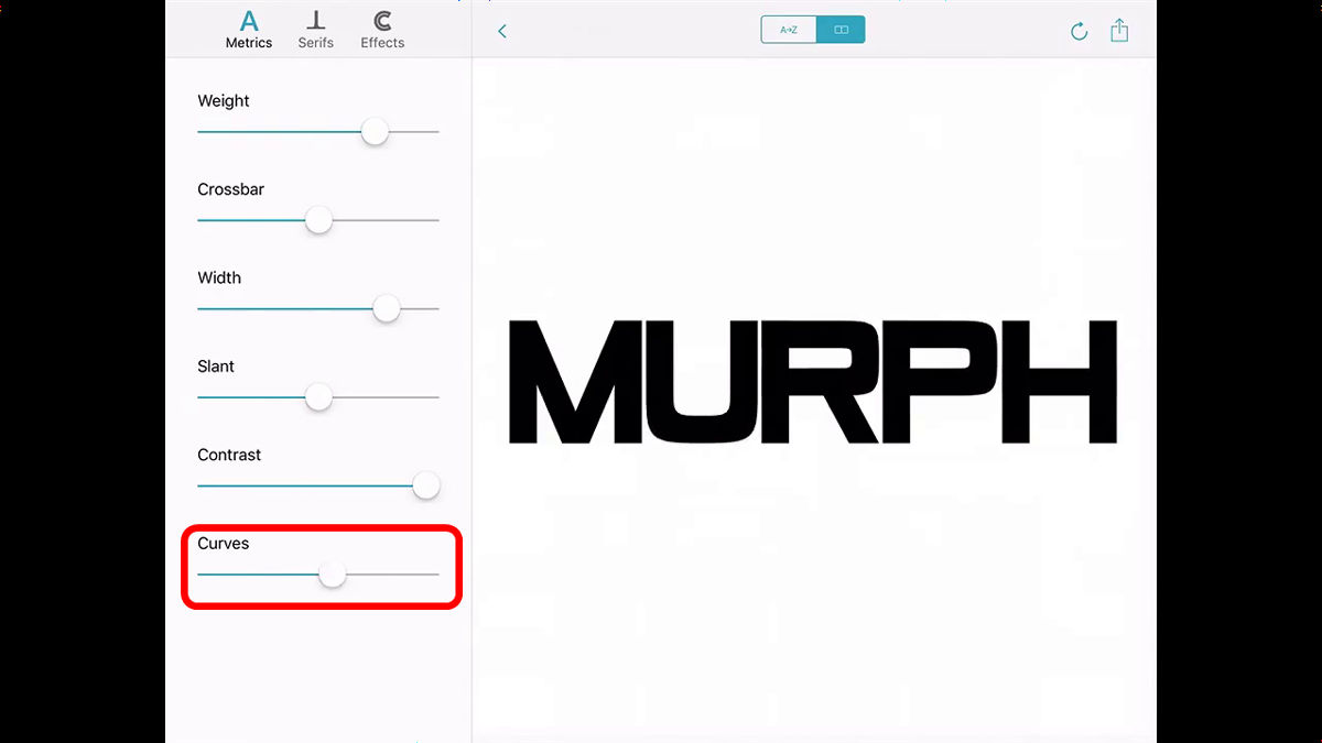
Adjust curves with Curves ...
The last is stencil processing with Effects Stencil.
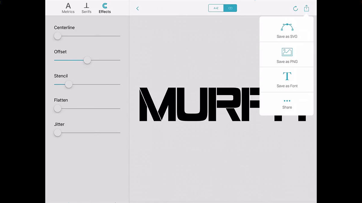
The created font can be saved as SVG or PNG format image data or font data. Furthermore, it seems to be up to the sharing function.
It is quite revolutionary that the user can freely adjust the font and create a new font. However, the copyright of the font seems to be controversial.
Related Posts: