Depending on how you view it, you can see it as "Ale" or "Kore" 16 logo designs of the world
Applied human imaginationCreative poster that you can admire when you look closelyAlthough it is made, there is no such intention, but "it seems to be something else" that "16 world logo designsA movie that can enjoy is released.
16 Creepy Logo Designs - YouTube
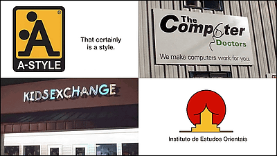
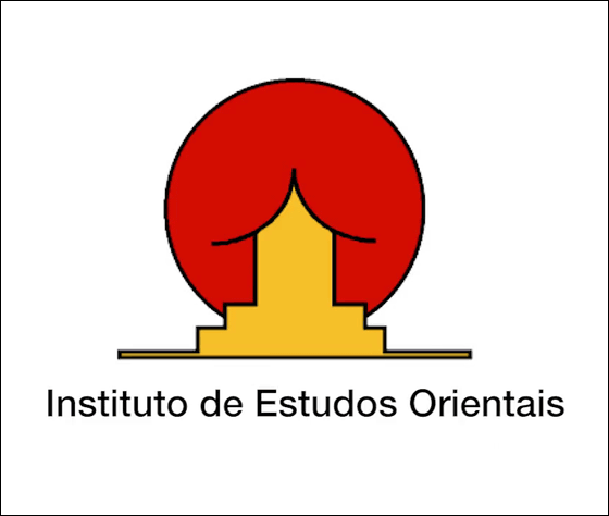
◆ 01:Instituto de Estudos Orientais(Oriental Studies Institute)
Symbol of Oriental Studies Institute of Catholic University of Portugal. It is a pattern called sun + building, but it seems as if something is stuck in something.
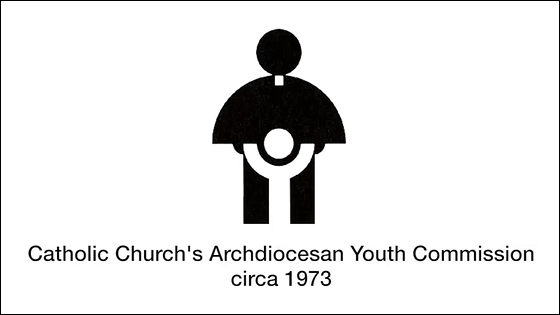
◆ 02: The Catholic Church Youth Committee in 1973
What is the bishop doing?
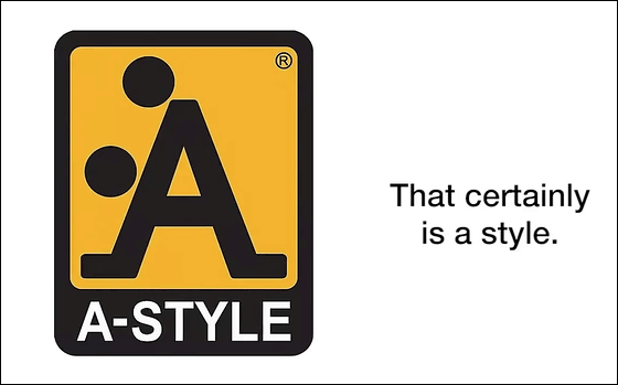
◆ 03: A-STYLE
It is unknown what the logo is, but with the design that O was 2 pushed in the alphabet A, with BuzzFeed's comment "This is definitely A style".
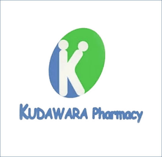
◆ 04:Pharmacy wow
A Japanese pharmacy that places the slogan "patient first principle". It might be "A style" as well.
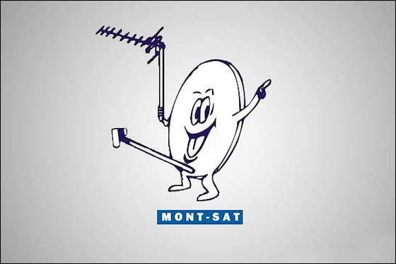
◆ 05:Mont-Sat
Polish satellite broadcasting company's logo is arrested design as long as there are police in the machine world.
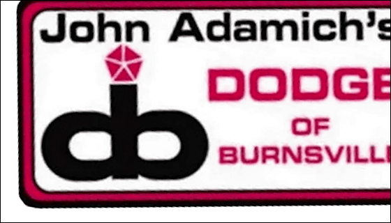
◆ 06:Dodge of Burnsville
The car dealer's logo is a combination of the initials "d" and "b". It does not have to resemble human pelvis.
◆ 07: Dance classroom
Logo of how girls dance, but a design combining visual effects that will appear as "different things" when staring still.

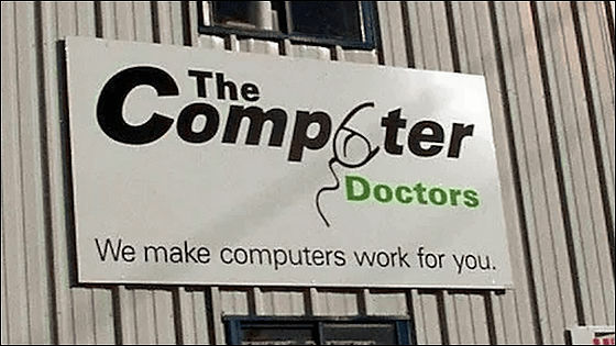
◆ 08: The Computer Doctors
As you can see that it is a PC repair company, I changed "u" which is part of company name to a mouse ... ....
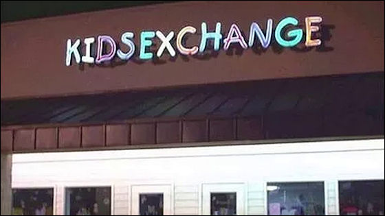
◆ 09: Child money exchange office
Since there is no space in the neon of "KIDSEXCHANGE", possibilities can not be ruled out, possibly being a mysterious facility called "KID SEX CHANGE (child sex change room for children)".
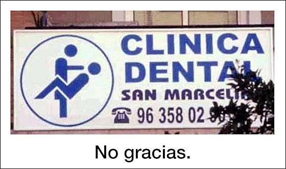
◆ 10: Spanish dentist
It is a logo of doctors and patients under examination seen from the side, but BuzzFeed commented as "No gracias (It is fine)".
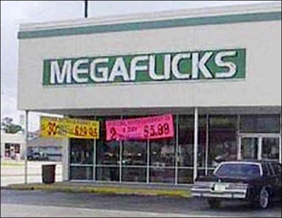
◆ 11: MEGAFLICKS
No matter where you lookEnglish broadcasting prohibition termAlthough it is used, it is not a suspicious shop, so be careful.
◆ 12: CAT WEAR
A clothing store for cats in Maine. It seems that the cat did not expect that such a place would be used for "A hole".

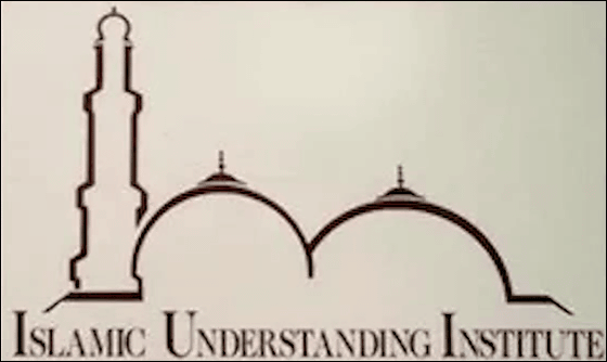
◆ 13:ISLAMIC UNDERSTANDING INSTITUTE
The logo of the institution deepening the understanding of Islam. By arranging two mosque tips, we create a mysterious visual effect.
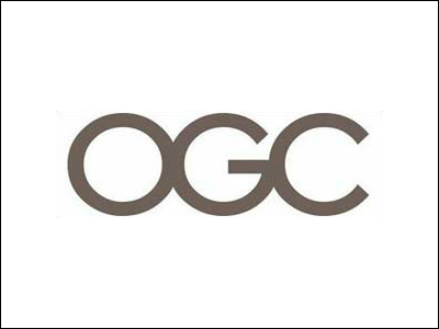
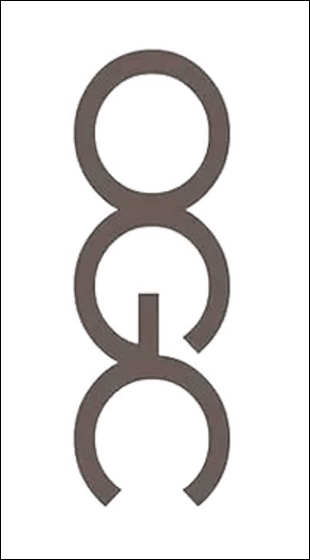
◆ 14: OGC (UK Commercial Bureau)
It is just a simple logo where three letters "O" "G" "C" are lined up ... ...
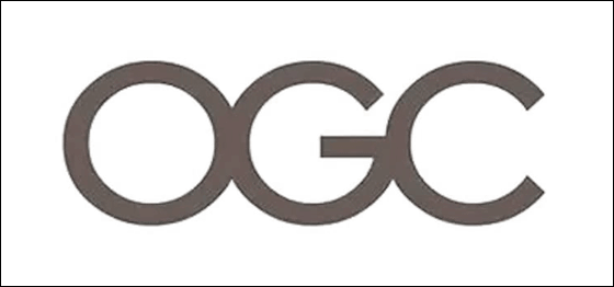
When it is set in portrait, "I am comforting myselfMaybe it looks like.
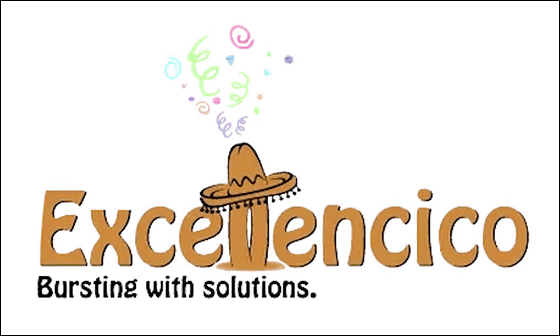
◆ 15: Excellencico
There is a subtitle "bursting with solutions"SombreroIf you make a mistake in the tip of the tip, it is that there are overwhelming solutions.
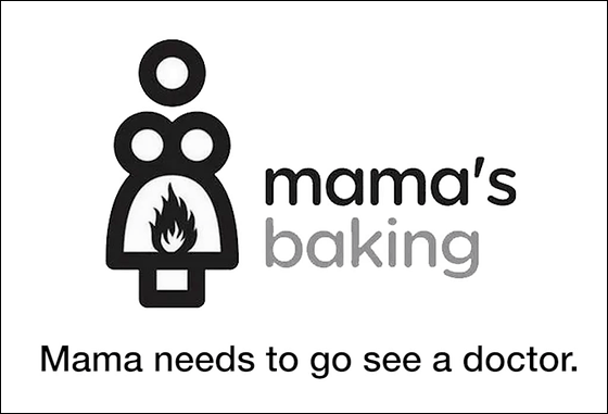
◆ 16: mama's baking (mom's baker's classroom)
Did you combine the illustrations of "Mama" and "Baked Pot"? According to the comment of BuzzFeed's "Mom needs to go to the doctor", it is not the case when baking bread.
Related Posts:
