What did iPhone iOS remix and what made it possible to design a user's heart?
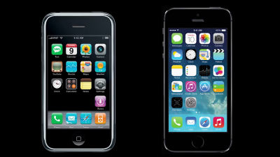
Although the smartphone was on the market before the iPhone appeared, it is true that the iPhone was to ignite the explosive popularity of smartphones. In addition, iOS 7 announced in 2013 called a topic by adopting a flat design, about 20% of the network traffic on the day of release was spent downloading iOS 7Statistics ResultsI came out. So, how did iPhone capture the user's mind, and where the design of iOS 7 is inspired, the movie summarizing the details in one "Everything is a Remix Case Study: The iPhone"Has been released.
Everything is a Remix Case Study: The iPhone on Vimeo
http://vimeo.com/81745843
With the arrival of iPhone released by Steve Jobs at Macworld Expo 2007, one of Apple's exhibitions held on January 9, 2007, the world surrounding mobile phones has changed dramatically.
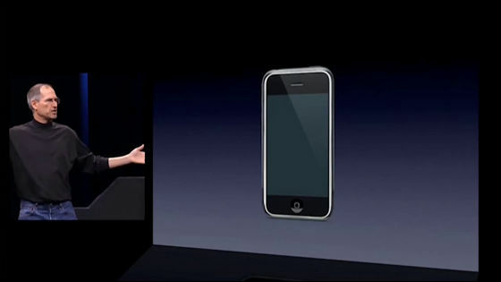
The function of the iPhone was not much different from other smart phones that had been circulated at the time that it was announced, but the installed technology had a line with other smartphones.
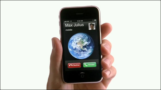
That technology is a multi-touch that allows the touch panel to be operated with multiple fingers.
Multi-touch technology was invented and studied before the iPhone appeared, but Apple introduced multi touch on smartphone for the first time in the world.
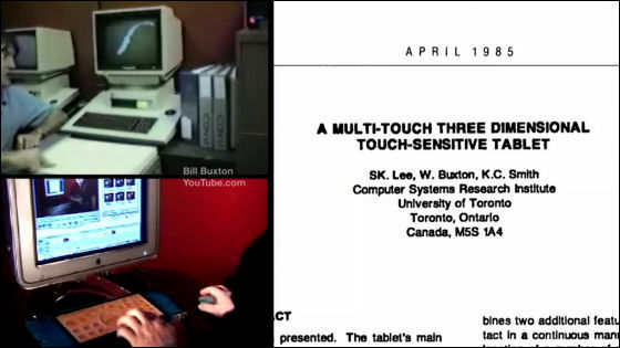
Multitouch was installed on smartphones and the door to the great possibility was opened.

Apple 's challenge is how to satisfy users on an iPhone that seemingly has a big display.

The UI of the iPhone's home screen places radio waves, time, batteries in the bar at the top of the screen, and displays applications under it.

The UI adopted by the iPhone is a familiar design even at other companies' smartphones at that time.

However, the UI other than the home screen is not a smartphone of another company, but is inspired by things that exist in the real world.

For example, the UI of the screen to unlock the device ......

It looks like a latch of a door.

Animation when typing characters with the keyboard is getting ideas from typewriters.

When you touch the album artwork, the turn of the album is displayed in reverse, and the animation is the actual CD album itself.

Swipe the screen and see the next image The action is like feeling like turning over the actual book.


The "ON" "OFF" switch of the function is the same as the actual light switch.

"START" is green and "STOP" is red ...


We incorporate the color of the signal into the UI.

Even within the UI of the iPhone, the design given to the icons and buttons is unique to Apple.

Shadows and shapes of icons and buttons have an important role in order to give a stereoscopic effect.

In this way, incorporating the design of real things into the UI, making it possible to give the user an easy-to-understand designSkew MorphismIs called.

For example, an early car is a design resembling a carriage of a carriage.

Graphical user interfaceTechnology, was the world's first commercial PCXerox StarThe

I adopted UI design which imaged what is on the office desk.

However, the UI design of the iPhone was not a design that imagined real things, it was like that one.

The innovative UI design of iPhone has a big influence on the smartphone of other companies, and smartphones which appeared in 2010 carried a UI which is very similar to the iPhone. Multi-touch technology developed by Apple is installed in many devices, other companies adopted iPhone's UI into smartphones, and iPhone's technology and UI are not brand new.

In this situation iOS 7 appeared.

IOS 7 is not a real thing, it created a new design from the features and UI design of other smartphone.

For example, "Parallax Effect" which the wallpaper moves according to the tilt of the device which is installed in iOS 7 is what was previously installed in other smartphone in the past.

"Pull-down menu" which slides your finger down from the top of the screen and was displayed on the Android terminal.

Swipe your finger from the left side of the screen and make it "Slide Menu" ......

The iOS 7 UI gets many ideas from other smartphone features and UI.

Flat design which is a big feature of iOS 7 is also aiming at Windows Phone and Android terminal and incorporates the fashion of design at the time.

So I can see that the first iPhone and iOS 7 incorporate two completely different design elements.

What kind of surprise is next prepared by Apple, and whether innovative things following iPhone and iOS 7 will be announced, expectation is expected for the next recital.

Related Posts:
